




DesignStudio rebrands loyalty scheme Nectar with a “cheeky personality”
DesignStudio: Nectar rebrand
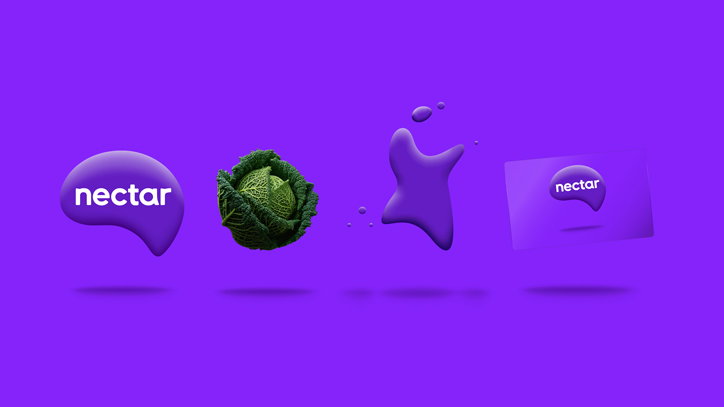
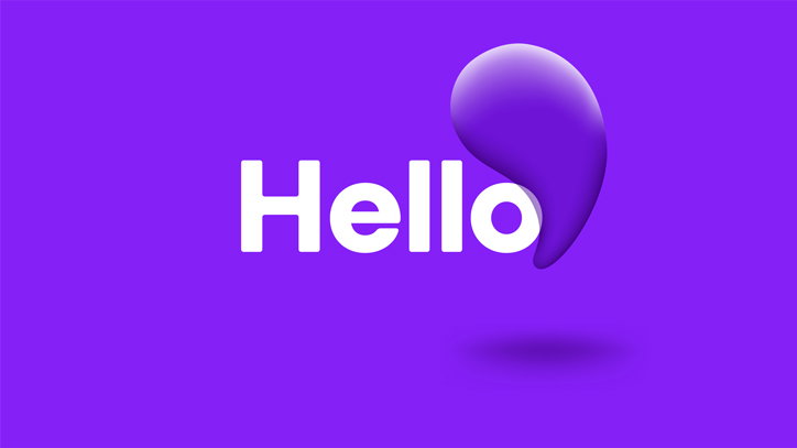
DesignStudio has created a new visual identity for Nectar – the largest loyalty scheme in the UK – to better appeal to a digitally savvy audience. Retaining nectar’s distinctive droplet shape, the new brand simplifies the overall look and feel in order to provide greater cut-through in the e-commerce environment, while adding a touch of “cheeky personality”, the studio says.
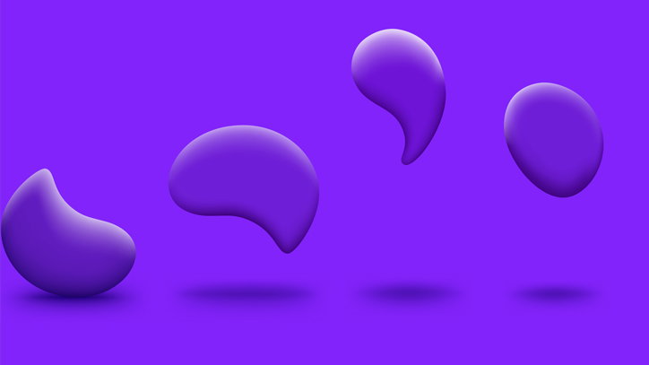
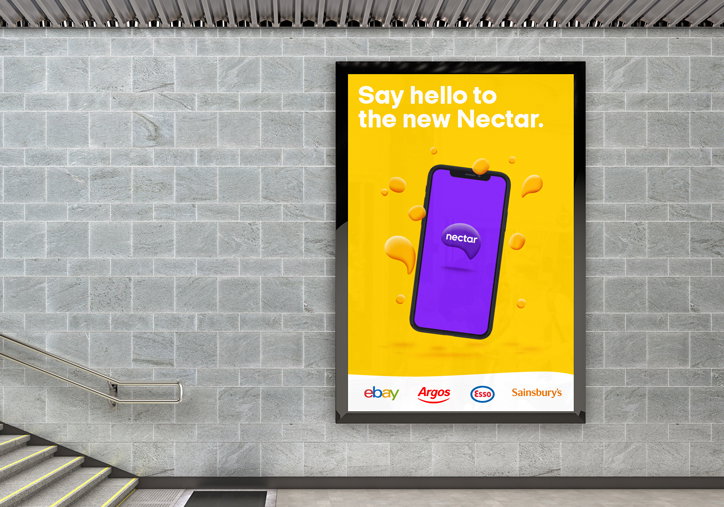
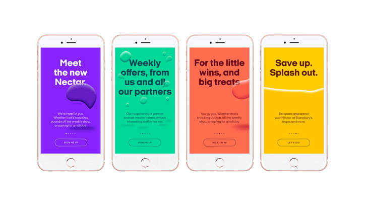
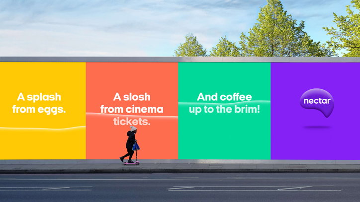
Throughout the new identity, the droplet morphs into a range of different shapes including splashes, tide lines and – in an animation – a bouncing ball. Designed to stand out in brand-filled supermarkets or the cluttered digital sphere, the new identity largely hinges around environments of bold block colours where the droplet introduces a three-dimensional perspective. It is also used as a device to interact with text.
“The main challenge we faced was giving people reasons to re-engage with Nectar,” says DesignStudio design director Elise Santangelo. “We needed to bring it to life, turn heads, and bring distinctive confidence back to one of the most household brands in Britain.”
While the new word mark is bespoke, elsewhere DesignStudio has used typeface Italian Plate No. 1 Expanded for supporting text. Copy accompanying the new visuals plays with the aquatic theme introduced by the droplet. The concept is that you are filling up a vessel with droplets of nectar every time you spend, acquiring “a splash” or “a slosh” on certain purchases.
DesignStudio also worked with Nectar to develop a new user interface for its iOS and Android apps, a suit of digital assets and a number of animations, as well as redesigning the famed Nectar card.
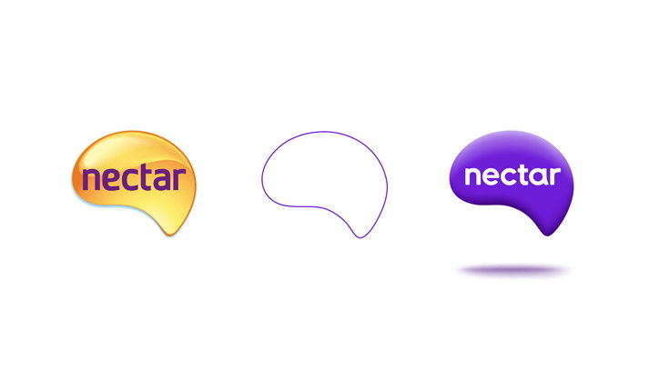
DesignStudio: Nectar rebrand – logo development
DesignStudio: Nectar rebrand
DesignStudio: Nectar rebrand
DesignStudio: Nectar rebrand
DesignStudio: Nectar rebrand
DesignStudio: Nectar rebrand
Share Article
Further Info
About the Author
—
Laura is a London-based arts journalist who has been working for It’s Nice That on a freelance basis since 2016.


