




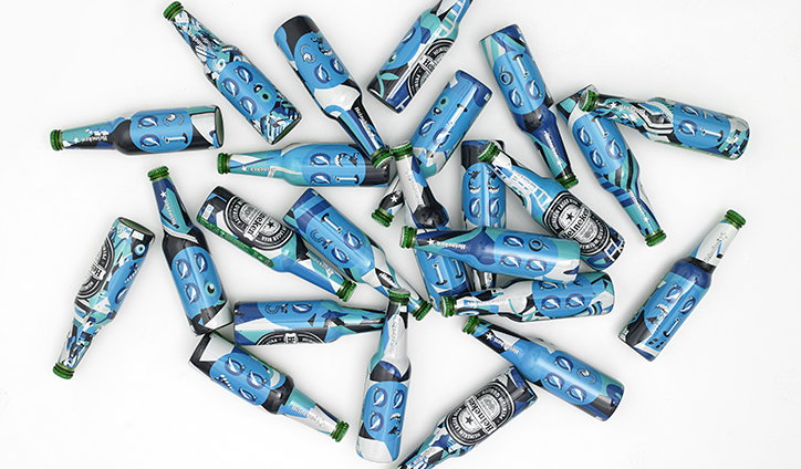
Emily Forgot designs one-of-a-kind graphics for 2000 Heineken Bottles
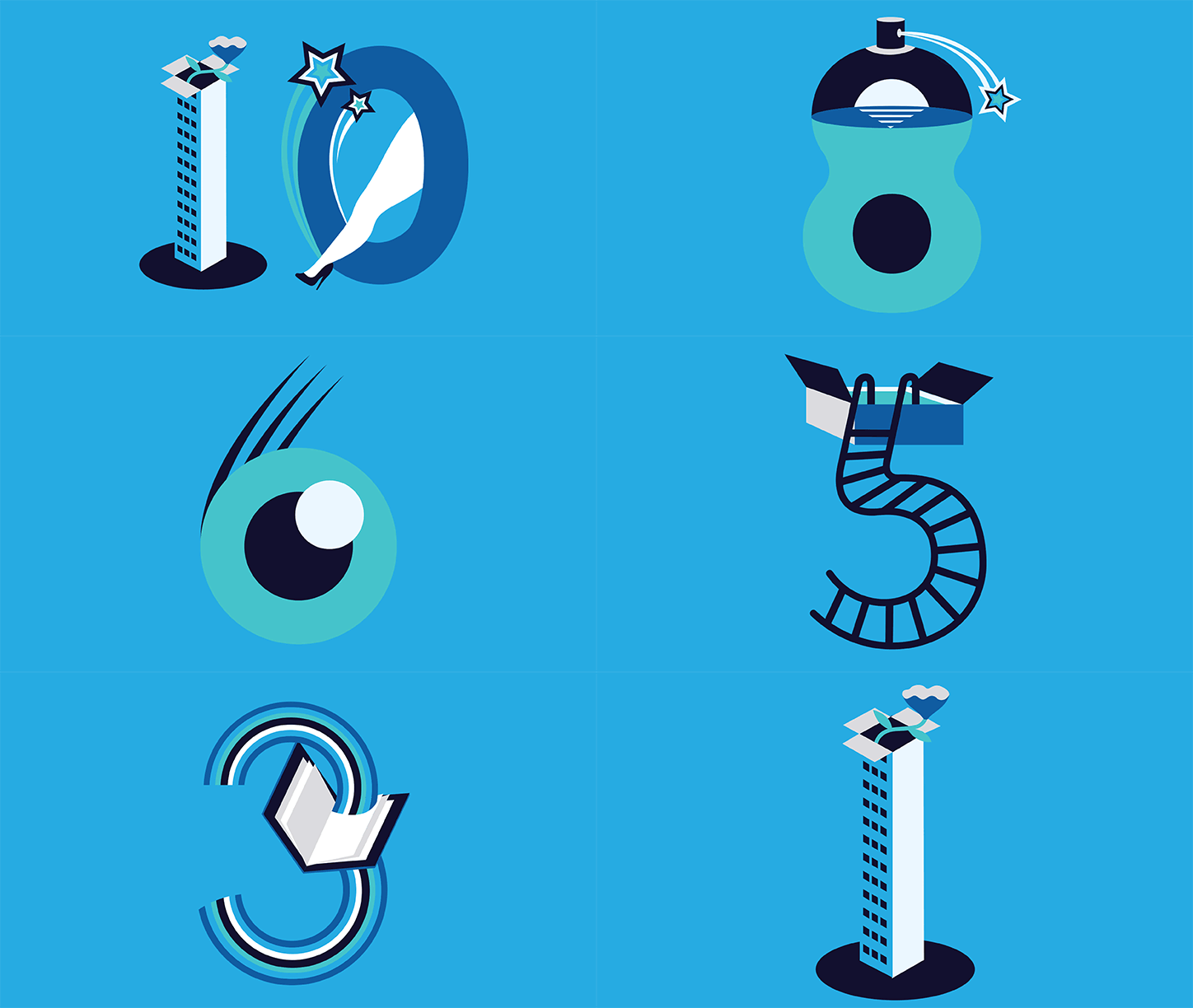
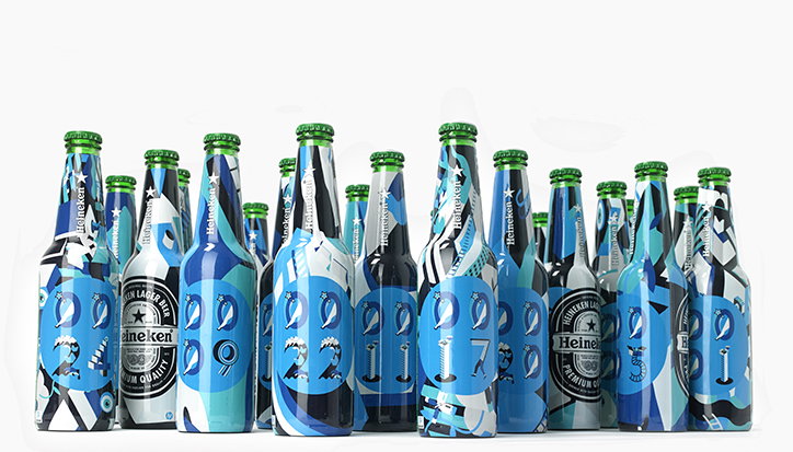
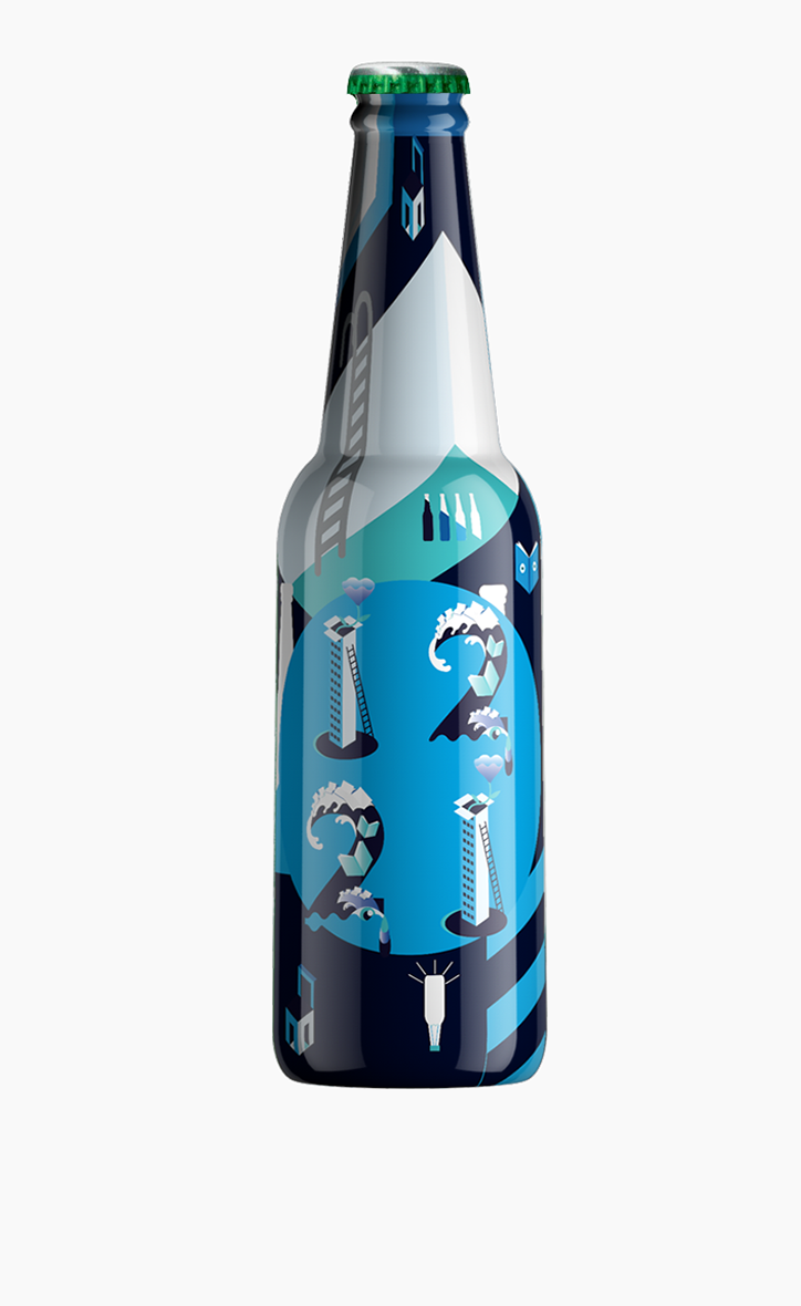
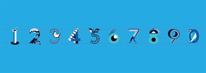
Graphic artist Emily Forgot, along with packaging designer Silas Amos and printing company HP, has created 2000 unique bottles of beer for Heineken. Unveiled at Interpack in Dusseldorf, the designs combine two unique elements – a shrink sleeve that provides a variation on a seed pattern, and an individual number using a font designed specifically for this project.
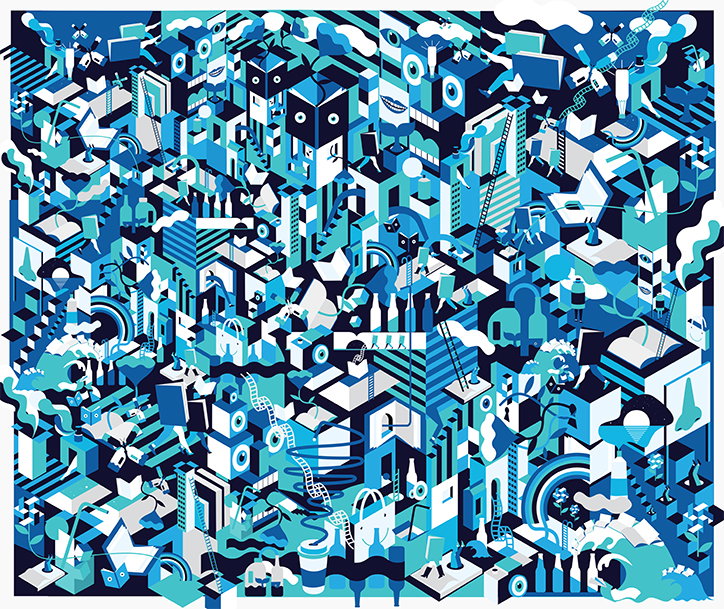
“The brief was pretty straight forward, the overarching theme for HP’s latest print fair was ‘the reinvention of packaging’, so we looked at ways to give packaging and other printed matter such as books and signage a new lease of life, giving what could potentially be a dry subject matter (to some!) a lot of personality,” explains Emily. “A large scale master or ‘core’ artwork (that would go through the mosaic printing process) and a set of numerals needed to be created so each bottle of heineken that would be given out during HP’s happy hour could be the same but different. Some of Silas’ references in the brief had quite a surreal psychedelic feel, so, based on some other projects I’ve been involved in I seemed to fit the bill, plus it gave me the perfect excuse to spend time with my ’60s and ’70s graphics annuals for inspiration.”
Emily’s pattern began in the sketchbook before being digitally artwork. It was, for her, an exercise in reinventing the carton and seeing where her imagination led, resulting in something akin to a cityscape. “Cartons became swimming pools, chairs, houses, tower blocks and sets of stairs… Bottles became butterflies. Once these elements had been created the master artwork was an exercise in visualising a world for all these eccentric elements to inhabit, it helped to have the box forms as part of the brief to build a city like structure,” says Emily. “In the grand scheme of the overall design there was lots of room for creative licence so other printed matter like books and magazines were given a life of their own with eyes and legs to wander around the surreal HP world we created.”
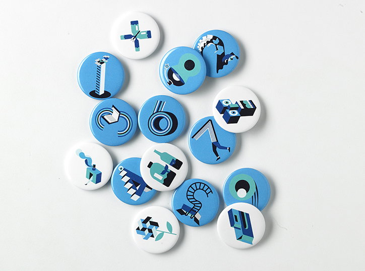
The reinvention of the numbers that would label provided a different challenge. “This something I personally really enjoy and seems to crop up in my work often is seeing something new in existing forms,” says Emily. “I’ve worked this way a lot with typography in the past so it felt natural to re-imagine the numerals in the surreal way Silas requested. I created numbers one to nine so each of the 2000 Heineken bottles could be numbered individually.”
Not only did the artwork have to fulfil its role as an image, it also had to take into account the technology that would allow to be applied to the packaging of the bottle. Something that was a new challenge for Emily. “I think i struggled a little with the amount of detail that needed to be in the original master mosaic illustration. The mosaic technology scans the work and isolates sections
scaling them up and down and rotating to create 2000 completely different variants of the same image,” she explains. “Often I am working on a piece that has to work as a stand alone image so its important the composition is balanced, its rare I would create such a busy single image but for the mosaic to work it was essential. A quiet simple section of the master artwork could potentially just come out as one block of colour if I wasn’t careful so it was important every square inch of the original artwork had something of interest within it. The technology took the choice out of my hands which as a control freak felt nerve wracking but in a way nice to let go for once!”
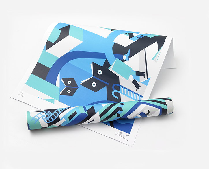
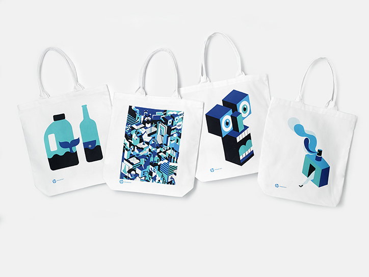
The designs have also been used across a posters, totes and even nail designs as an extension of the project.
Emily Forgot: Heineken
Emily Forgot: Heineken
Emily Forgot: Heineken
Emily Forgot: Heineken
Emily Forgot: Heineken
Emily Forgot: Heineken
Emily Forgot: Heineken
Emily Forgot: Heineken
Share Article
Further Info
About the Author
—
Owen joined It’s Nice That as Editor in November of 2015 leading and overseeing all editorial content across online, print and the events programme, before leaving in early 2018.