




Brighton and Hove Albion has a new typeface: Filthy Seagull Display
Filthy Media: Filthy Seagull Display
Filthy Media, a design agency based on the coast in Brighton, has been dedicating its Thursdays to do the work it really wants to do. Titling it Filthy Thursdays, the team, led by creative director Joe Pilbeam, picks a brand it really loves and designs a custom typeface for it. Following experiments with Adidas, Kodak and The North Face, Filthy Media’s local football team Brighton and Hove Albion, were next to receive the typographic treatment.
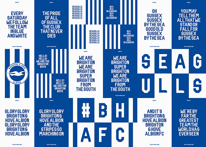
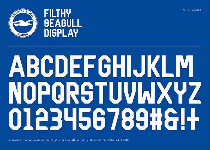
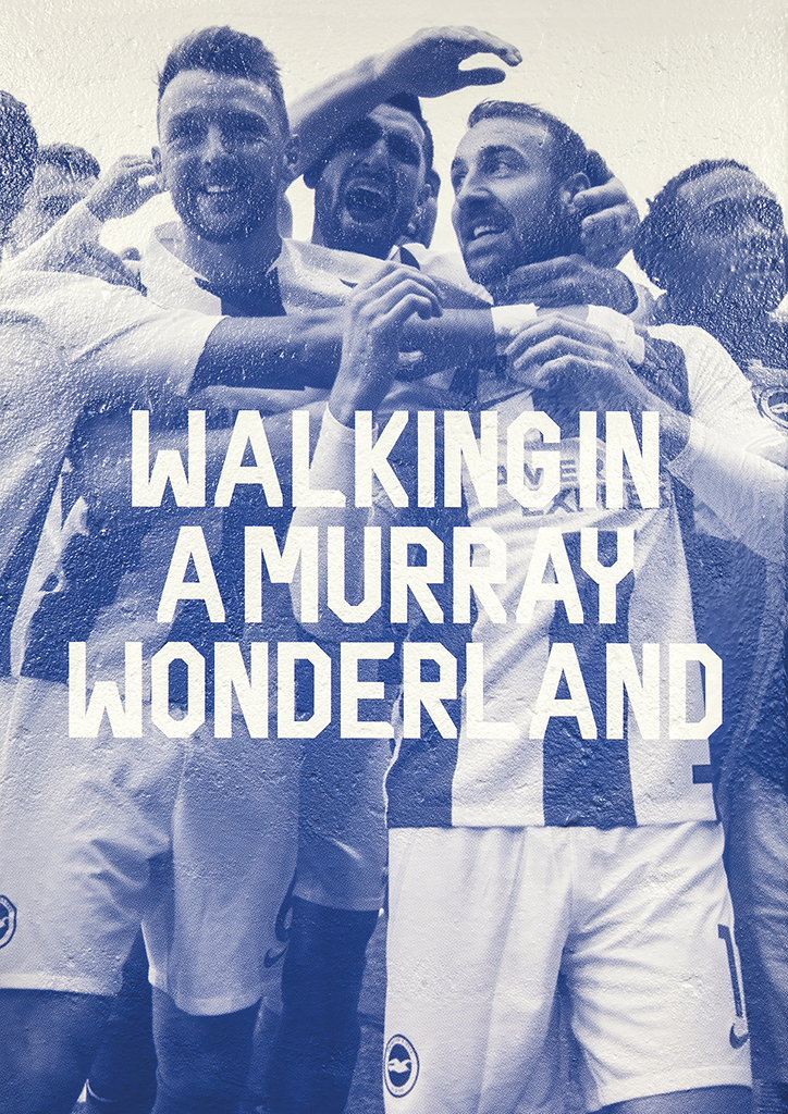
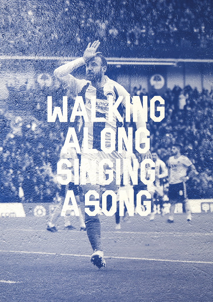
Titled Filthy Seagull Display (fantastic), Joe was looking to “create a typeface that would work well at scale, specifically for a fly poster campaign,” he tells It’s Nice That of the project’s initial beginnings. The result is a typeface that “is bold, condensed with distinct angles for impact at large sizes”, perfect for when typesetting one of BHAFC’s chants on a poster. “Before we had the opportunity to paste the posters up around the city, the club saw a mock-up that we pushed out on socials and invited me in for a meeting,” Joe continues. Subsequently working with the football club on the typeface “a lot of it was down to timing, and a bit of good luck”, the designer says modestly. “The club wanted to create an alternative brand image to engage with its fans at the Amex Stadium, and the campaign we’d created for them fitted perfectly with what it had in mind.”
From there, Joe and the team at Filthy Media worked closely with Linton Rogers, the head designer at BHAFC, both in-house at Filthy and at the club’s stadium. “It’s imperative that we have this kind of relationship with the design team at the club,” explains Joe of this process. “The closer we collaborate, the more ideas get passed about, the greater the opportunities become. The club is really on board with the aesthetic we’ve developed since the initial flyposter campaign, so from a creative viewpoint the whole process has been very rewarding.”
Filthy Seagull Display can now be seen across 150 square meters of wall graphics in the east stand concourse, across the largest main wall, in print and on social media too.
For Joe, working with the football club has seen him rekindle a relationship with his childhood team. “I’m local to Brighton so the Seagulls have been my team since I was a kid,” he explains. “I’m not a diehard football fan but we’ve had season tickets the stadium opened, it’s a real pleasure to be working with the club.”
Filthy Media: Filthy Seagull Display
Filthy Media: Filthy Seagull Display
Filthy Media: Filthy Seagull Display
Filthy Media: Filthy Seagull Display
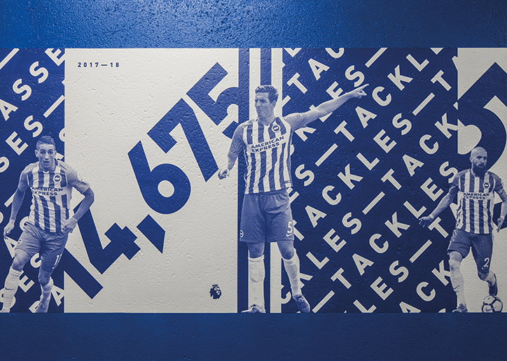
Filthy Media: Filthy Seagull Display
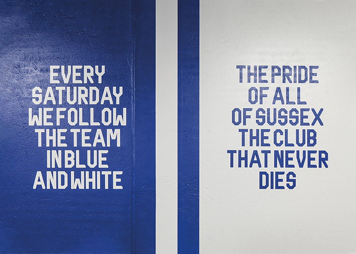
Filthy Media: Filthy Seagull Display
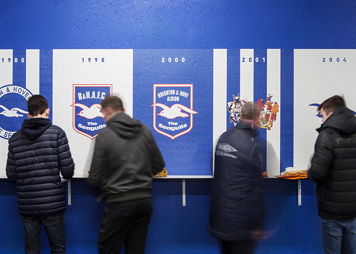
Filthy Media: Filthy Seagull Display
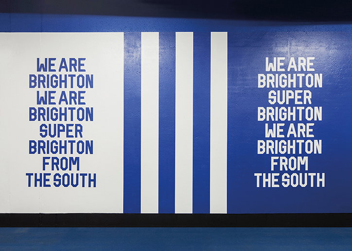
Filthy Media: Filthy Seagull Display
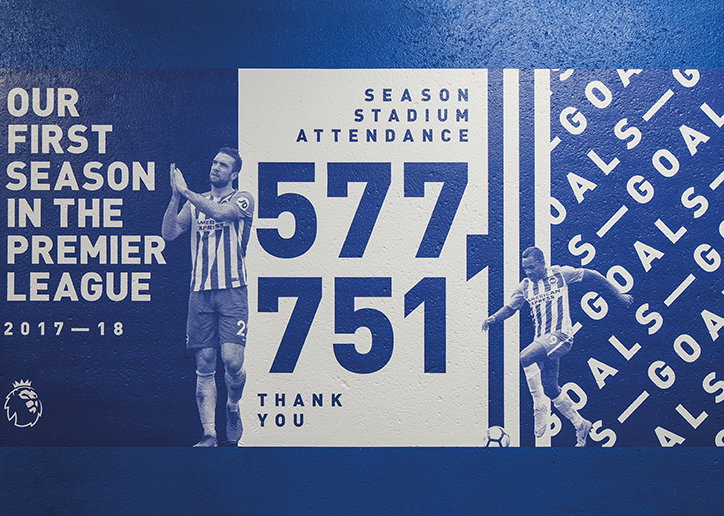
Filthy Media: Filthy Seagull Display
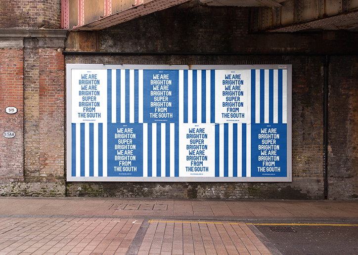
Filthy Media: Filthy Seagull Display
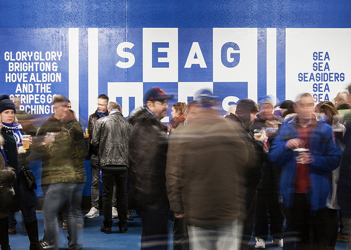
Filthy Media: Filthy Seagull Display
Share Article
Further Info
About the Author
—
Lucy (she/her) was part of the It’s Nice That team from 2016–2025, first joining as a staff writer after graduating from Chelsea College of Art with a degree in Graphic Design Communication, eventually becoming a senior editor on our editorial team, and most recently at Insights, a research-driven department with It’s Nice That.