High Tide’s refresh for audio furniture brand Symbol echoes the edged corners of a cabinet
Sitting in line with High Tide’s anti-fast furniture approach, the creative studio constructs a hard-wearing brand with forms built to last.
Share
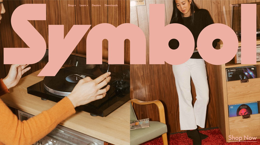
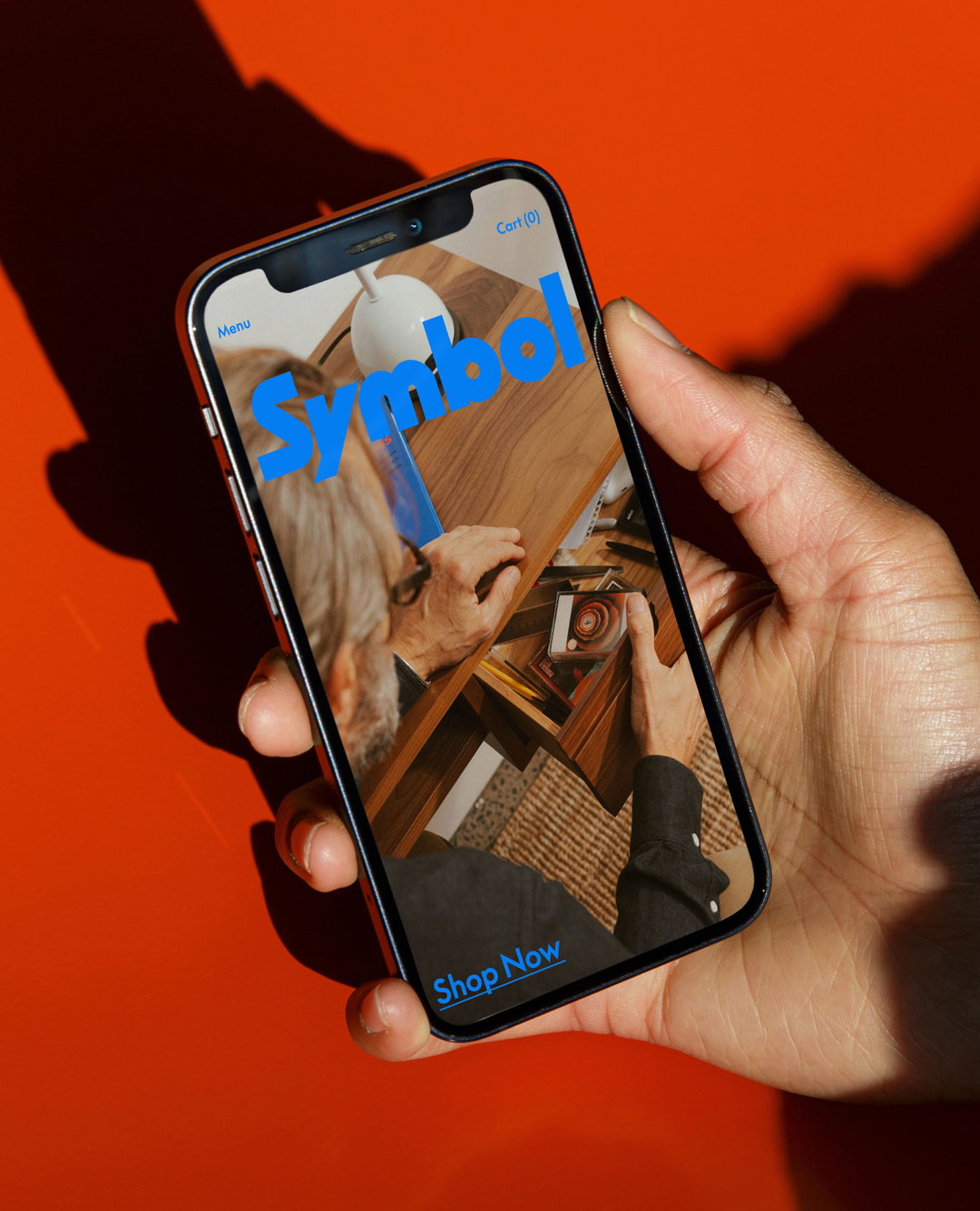
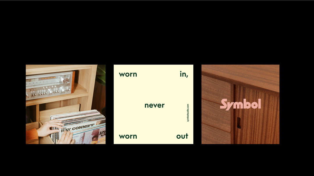
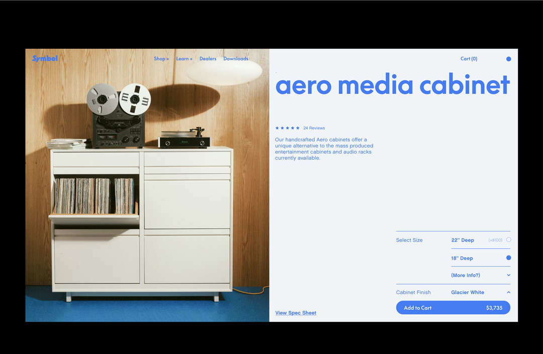
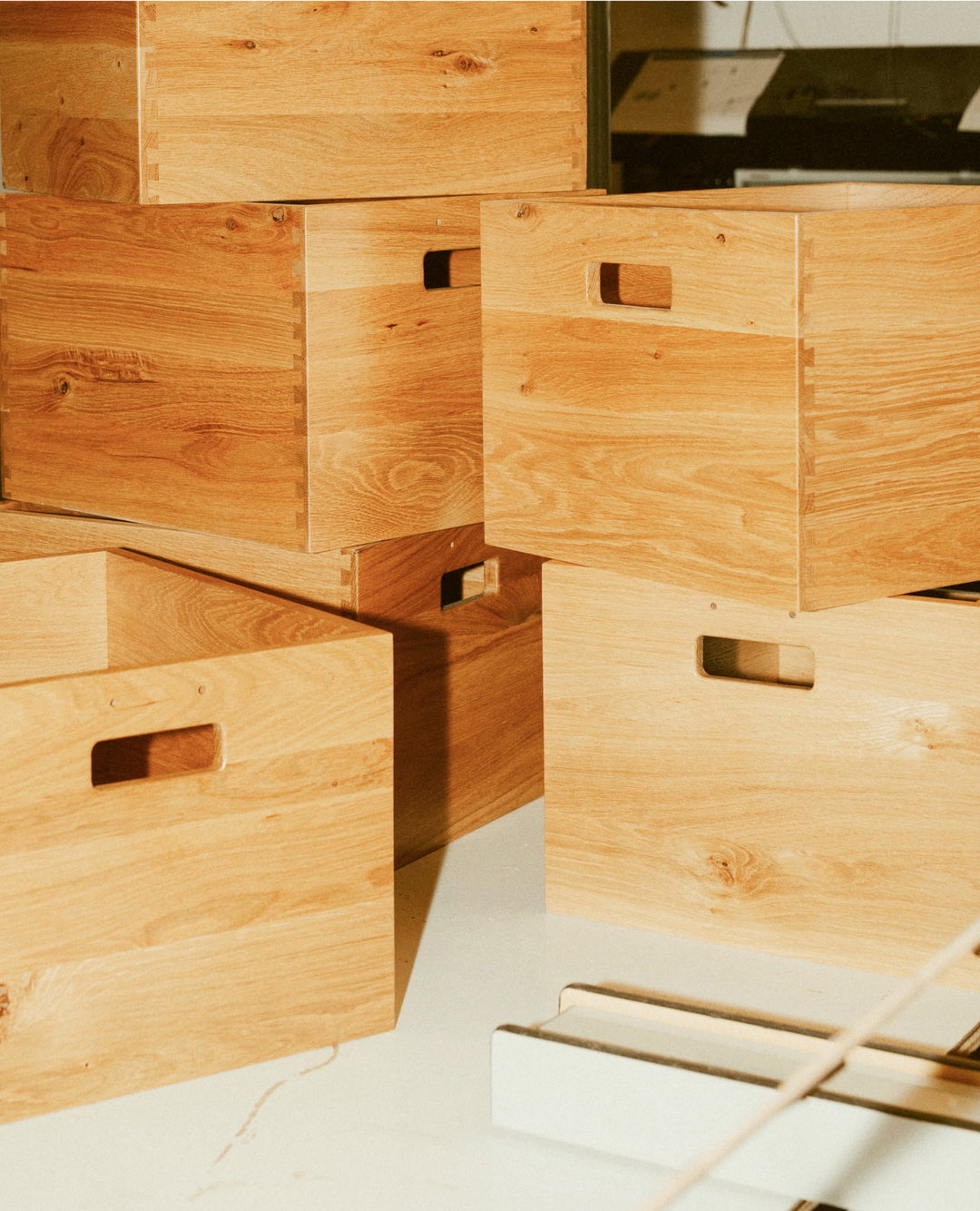
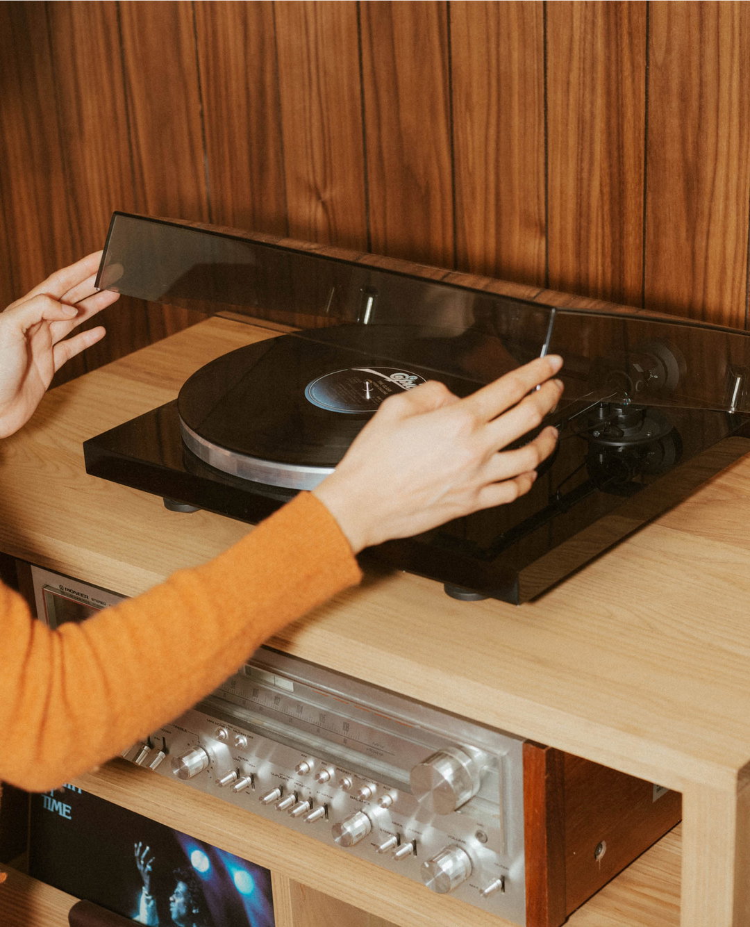
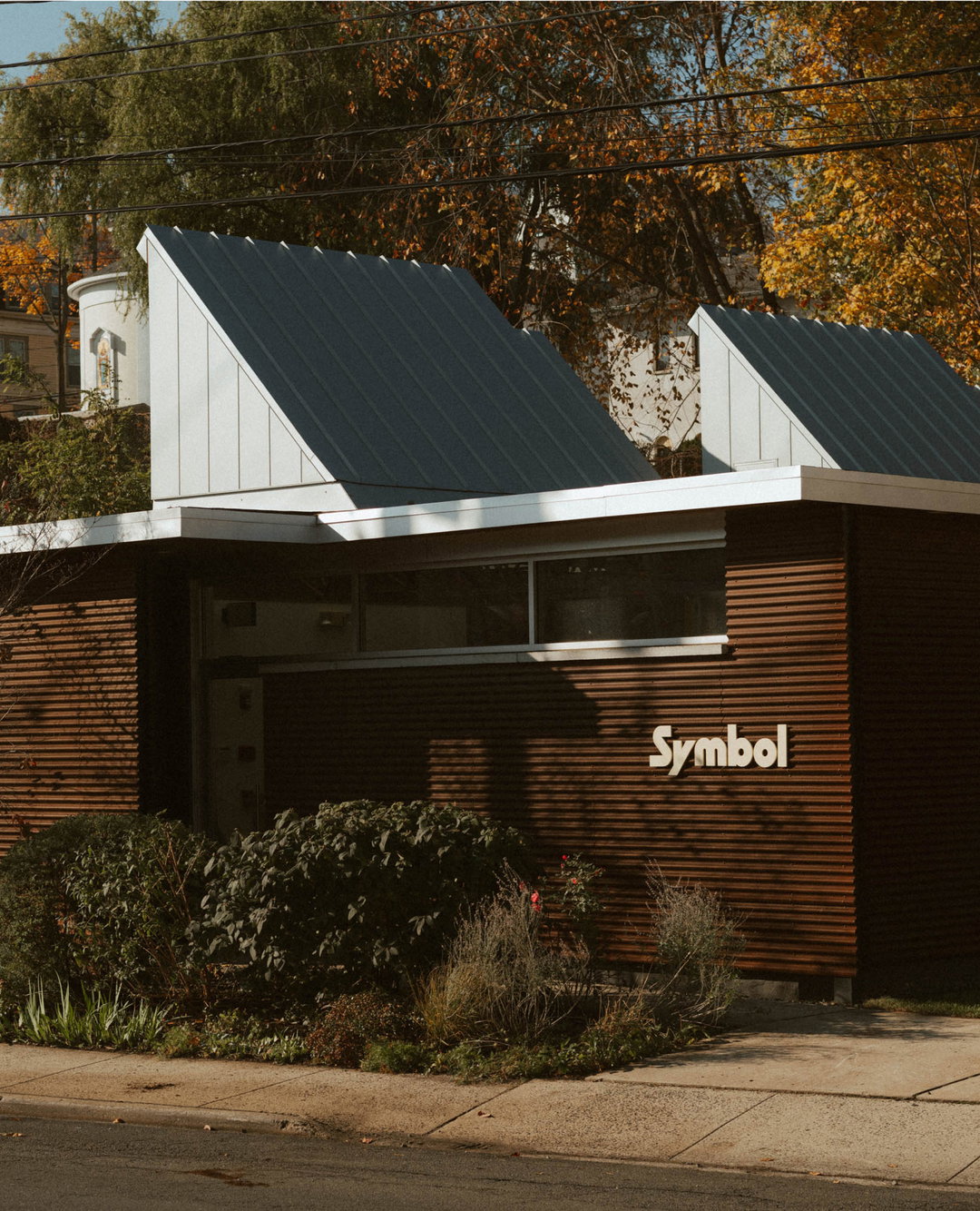
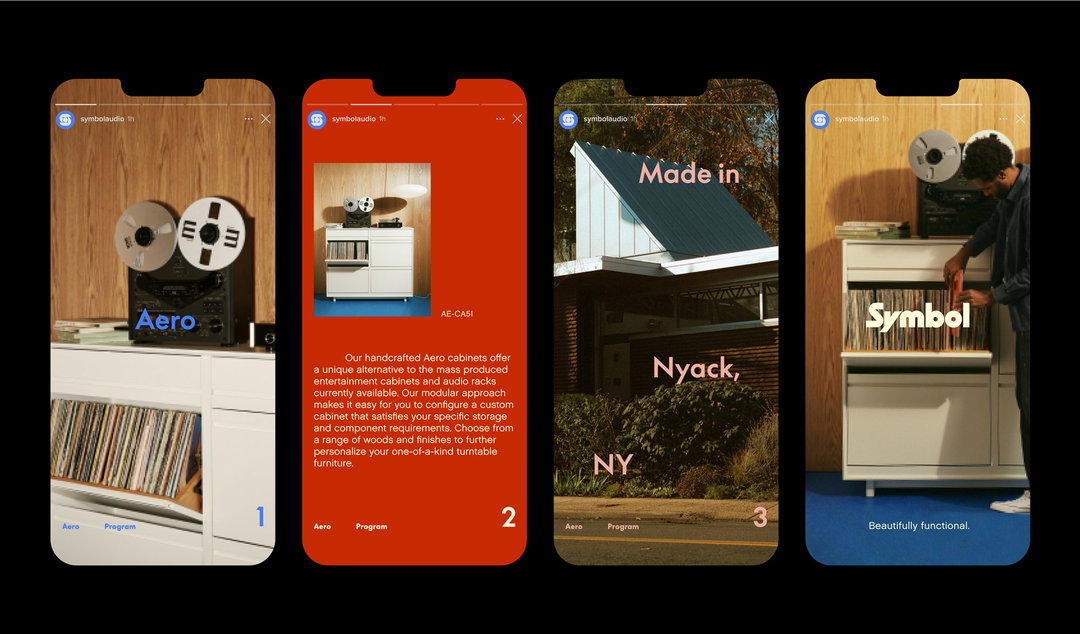
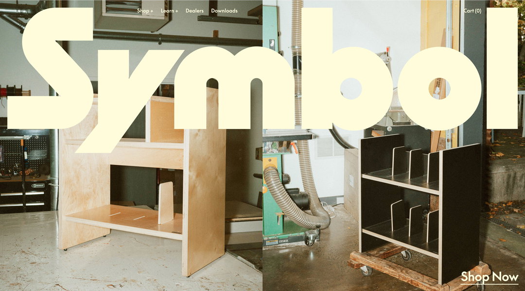
During the pandemic, vinyl sales exploded. In 2021, the Billboard MRC year end report stated that over 50 per cent of all physical album sales were vinyl. Symbol is a brand well-positioned for this boom. It builds and sells audio furniture, which covers record consoles, vinyl and hi-fi storage but also tote bags and sleek wooden record crates. The era of the vinyl also informs the kind of homeware Symbol makes, not just in look but in quality; the brand coins itself as the antidote to disposable homeware. Calling in Brooklyn-based creative studio High Tide to help realise this vision, Symbol has launched a makeover that borrows from the sturdiness and structure of mid-century furniture, using punchy colours to elevate the dark polished wood so central to the Symbol range.
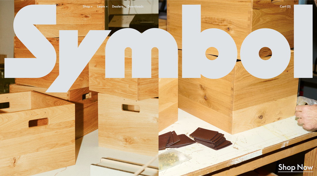
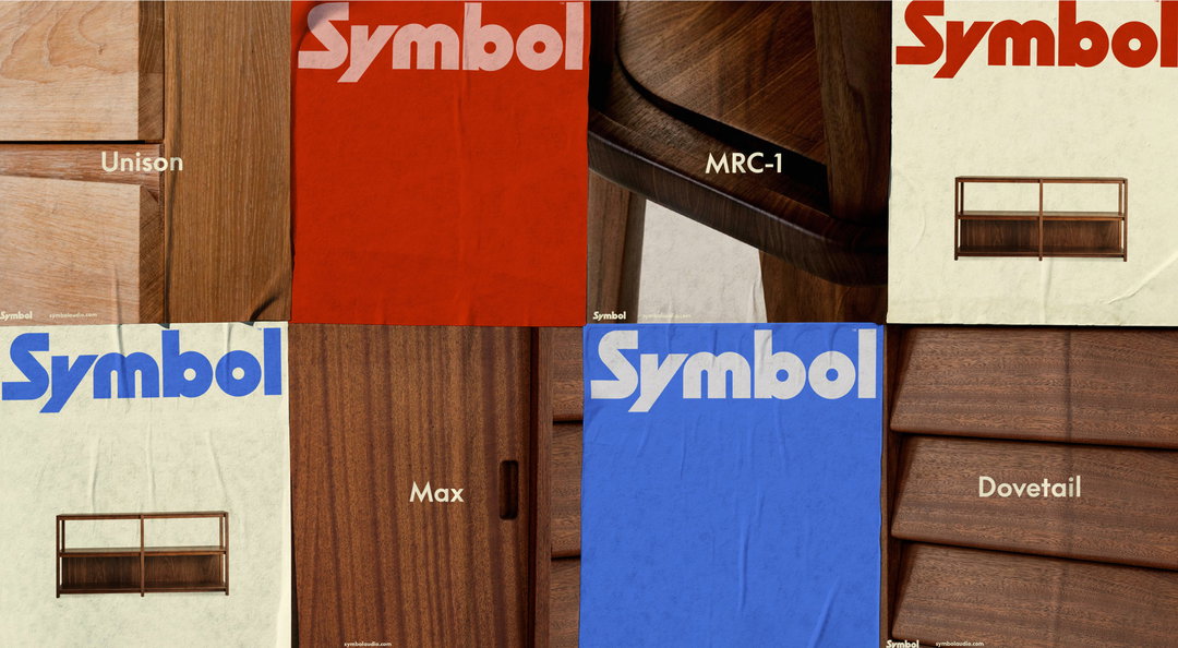
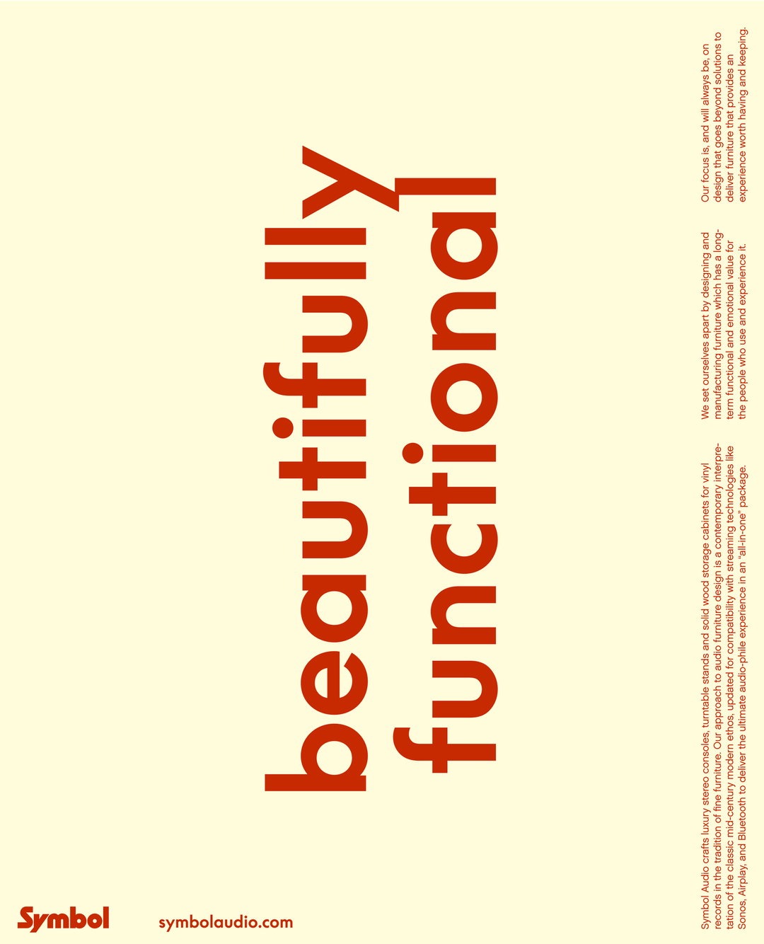
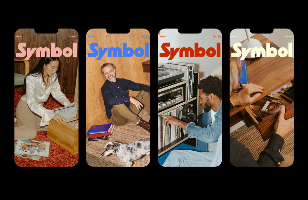
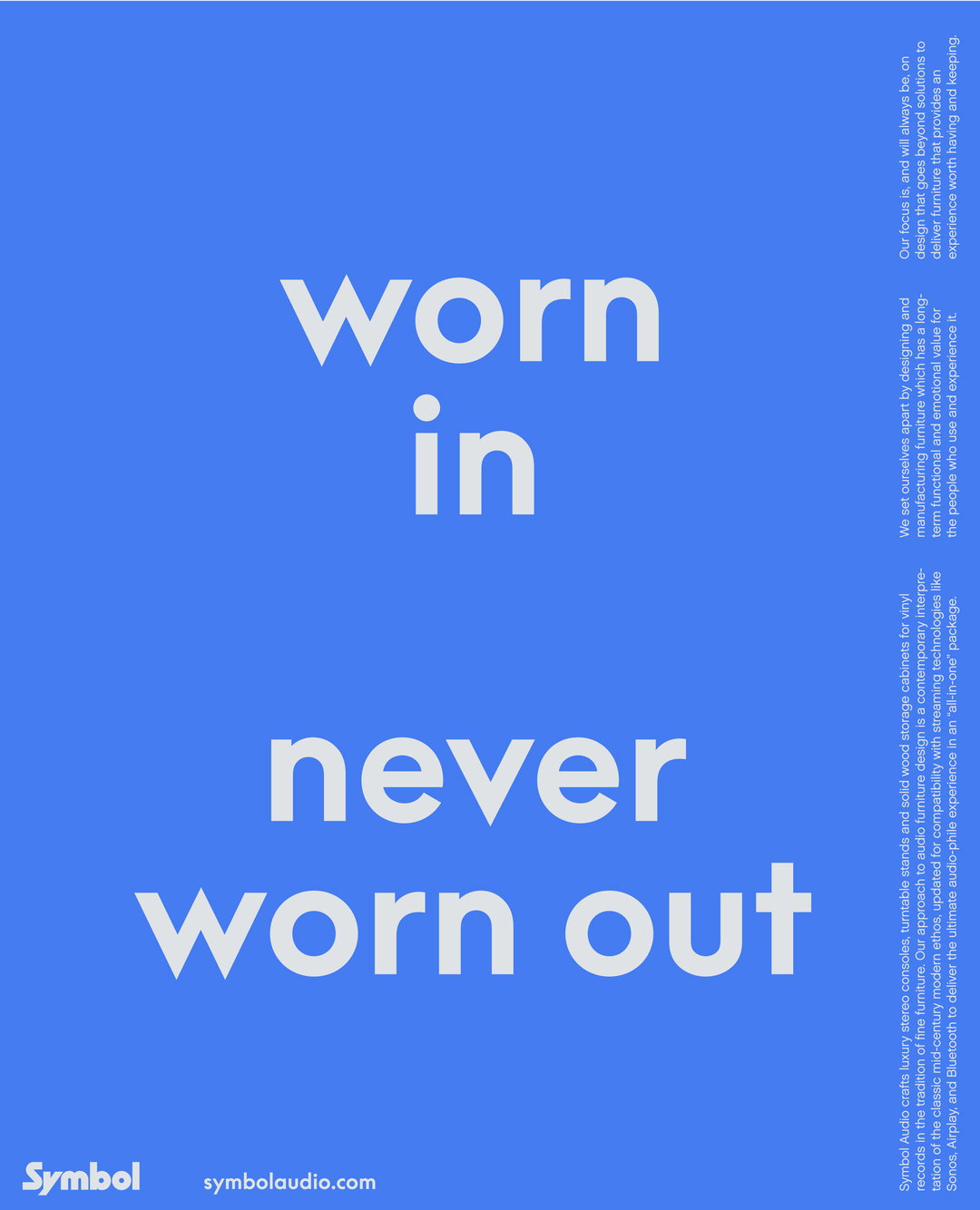
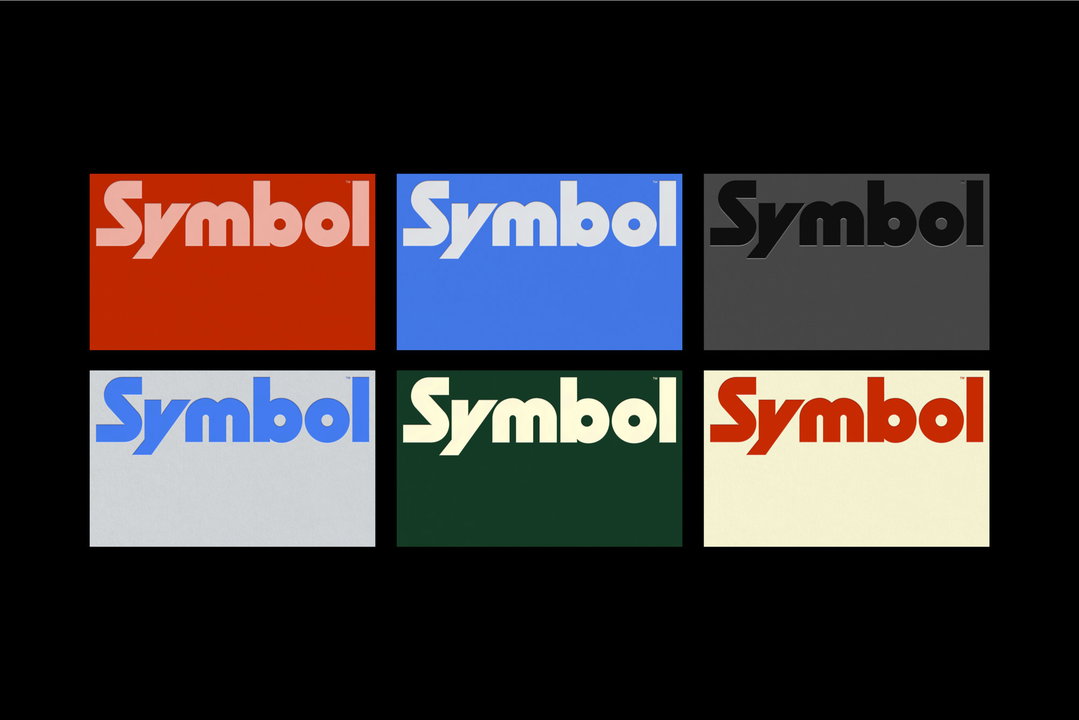
Through Symbol’s furniture is “very much a contemporary take on mid-century and classic Scandinavian furniture design”, a press release from High Tide explains, the branding had to nod to the 50s, 60s and 70s while not getting stuck in a nostalgia loop. “Akin to heirloom pieces that get passed down from generation to generation, it was important that the identity could transcend different decades and not be too tied down to one specific era.” The wordmark for example, draws from the boldness of mid-century design, while mirroring the structured edges of Symbol’s product range today. “We added some sharp quirky moments like the custom ‘Y’ to give the mark ownability and an edge,” High Tide explains.
High Tide: Symbol (Copyright © Symbol, 2022)
The font family Supreme, a contemporary take on the classic Futura typeface, has been utilised for its sharp geometric letterforms. The creative studio states: “The way we lay the type out in a rhythmic fashion is directly inspired by music and musical notes on a page.” This speaks to another important theme for the brand. “Even as [Symbol] were expanding into other types of furniture, a key consideration was also that they wanted the brand to still feel rooted in music,” confirms High Tide founder and creative director Danny Miller. The audio aspect of Symbol takes centre stage within the brandmark. Deconstructing forms within the wordmark, High Tide introduces a central dot, representing a vinyl record – to enclose the circle, High Tide combines other shapes to create an ‘S.’ This new design replaces the previous iteration of a simple circle within a square.
“Sometimes with a rebrand you need to find the character of the brand, take everything that works and polish it. With Symbol, the company was in the right place, but its strengths weren’t quite visible yet,” says Danny.
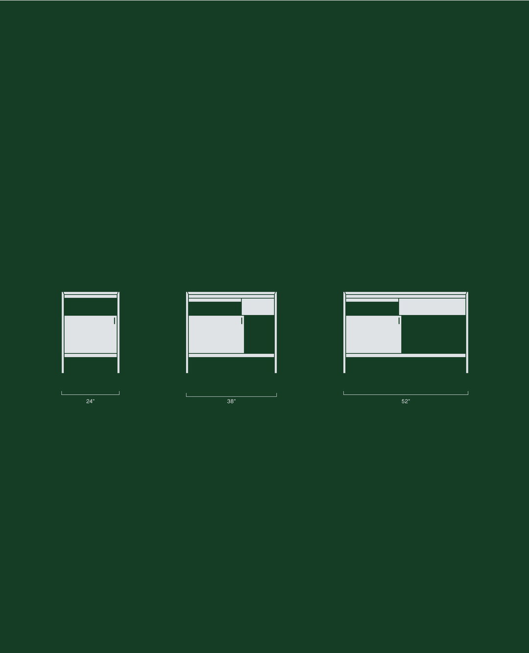
Finally, the creative studio adds a myriad of furniture schematic drawings to the brand. With a clean and technical drawing style, High Tide breaks down each product’s form in a utilitarian way, which contrasts the almost emotional use of colours in the brand. This is another trick High Tide pinches from mid-century design, as a time “when designers were limited with what they could produce from a graphics standpoint, so utilising bold punchy colours allowed them to create maximum impact in a simple and effective way”, the press release reveals. This technique is particularly important to bringing a sense of “excitement” to the Symbol refresh, says High Tide.
GalleryHigh Tide: Symbol (Copyright © Symbol, 2022)
Hero Header
High Tide: Symbol (Copyright © Symbol, 2022)
Share Article
Further Info
About the Author
—
Liz (she/they) is the senior editor at Insights, a research-driven department within It’s Nice That. They previously ran the news section of the website. Get in contact with them for potential Insights collaborations or to discuss Insights’ public-facing reports.