Typographers collaborate between Brisbane and Glasgow on Lettering meets Letterpress project
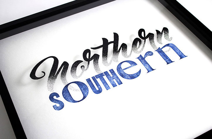
Craig Black and Nicole Arnett Phillips have collaborated on a new type project that combines letterpress printing and hand-drawn lettering. Craig, a typographer and designer based in Glasgow, Scotland, and Nicole, a letterpress designer based in Brisbane, Australia, met online and decided to work on a project together despite the significant geographical distance between them.
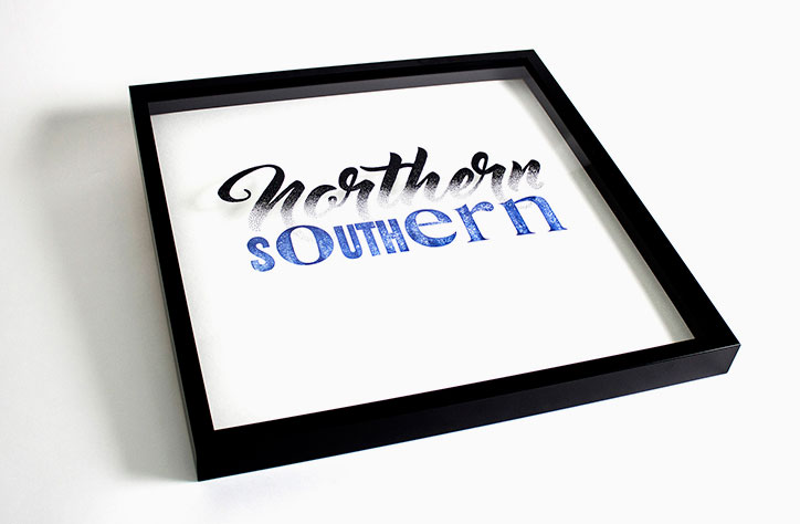
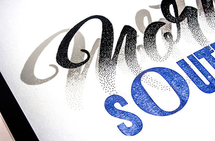
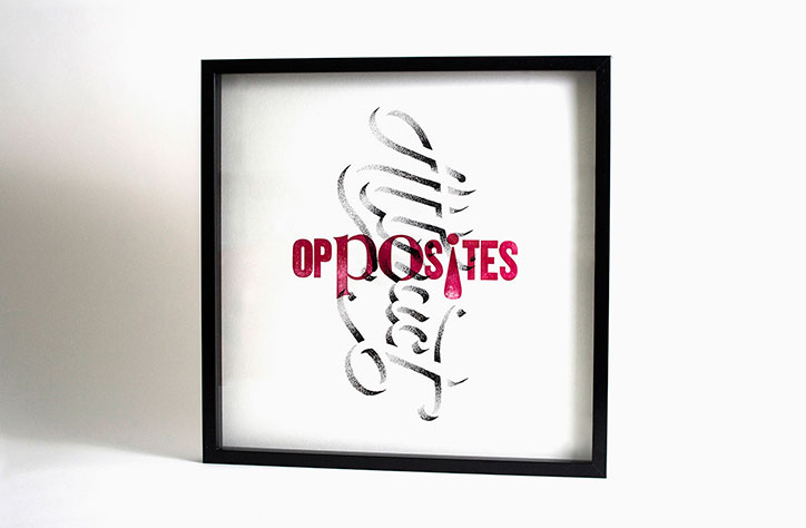
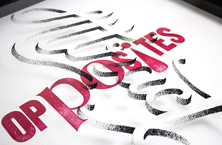
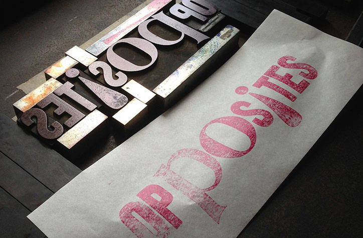
Nicole printed the first stage of the artworks, the words “Southern” and “Opposites,” using a Farley No. 25 letterpress, using some of her wood type block collection. She composed the form, selected the paper stock, and hand-inked the press. “I wanted the printing to be as manual as possible,” she explains.
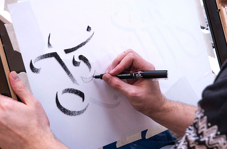
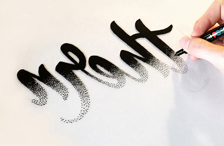
Nicole then posted the proofs to Craig in Glasgow, who used them as a basis for his hand-drawn lettering on glass. He stippled the words “Northern” and “Attract” in paint pen on the glass panels, then layered them on top of Nicole’s prints and made six custom frames to hold the works. This was all done within eight weeks.
The pieces, Northern/Southern and Opposites/Attract were then shipped to Dubai to be shown at the ING Creatives show, where Craig says the project garnered interest because “people wondered how we made the works from opposite sides of the world.” Similarly at a second show at The Design Conference in Brisbane Nicole says visitors were curious as to how the duo made an analogue collaboration work long distance.
The self-penned “typo-pairing” hopes to continue the collaboration further. “We wanted to explore the juxtapositions in our relationship. We may contrast in styles but we are cohesive in our passion and approach.”
Share Article
Further Info
About the Author
—
Jenny oversees editorial output across It’s Nice That. Get in touch with writing pitches for features or opinion pieces, big creative story tips, or questions about all things editorial. [email protected]
To submit your work to be featured on the site, please see our Submissions Guide.