




LucienneRoberts+ creates identity and AR artwork for Non-Pavilion installation

LucienneRoberts+: Non-Pavilion logo
Non-Pavilion is an installation with a difference, taking pride of place in the V&A courtyard during London Design Festival. Taking inspiration from Swiss Baugespanne – poles erected to help the public visualise the mass of a proposed development – the installation is simply an empty frame to be “filled” with six commissioned augmented reality artworks. The project is conceived by Studio MiCat, There Project and Proud Studio, and the identity, as well as one of the AR pieces, has been designed by LucienneRoberts+ studio.
The installation hopes to combat societal issues such as carbon footprint and overpopulation. “We believe that design can play a major role in shifting mindsets away from over-production and consumption, towards a regenerative economy that doesn’t need growth to thrive,” says a statement from the group of studios. “Defined by its outer edges only, Non-Pavilion plays on the idea of ‘less’ as enrichment, not loss.”
Each augmented piece aims to provoke fresh thinking about our current consumerist patterns and the systems in which society currently operates. These are designed by Leon Chew, Arne Hendriks, Leo Murray, LucienneRoberts+, Michael Schoner and Radical Norms, and can be viewed via tablets available on site or by downloading the app on to personal devices.
LucienneRoberts+ AR piece, designed with David Shaw and John McGill, is titled Down is Up / Up is Down and features three different staircases, representing the “discordant relationship between people, planet and profit”.
“Rampant growth and debilitating inequality mean the world is dangerously out of balance,” says Roberts. “By 2100, the world will be home to 11 billion people. For humanity to survive well, we need to recalibrate – moving away from the short-term profiteering that benefits only the few and will contribute to long-term, irreversible environmental damage. To restore balance and diversity, the sphere must roll back down the steps.”
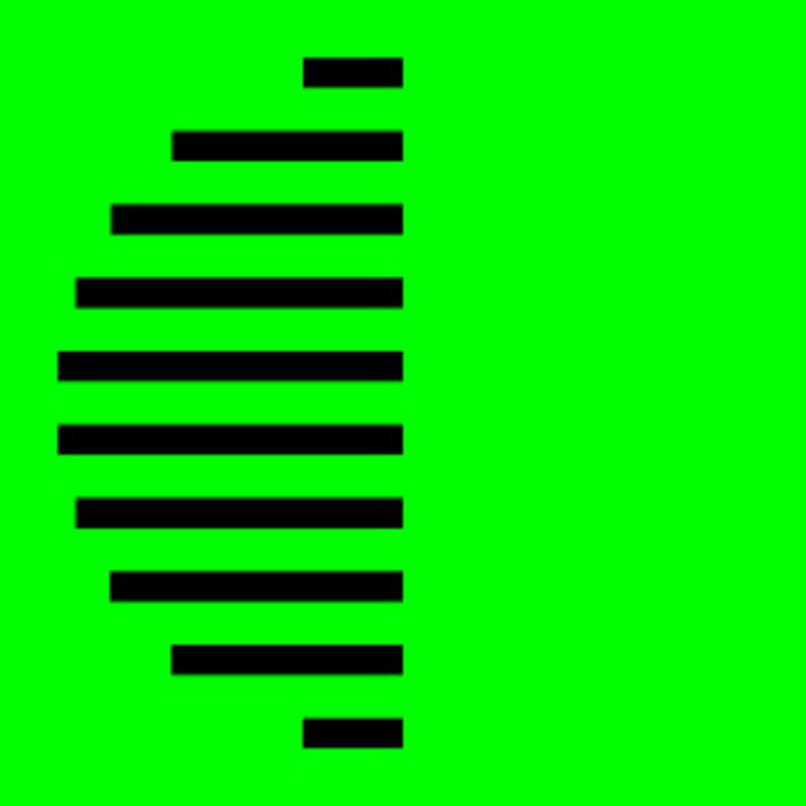
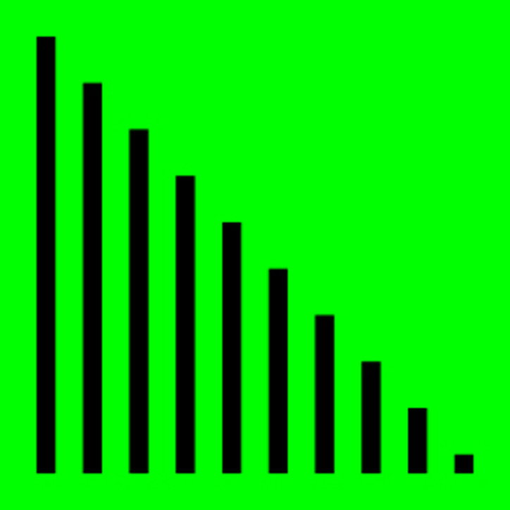
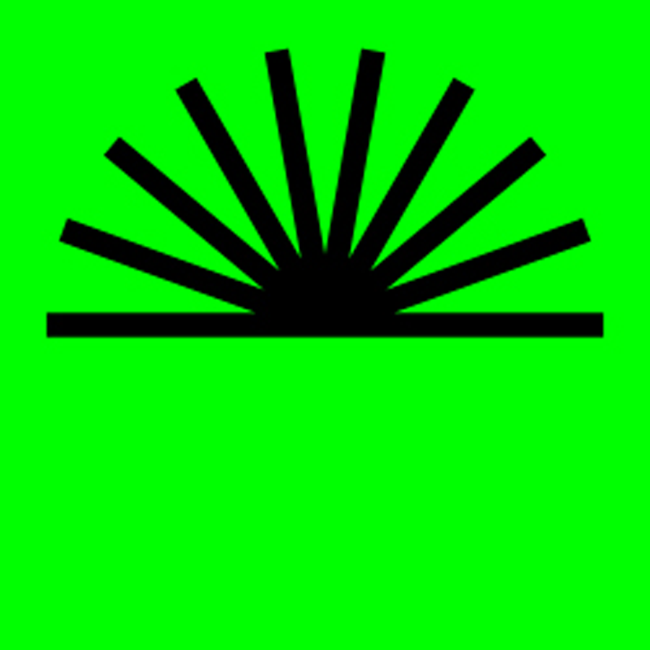
Meanwhile, the identity features a set of line-based icons to represent each piece within the app, as well as the installation’s word marque and a set of graphics to promote the installation on social media.
LucienneRoberts+ studio also worked on the Design Museum’s Hope to Nope exhibition, and Lucienne spoke at Nicer Tuesdays back in 2017 about her work on the Wellcome Collection’s Can Graphic Design Save Your Life?
Non-Pavilion is at the V&A’s Sackler Courtyard from 14-22 September 2019 for London Design Festival. A one-day event featuring a panel discussion will take place on 22 September-
day-of-design.
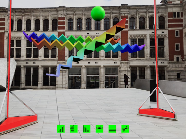
LucienneRoberts+: Non-Pavilion artwork, Down is Up / Up is Down
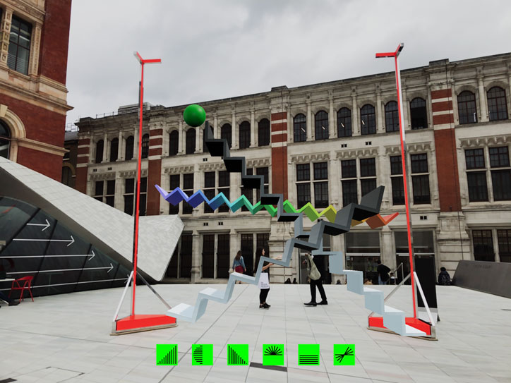
LucienneRoberts+: Non-Pavilion artwork, Down is Up / Up is Down
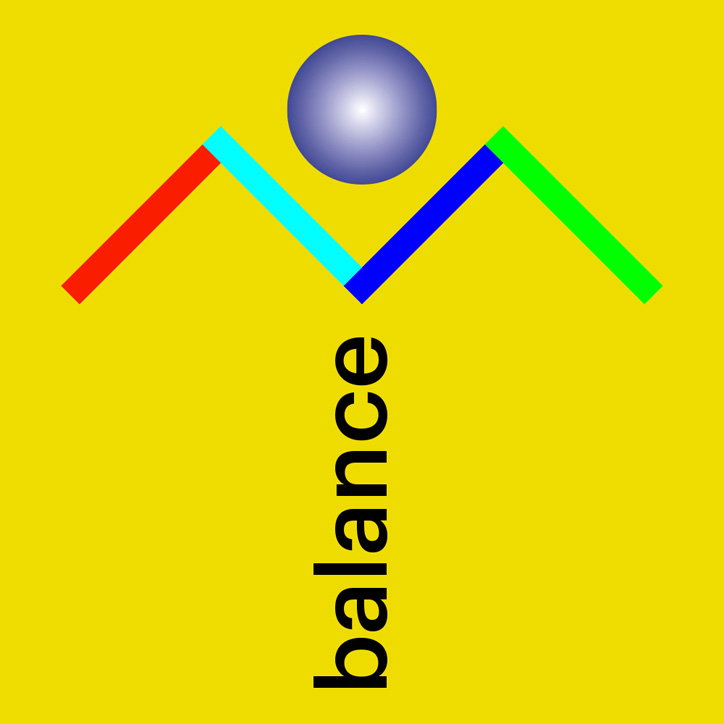
LucienneRoberts+: Non-Pavilion social campaign
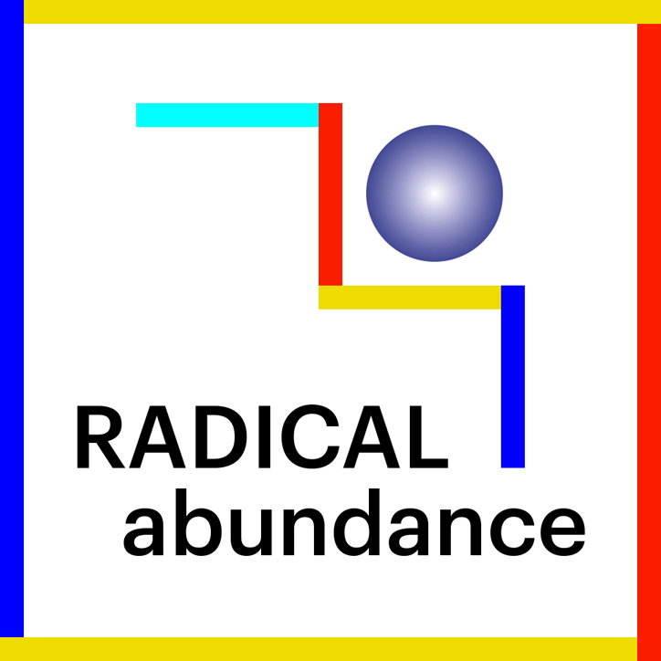
LucienneRoberts+: Non-Pavilion social campaign
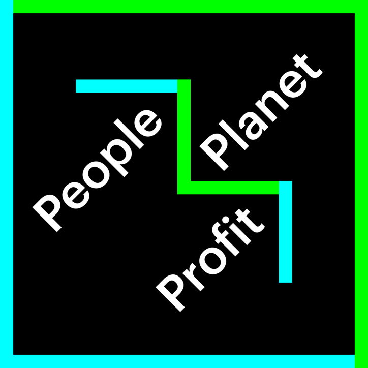
LucienneRoberts+: Non-Pavilion social campaign
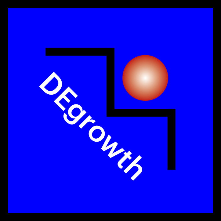
LucienneRoberts+: Non-Pavilion social campaign
LucienneRoberts+: Non-Pavilion social campaign
LucienneRoberts+: Non-Pavilion social campaign
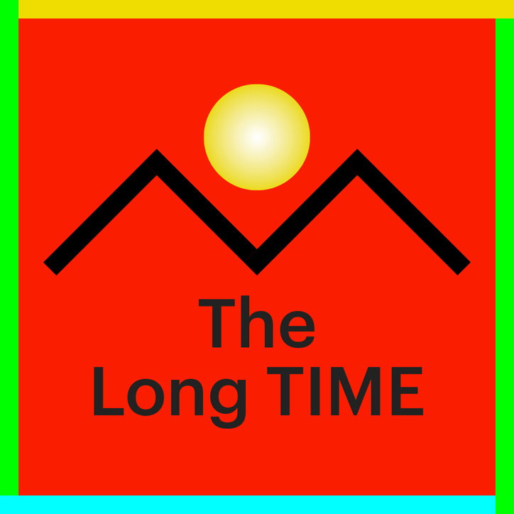
LucienneRoberts+: Non-Pavilion social campaign
LucienneRoberts+: Non-Pavilion in-app icons
LucienneRoberts+: Non-Pavilion in-app icons
LucienneRoberts+: Non-Pavilion in-app icons
LucienneRoberts+: Non-Pavilion in-app icons
LucienneRoberts+: Non-Pavilion in-app icons
LucienneRoberts+: Non-Pavilion in-app icons
LucienneRoberts+: Non-Pavilion in-app icons
LucienneRoberts+: Non-Pavilion in-app icons
LucienneRoberts+: Non-Pavilion in-app icons
LucienneRoberts+: Non-Pavilion logo
LucienneRoberts+: Non-Pavilion logo
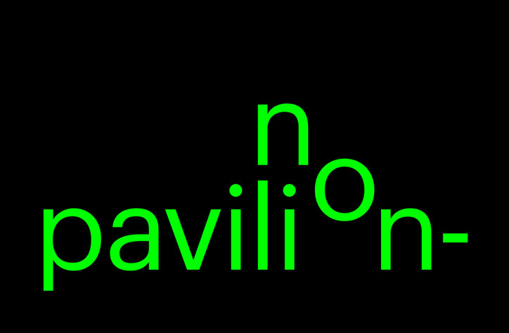
LucienneRoberts+: Non-Pavilion logo
Share Article
Further Info
About the Author
—
Jenny oversees editorial output across It’s Nice That. Get in touch with writing pitches for features or opinion pieces, big creative story tips, or questions about all things editorial. jb@itsnicethat.com
To submit your work to be featured on the site, please see our Submissions Guide.