Practice donates studio time to design a guerilla print piece for anti-racism community Outer Work
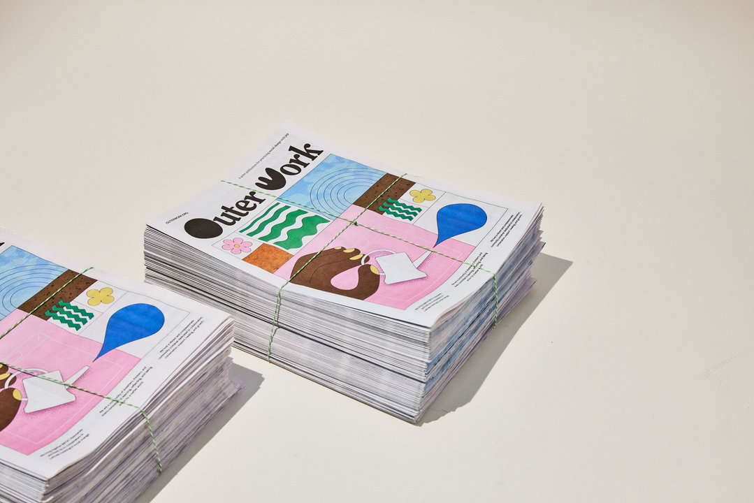
With the Outer Work Newspaper in distribution across the US this week, we talk to Practice about what can happen when studios donate time to grassroots initiatives.
Share
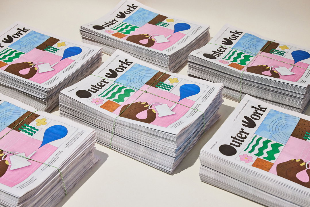
When the brand building house Practice first approached online anti-racism community Outer Work about supporting the initiative, the team knew it wanted the project to be more than a brand exercise; it had to be impactful. Founder Michelle Mattar suggested that a new visual language could be explored through an editorial project – with newspapers being the most cost-effective, creative option. The result is the Outer Work Newspaper, a publication rooting anti-racism practices in joy. Practice worked on the publication by donating its Fridays for a few months to create the editorial identity and ideate content with Lenea Sims, founder of Outer Work. The process of delivering the work presents exciting possibilities for other studios looking to collaborate with initiatives that inspire them.
At Practice, Fridays are used as development days for non-client work. In the past, Practice has used the day to work on a pro-bono project for Waste Not, a free and searchable site of sustainable suppliers. As such, Michelle wanted the next project to be with Outer Work. This kind of work is, “of course”, something Michelle encourages for other studios – for more reasons than one. “So often we don’t realise how inaccessible [the skills of a studio] can be to initiatives that can really use it. Donating time and expertise can be just as impactful – and feel even more meaningful – as donating funds,” says Michelle. Creating the newspaper for Outer Work bought new working dynamics to Practice too, encouraging “everyone to step out of our roles to realise and produce something grassroots together. A guerrilla initiative like this, and the power of a small group of people coming together with a purpose, truly sparks creativity.”
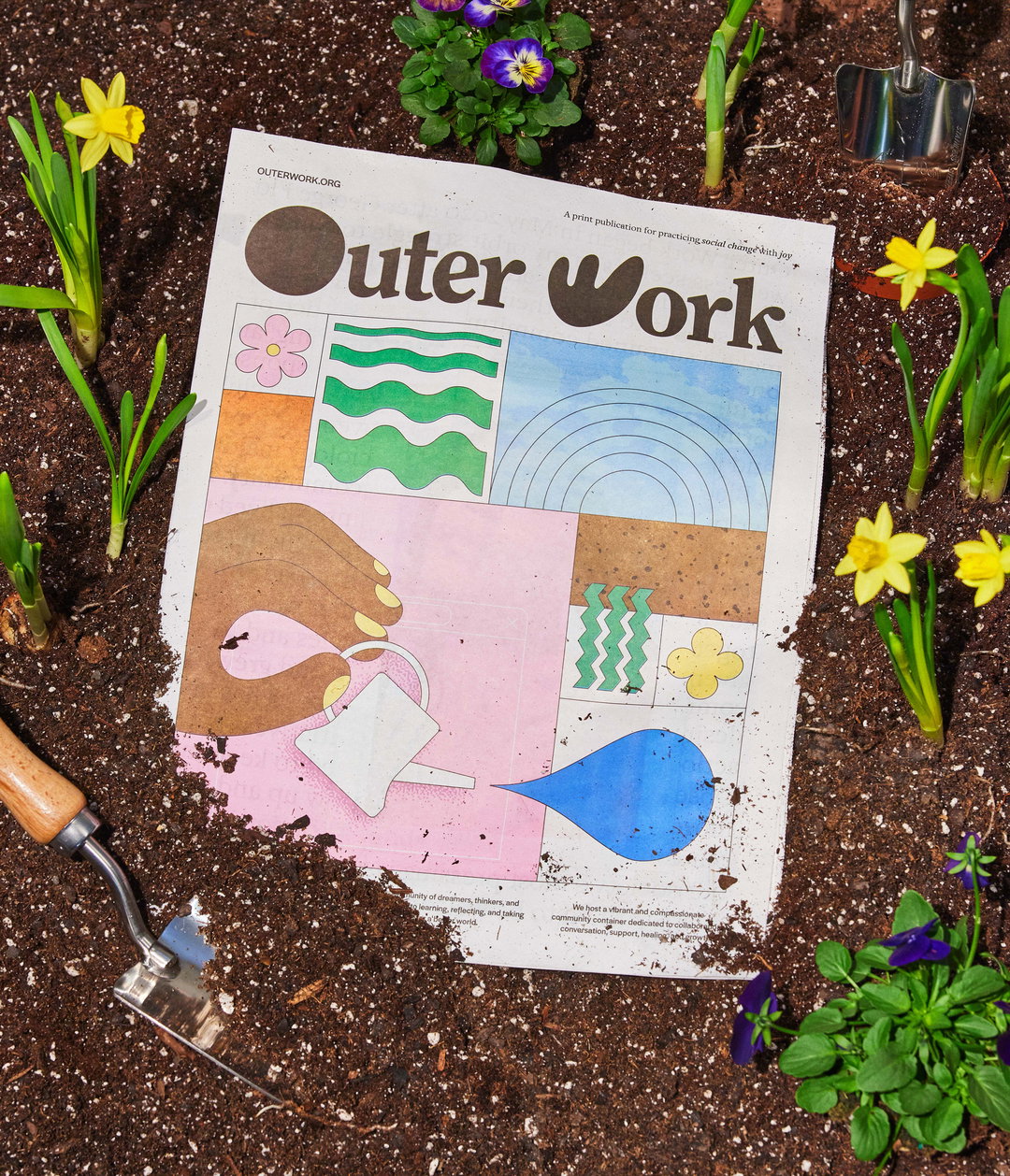
Practice: Outer Work Newspaper (Copyright © Practice, 2022)
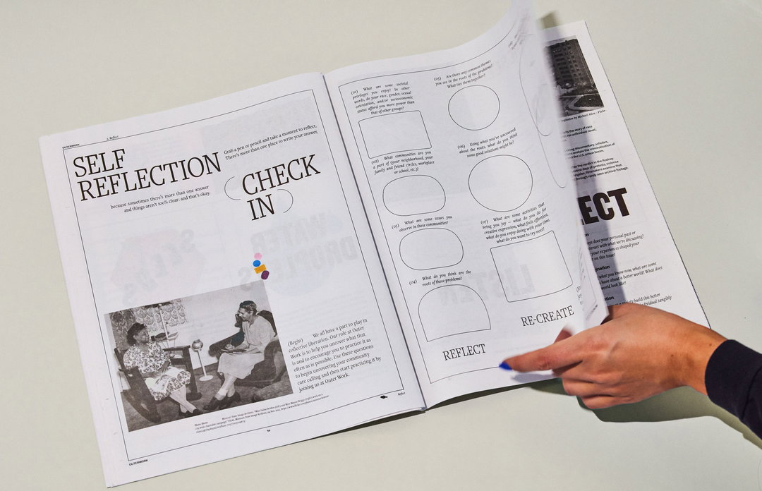
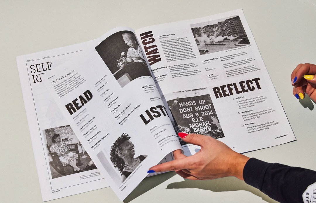
The Outer Work Newspaper launches this week via physical distribution in local establishments such as libraries, schools, cafes and bookstores. The newspaper itself comprises a range of content: an article that acts as a simple guide on how to approach racial issues when you’re worried about sounding racist; pieces highlighting the initiatives of seven BIPOC community leaders; a letter from the editor on Outer Work; a poster; and more. With the project being rooted in the idea that anti-racism stems from individual action, Practice also included space for self-reflection in the design via worksheets created with Lenea. Equally, “while we love writing copy on most projects”, with Practice’s goal “to elevate BIPOC voices”, “we stepped back on this one to let them speak”, explains Michelle.
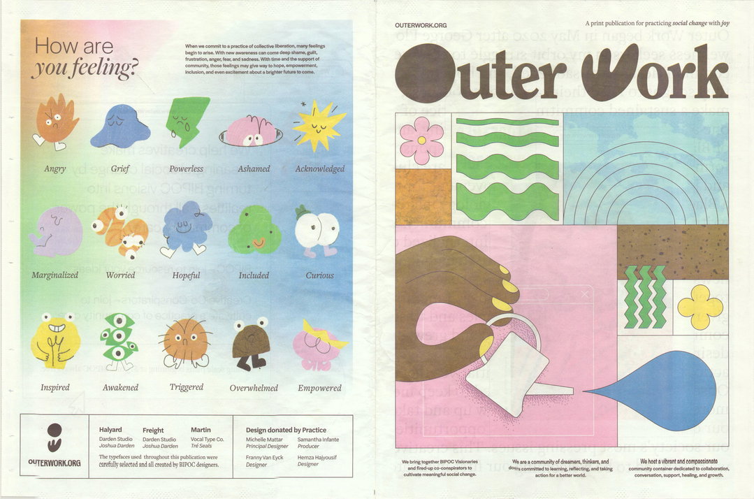
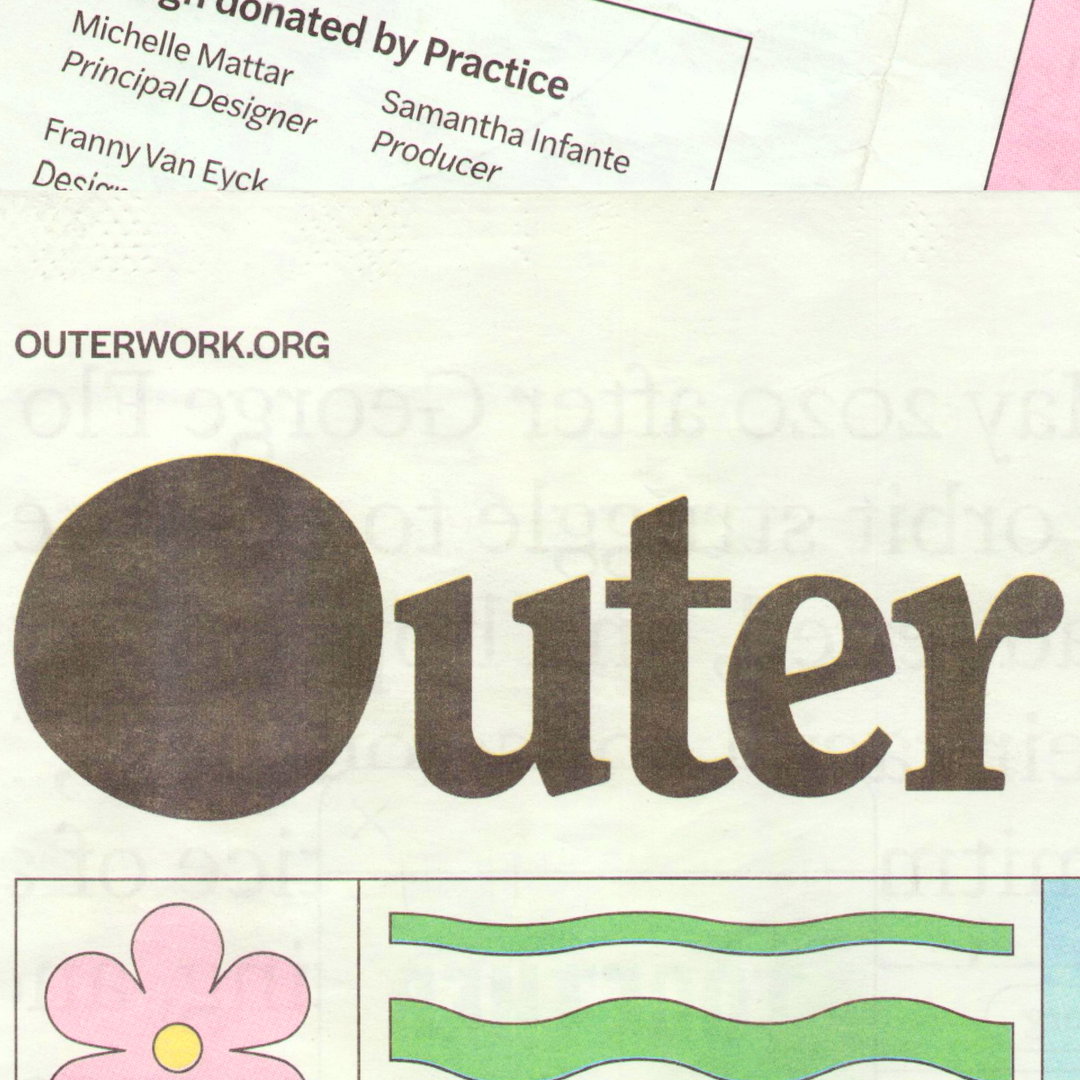
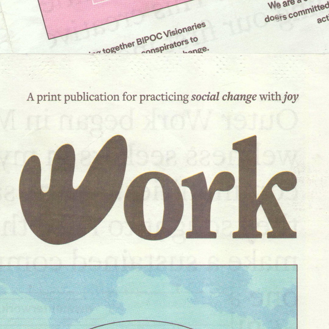
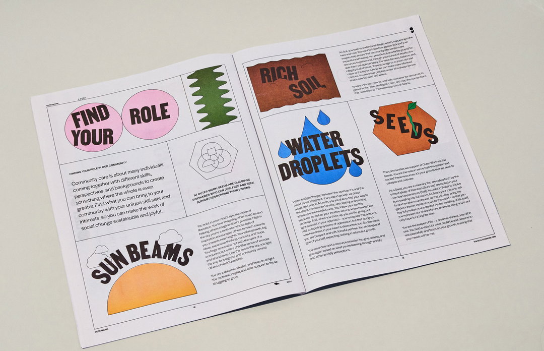
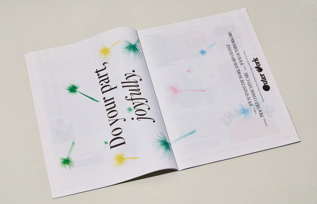
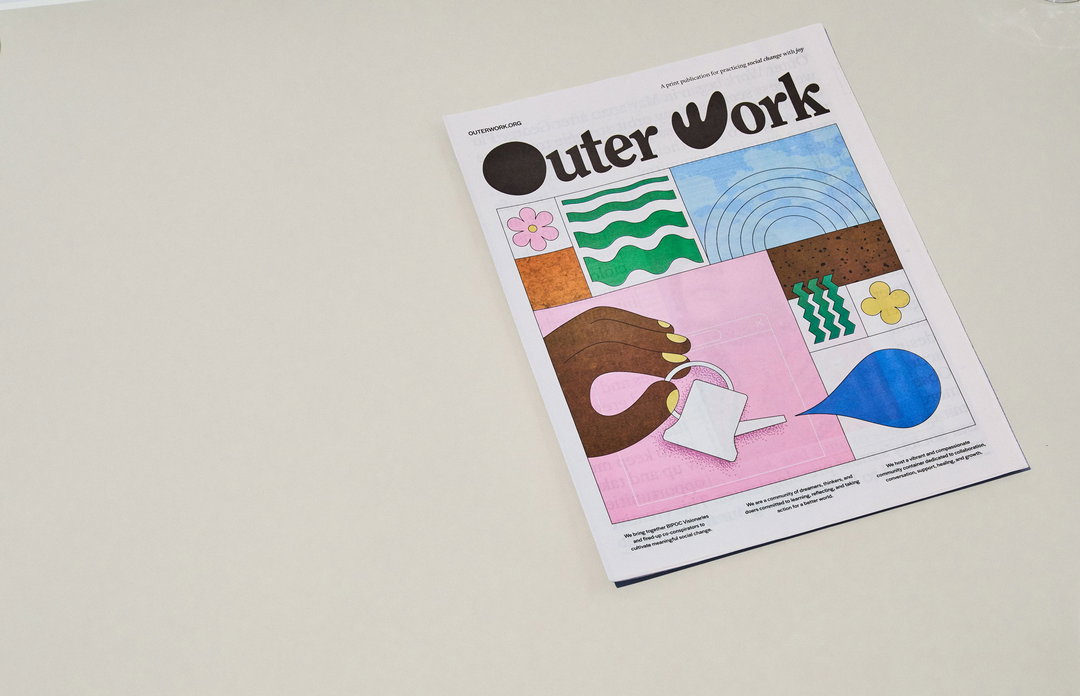
Each area of design on the newspaper speaks to its purpose, with a truly stunning result. Helping shape the idea of anti-racism work around growth, the colour palette and surrounding imagery is rooted in references to community gardens – seedlings, soil and droplets. “The result”, Michelle explains, is “a joyful palette featuring a rich brown (soil) as opposed to an inky black typically used in offset print pieces. A secondary palette of pastel tones of green(grass), blue(sky), yellow (sun), pink & lavender(flowers) helps us reinforce this metaphor.” Similarly, the Outer Work logo consists of an organically drawn ‘O’ and a ‘W’, which stack to create a flower.
This sense of play and approachability is mirrored in illustrations. The back cover of The Outer Work Newspaper features illustrated character icons – labelled Ashamed, Acknowledged, Included, Overwhelmed – to “help normalise the many complicated feelings one might experience when committing to social change”, says Michelle. Equally, to encourage free interaction with the publication, Practice purposefully included “scribbles and scratches”, to welcome further annotation from readers, whether through markings, by highlighting impactful passages or jotting down thoughts.
Practice also looked to balance familiarity with the serious nature of discussing anti-racism, sourcing a type family which could do both. The publication has been intentionally set in type created by Black designers “to highlight the work done by individuals like Tré Seals and Joshua Darden”, says Michelle.
For studios looking to help shape incredible projects such as the Outer Work Newspaper, Michelle concludes by pointing them in the way of Outer Work itself. “[The community] has created a space for designers and creatives of all kinds to donate their time and skills, so one way studios could do this is by connecting with BIPOC visionaries on the platform.” Finally, for anyone based in the US, we highly recommend keeping your eyes peeled for the beautiful publication this week; for everyone else, make sure to head to the Outer Work site.
GalleryPractice: Outer Work Newspaper (Copyright © Practice, 2022)
GalleryPractice: Outer Work Newspaper (Copyright © Practice, 2022)
Practice: Outer Work Newspaper (Copyright © Practice, 2022)
Hero Header
Practice: Outer Work Newspaper (Copyright © Practice, 2022)
Share Article
Further Info
About the Author
—
Liz (she/they) is the senior editor at Insights, a research-driven department within It’s Nice That. They previously ran the news section of the website. Get in contact with them for potential Insights collaborations or to discuss Insights’ public-facing reports.