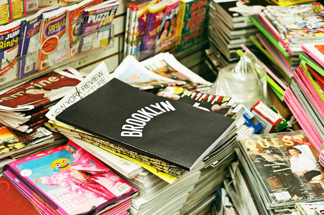
The Brooklyn Way book is a love letter to the New York borough, this time in print
The publication is a “natural extension” of a 2022 advert directed by Brooklyn-based Andre D. Wagner.
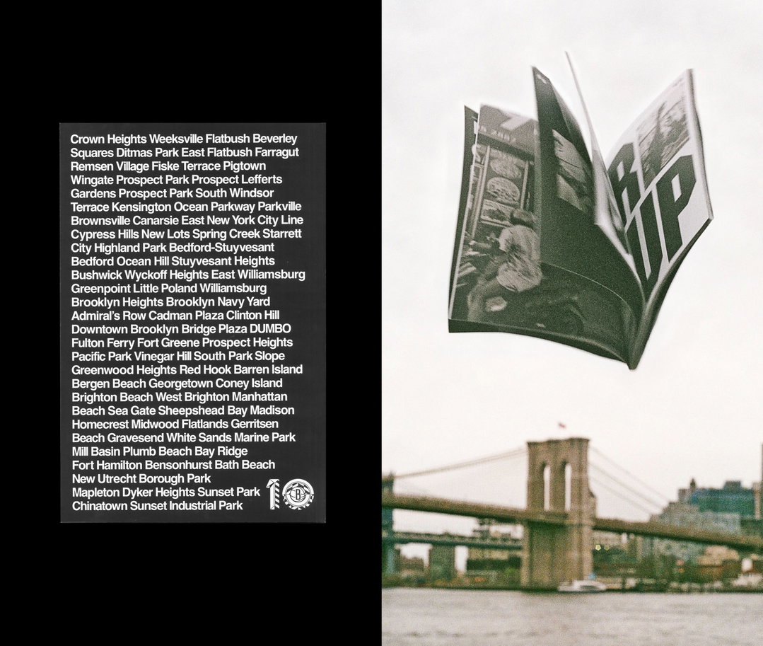
The Brooklyn Way is a new book from Wieden+Kennedy New York and a companion to its 2022 advert of the same name – though, the two weren’t created simultaneously. In fact, Wieden+Kennedy created the book only after reflecting on its work with director Andre D. Wagner. “I think we all saw the spot and the accompanying stills and said: ‘Oh, this has the potential to be something we can really sit in. Print felt like a good way to push this concept into a very real, very physical world,” says designer Malithi Gunawardena.
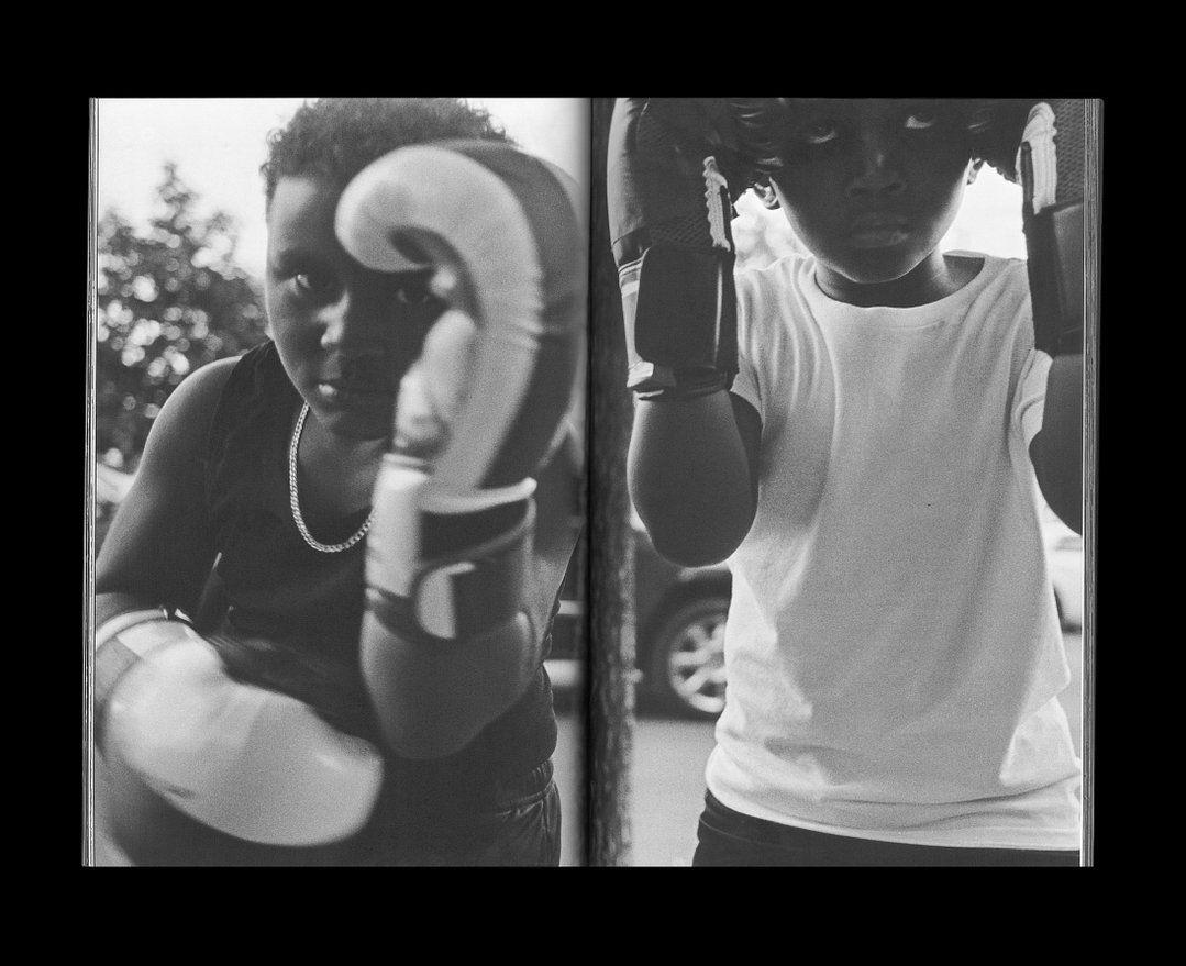
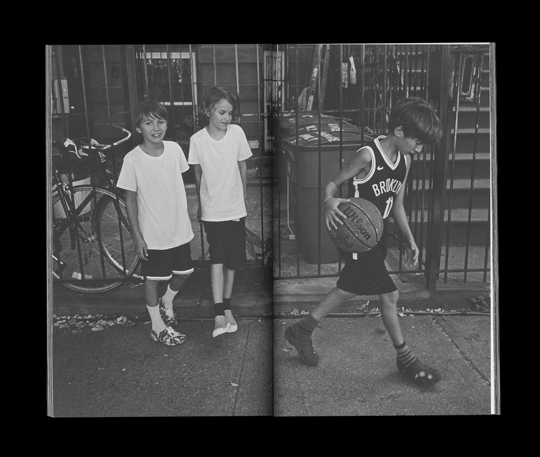
The original spot was created as an anniversary advert for Brooklyn Nets – if you haven’t seen it yet, stop what you’re doing and take five to enjoy the film. The work flips what you’d expect from your typical sports-centric anthem film. Rather than focusing on the triumphs of the Brooklyn Nets over the years, Andre D. Wagner filmed kids who live in the borough talking about the best parts of their neighbourhood. The whole thing was shot with almost no script and with hardly any Nets branding, more of a “love letter to Brooklyn” than an ad.
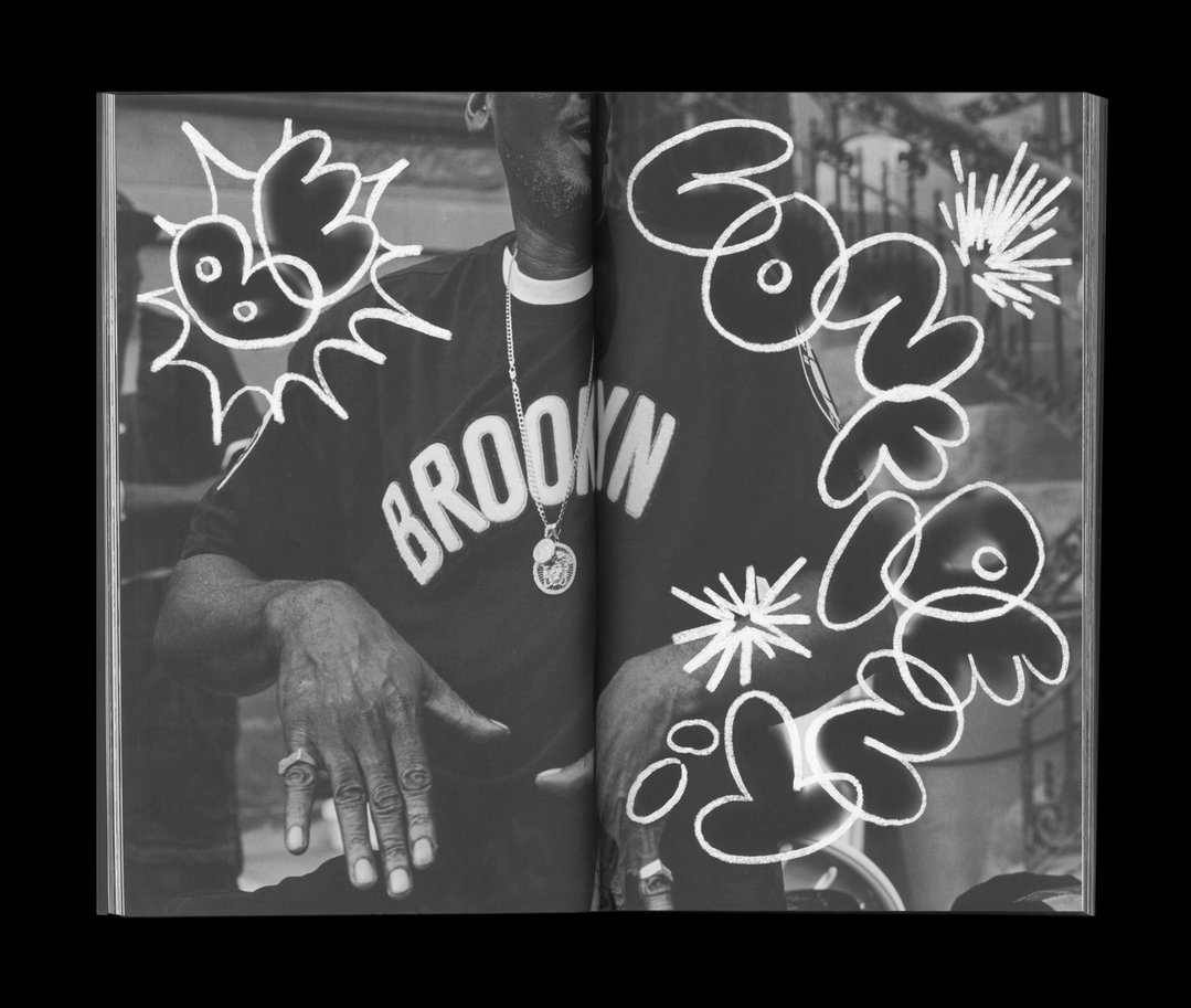
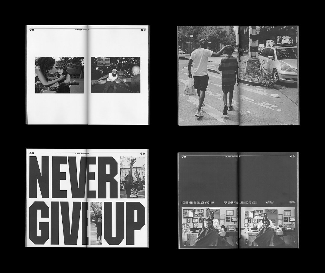
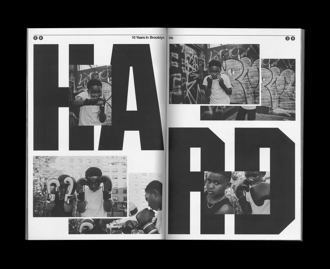
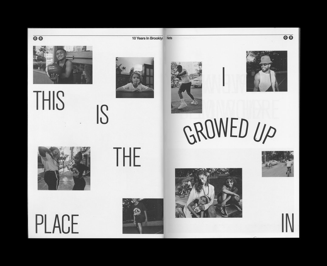
The Brooklyn Way book builds on this further. The design is stripped back. It’s black and white like the original source material and, inspired by classic New York newspapers, the book is printed on newsprint. Throughout the process, the design team looked frequently to Andre’s original material and asked if the design was serving the stories he had captured.
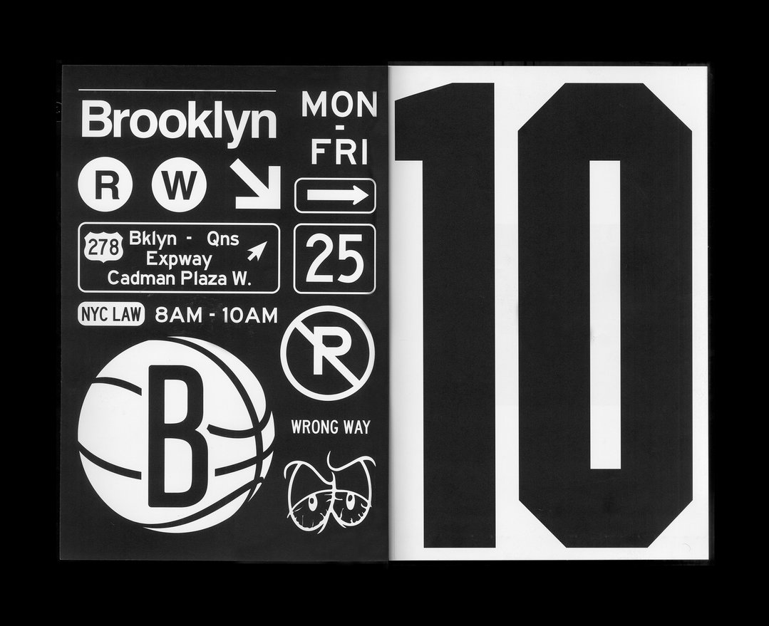
Wieden+Kennedy New York: The Brooklyn Way Book, photography by Andre D. Wagner (Copyright © Wieden+Kennedy New York, 2023)
“Every choice we made was in service of the idea of Brooklyn through the eyes of the people who know it the best,” says Malithi. “This was complicated, as Brooklyn is about a million different things to literally two million different people, all of which go head-to-head in the ring at once.”
The design makes space for juxtaposing perspectives too. Some of the layouts are louder with heavy or playful hand-drawn type, others are quieter. “It was all about balance – for every behemoth black type block, there was a page of white. For everything soft, there was something hard. And this way of working, bouncing back and forth between black-and-white feelings, felt like the only way we could begin to capture the energy of Brooklyn.”
GalleryWieden+Kennedy New York: The Brooklyn Way Book, photography by Andre D. Wagner (Copyright © Wieden+Kennedy New York, 2023)
Hero Header
Wieden+Kennedy New York: The Brooklyn Way Book, photography by Andre D. Wagner (Copyright © Wieden+Kennedy New York, 2023)
Share Article
Further Info
About the Author
—
Liz (she/they) is the senior editor at Insights, a research-driven department within It’s Nice That. They previously ran the news section of the website. Get in contact with them for potential Insights collaborations or to discuss Insights’ public-facing reports.