Wieden+Kennedy designs a uniquely blank-labelled vodka with Bráulio Amado
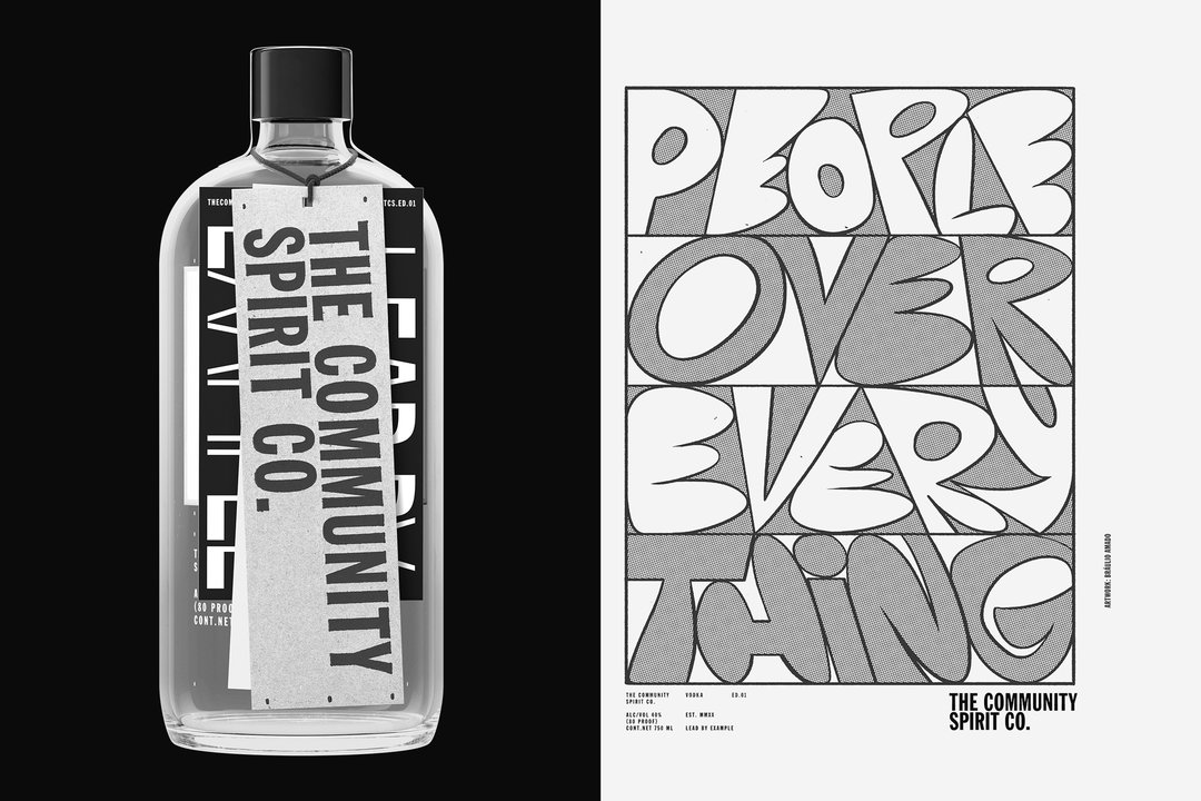
Featuring an intentionally empty label, to be occupied with different social justice causes over time, The Community Spirit presents a specific design challenge.
Mexican American spirits brand Casa Lumbre has bought on board Wieden+Kennedy to design The Community Spirit, a vodka line supporting “hyper-local, community-based initiatives”. Based around the premise of a blank label, to be used as a space to amplify community initiatives, the project presents Wieden+Kennedy with the unique challenge of designing around an empty space, and keeping conventional branding away from much of the work. The design agency collaborated with Bráulio Amado for illustrations and type, Vanessa Granda for photography and No Ideas for website design on the project.
Faced with a client who wanted to be more “impactful than the 10 per cent donation model that cause-based brands typically utilise”, Wieden+Kennedy attempted to find ways to exploit Casa Lumbre to “redirect marketing dollars” to other causes. Using a blank label to realise this idea, Justin Flood, Wieden+Kennedy design director, tells It’s Nice That: “Designing something intended to highlight causes and communities is a tightrope to walk because it’s so easy to come off as feeling exploitative and disingenuous. There’s so much out there these days that just feels gross and insincere, with these massive corporations suddenly speaking the language of social justice when they’ve been slinging credit cards or whatever for the past fifty years. At the end of the day we’re selling vodka, and we wanted to be honest about that.”
To let the brand recede and the causes come to the forefront, the blank label is paired with a minimal, industrial type treatment; subsequent editions will be “interrupted” with expressive illustration work. “Using documentary photography on the label, while sometimes visually stunning, felt wrong”, says Justin. Wieden+Kennedy came up with the concept of using illustrative imagery on the label instead and “this notion of a series of artists being the conduits for different causes”. The “frenetic energy of Bráulio’s illustration style” was chosen to contrast the “otherwise constrained, intentionally generic brand”.
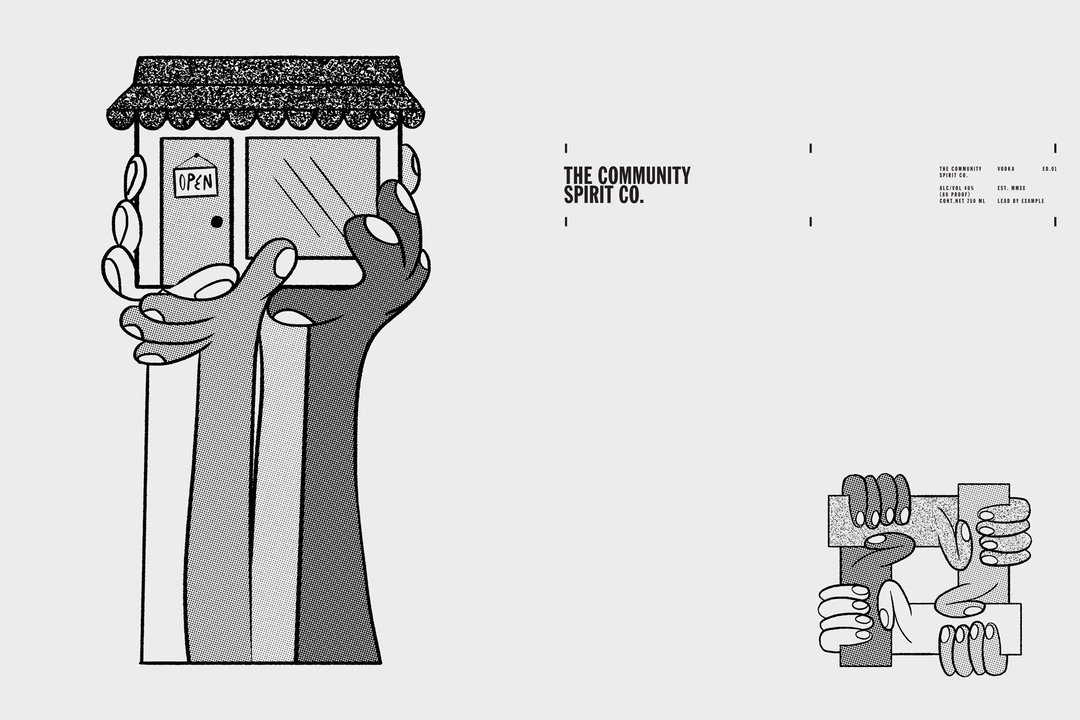
Wieden+Kennedy: The Community Spirit, illustration by Bráulio Amado (Copyright © Casa Lumbre, 2021)
All other branding on The Community Spirit bottle is moved to the neck tag, “usually reserved for sales ads and maybe cocktail recipes.” In a layer of three tags in different stocks, the logo is featured, then an “annual report” to hold the brand accountable for its actions with featured causes, then a sticker layer, changing with each new artist. Outside of the bottle, type is always “straight”, “kind of dumb and never too tricky”. The grid marks on the bottle double is an underlying system to hold other elements, like the website, together. Throughout, the colour palette remains monochromatic, something Justin explains was a challenge for Amado’s contribution as a master of colour, while photography stands apart by being vibrant.
The Community Spirit’s first campaign takes the form of a list of demands for hospitality workers in New York City, in partnership with five local non-profits, titled Project 86. Amado delivered type, creating a hand-rendered version for each demand, as well as a Project 86 logo. The studio has yet to introduce what the next label artwork filling the space will be; Justin states: “For the moment, we’re hoping that the blank label will just feel striking on the shelf and hint at what’s to come.”
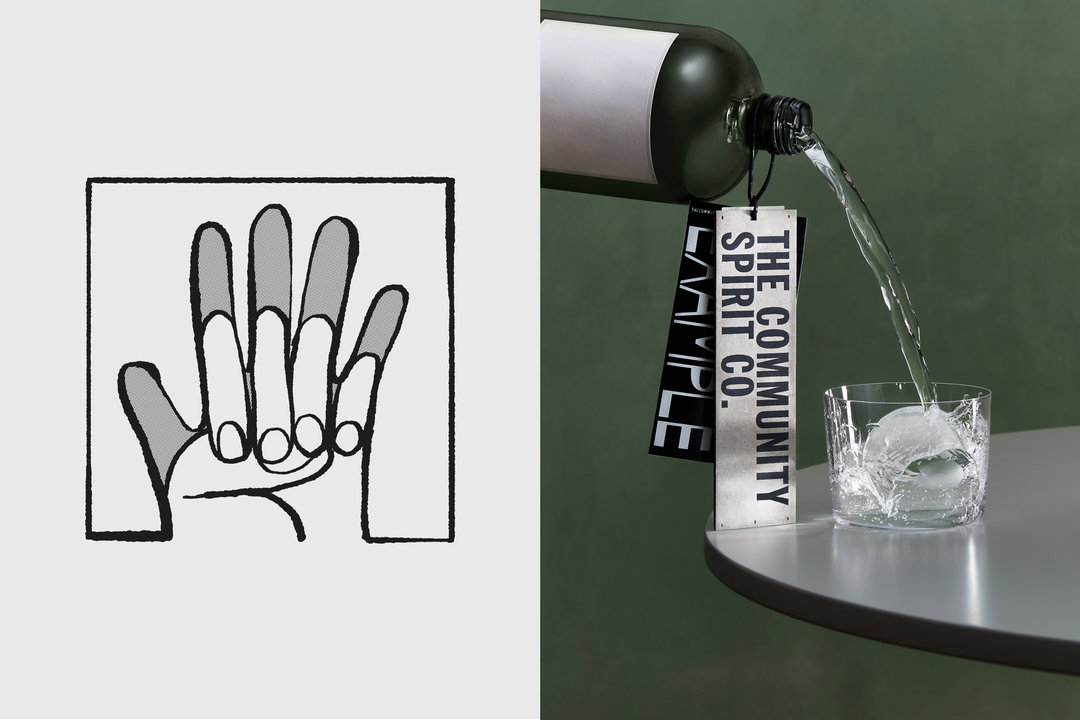
Wieden+Kennedy: The Community Spirit, illustration by Bráulio Amado, photography by Vanessa Granda (Copyright © Casa Lumbre, 2021)
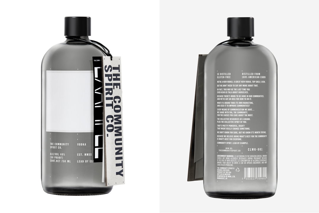
Wieden+Kennedy: The Community Spirit (Copyright © Casa Lumbre, 2021)
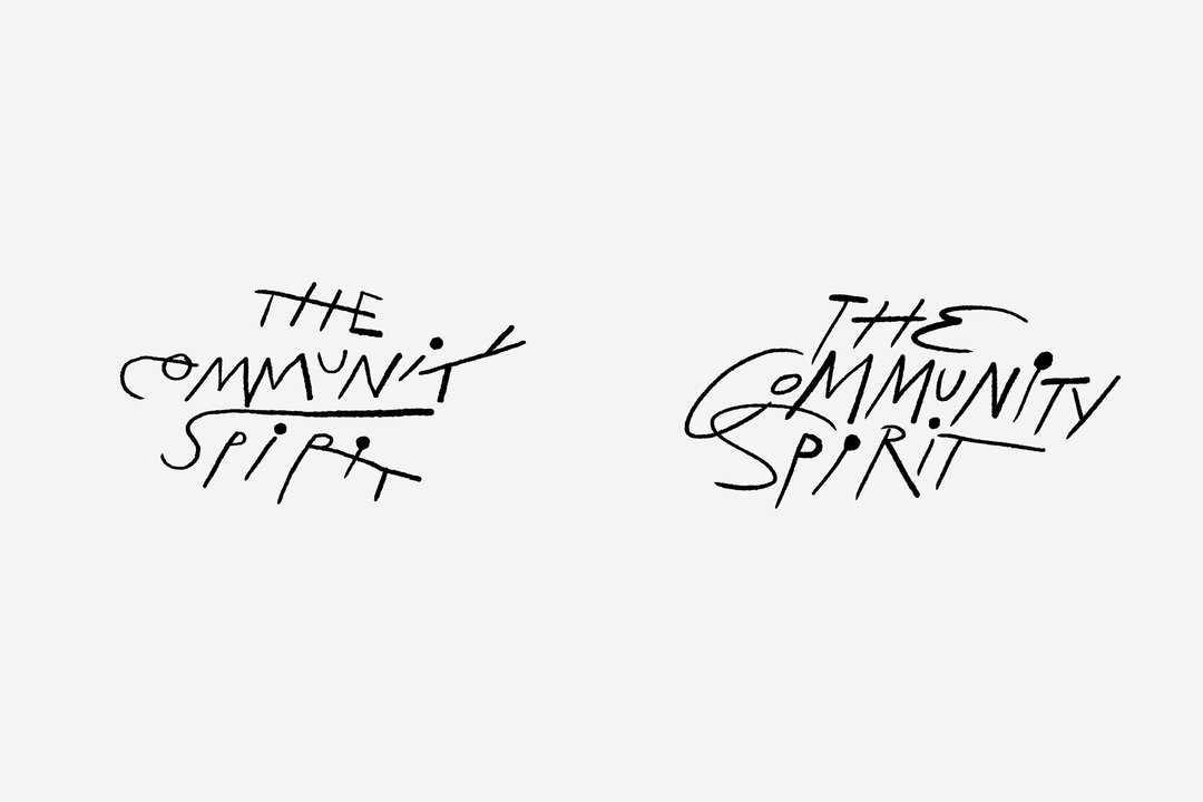
Wieden+Kennedy: The Community Spirit (Copyright © Casa Lumbre, 2021)
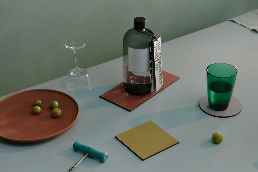
Wieden+Kennedy: The Community Spirit, photography by Vanessa Granda (Copyright © Casa Lumbre, 2021)
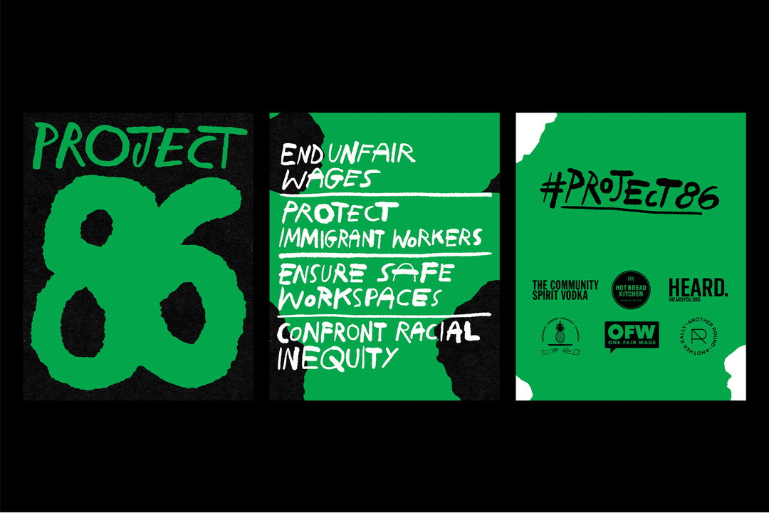
Wieden+Kennedy: Project 86 Campaign, type by Bráulio Amado (Copyright © Casa Lumbre, 2021)
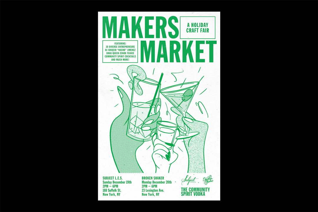
Wieden+Kennedy: The Community Spirit, illustration by Bráulio Amado (Copyright © Casa Lumbre, 2021)
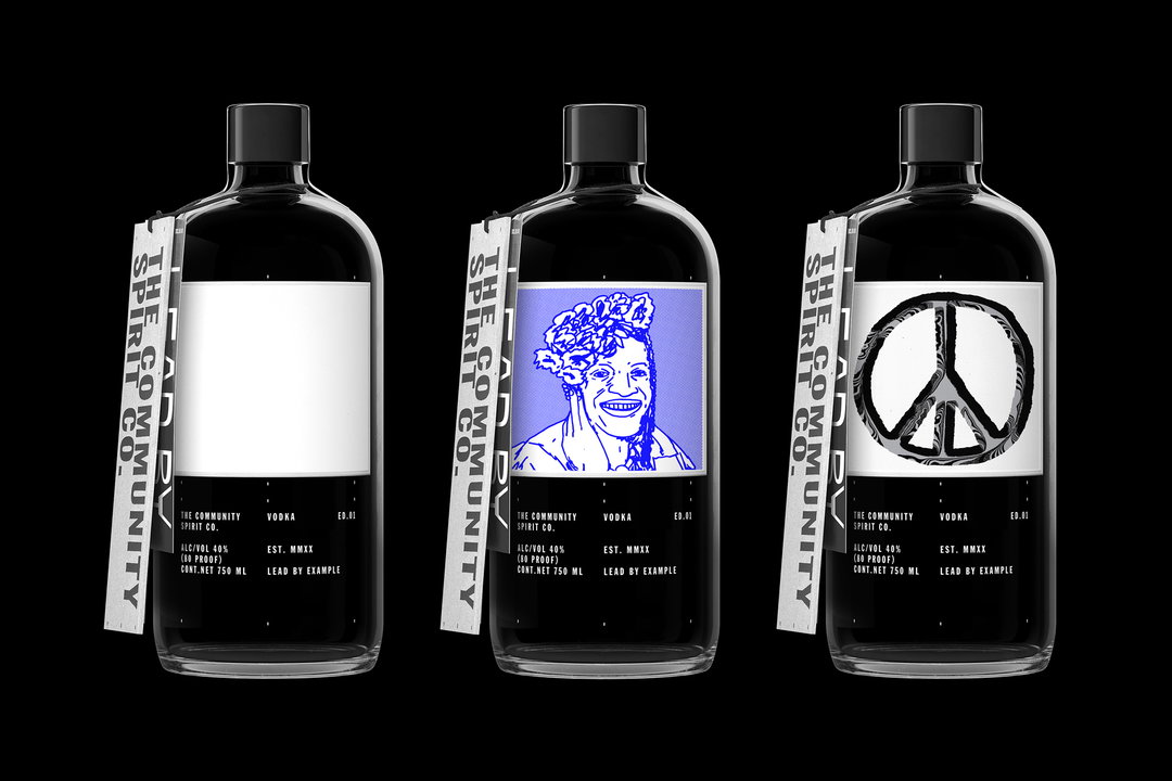
Wieden+Kennedy: The Community Spirit (Copyright © Casa Lumbre, 2021)
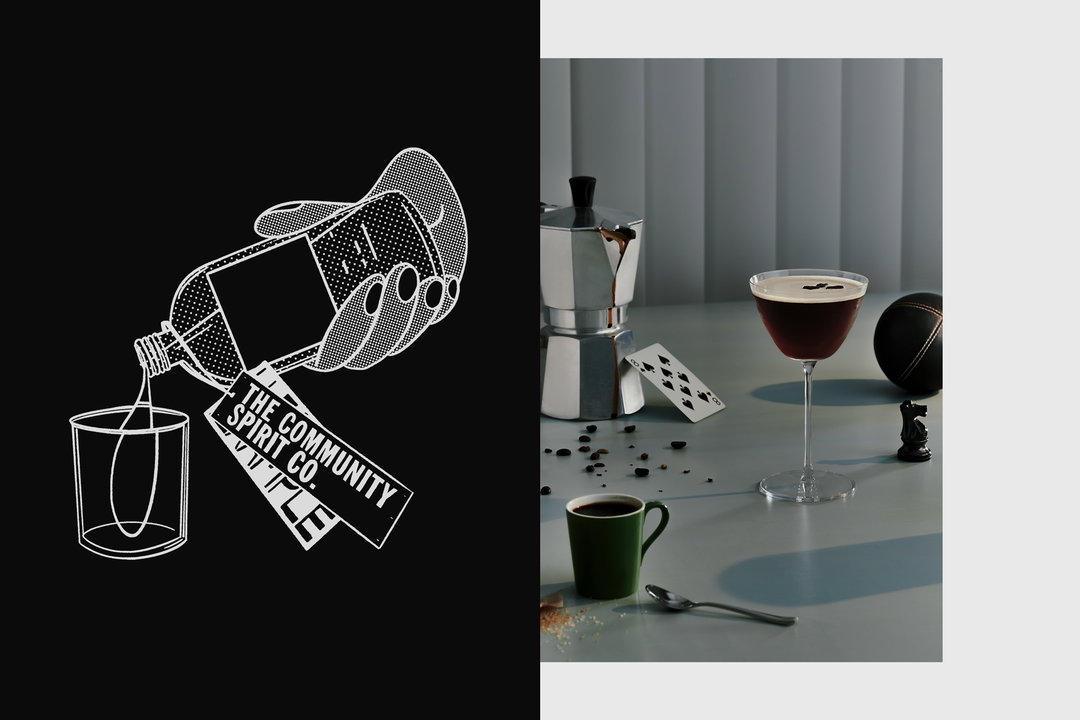
Wieden+Kennedy: The Community Spirit, illustration by Bráulio Amado, photography by Vanessa Granda (Copyright © Casa Lumbre, 2021)
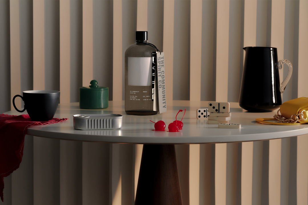
Wieden+Kennedy: The Community Spirit, photography by Vanessa Granda (Copyright © Casa Lumbre, 2021)
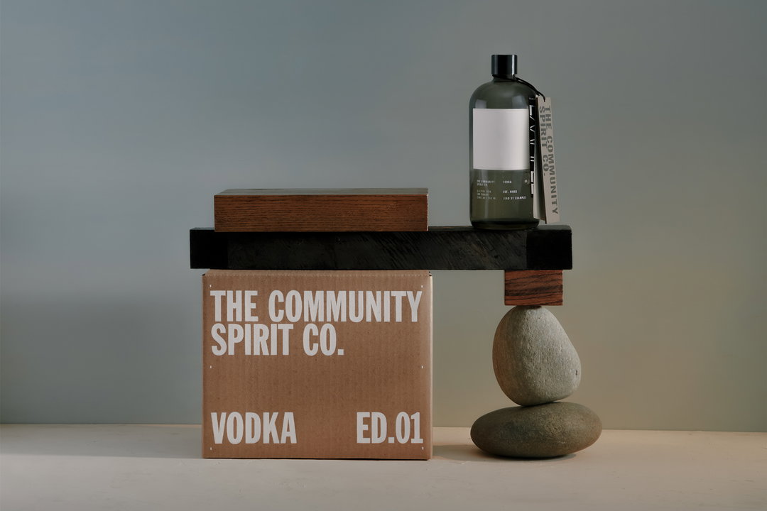
Wieden+Kennedy: The Community Spirit, photography by Vanessa Granda (Copyright © Casa Lumbre, 2021)
Hero Header
Wieden+Kennedy: The Community Spirit, type design by Bráulio Amado (Copyright © Casa Lumbre, 2021)
Share Article
Further Info
About the Author
—
Liz (she/they) is the senior editor at Insights, a research-driven department within It’s Nice That. They previously ran the news section of the website. Get in contact with them for potential Insights collaborations or to discuss Insights’ public-facing reports.