Wolff Olins flips the fintech script for DailyPay with a logo inspired by a tossing coin
Wolff Olins gives their two cents on fintech branding for DailyPay, with a logo inspired by how a coin looks mid-flip.
Share
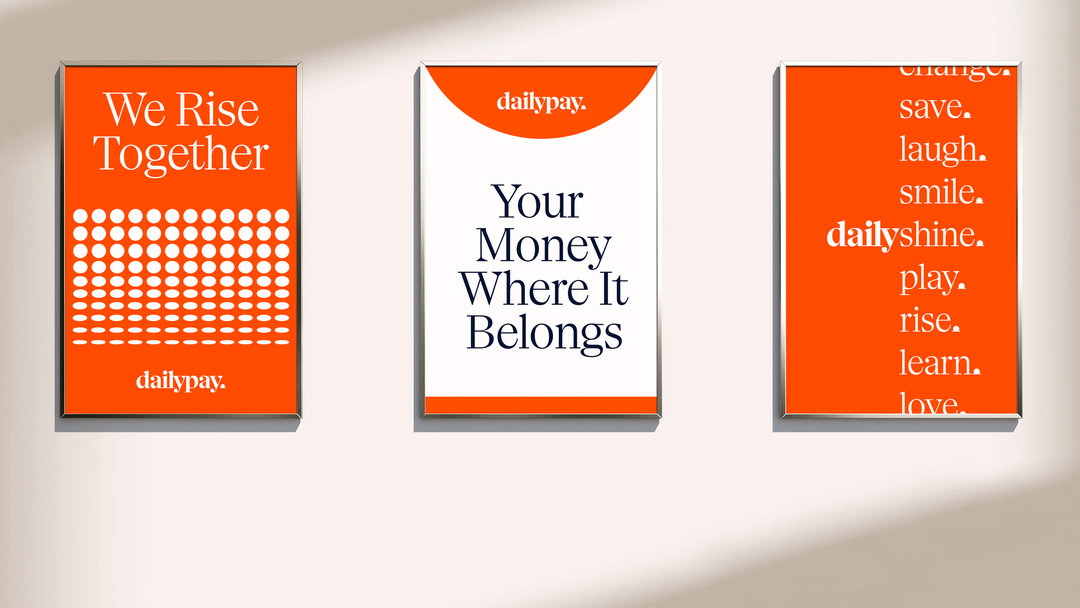
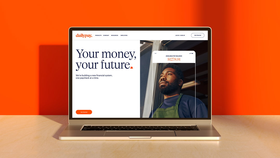
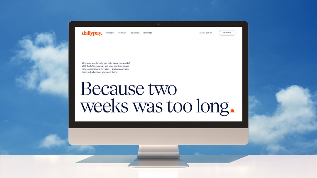
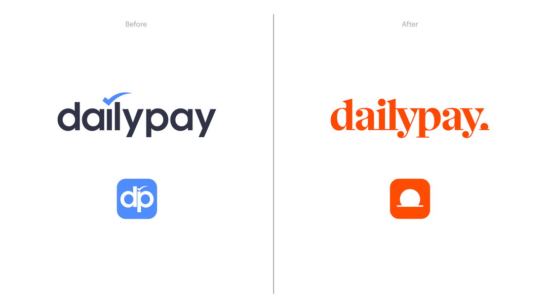
Wolff Olins has just unveiled an identity for fintech company DailyPay. Taking inspiration from some of the key cornerstones of the brand, specifically how the brand aims to free up a person’s access to their wages throughout the month, the design consultancy has created a corresponding coin-based logo, visualising money in motion. The branding project also comprises a go-to-market campaign from Wolff Olins to support the launch.
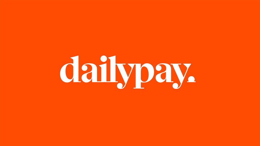
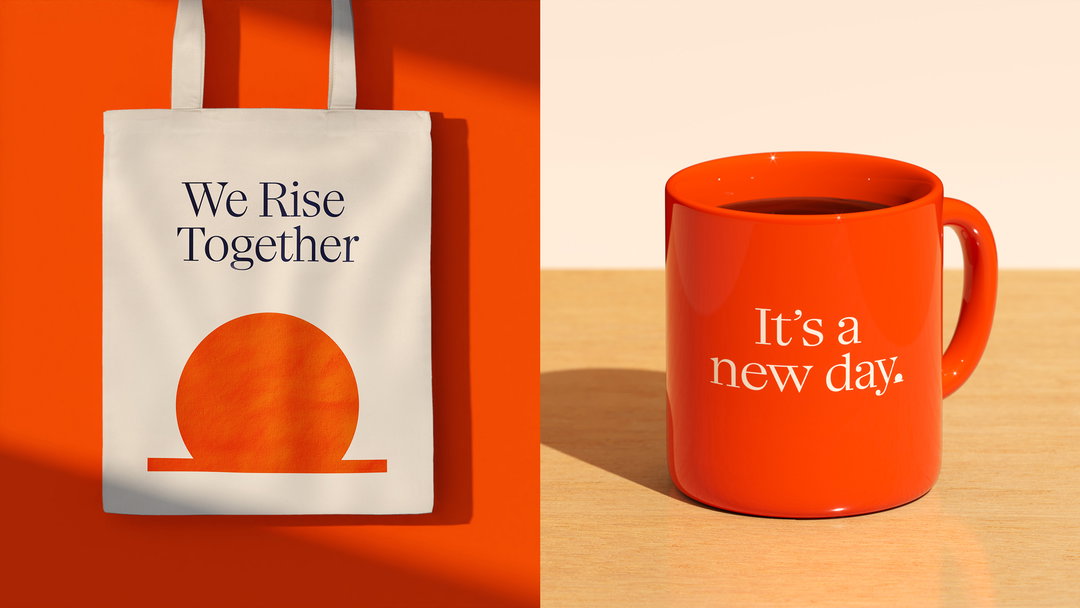
The premise of DailyPay is that the brand uses payment technology to allow customers access to pay wages as you earn them. The logo distils this concept by using an icon that represents this idea in a few ways: how DailyPay flips the financial system on its head; the coin toss; the sense of freedom this financial flexibility offers; a sun on the horizon; the practical benefits of the service; plus a coin being deposited into a bank.
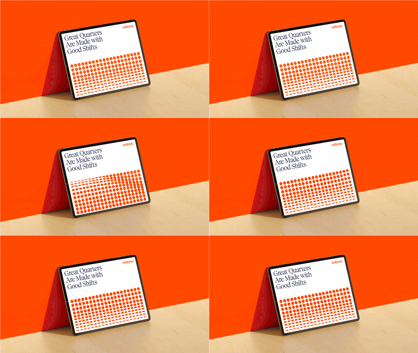
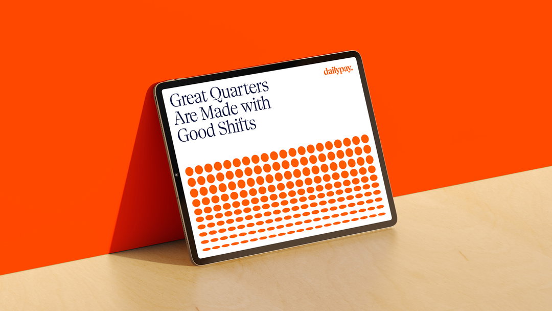
The consultancy took this simple but strong visual motif a step further with motion design, while shifting patterns across the identity nod subtly to the flipping action once more. The concept translates typographically too, as full stops throughout the work and in the wordmark become coins entering a slot.

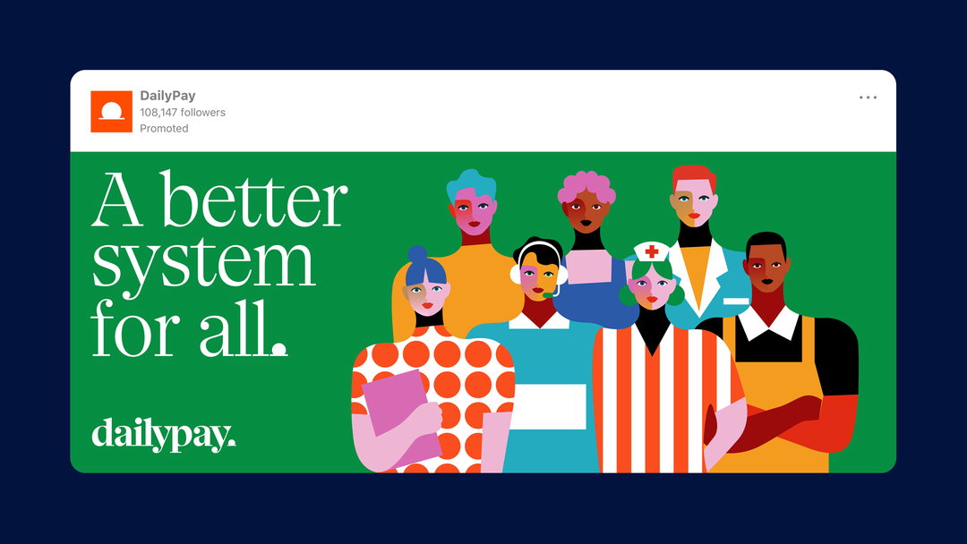
The branding is supported by a custom typeface, Horizon, that echoes curved, circular motifs through its ball terminals, with lowermost serifs that allude to the slot line the coin enters in the logo. The consultancy worked with Minji Moon on supporting illustrations in a blue, violet, green, yellow and red palette, featuring characters that sport the signature orange circle and line brand patterns in various ways, such as through a polka dot jumper.
In a case study, Wolff Olins states: “Our challenge was to reposition DailyPay as the champion for trust and transparency in the world of money movement. We worked together to create a disruptive brand strategy, identity and voice that better tell their distinctive proposition in an impactful way — building confidence among modern workers and their workplaces.”
GalleryWolff Olins: DailyPay (Copyright © DailyPay, 2022)
Hero Header
Wolff Olins: DailyPay (Copyright © DailyPay, 2022)
Share Article
Further Info
About the Author
—
Liz (she/they) is the senior editor at Insights, a research-driven department within It’s Nice That. They previously ran the news section of the website. Get in contact with them for potential Insights collaborations or to discuss Insights’ public-facing reports.