




Abracradama studio designs a crafty and tonal identity for Hap ceramics
Having first met while studying Retail Design in 2013 at Peter Behrens School of Arts in Düsseldorf, Lena Cramer and Johanna Dahmer knew from the get-go that they were a perfectly suited team. Their first project together began in the third semester and took form of a concept titled Mud – “where consumers could enjoy rain, test rubber boots and raincoats inside of the shop,” says Lena. Shortly after, it just so happened that they did every group project together thereof.
Following shortly after was the duo’s bachelor thesis, titled Breizeit, which saw a porridge concept centred around the feeling of joy. Comprising an entire visual identity replete with a fully functional porridge food pop-up, the team also created the logo, typeface, brand colours and brand guide – which sparked an interest in visual storytelling and the desire to pursue a master degree in communication design. “The retail design background gave us a lot of knowledge in craftsmanship, storytelling and in multi-channel disciplines – such as what is needed to form a whole brand, as well as think and create in terms of graphic, communication, space and digital,” Lena tells It’s Nice That. Additionally, combining their love for food and design, they worked on a magazine on the topic of the zeitgeist of food, titled E150a.
“We complement each other very well,” says Lena. “Johanna is the one who quickly has first ideas and sketches, and I love to work out the details. Our aesthetic perception is quite similar and thus it’s a perfect match.” She adds: “It’s not easy to find the right person to work with, but when you found someone you should keep it.” Motivated by the people around them and from the abundance of positive feedback, the duo followed a new path that ultimately led them to open their own studio, titled Abracradama. Ranging from graphic design to editorial, branding, art direction and various digital and physical projects, the studio likes to take on anything that comes its way – all of which are influenced by the founders’ retail background and passion for functional, classic graphic design.
Abracradama: Hap
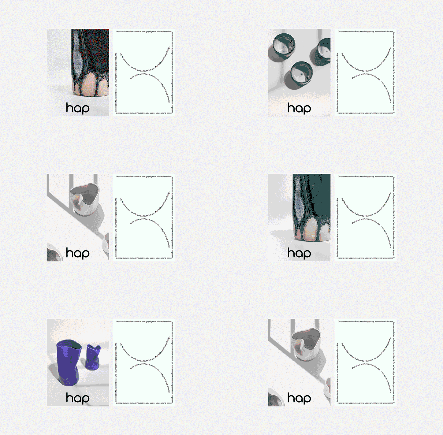
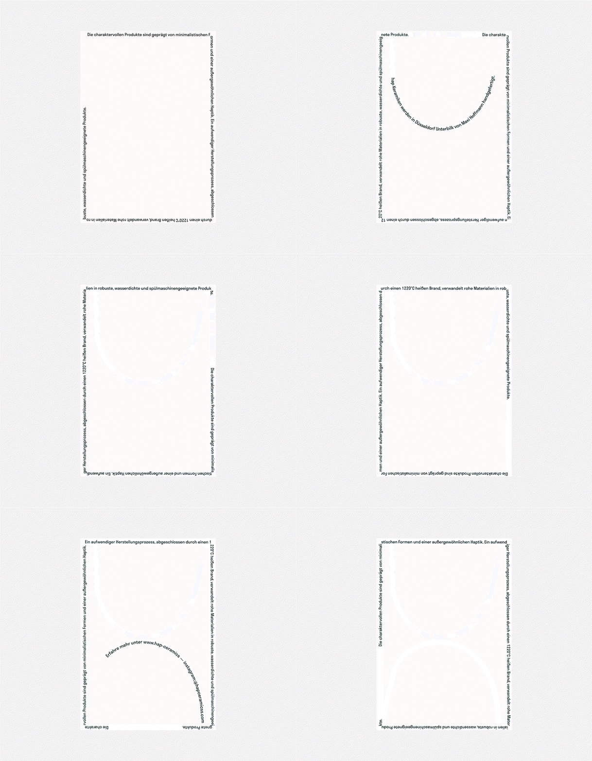
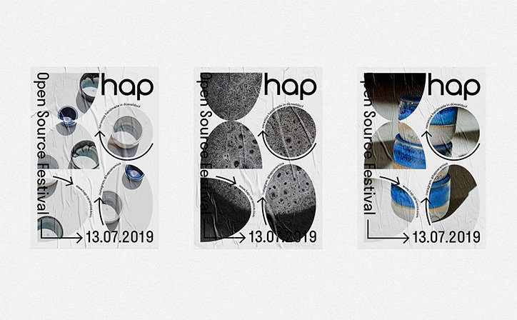
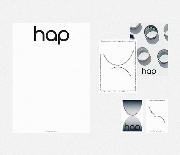
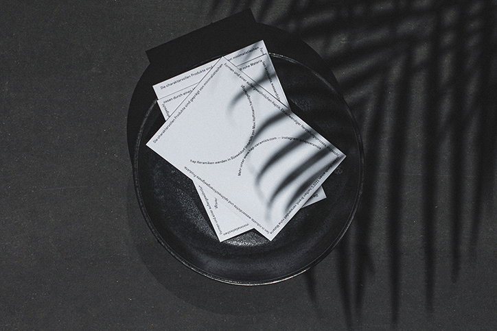
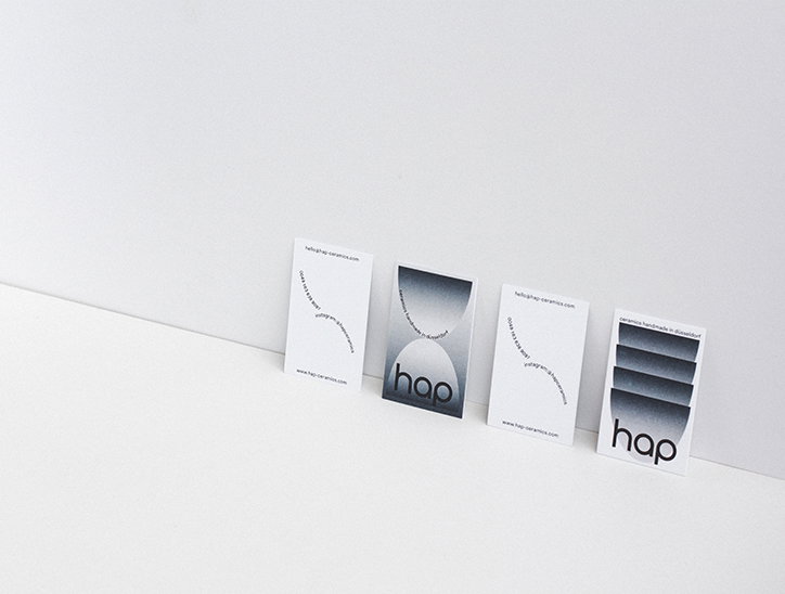
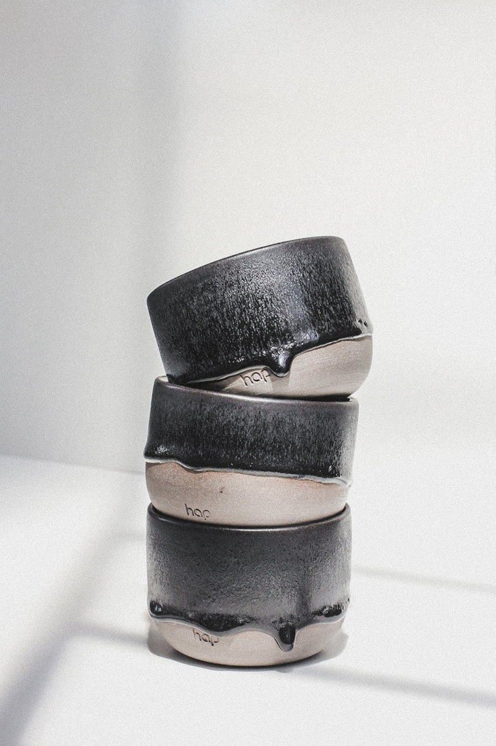
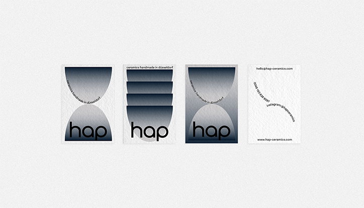
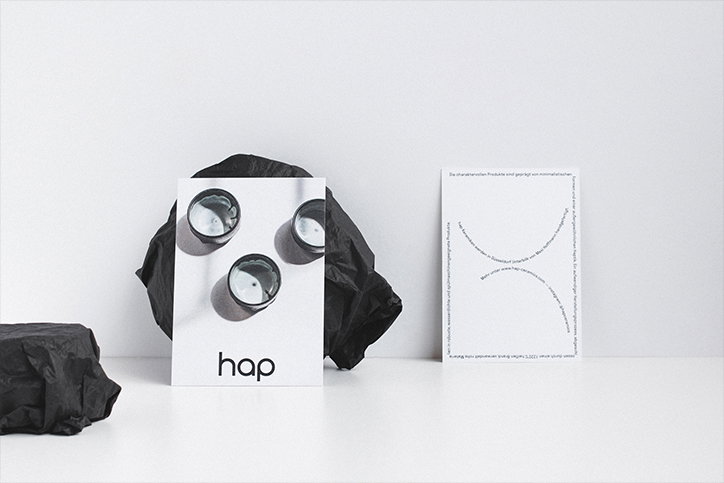
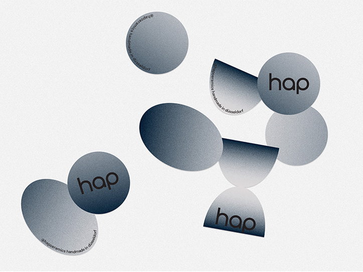
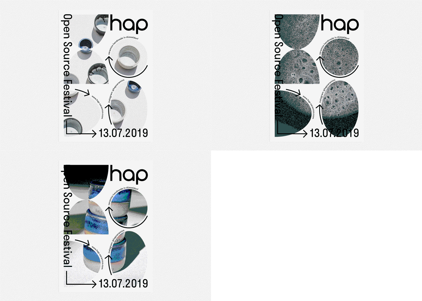
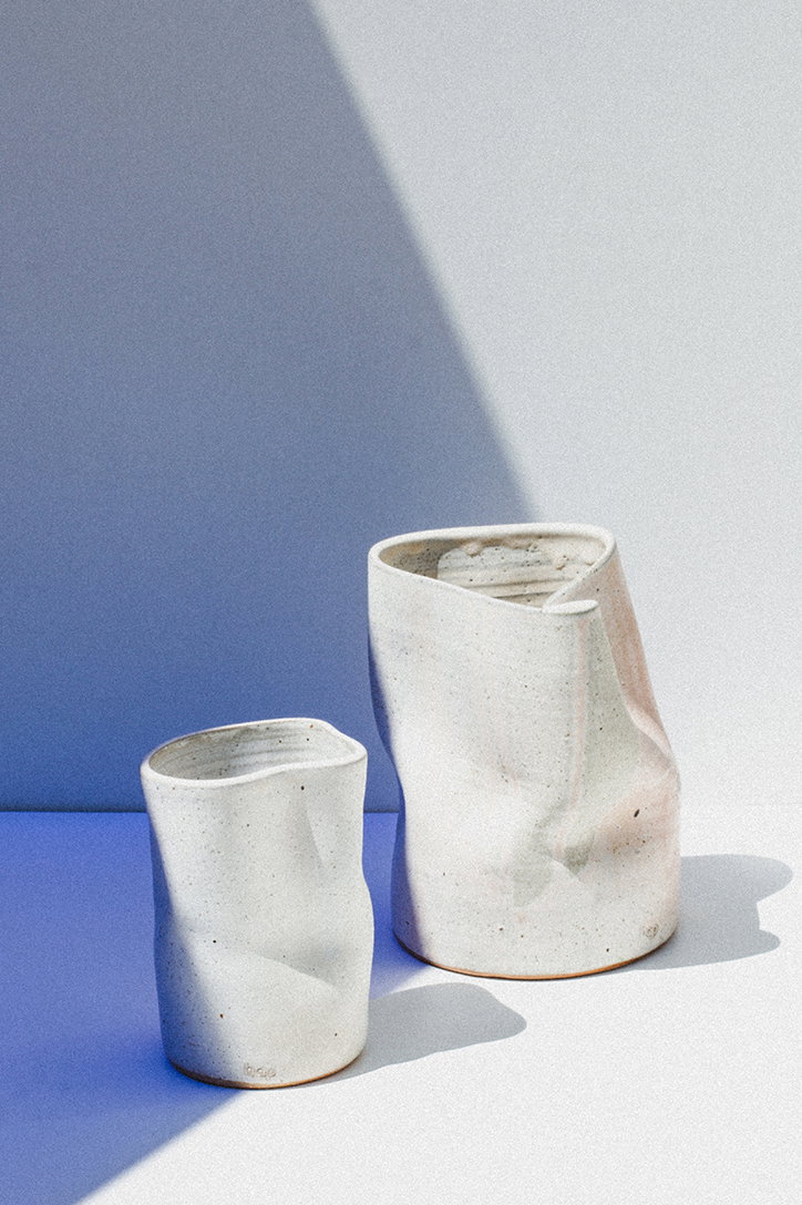
Most recently, Lena and Johanna have completed a project with Maxi Hoffman, owner of the young ceramic label, Hap, based in Düsselford. The duo were instantly infatuated with the ceramics and, just before they started working together, fate took charge and Maxi contacted the studio to start working on the branding. The brief was to create a visual identity, including a new logo, business cards, postcards, product photography, stickers for the packaging and a poster series for an upcoming event. “A sketch of the logo was given and the rest was completely free work,” says Lena. The result sees a fantastically structured, clean and tonal series that depicts the craft of ceramics in its entirety.
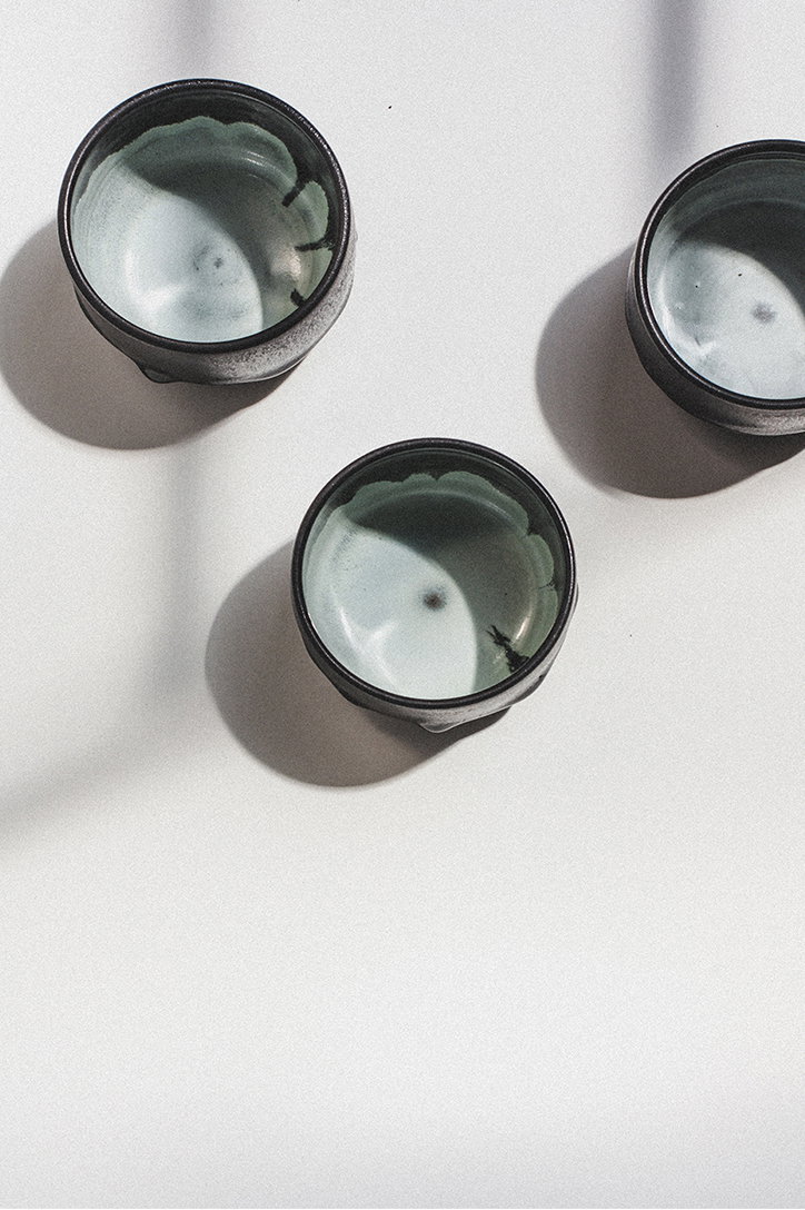
“Our favourite ceramic piece is a black plate with blue highlights – so we used this as an orientation for the look,” she continues. “We created a black, blue and grey gradient, gave it a shape of a deformed plate and played with this form. Also, the type follows the organic forms of the ceramic and thus brings it movement. For the product photography, we chose something clean and just played with some shadows to let the ceramic stand out.”
Importantly, the studio isn’t bound or focused on one field of work. With plans to launch new collaborations and working processes, the future for Abcracradama is a bright and varied one filled with cultural and branding projects, and maybe even an artwork for a musician. “There are lots of strong women we definitely would like to work with – especially in the food design sector, such as Lin Yee Yuan who we met in New York and inspires us hugely with her magazine Mold. Also, Marije Vogelzang, who runs the Food non Food Department in Eindhoven and does a lot of work for the design future.” Elsewhere, graphic designers such as Gemma Mahoney, Marta Veludo, Sakria Studio, Caterina Bianchini, Anja Kaiser and their friend Charlotte Rohde inspire the duo greatly – plus photographers such as Laura Zalenga and friend Annika Weertza.
Abracradama: Hap
Abracradama: Hap
Abracradama: Hap
Abracradama: Hap
Abracradama: Hap
Abracradama: Hap
Abracradama: Hap
Abracradama: Hap
Abracradama: Hap
Abracradama: Hap
Abracradama: Hap
Share Article
Further Info
About the Author
—
Ayla is a London-based freelance writer, editor and consultant specialising in art, photography, design and culture. After joining It’s Nice That in 2017 as editorial assistant, she was interim online editor in 2022/2023 and continues to work with us on a freelance basis. She has written for i-D, Dazed, AnOther, WePresent, Port, Elephant and more, and she is also the managing editor of design magazine Anima.