Agathe Millet’s pixel font is based on the traditional crafts of Norwegian embroidery
The graphic designers 8-bit retro-style font Hardanger neatly ties together digital and physical crafts to construct rich and complex modular letterforms.
Freelance graphic designer Agathe Millet has been working away on some interesting type design projects in her hometown of Montpellier. Speaking of her start in the graphic design world, the type enthusiast tells It’s Nice That: “I’ve always loved making things, especially books as a child, so it was easy to choose my future and my dream job.” It was a natural step for the designer to go on to study at art school, choosing art direction for her masters degree at École de Communication Visuelle in Bordeaux. But it wasn’t until the designer’s Erasmus exchange year to Norway that the seeds for her modular typeface were truly sewn.
“During my exchange I was able to travel around the country and discover lots of different aspects of the culture [...] it allowed me to see a lot of typical Norwegian things and without knowing it, I’d kept it all inside.” Like a lot of creative inspiration that strikes a bit later down the line with some time to digest, Agathe found herself researching forms for a modular type design project a little while later and came across the famous style of Norwegian embroidery work named after a district in the country: Hardanger. This is when the design for her letterset all clicked into place. “At the time I hadn’t made the connection between my time in Oslo and my work”, she says “But I’d seen this embroidery everywhere on tablecloths and decorations during a trip to the north of Norway”.
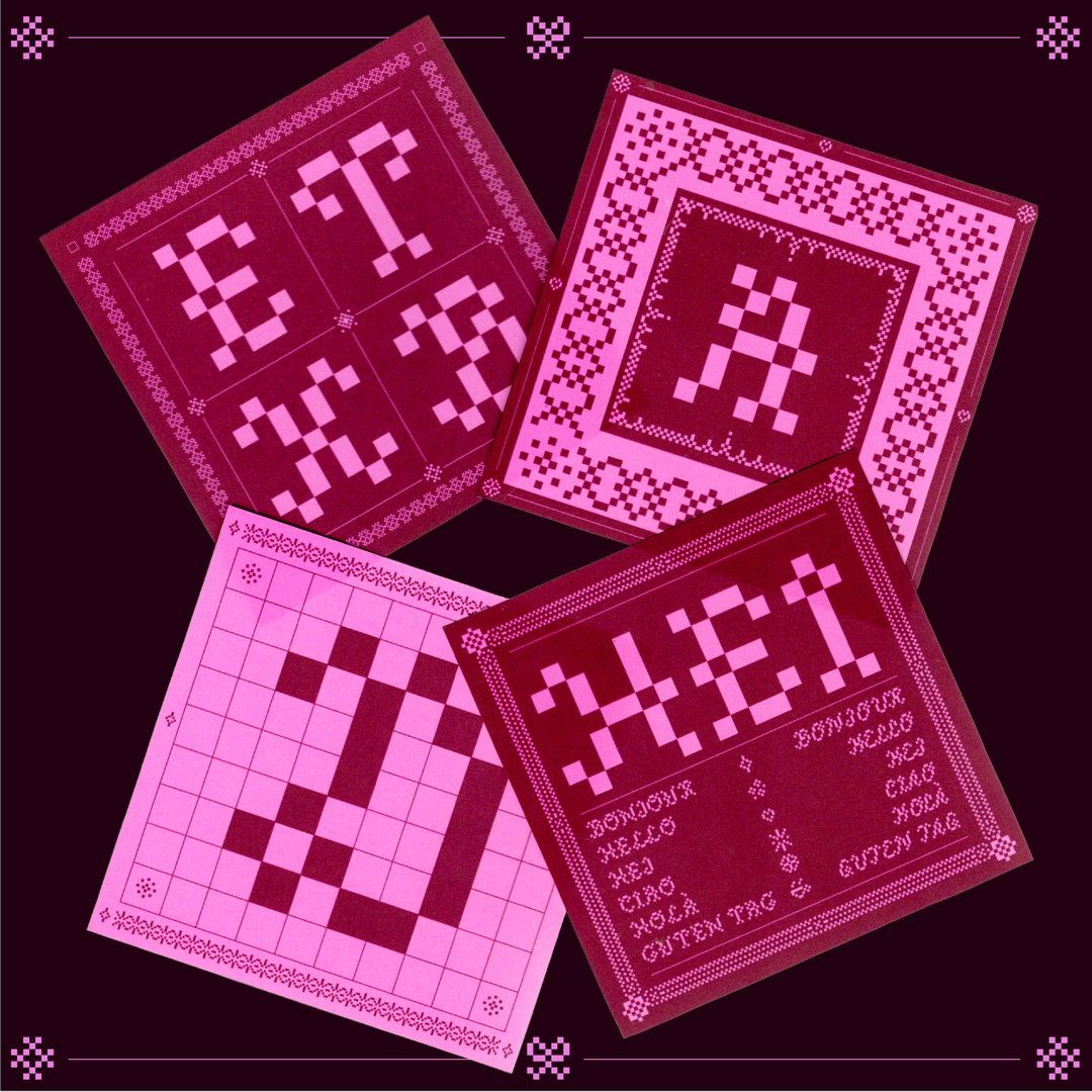
Agathe Millet: Hardanger (Copyright © Agathe Millet, 2024)
Taking inspiration from the patterns of this traditional thread work, Agathe made the first version of Hardanger “which only had capitals and numbers and didn’t really have a name or an identity yet”, she says. Two years later the designer brought her letterforms back to the drawing board with the intention of creating a more distinct visual link between her use of technology and the traditional craft.
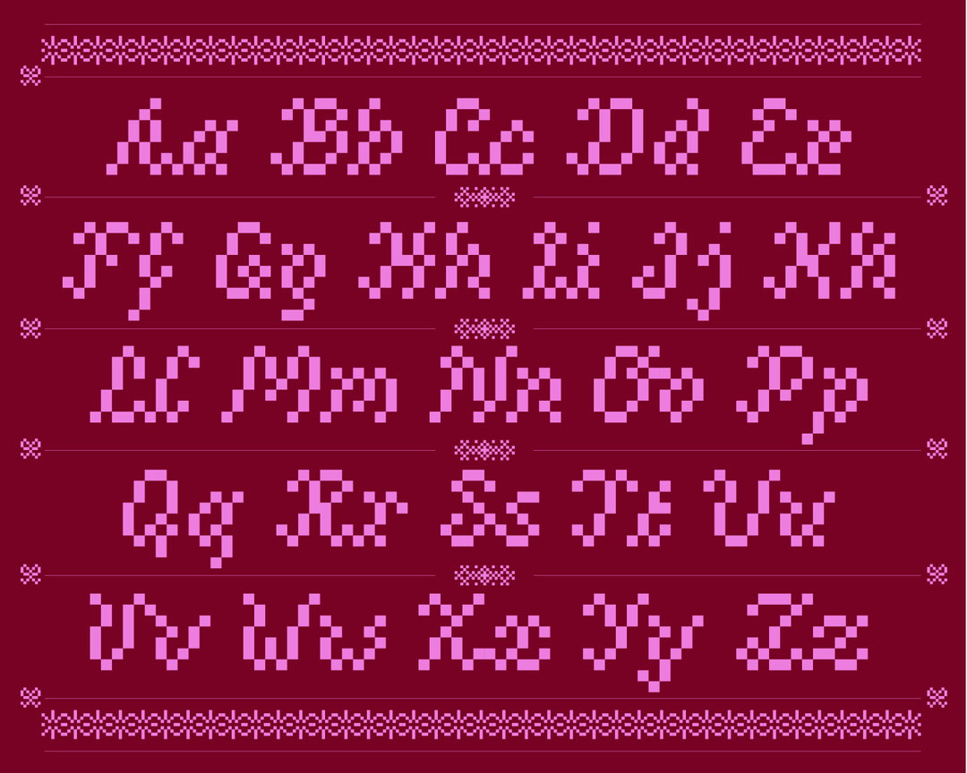
Agathe landed on a new design system in which each character is based on a 7-pixel grid, drawing a direct parallel between Hardanger’s distinct positive and negative ‘Kloster’ stitched blocks and digital pixel patterns. “The constraints of the block led me to find a compromise between legibility and aesthetics”, the designer explains “I wanted the letters to be understandable but exist in the maximalist world of embroidery.”
Seen mostly as a display typeface for titling, running text or overlays to be used in an experimental sense, Agathe wanted the whole letterset to feel “like a large piece of embroidery: a distinctly decorative element” to any design project. With three alternative versions of the typeface that carefully transform pixels into patterns derived from the embroidery technique, she has now created a type specimen in print. This will display the typefaces more delicate details as well as the work of fellow designers showcasing the font in use. Following on from Hardanger’s completion, Agathe is keeping things historical; she’s currently working on a monospace typeface inspired by the first Industrial Revolution – so make sure to stay tuned.
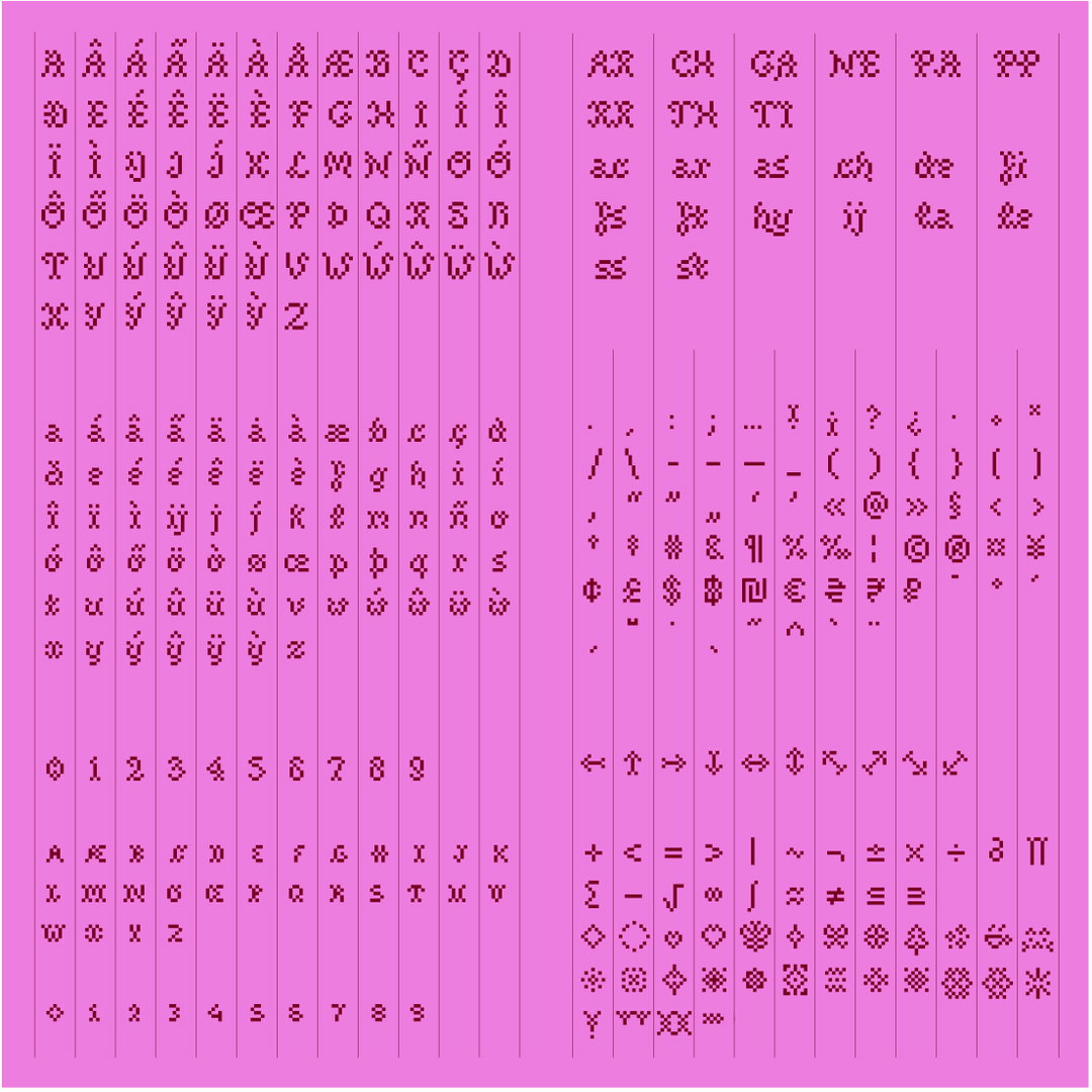
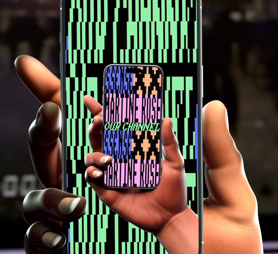
Agathe Millet: Hardanger (Copyright © Agathe Millet, 2024)
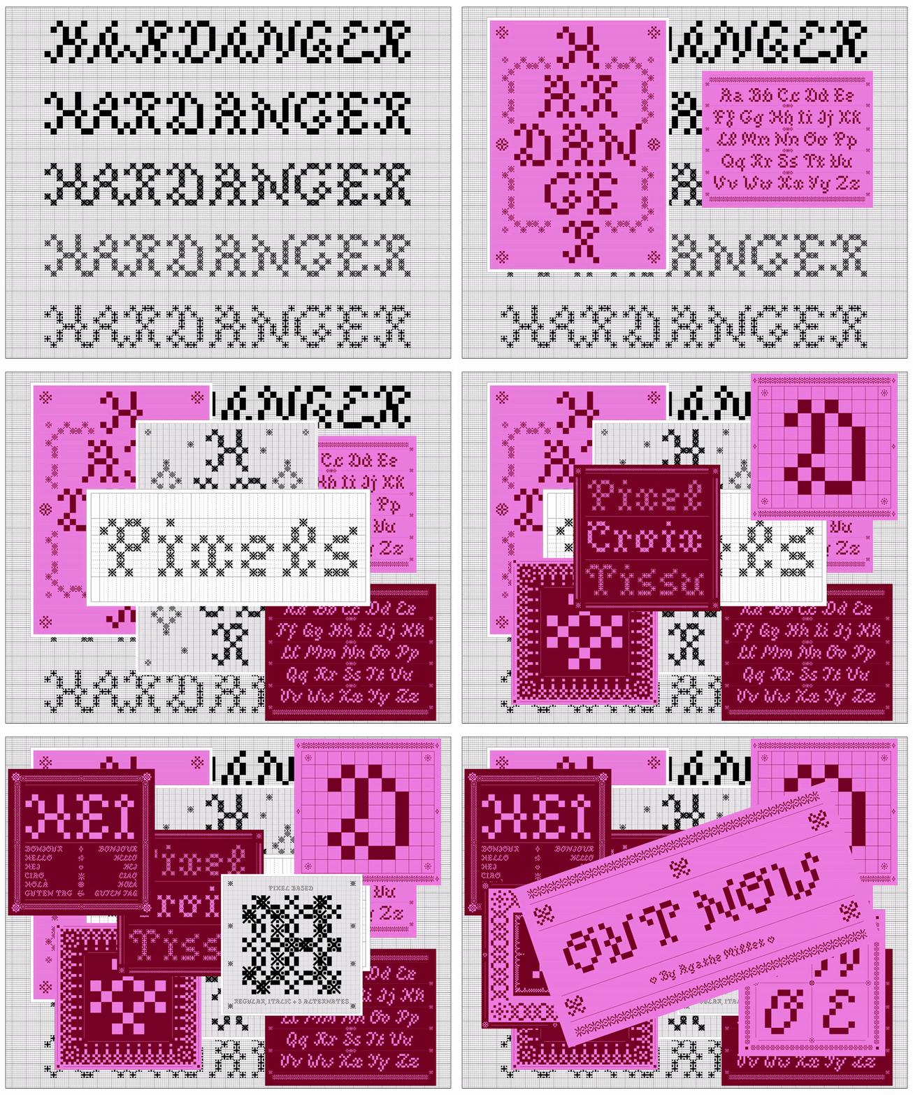
Agathe Millet: Hardanger (Copyright © Agathe Millet, 2024)
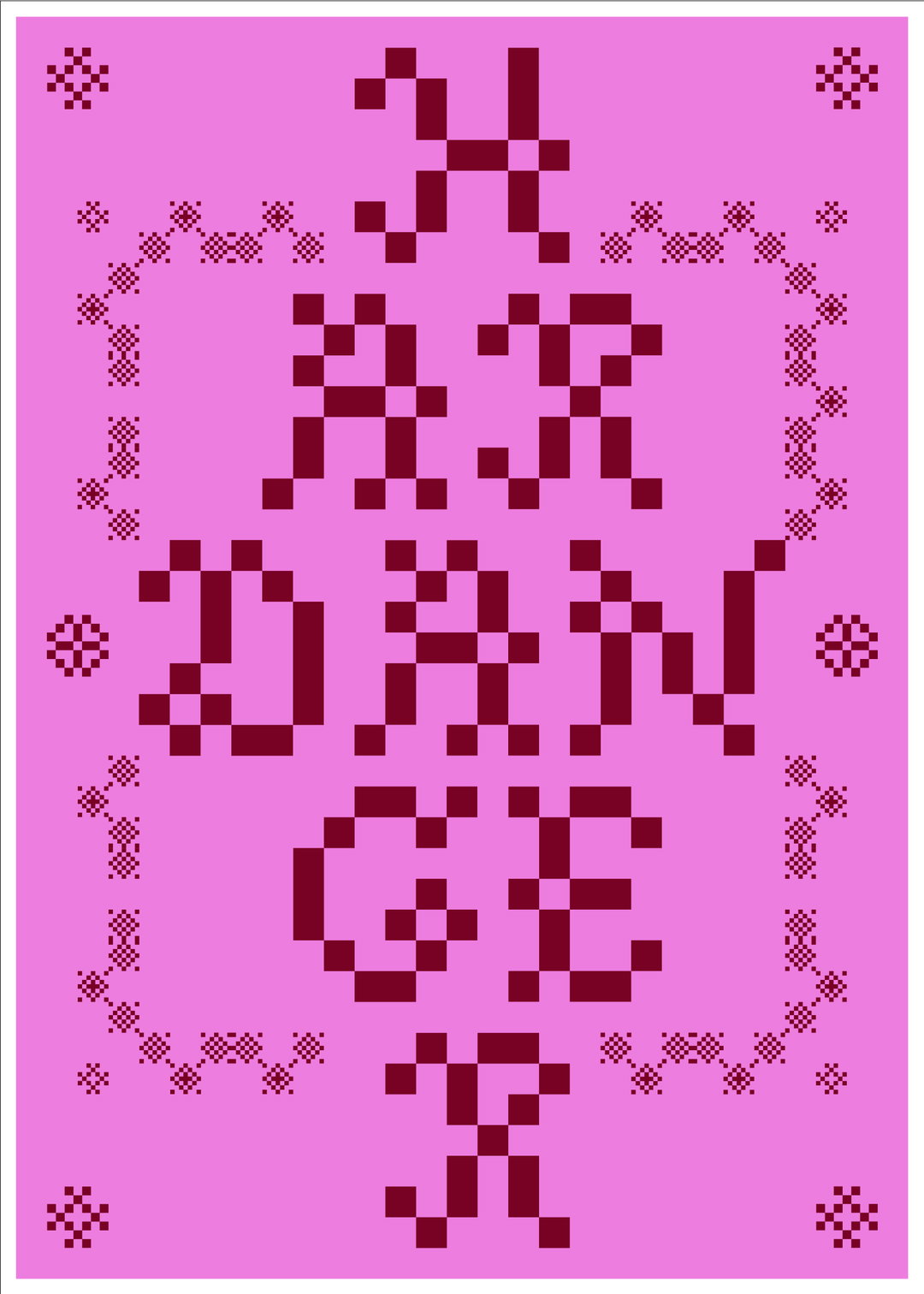
Agathe Millet: Hardanger (Copyright © Agathe Millet, 2024)
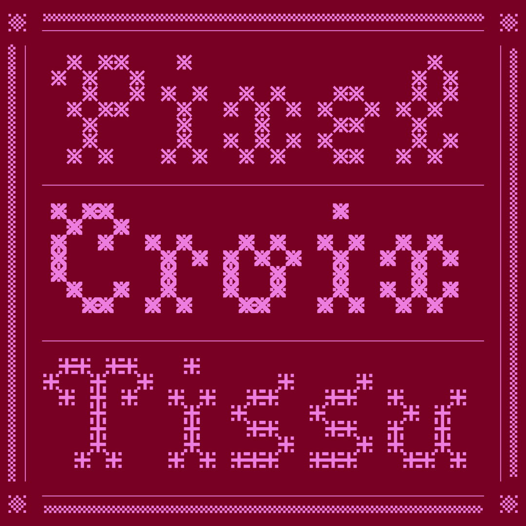
Agathe Millet: Hardanger (Copyright © Agathe Millet, 2024)
Agathe Millet: Hardanger (Copyright © Agathe Millet, 2024)
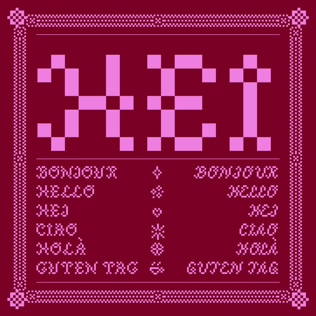
Agathe Millet: Hardanger (Copyright © Agathe Millet, 2024)
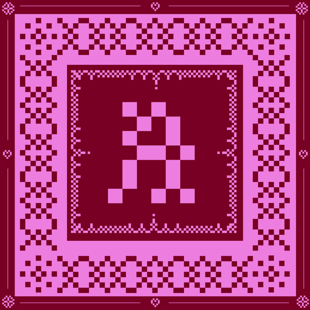
Agathe Millet: Hardanger (Copyright © Agathe Millet, 2024)
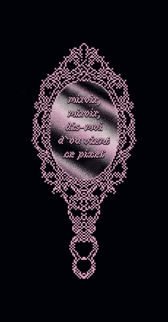
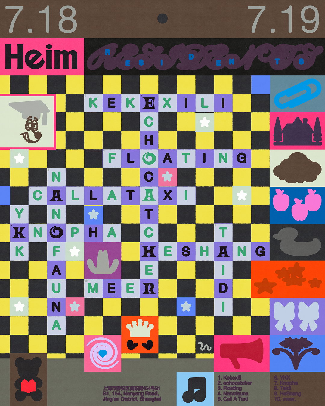
Audrey Aujoulat: Miroir Miroir, featuring Hardanger (Copyright © Audrey Aujoulat, 2024)
Marie Hermez: Flou Croisé, featuring Hardanger (Copyright © Marie Hermez, 2024)
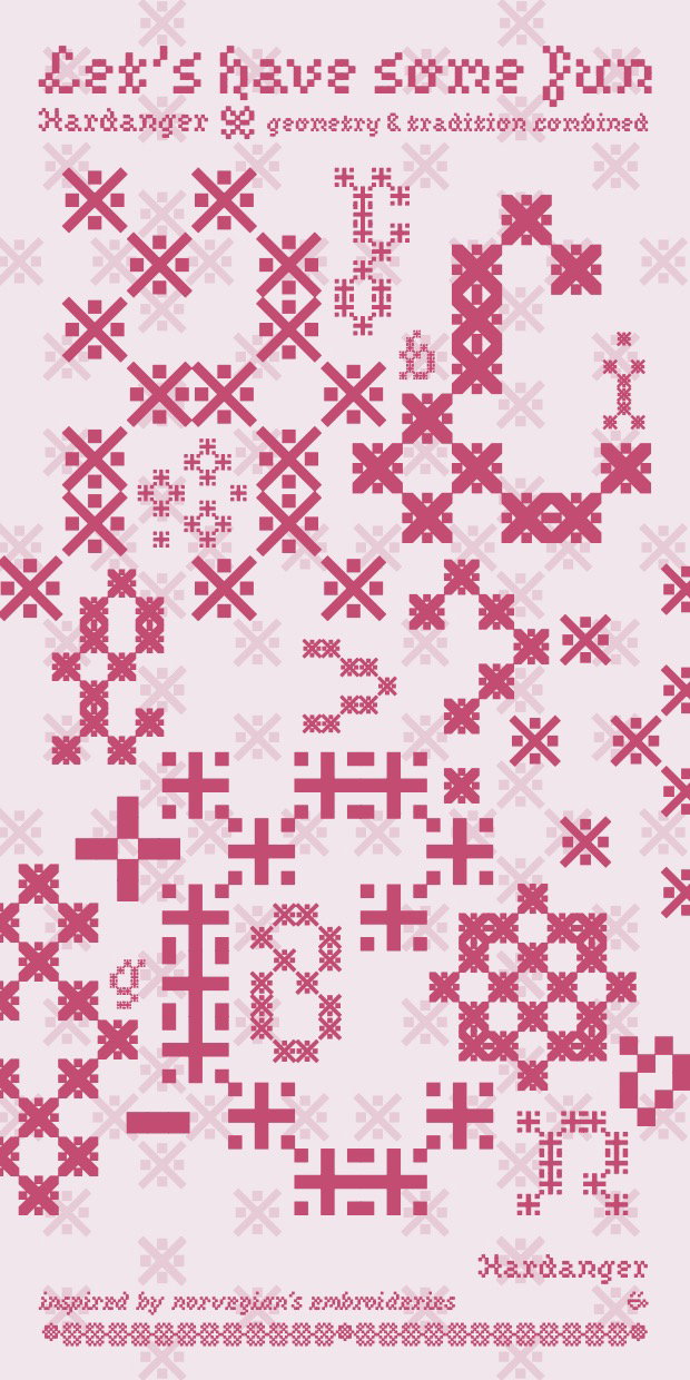
Marie Hermez: Flou Croisé, featuring Hardanger (Copyright © Marie Hermez, 2024)
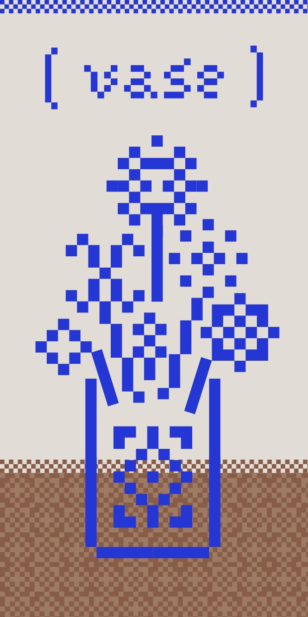
Maëlys Peille: Households Items, featuring Hardanger (Copyright © Maëlys Peille, 2024)
Sophie Lavignotte: Våren, featuring Hardanger (Copyright © Sophie Lavignotte, 2024)
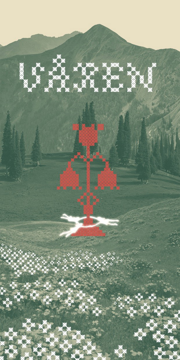
Sophie Lavignotte: Våren, featuring Hardanger (Copyright © Sophie Lavignotte, 2024)
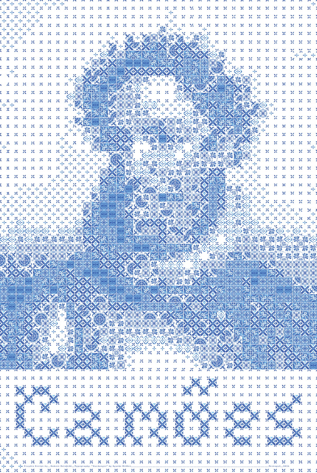
Hubert Reinfeld: Camões, featuring Hardanger (Copyright © Hubert Reinfeld, 2024)
Hero Header
Agathe Millet: Hardanger (Copyright © Agathe Millet, 2024)
Share Article
About the Author
—
Ellis Tree (she/her) is a staff writer at It’s Nice That. She joined as a junior writer in April 2024 after graduating from Kingston School of Art with a degree in Graphic Design. Across her research, writing and visual work she has a particular interest in printmaking, self-publishing and expanded approaches to photography. ert@itsnicethat.com
To submit your work to be featured on the site, see our Submissions Guide.