




Studio Mathias Clottu redraws Mies van der Rohe’s Allzweck typeface for new exhibition
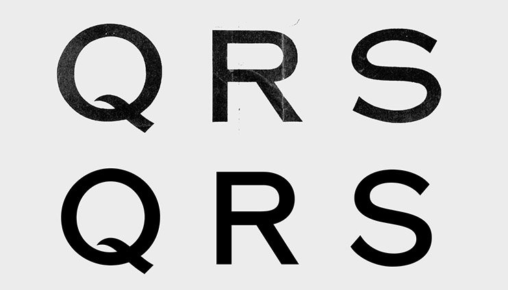
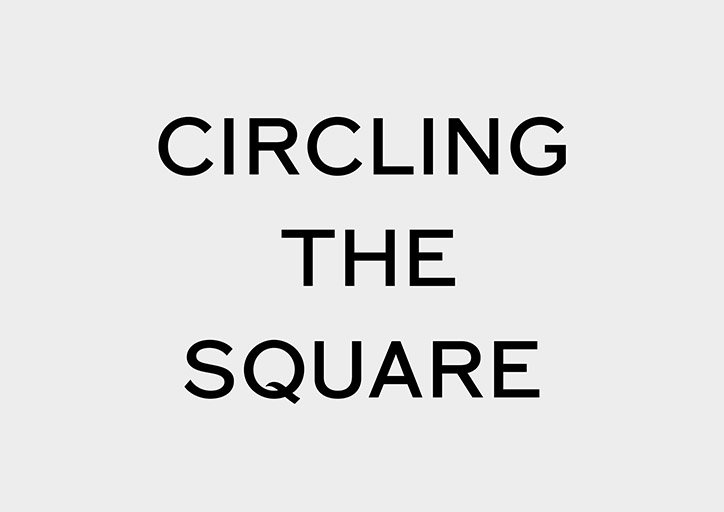
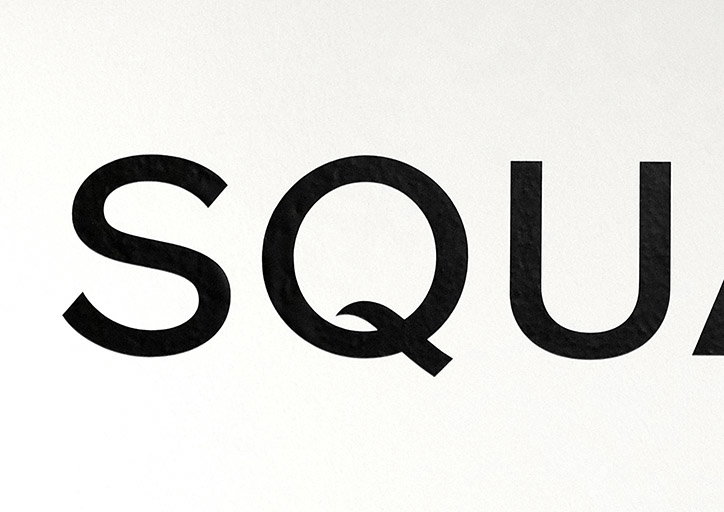
In 1966 architect Ludwig Mies van der Rohe created a set of sans-serif extended capital letters. The Allzweck alphabet was used on correspondence and to annotate blueprints by the modernist master and has been redrawn by Studio Mathias Clottu to be used in a an exhibition that explores Mies van der Rohe’s proposed plan for building a 19-storey skyscraper in the City of London alongside the built No. 1 Poultry by James Stirling. “We have drawn a bespoke version based on Mies’ letters with some elements of English vernacular alphabets.” explains Mathias. “The result is a more regular set of capitals but keeps some of the more drawn characteristics found in the Allzweck. Its weight is in between a regular and a medium font.”
“The way numerals are set in a text used to differentiate modernist designers adhering to the New Typography and those who represented a more traditional typography,” says Mathias “The former would choose regular case – the height of the numerals equal the capital height – alongside sans-serif typefaces in text. The latter would argue that text-case numerals – of which the heights vary to resemble a typical line of running text – should be used alongside a serif font. Jan Tschichold, whose dispute with modernist Max Bill is a central debate in typography, specified in his Penguin Composition Rules, to not mix old style text composition with modern text figures.”
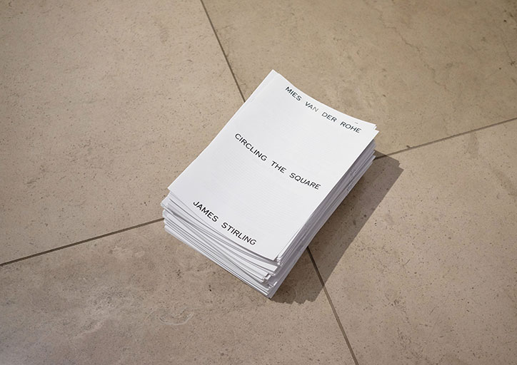
For the exhibition Circling the Square at the RIBA in London, that examines Mies’ proposal and the building that actually occupies the site designed by James Stirling, the alphabet and numerals are used across the displays and exhibition brochure. “We have redrawn three variants of numerals for the graphics of the exhibition: the Allzweck extended numbers relate to Mies van der Rohe’s scheme; regular weight is used in a document related to the public debate; and sans-serif non-lining numbers for the James Stirling’s scheme,” says Mathias. Using the reference material from Mies’ archive, these were sketched and vectorised, before being applied to the exhibition.
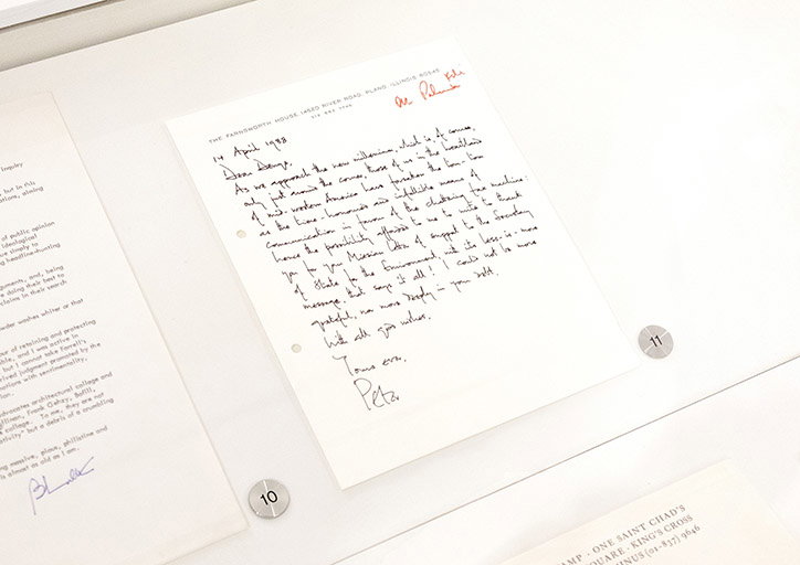
Allzweck on Farnsworth House letterhead
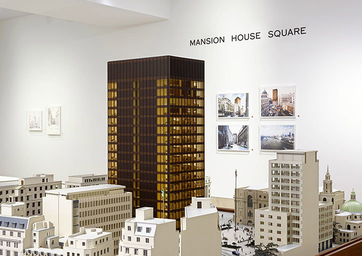
Mies’ model
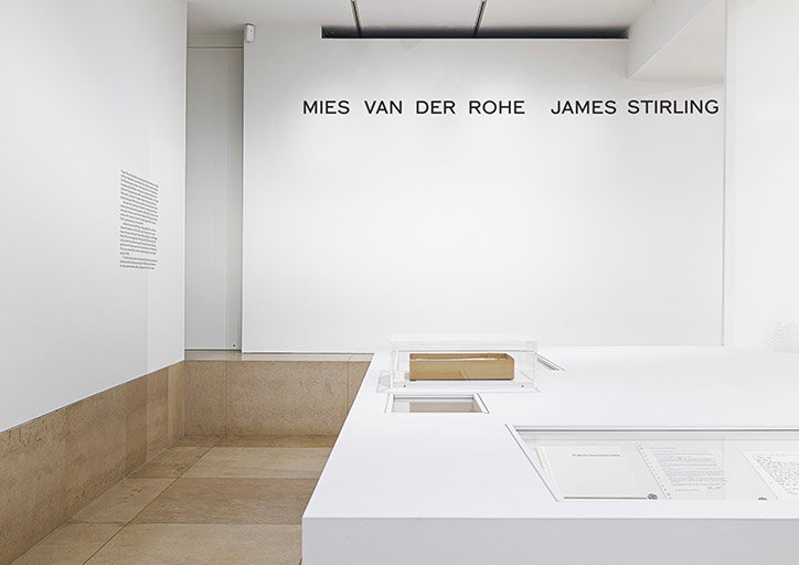
Insitu at Circling the Square
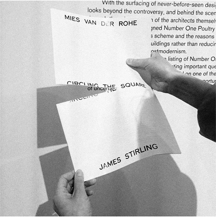
Insitu at Circling the Square
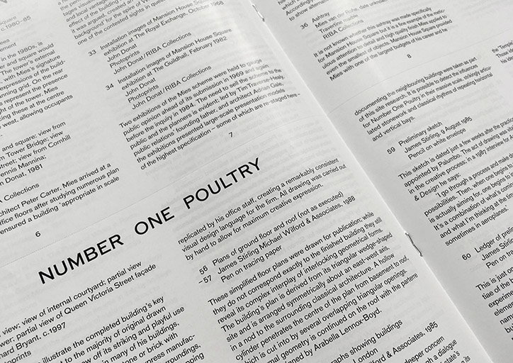
Insitu at Circling the Square
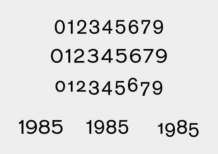
Variations on numerical
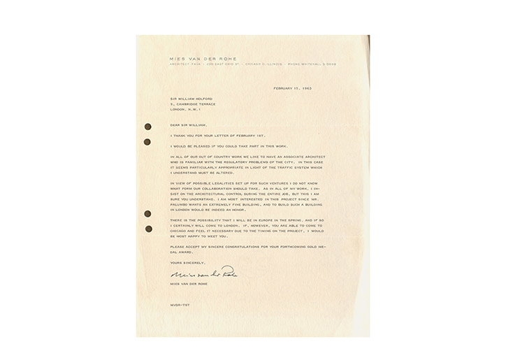
Letter from Mies van der Rohe to Lord Holford. Letterhead set in Allzweck.
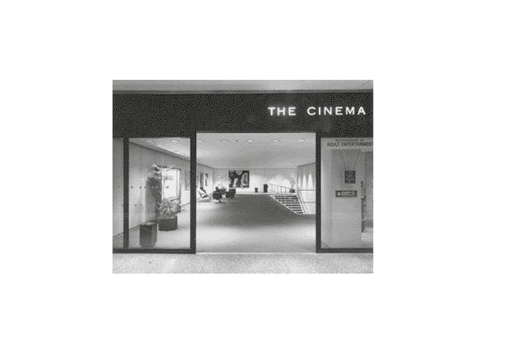
The cinema at the Mies’ Toronto Dominion Centre, opened in 1967. The sign uses Allzweck.
Share Article
Further Info
About the Author
—
Owen joined It’s Nice That as Editor in November of 2015 leading and overseeing all editorial content across online, print and the events programme, before leaving in early 2018.


