Launch Recite Me assistive technology
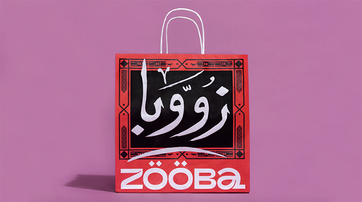
A red paper shopping bag with white handles against a purple background. The bag features a black central panel with white Arabic calligraphy and the word “Zooba” in a bold white typeface below.

&Walsh designs Zooba's identity inspired by the busy streets of Cairo

—
Date
5 November 2019

&Walsh, the creative agency set up by Jessica Walsh, has released an identity for the New York venture of Cairo-based restaurant, Zooba. Enlisting the design agency, which only announced its formation, in July of this year, Zooba’s branding is created with the aim “to resonate with a NYC audience,” says Jessica, “while celebrating Egypt”.

Working closely with Zooba’s own creative team based in Cairo – which Jessica notes was the “key to success” – the project began with a trip to the Egyptian capital where the collaboration kicked off proceedings by tasting food, meeting the Zooba team and learning more about the culture, particularly through &Walsh’s collaboration with Chris Khalifa, Adam Mourad and Omar Mobarek. “While in Cairo we walked the streets together with the Zooba team, taking hundreds of photos, discussing ideas and possibilities,” Jessica tells It’s Nice That.

Inspired “by the beauty on the streets of Cairo”, a key element Jessica points out as an influence is the city’s vast combination of visuals: “posters would be put up on top of hand painted type or illustrated murals, next to a shop with a mix and matched geometric tiles, next to a bright solid colour painted wall with a complementary colour rug,” she tells us. “While these visuals were not always purposefully coordinated, they combined together in a busy, but beautiful way. We wanted the branding to celebrate this.”
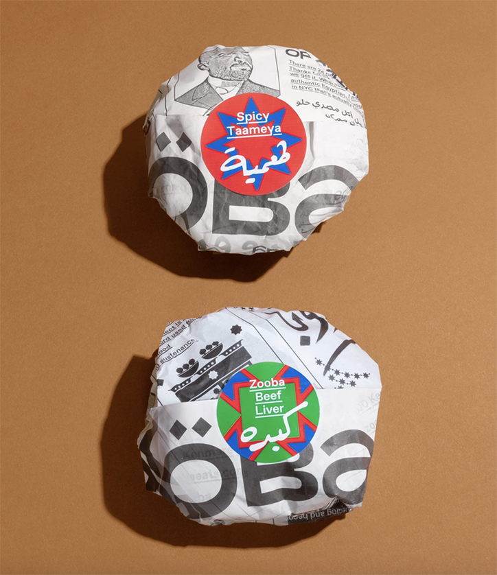
Two food items wrapped in white paper with black graphic prints and the word “Zooba”. Each is sealed with a colourful circular sticker; one red and blue for “Spicy Taaneya” and one green and blue for “Zooba Beef Liver”.
Above
Left

&Walsh: Zooba

Right

&Walsh: Zooba

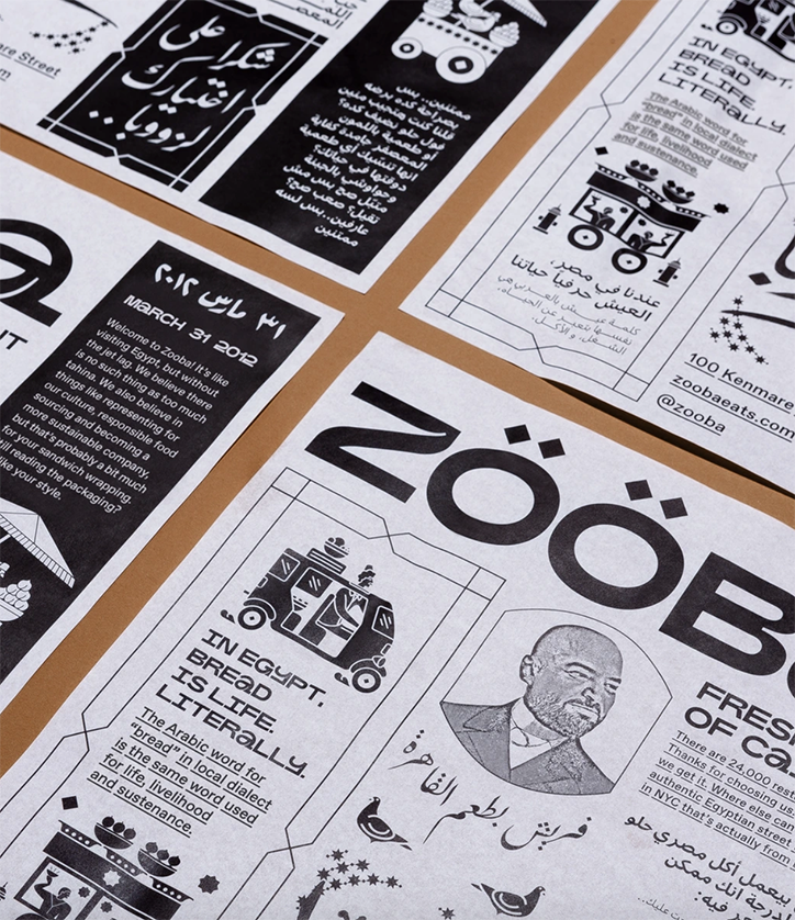
A collection of black and white printed materials for the restaurant Zooba. The designs feature bold typography, Arabic script and an illustration of a man alongside the text “In Egypt. Bread is life. Literally.”
Above

&Walsh: Zooba

Typographically, Cairo’s “beauty and craftsmanship,” as Jessica describes, was additionally presented throughout the city, leading the &Walsh and Zooba team to commission Mohamed Mohamed, the painter of typographic details on many of the foul carts set up across Cairo. “The paintings were scanned and photographed, and used through the branding over the vector compositions. We loved the contrast of the organic paint strokes against the vector geometric patterns and borders,” she says, adding that: “I am always a big believer that when you admire someone’s work, you should commission them, versus imitating it.”

With all of these elements combined in the final result, Jessica describes &Walsh’s efforts as a representation of how “Zooba’s food is a unique modern twist on traditional Egyptian classics, and we wanted to do something similar with the branding.” Carefully piecing together references such as traditional patterns, tiles and graphics alongside layers of modern interpretations, Jessica sums up the project succinctly by adding: “Everything was inspired by the the visuals we saw in Egypt. The way it’s leathered together was inspired by the layering we saw in Cairo, though the final result is a style we think is ownable and unique to Zooba,” particularly in details such as its copywriting, directly inspired by the “down-to-earth” team at Zooba too. The final results can be seen across a wide range of ephemera, from menus to bags, staff announcements and uniforms instructing customers: “If you’re not making a mess, you’re not doing it right.”
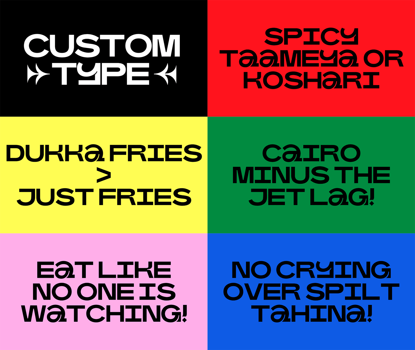
An animation in which bold, black typography appears against a sequence of flashing coloured backgrounds. The text reads “CUSTOM TYPE”, “SPICY TAAMEYA OR KOSHARI”, “DUKKA FRIES > JUST FRIES”, “CAIRO MINUS THE JET LAG!”, “EAT LIKE NO ONE IS WATCHING!” and “NO CRYING OVER SPILT TAHINA!”.
Above

&Walsh: Zooba

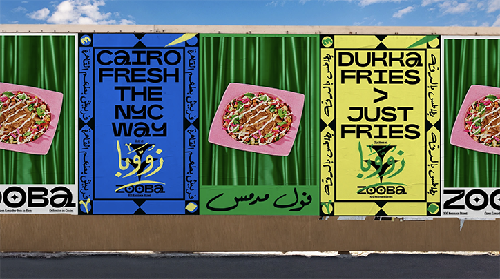
A row of colourful street posters for the restaurant Zooba. The designs feature food photography on green curtains and bold typography reading “Cairo fresh the NYC way” and “Dukka fries > just fries”.
Above

&Walsh: Zooba

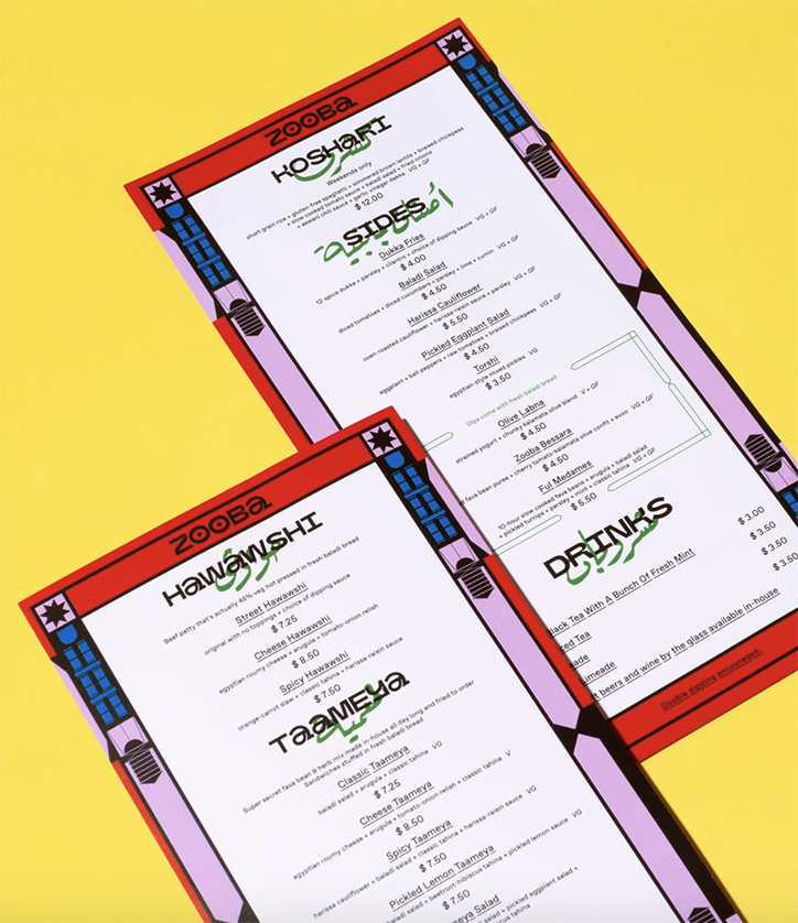
Two menus for the restaurant Zooba are laid diagonally against a bright yellow background. The menus list various food and drink options, including sections for “Koshari”, “Sides”, “Hawawshi”, “Taameya” and “Drinks”.
Above

&Walsh: Zooba

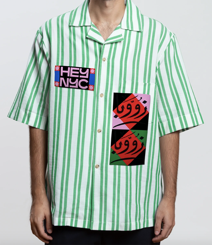
A person wears a short-sleeved, green and white striped shirt. A pink patch on the chest reads “HEY NYC”, while a larger graphic on the pocket features red Arabic calligraphy on a black and pink background.
Above

&Walsh: Zooba

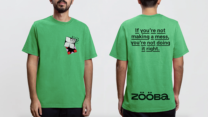
A person wears a green T-shirt, shown from the front and back. The front features a small graphic on the chest, while the back reads “If you’re not making a mess, you’re not doing it right.” above the Zooba logo.
Above

&Walsh: Zooba

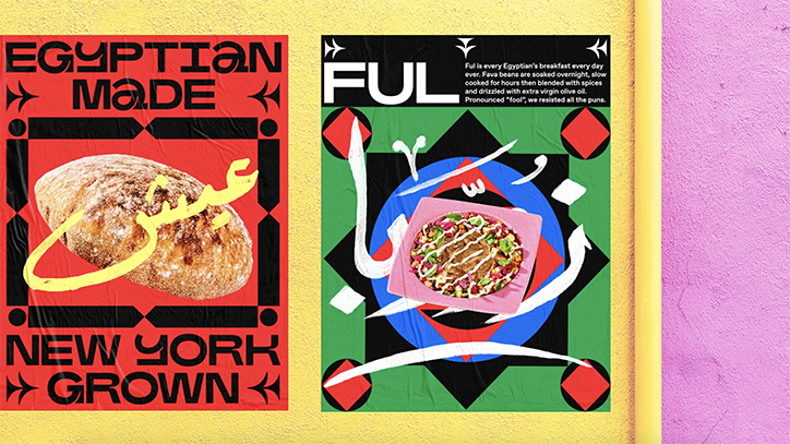
Two posters are pasted side by side on a yellow wall. The first is red and black, featuring a loaf of bread and the text “Egyptian Made” and “New York Grown”. The second is a green and black graphic design featuring a bowl of food and the word “Ful”.
Above

&Walsh: Zooba

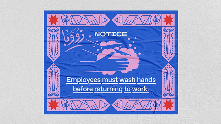
A blue and pink poster reads “NOTICE” and “Employees must wash hands before returning to work.” An illustration in the centre shows a pair of hands being washed with soap.
Above

&Walsh: Zooba

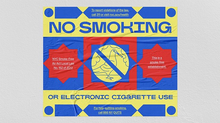
A yellow and blue sign reads “NO SMOKING” in bold blue letters. A central graphic shows a cigarette with a diagonal line through it, surrounded by red and blue geometric shapes. Additional text includes “OR ELECTRONIC CIGARETTE USE” and references to the “NYC Smoke-Free Air Act Local Law No. 152 of 2013”.
Above

&Walsh: Zooba

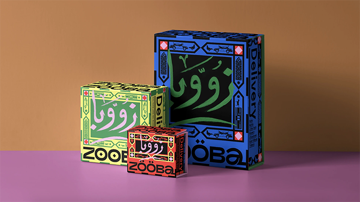
Three cardboard delivery boxes in different sizes, coloured blue, yellow and red. Each features bold Arabic calligraphy and the brand name “Zooba” in a chunky, stylised typeface.
Above

&Walsh: Zooba

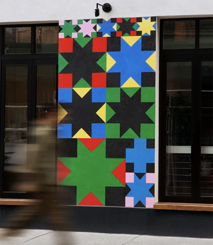
A colourful geometric mural on a white exterior wall between two black-framed windows. The artwork features a grid of bold, multi-coloured stars in red, blue, green, yellow, black and pink. A blurred figure walks past the wall in the foreground.
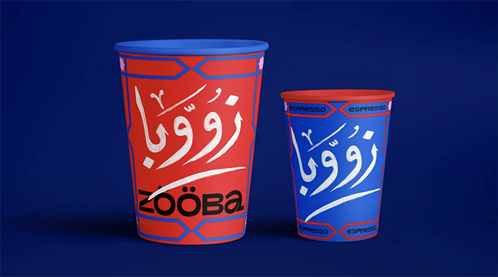
Two branded cups for Zooba stand against a deep blue background. One is red with blue accents and the other is blue with red accents, both featuring the “Zooba” wordmark and Arabic calligraphy.
Above

&Walsh: Zooba

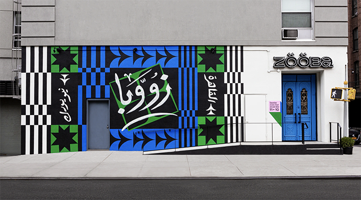
A bold, colourful mural in blue, green, black and white covers the exterior wall of a Zooba restaurant. The artwork features geometric patterns and Arabic calligraphy, with the brand name “Zooba” displayed in a stylised logotype above the blue entrance doors.
Above

&Walsh: Zooba

Share Article

Further Info

About the Author

Lucy Bourton

—

Lucy (she/her) was part of the It’s Nice That team from 2016–2025, first joining as a staff writer after graduating from Chelsea College of Art with a degree in Graphic Design Communication, eventually becoming a senior editor on our editorial team, and most recently at Insights, a research-driven department with It’s Nice That.

It's Nice That Newsletters

Fancy a bit of It's Nice That in your inbox? Sign up to our newsletters and we'll keep you in the loop with everything good going on in the creative world.