Launch Recite Me assistive technology
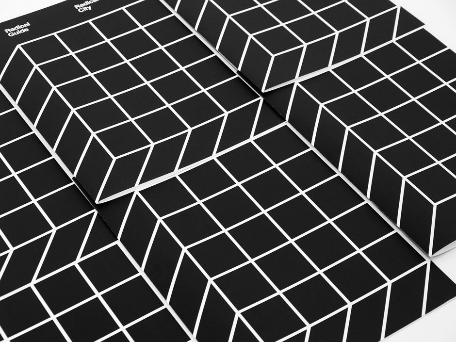
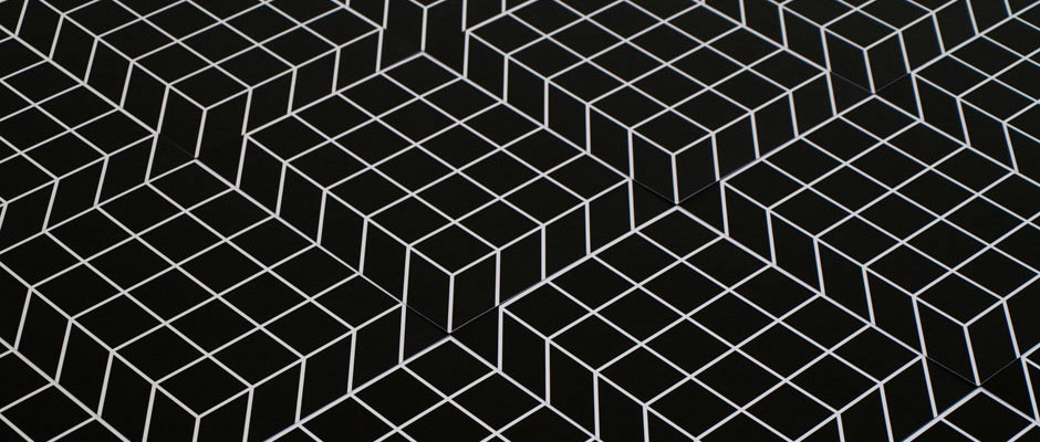
An abstract pattern of black and white lines creates an optical illusion of interlocking 3D cubes. The geometric shapes shift in perspective, forming a series of staggered, stepped platforms.

Italian designers Artiva live and breathe Helvetica like the Swiss designers of old – and they're brilliant

—
Date
9 August 2012

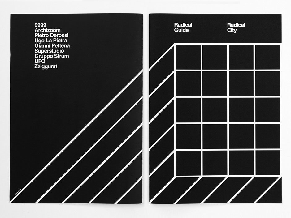
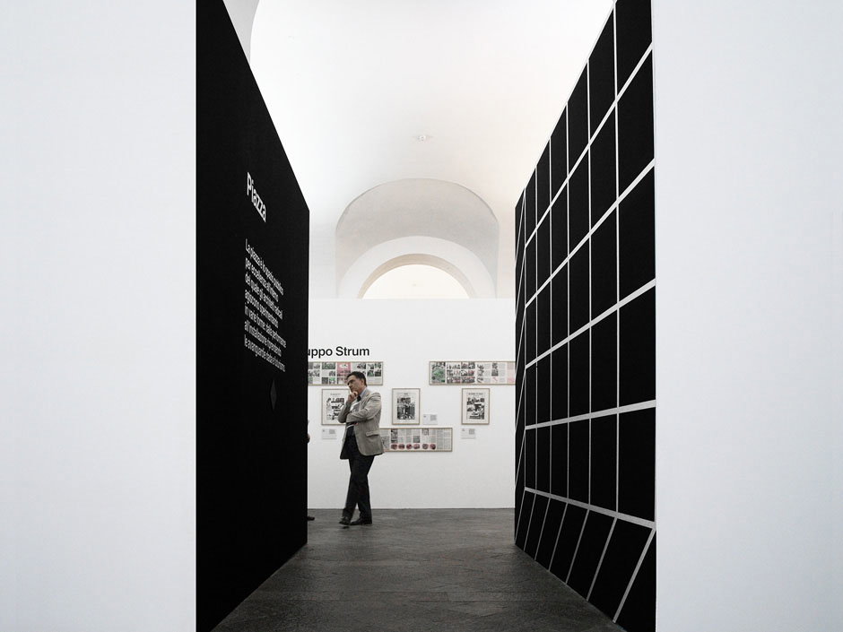
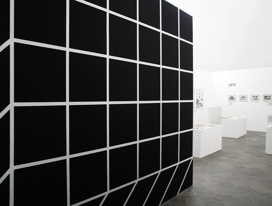
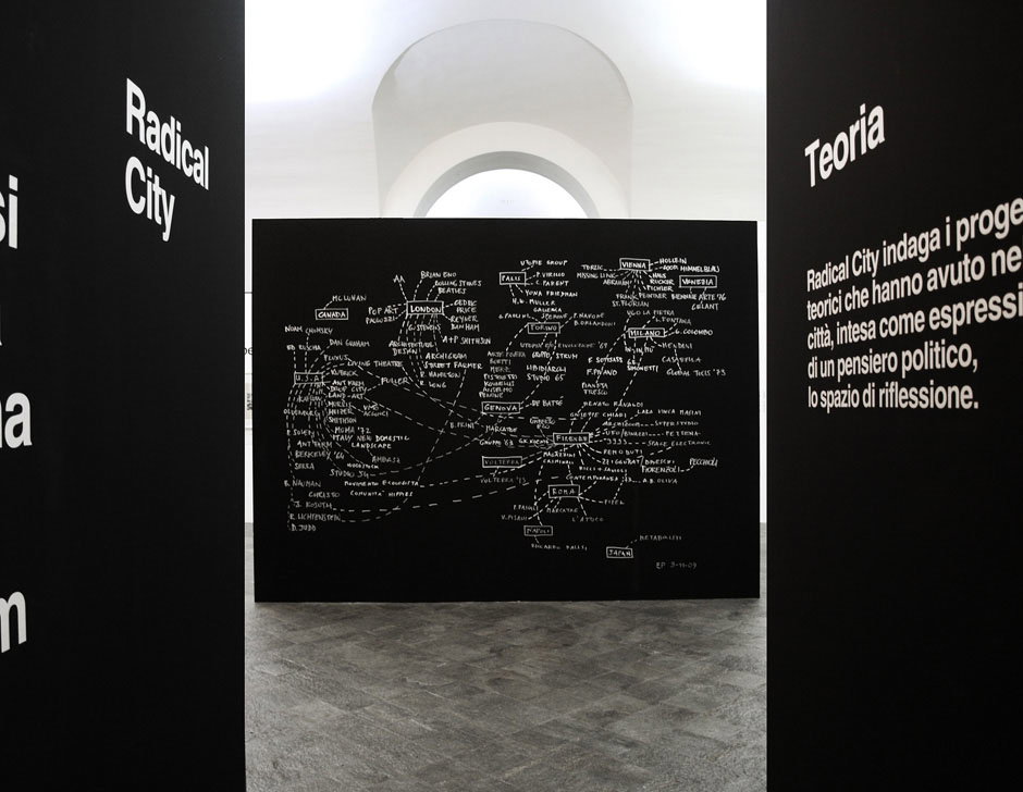
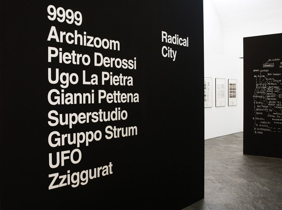
Artiva’s exhibition identity for Radical City is as inherently modernist as they come; the choice of type, the monochrome colour palette, the overbearing grid all firmly grounded in the Swiss tradition of graphic design. As the visual identity for a show that deals with Italian radical architecture (specifically between 1963 and 1973) it’s a perfect fit, deftly summarising the gridded urban landscapes of geometric concrete that were the hallmark of Italian radicalism.

What’s fascinating about the rest of Artiva’s portfolio is their singular design vision. Every one of their other projects utilises the same principles as Radical City. Whether it’s a brand identity or an experimental publication the calling cards are all there; Helvetica, black and white palette and that same rigid grid. Is this a simple case of design malaise or are these guys from the same mould as their Swiss predecessors, staunchly pursuing design perfection through simplicity and order? I’d argue the latter as the studio’s output shows a consistency of vision and understanding of design too refined to discount them as one trick ponies. And in this ever-fluctuating landscape of creative chameleons it’s incredibly refreshing to discover designers who still live and breathe Helvetica.
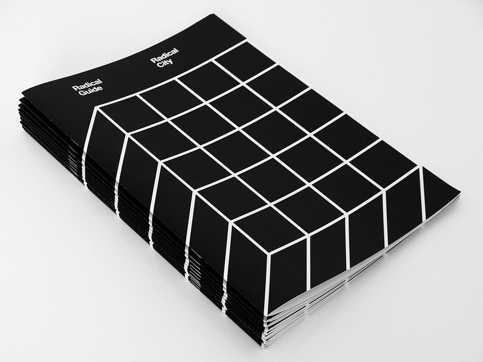
A stack of black booklets with a white grid pattern on the cover. The text “Radical Guide” and “Radical City” is printed in the top left corner.
Above

Artiva: Radical City

Two black book covers with white linear graphics. The left cover lists names including “Archizoom”, “Superstudio” and “Zziggurat” above a series of diagonal lines. The right cover features a 3D grid pattern and the titles “Radical Guide” and “Radical City”.
Above

Artiva: Radical City

A stack of black booklets featuring a white grid pattern that creates a 3D optical illusion of cubes. Small white text in the top left corner reads “Radical Guide” and “Radical City”.
Above

Artiva: Radical City

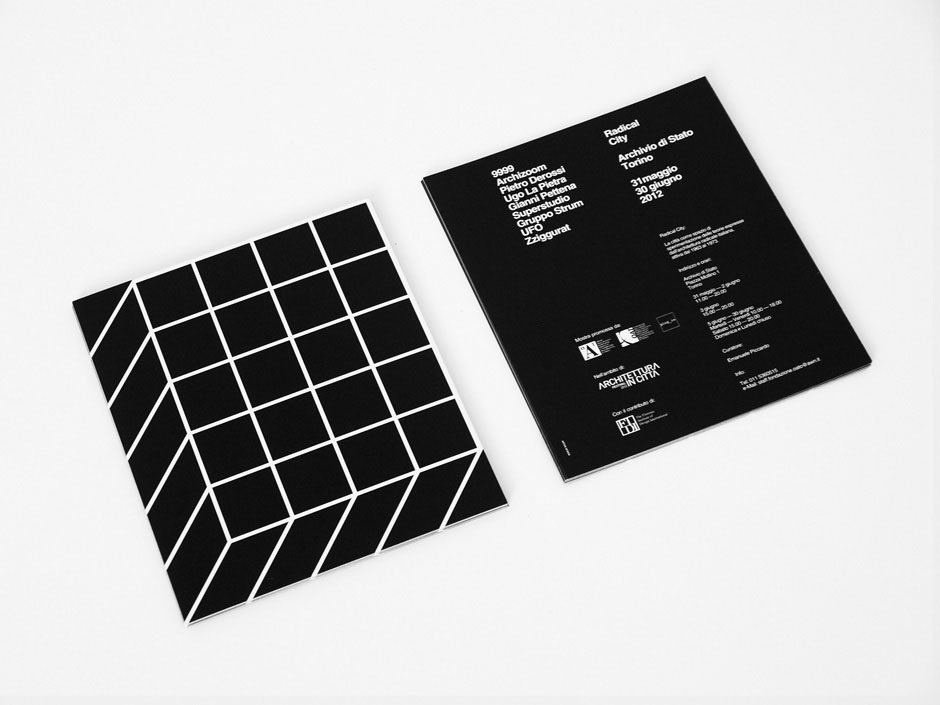
Two black and white exhibition pamphlets lie on a plain white surface. One shows a white geometric grid forming a 3D cube, while the other lists event details for “Radical City” at the Archivio di Stato Torino.
Above

Artiva: Radical City

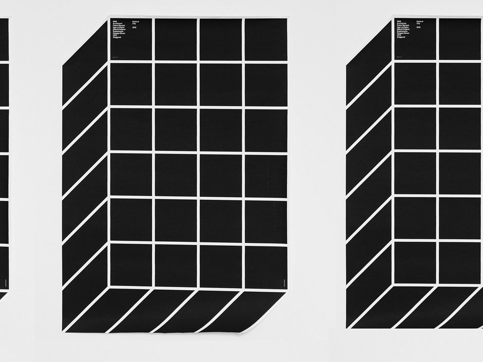
Two black and white prints hang side by side on a white wall. Each features a grid of black squares arranged to create a 3D illusion of a receding corner.
Above

Artiva: Radical City

A person in a light-coloured blazer stands in a white gallery space, looking at a series of framed photographs. They are positioned between two large black walls, one of which features a grid of white lines.
Above

Artiva: Radical City

A large wall of black square panels separated by thin white lines dominates the foreground of a gallery. In the background, a white wall features the word “UFO” above a series of small framed photographs.
Above

Artiva: Radical City

A large black canvas featuring a complex white network of handwritten names and locations connected by lines. The artwork is displayed in a gallery between two black walls, one of which reads “Radical City” and the other “Teoria”.
Above

Artiva: Radical City

A black gallery wall features a list of names in white sans-serif type, including “Archizoom”, “Superstudio” and “UFO”. To the right, the words “Radical City” appear in a smaller font.
Above

Artiva: Radical City

Share Article

Further Info

About the Author

James Cartwright

—

James started out as an intern in 2011 and came back in summer of 2012 to work online and latterly as Print Editor, before leaving in May 2015.

It's Nice That Newsletters

Fancy a bit of It's Nice That in your inbox? Sign up to our newsletters and we'll keep you in the loop with everything good going on in the creative world.