Launch Recite Me assistive technology
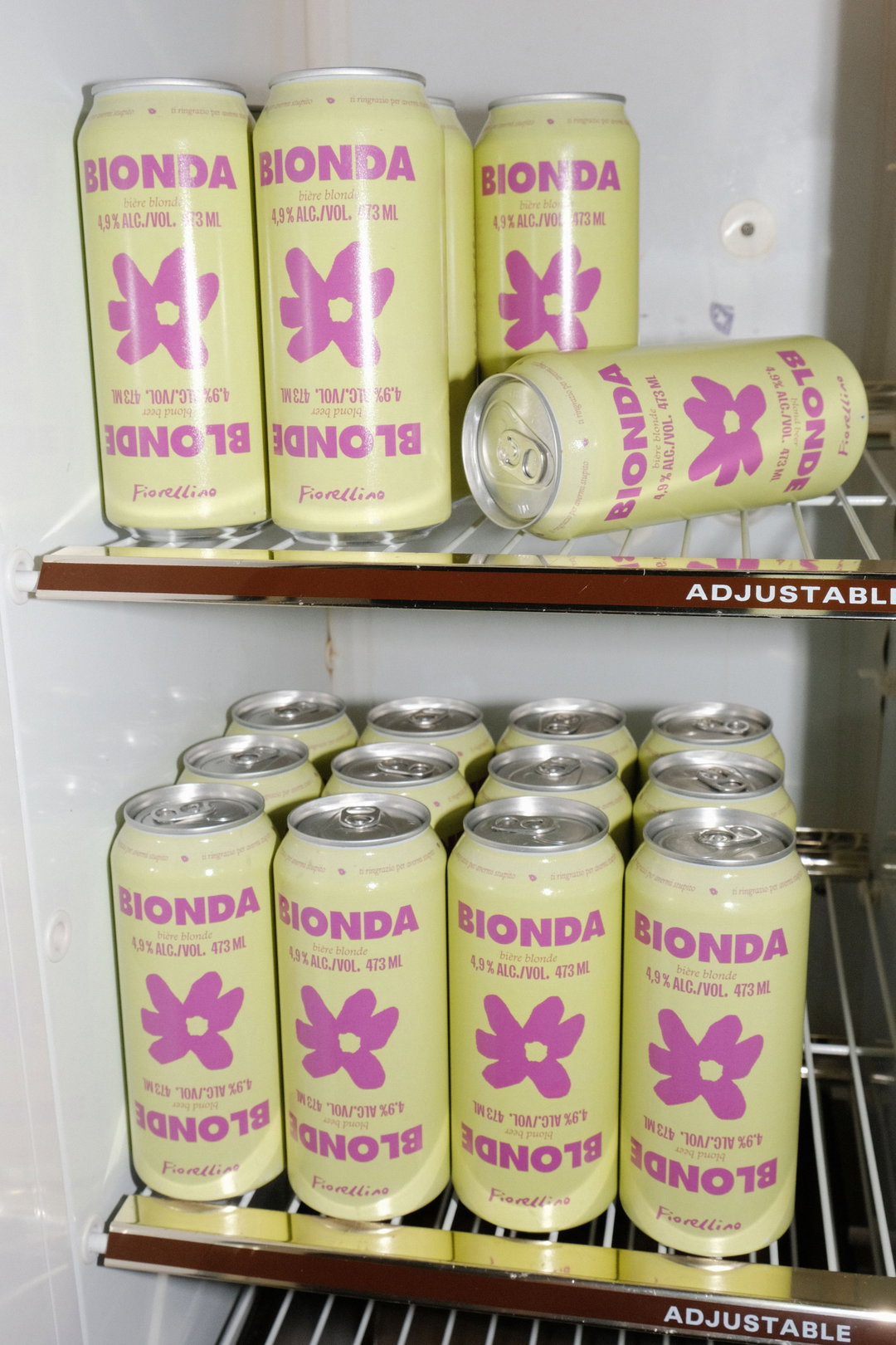
Several pale yellow cans of “Bionda” beer are arranged on two wire fridge shelves. Each can features a purple flower illustration and the word “Blonde” printed upside down.

AWP’s brand identities need to be “gritty and disruptive – or it’s not ours”

The Montréal-based independent studio is building unique visual personalities by finding a wide range of inspiration outside of the design world.

—
Date
30 July 2024

AWP (As We Proceed) is the kind of studio that looks like it’s having heaps of fun. Co-founded by creative directors Emanuel Cohen and Mariane Vaillancourt, the independent design firm is what the duo describes as their shot at “building something different together” — having gravitated around each other’s creative worlds for a little while.

With a spirit for all things design, “a raptness for storytelling and a particular affection for street culture”, the pair have been finding joy in building beautiful brand identities, in their multidisciplinary team. “Our eclectic backgrounds combine strategy, ideation, design, craftsmanship, art direction, photography, psycho-sociology, art history, sports and music – anything AWP puts forth carries depth and strives to bring rapture,” says Emanuel. “It needs to be gritty and disruptive or it’s not ours. Regardless of context, space or subject, we’re here to build unique visual personalities and voices.”

AWP’s research methods often pushes the team to find similarities between their “projects core” and other “unrelated subjects”, so they frequently find themselves “diving into unexpected realms” with their branding endeavours and finding inspiration in places just outside of the creative world, says Mariane. For instance, barber shops and whiskey informed its recent visual identity for dental clinic Maison Dentaire.

When it comes to creative inspiration, most of this happens outside of office hours at AWP — and most importantly offline. “Detaching from our design world and daily tools is essential in maintaining our creative clarity”, says Emanuel. “What do you do when you’re not working? is one of our favourite questions to ask when meeting new people. AWP’s body of work is definitely coloured by the people behind it. Whether it’s the graphic language, tone of voice, or photographic choices, projects exude codes that stem from music, sports, street culture, and self betterment.”
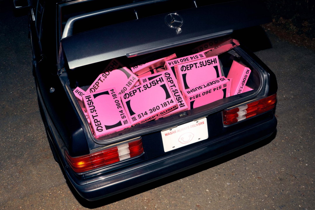
The boot of a dark Mercedes is filled with bright pink sushi boxes. The packaging features the brand “Dept. Sushi” and a telephone number.
Above

AWP: Dept.Sushi (Copyright © AWP, 2021)
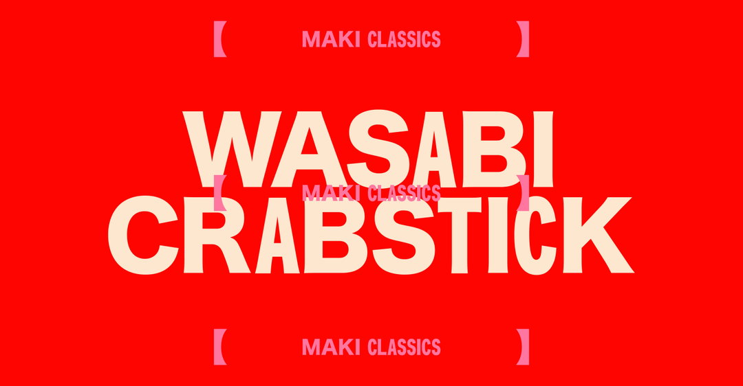
Bold cream typography on a bright red background reads “WASABI CRABSTICK”. The words “MAKI CLASSICS” appear in smaller text above and below the main title, framed by pink brackets.
Above

AWP: Dept.Sushi (Copyright © AWP, 2021)
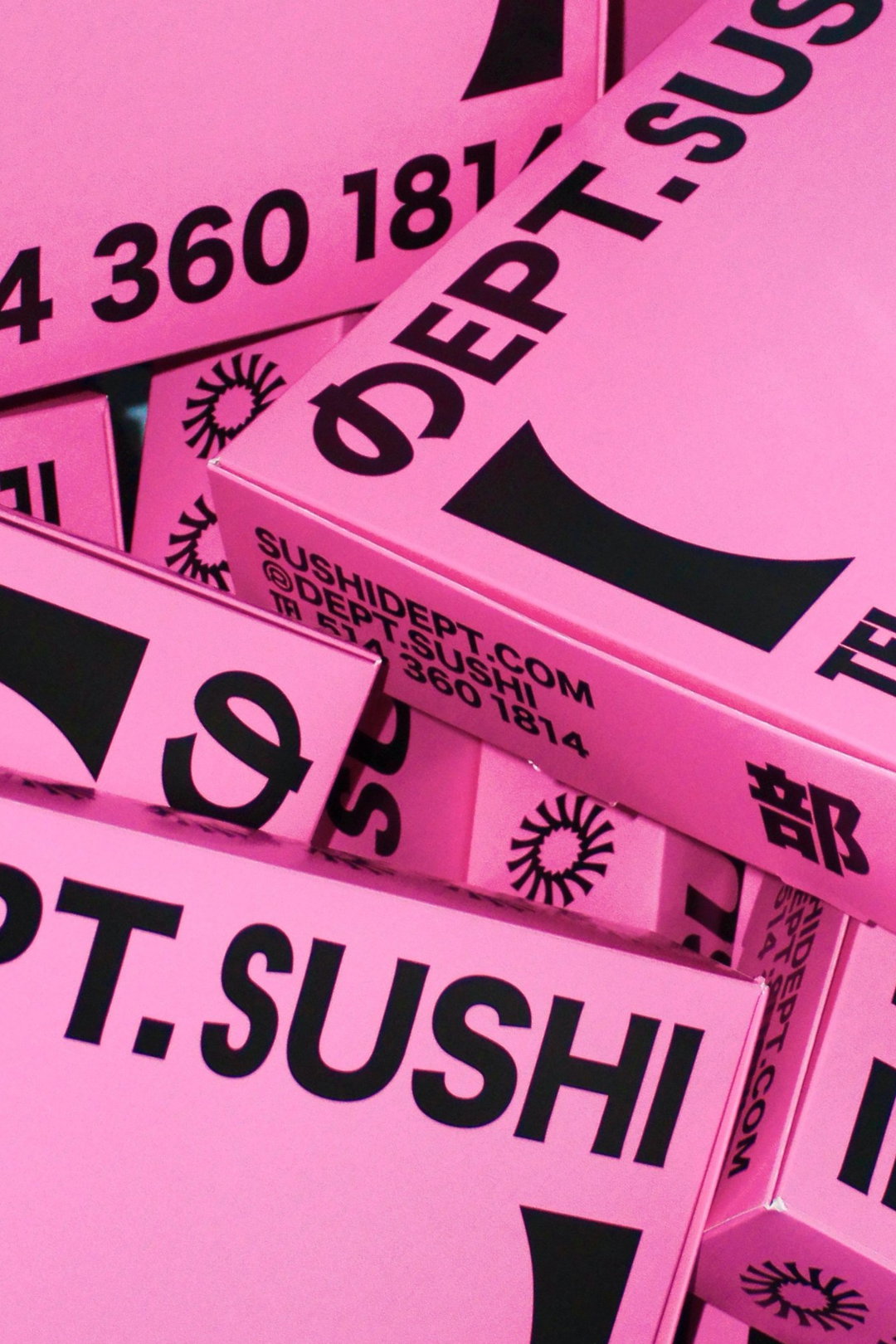
A stack of bright pink sushi boxes with bold black typography. The packaging features the brand name “Dept.sushi” and the website “sushidept.com”.
Above

AWP: Dept.Sushi (Copyright © AWP, 2021)
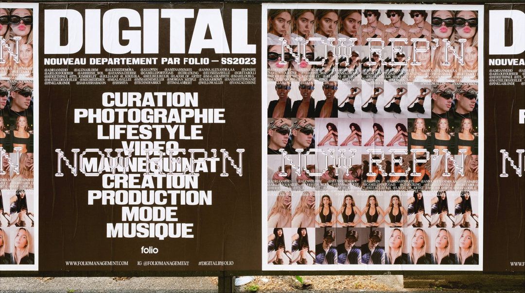
A large poster for Folio reads “DIGITAL” in bold white letters. Below, a list of services includes “CURATION”, “PHOTOGRAPHIE” and “MUSIQUE”, overlaid with the phrase “NOW REP’N”. To the right, a grid of repeated portrait photographs shows various people in different poses.
Above

AWP: Digital (Copyright © AWP, 2023)

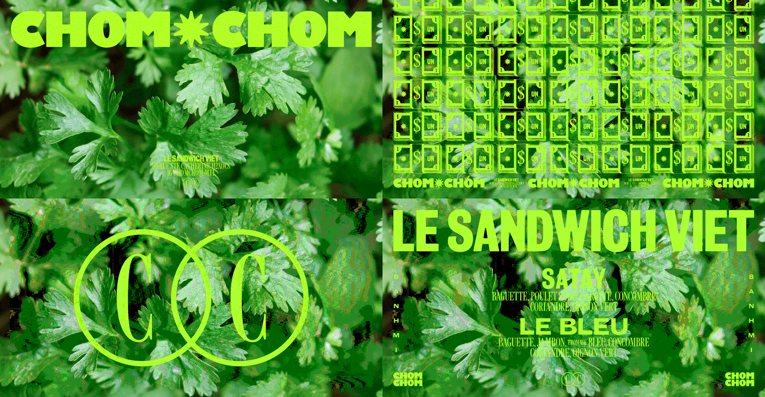
An animation in which lime green text and graphics flash over a background of fresh coriander leaves. It features the words “CHOM CHOM” and “LE SANDWICH VIET”, alongside a grid of banknotes and a logo of two interlocking circles containing the letter “C”.
Above

AWP: Chom Chom (Copyright © AWP, 2024)
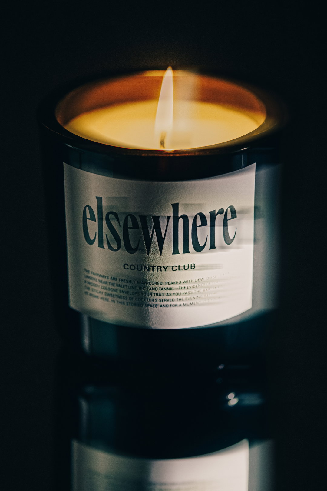
A lit candle in a dark glass jar, its flame casting a warm glow over the wax. A white label on the front reads “elsewhere” and “COUNTRY CLUB”, followed by a short paragraph of descriptive text.
Above

AWP: Elsewhere Fragrances (Copyright © AWP, 2023)
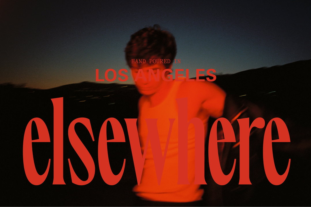
A blurred figure in a red top stands against a dark, hilly landscape at dusk. Bold red text laid over the image reads “elsewhere”, with smaller text above it stating “HAND POURED IN LOS ANGELES”.
Above

AWP: Elsewhere Fragrances (Copyright © AWP, 2023)
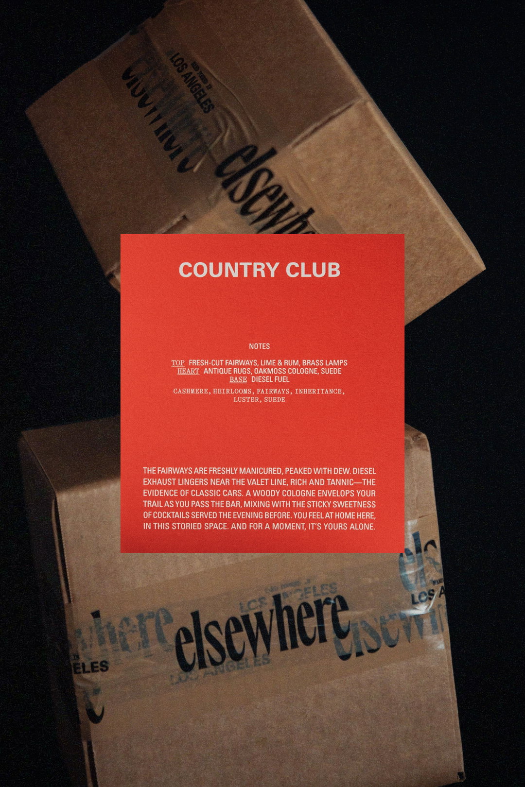
A bright red card reads “COUNTRY CLUB” in bold white capitals. Below, a list of fragrance notes includes “fresh-cut fairways, lime & rum” and “antique rugs, oakmoss cologne, suede”. The card sits atop two brown cardboard boxes branded with the word “elsewhere” and “Los Angeles”. A short paragraph of descriptive text at the bottom of the card evokes the atmosphere of a manicured golf course and classic cars.
Above

AWP: Elsewhere Fragrances (Copyright © AWP, 2023)
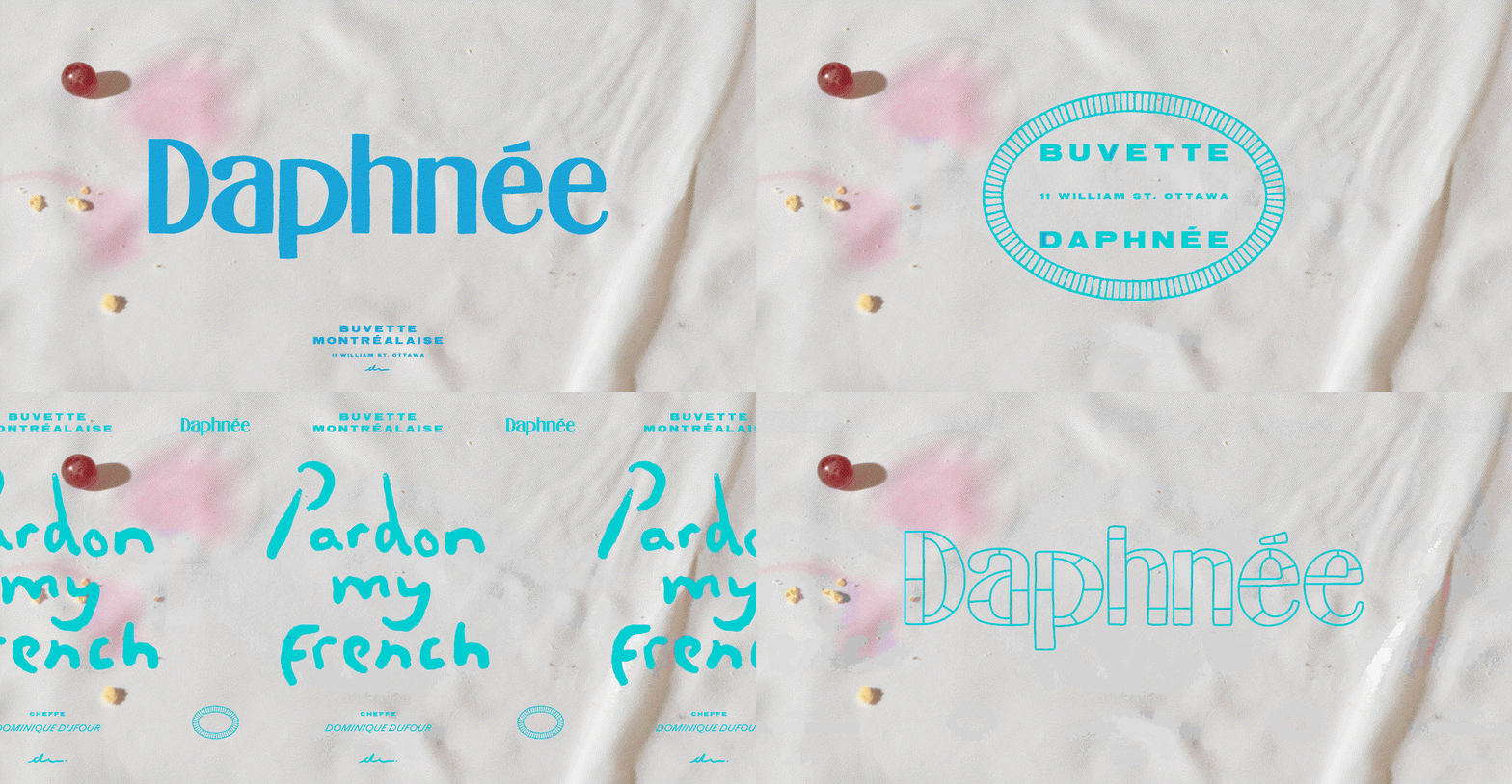
An animation in which blue text shifts over a white cloth backdrop with a red berry and food crumbs. The text changes between “Daphnée”, “Pardon my French”, and “Buvette Montréalaise”.
Above

AWP: Buvette Daphnee (Copyright © AWP, 2023)
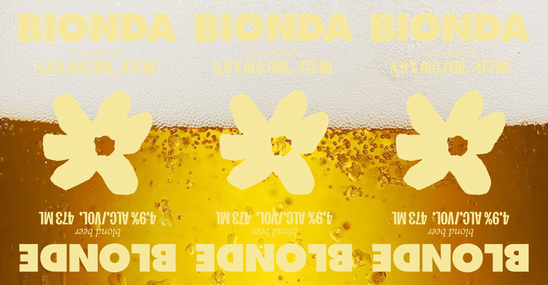
Three pale yellow flower shapes are arranged in a row over a background of golden beer and white foam. The image is mirrored, with the word “Bionda” appearing at the top and “Blonde” at the bottom. Smaller text reads “blond beer 4.9% alc./vol. 473 ml”.
Above

AWP: Fiorellino (Copyright © AWP, 2023)
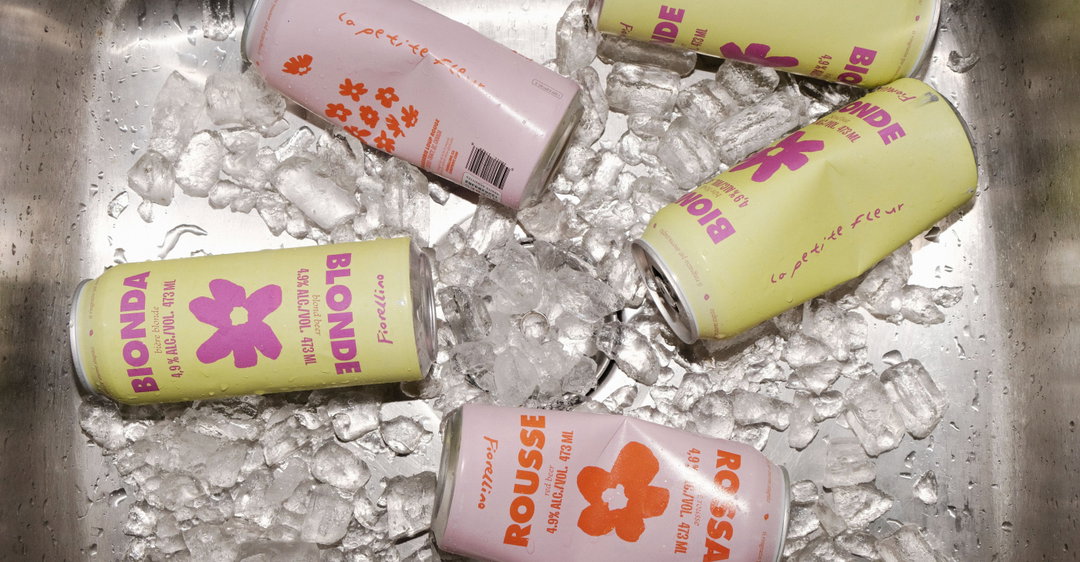
Five colourful beer cans are nestled in a metal sink filled with ice. The cans feature floral graphics and text including “Bionda”, “Blonde”, “Rousse” and “Rossa”.
Above

AWP: Fiorellino (Copyright © AWP, 2023)
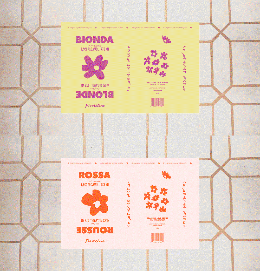
An animation in which a beer label on a tiled background changes colour and text. The yellow “Bionda” label with purple flowers switches to a pale pink “Rossa” label with orange flowers.
Above

AWP: Fiorellino (Copyright © AWP, 2023)
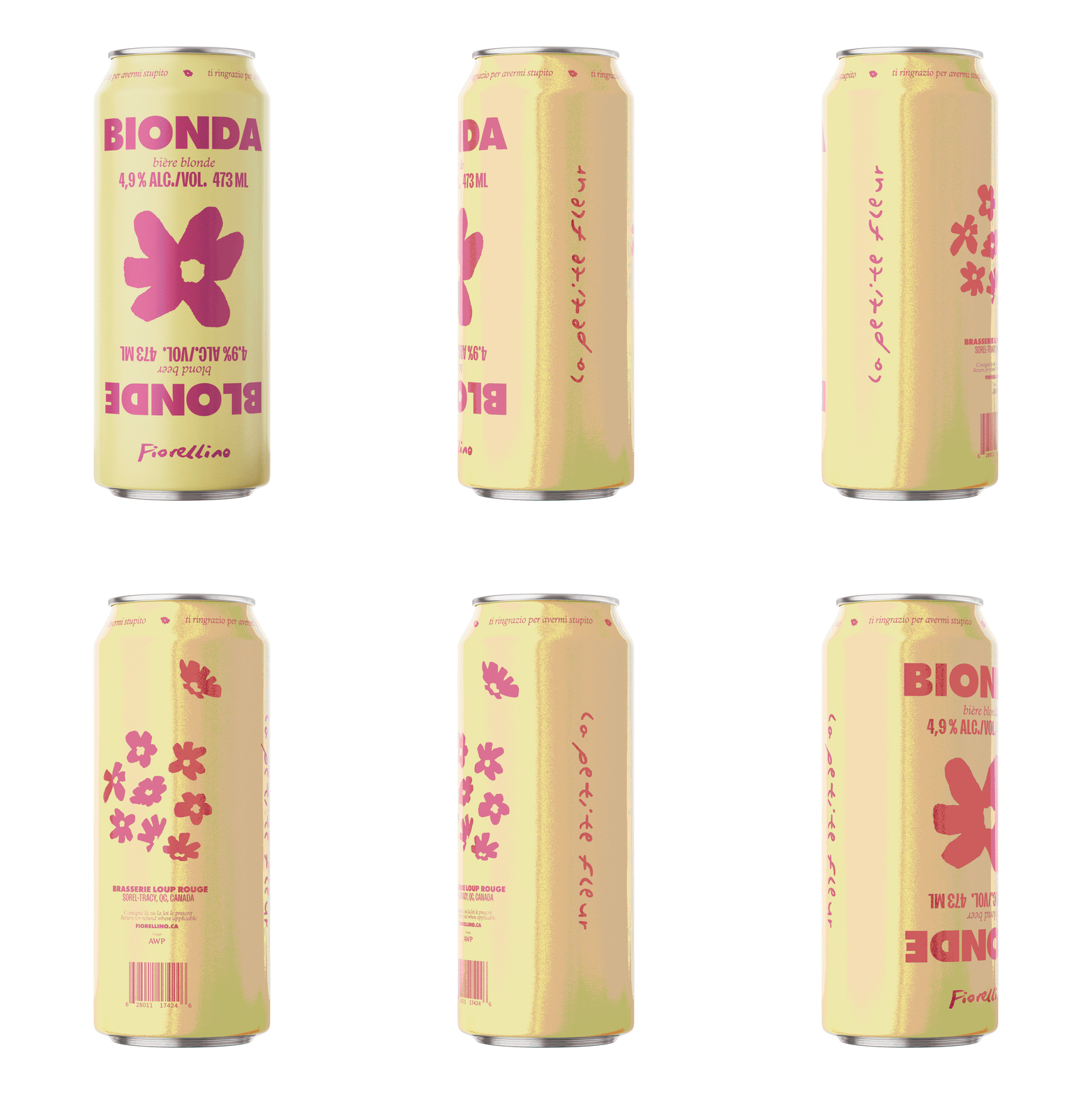
An animation in which a pale yellow beer can rotates to show its packaging. Pink text and floral graphics appear, including the brand “Onda”, the product “Fiorellino”, and the brewery “Brasserie Loup Rouge”.
Above

AWP: Fiorellino (Copyright © AWP, 2023)

Hero Header

AWP: Fiorellino (Copyright © AWP, 2023)

Share Article

About the Author

Ellis Tree

—

Ellis Tree (she/her) is a staff writer at It’s Nice That. She joined as a junior writer in April 2024 after graduating from Kingston School of Art with a degree in Graphic Design. Across her research, writing and visual work she has a particular interest in printmaking, self-publishing and expanded approaches to photography. ert@itsnicethat.com

To submit your work to be featured on the site, see our Submissions Guide.

It's Nice That Newsletters

Fancy a bit of It's Nice That in your inbox? Sign up to our newsletters and we'll keep you in the loop with everything good going on in the creative world.