




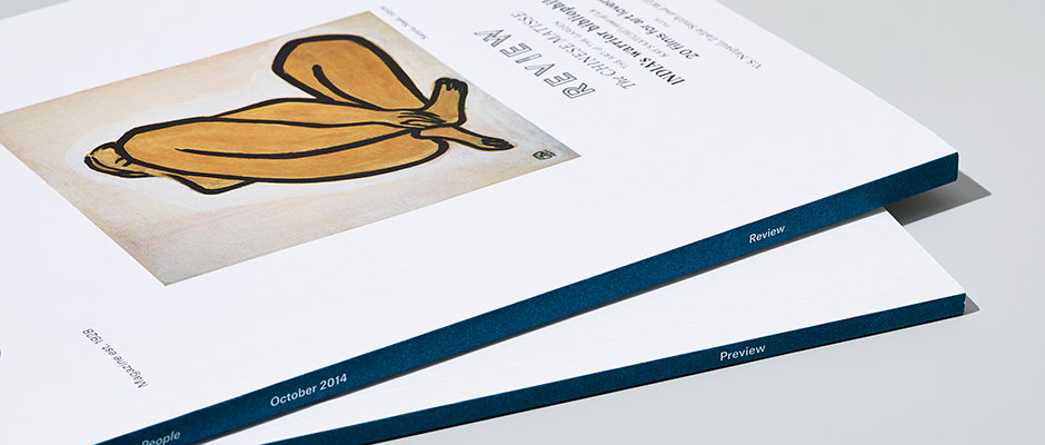
We talk to David McKendrick about the new-look Christie's magazine
When David Mckendrick told us he was leaving Esquire and setting up a new venture with Wallpaper* art director Lee Belcher, we were fascinated to see what the fruits of such a top-notch collaboration might look like. Last week we got our answer, when a copy of the new Christie’s magazine came dropping through our letterbox.
Now working together as B.A.M., they have redesigned the august auction house’s publication into something “clear and concise, elegant and sophisticated” and have actually split the title into two; one magazine carries editorial features and the other is a more hard-nosed look at up-coming sales and auctions.
Bound together with a smart cover band, this seemingly simple decision is actually very clever, as it allows the team to to pursue two quite conflicting editorial aims without impinging on the other. We caught up with David to find out a little more…
You left Esquire and Lee left Wallpaper* to set up B.A.M. – what kind of pressure does that bring with it?
Lots of very different pressures. We both had great jobs and decent salaries, so it was a bold move to leave all this behind and set up B.A.M. We had to grow quite quickly, and the general day-to-day running of a studio takes up a lot of time, but when it’s your own baby it doesn’t really feel like work.
We have taken on some key people that allow us to do what we are good at. Being honest, none of it really seems like pressure – we are having a great but busy time. We are eight weeks old and have some top projects and clients. We have had the classic moment of saying: “Why didn’t we do this five years ago.”
Oh, I’ve just remembered one of the biggest pressures – dealing with Brenda, our bank manager. She is as useful as a chocolate fireguard.
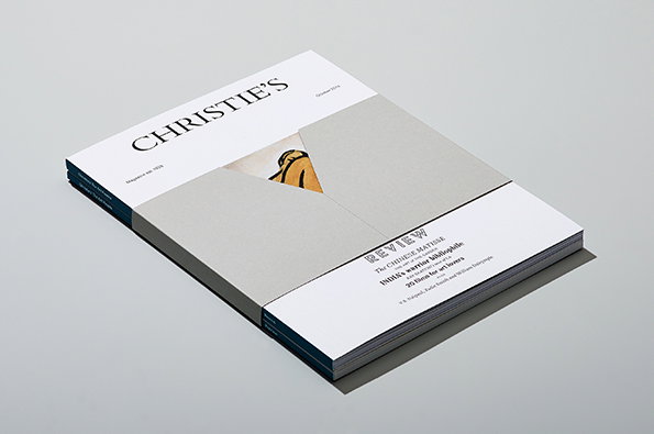
B.A.M London: Christie’s magazine redesign
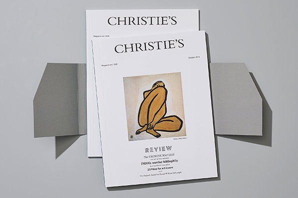
B.A.M London: Christie’s magazine redesign
Do you have similar ways of thinking about design or is the exciting part of the collaboration that you come at it from different angles?
Yeah, different angles – "Lee does all the work, I fuck about all day…” (his words, not mine). But seriously, we have a very similar, unpretentious, approach to art direction and design, but we bring different skills to the table that make each project better for it. We have different practical strengths too, but having the same strong beliefs about what good design and art direction is, makes working together easy.
Tell us about how the Christie’s commission came about. It’s been done by some pretty big-hitters in the past hasn’t it?
Our good friend and ex-Esquire boss, the mighty Jeremy Langmead, is now CCO at Christie’s. He knew that we had plans to start B.A.M. so he offered us the gig of relaunching Christie’s magazine. It was an amazing opportunity to redesign such a high-profile product. It also gave us the opportunity to leave full-time employment without going bankrupt.
As for the big-hitters in the past, I’m sure there have been but we didn’t look at the recent history of the magazine. Instead we delved a wee bit deeper into the Christie’s archive, which dates back to 1766. This is where we found our inspiration.
"I haven’t been in the fakes room yet myself, but there is one and when I get in there I will report back. I fancy a Rembrandt for my flat."
David Mckendrick
You said the magazine was the result of six weeks no sleeping; why was it such an intense job?
The simple work load of redesigning, commissioning photography and illustration in different parts of the globe, changing format, paper stocks etc. We had to be on it 24/7, from leaving Esquire and Wallpaper* on a Friday and hitting the ground running on the Monday with the redesign. It was also our first job as B.A.M. so it had to be up to scratch. We got some of the best photographers and illustrators on board too which takes quite a bit of effort.
Finally, what does B.A.M. stand for?
It has a double meaning. The first simply being our surnames, Belcher And Mckendrick. The second you would only really understand if like me you grew up in a rough part of Glasgow. Maybe try Googling it….
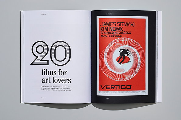
B.A.M London: Christie’s magazine redesign
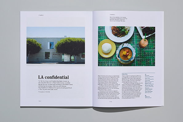
B.A.M London: Christie’s magazine redesign
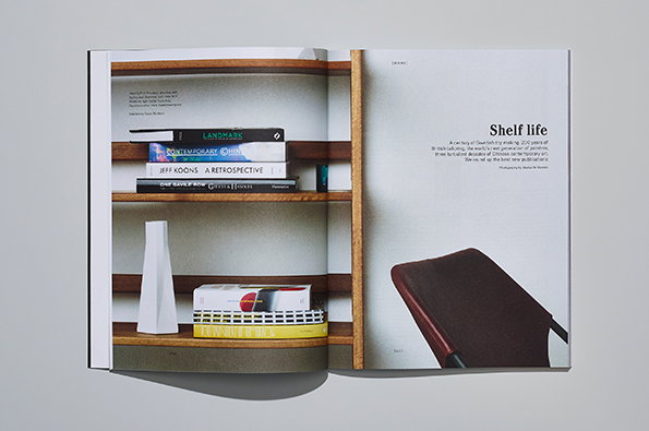
B.A.M London: Christie’s magazine redesign
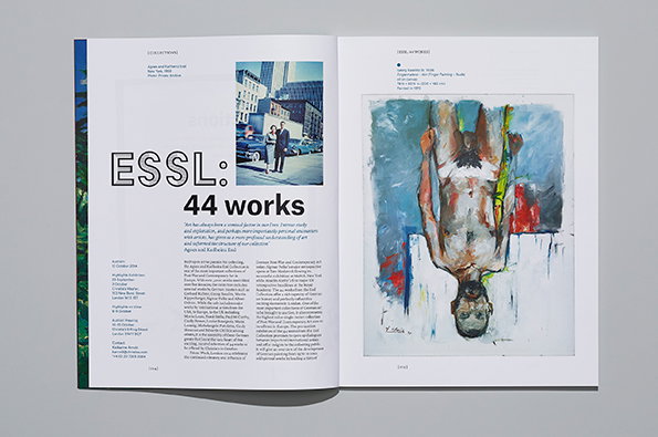
B.A.M London: Christie’s magazine redesign
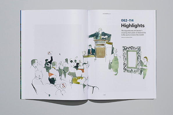
B.A.M London: Christie’s magazine redesign
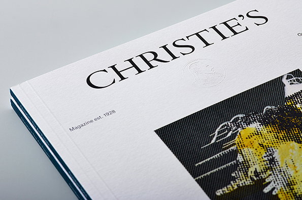
B.A.M London: Christie’s magazine redesign
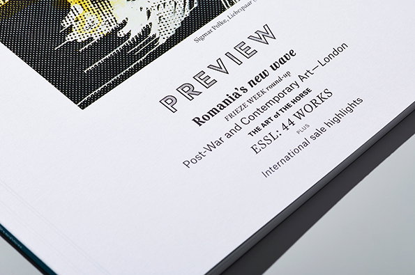
B.A.M London: Christie’s magazine redesign
Share Article
Further Info
About the Author
—
Rob Alderson is a freelance writer, editor and strategist. He was previously editor-in-chief of It’s Nice That and WePresent, and editor of Design Week. He publishes the newsletter Undo, which tries to make sense of how AI is changing design work, the design process and the design industry.



