“Less bank, more life”: Barkas gives Nigerian digital bank Kuda an identity with the pace of Lagos
Spanning chunky geometric letterforms, a custom Naira sign and hand-drawn illustrations, the new brand moves Kuda on from its challenger days.
Open a banking app and there’s a decent chance you’ll be met by the same cast of characters: a soft gradient, some pastel colours, a friendly sans serif and a flat illustrated person gesturing at a phone, maybe with a suspiciously welcoming half smile. Over the last decade, the challenger-bank look has hardened into a house style of its own, making everything look same-y with as little personality as is legally possible (and probably – most likely – AI generated). A few have wriggled out of it over the past few years, like Monzo who enlisted Ragged Edge to warm things up back in 2022, and Wolff Olins who the same year gave DailyPay a logo shaped like a coin mid-toss.
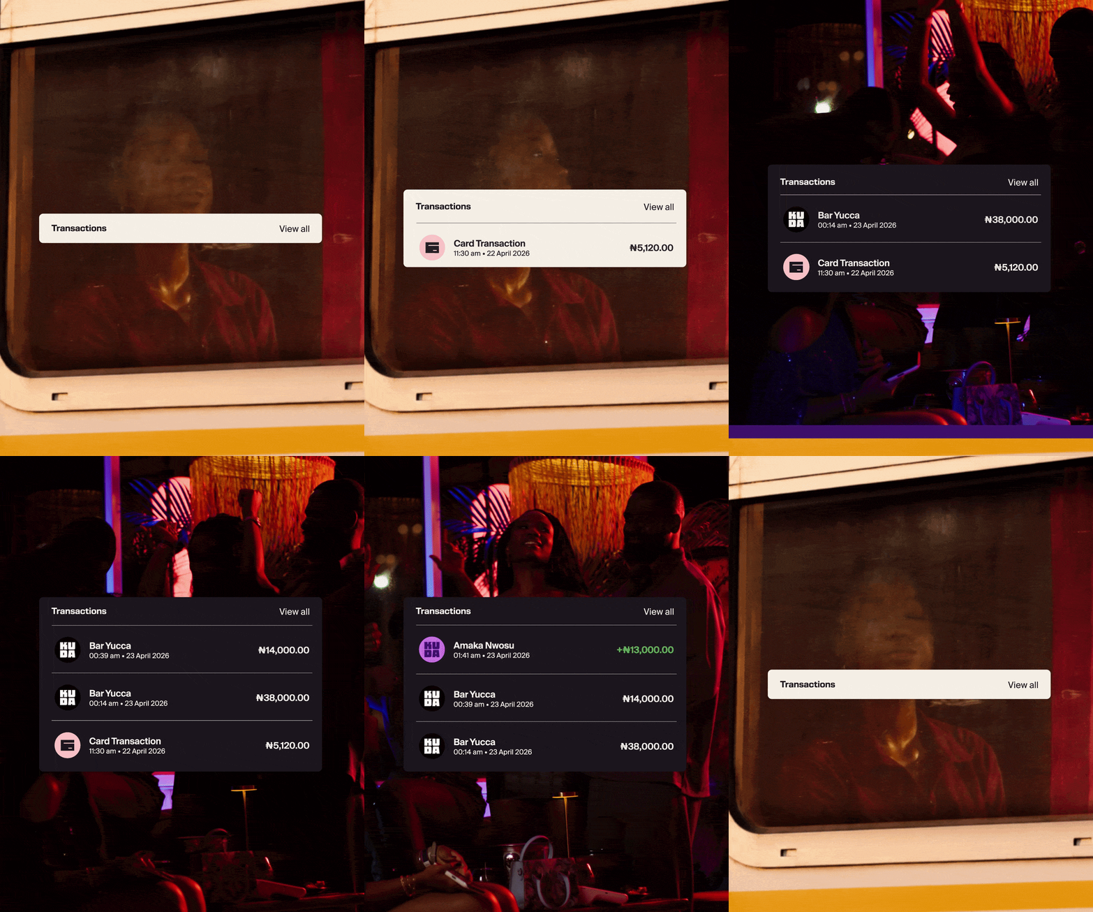
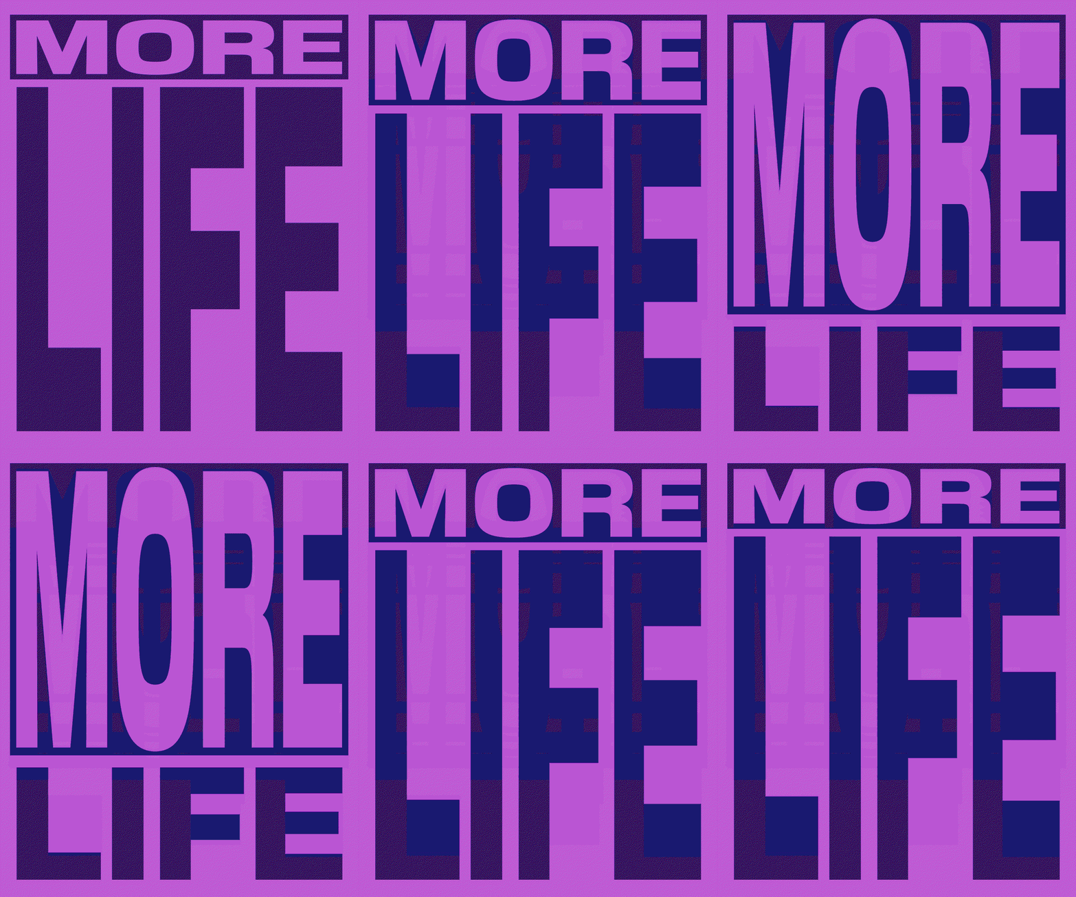
Today, Kuda joins the conversation from Lagos. Created with independent creative company Barkas, the Nigerian digital bank’s new identity spans strategic positioning, brand identity, website design and implementation across product and marketing, covering its personal and business banking. At the heart of it all is the saying ‘More Life’, which borrowed its name from a Jamaican slang phrase for wishing someone well, popularised by dancehall artist Vybz Kartel. “Born in Jamaica and now used globally, the phrase carries a universal wish for abundance – one Kuda’s audience already live and speak through music, conversation and aspiration,” says Luca Rasmussen, partner at Barkas. “In a category obsessed with features and finance jargon, it gives the brand something more human. The visual identity expresses this through vibrancy and real, everyday snapshots of life, capturing the momentum, confidence and pace of Lagos.”
Barkas: Kuda (Copyright © Barkas, 2026)
Kuda was founded in 2019 by Babs Ogundeyi and Musty Mustapha, and launched as the “bank of the free”, with zero fees on cards, account maintenance and transfers. Seven years on, the new kid on the block has grown up, and now counts millions of customers. Barkas’ brief was to help it move up the lagger from challenger to established, to become more culturally relevant and to authentically represent contemporary Nigerian youth – “a new generation of aspirational Africans who are digitally savvy and intentional with their money,” says the release.
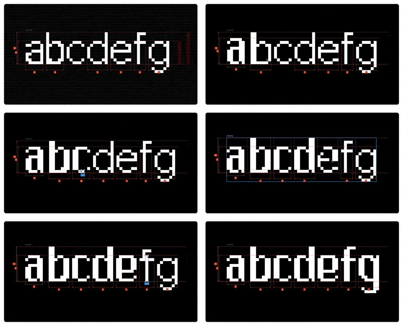
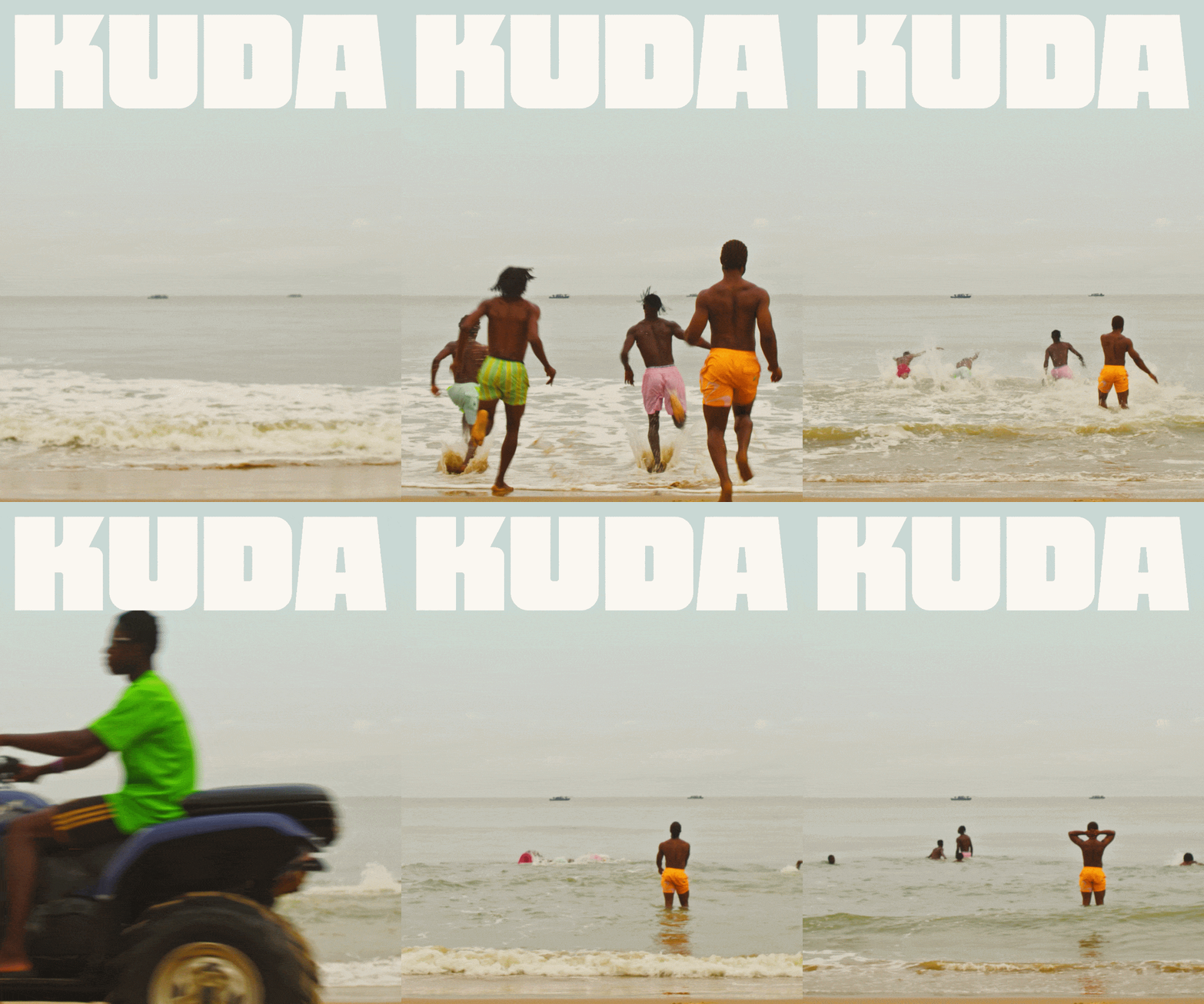
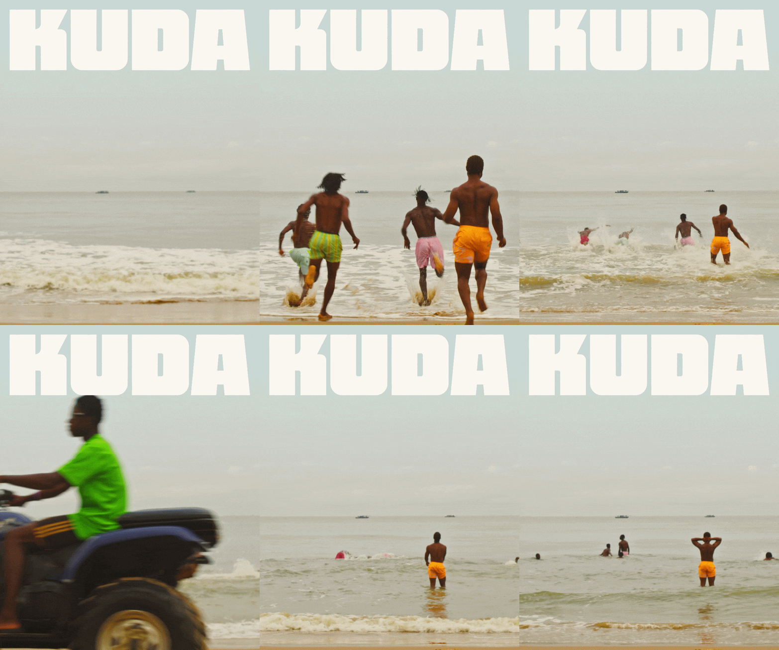
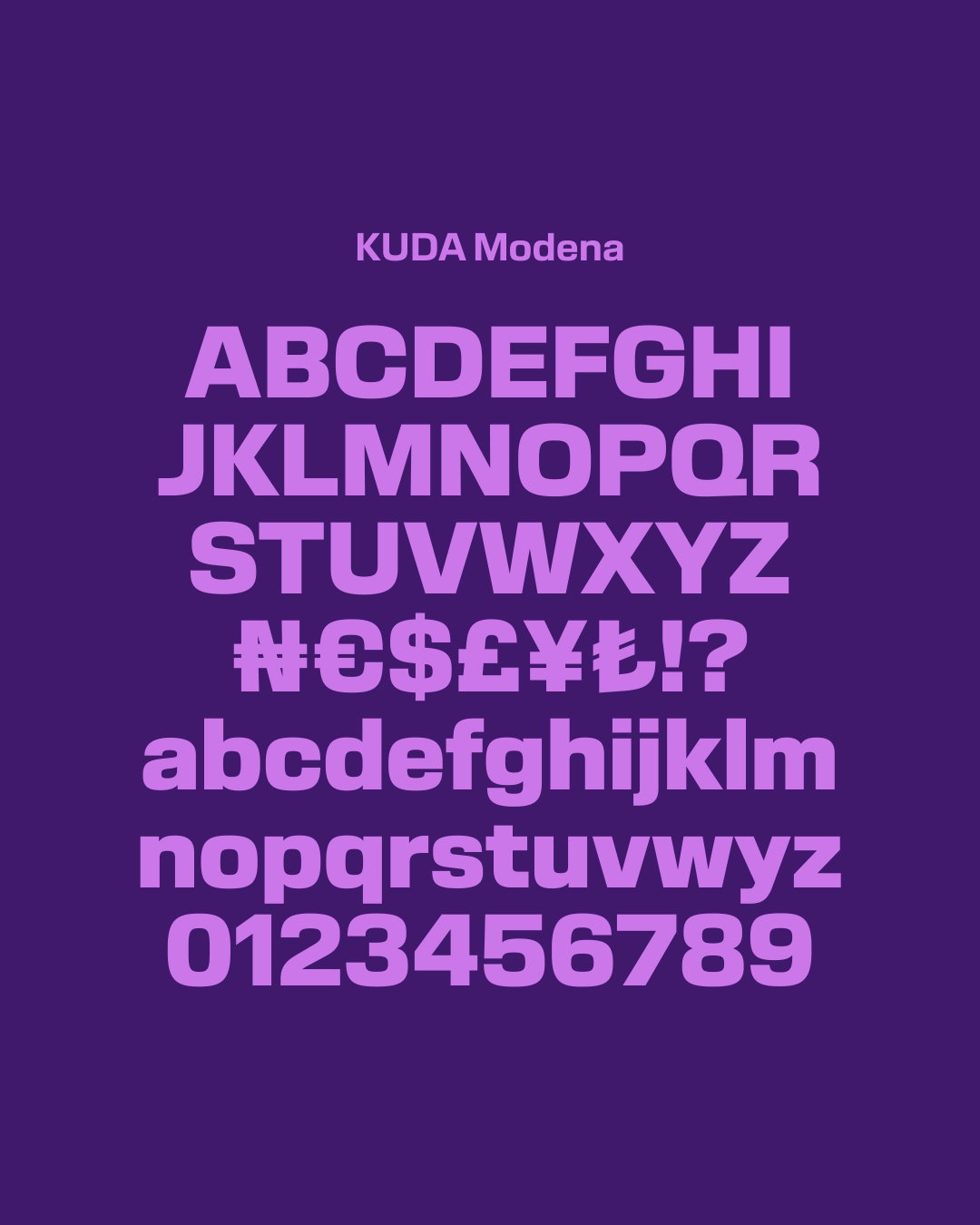
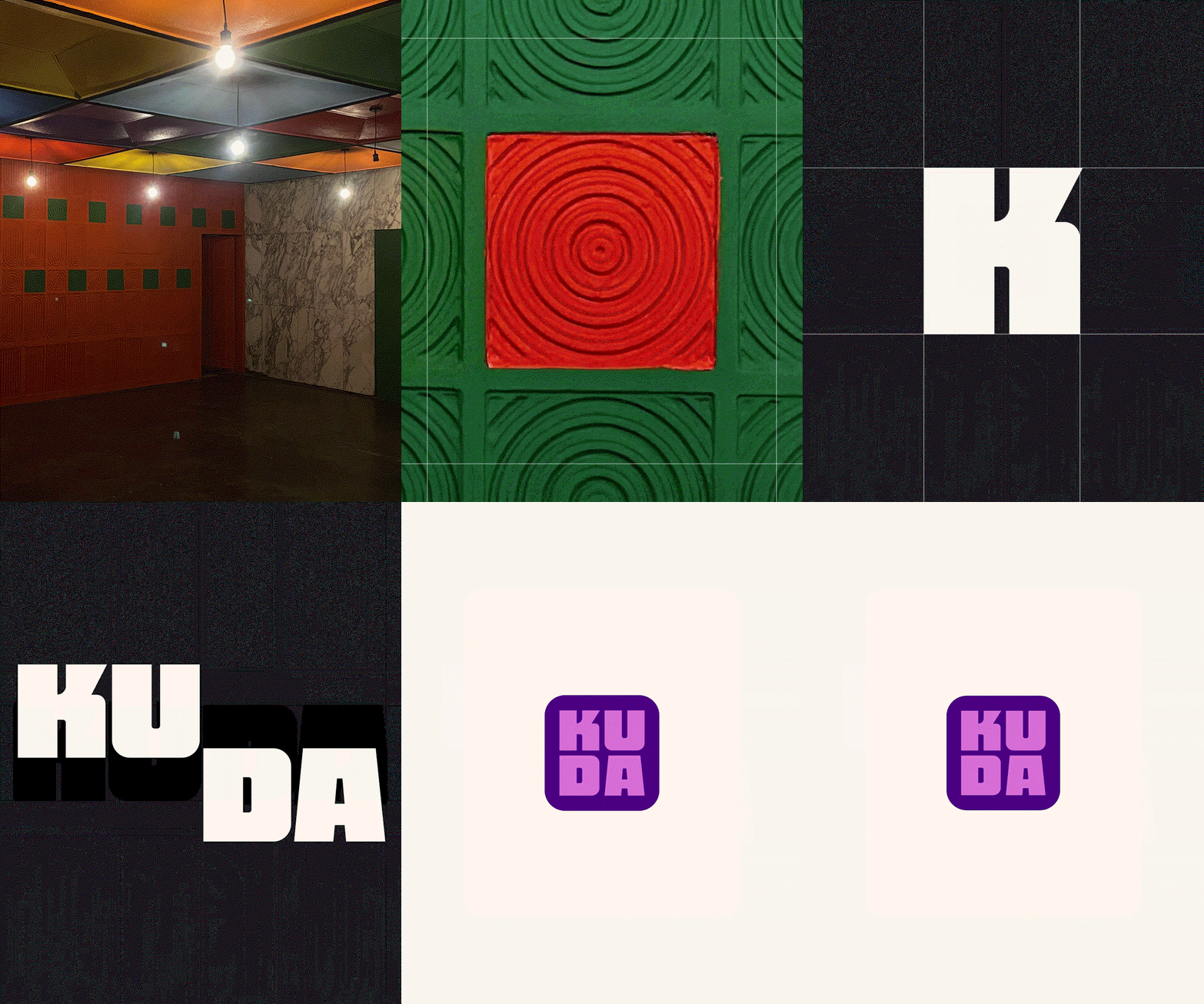
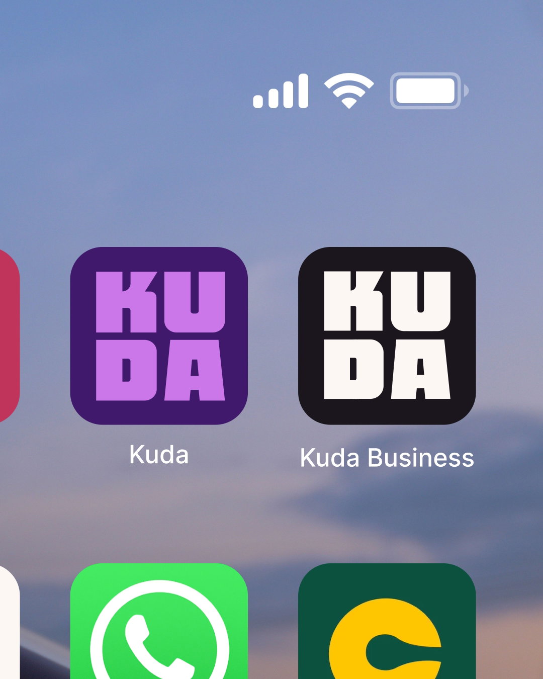
So what does that look like? Loud, purposeful, chunky and absolutely void of any gradients or uneasily happy looking characters. The new logo sees Kuda’s short, memorable name in thick, geometric letterforms inspired by Nigerian art and architecture – the stacked KU over DA is like a stamp, with four iterations developed for legibility and flexibility. The personal banking identity is splashed in a deep purple, while Kuda Business is in black as a sharper and more serious contrast. There’s also a custom Naira sign, created with local partners to reflect Nigerian culture, and a bespoke typeface specimen labelled Kuda Modena, which is designed to cut through the conservative aesthetics of the banking industry. The layout system is modular, drawing from grids and forms rooted in the same local references.
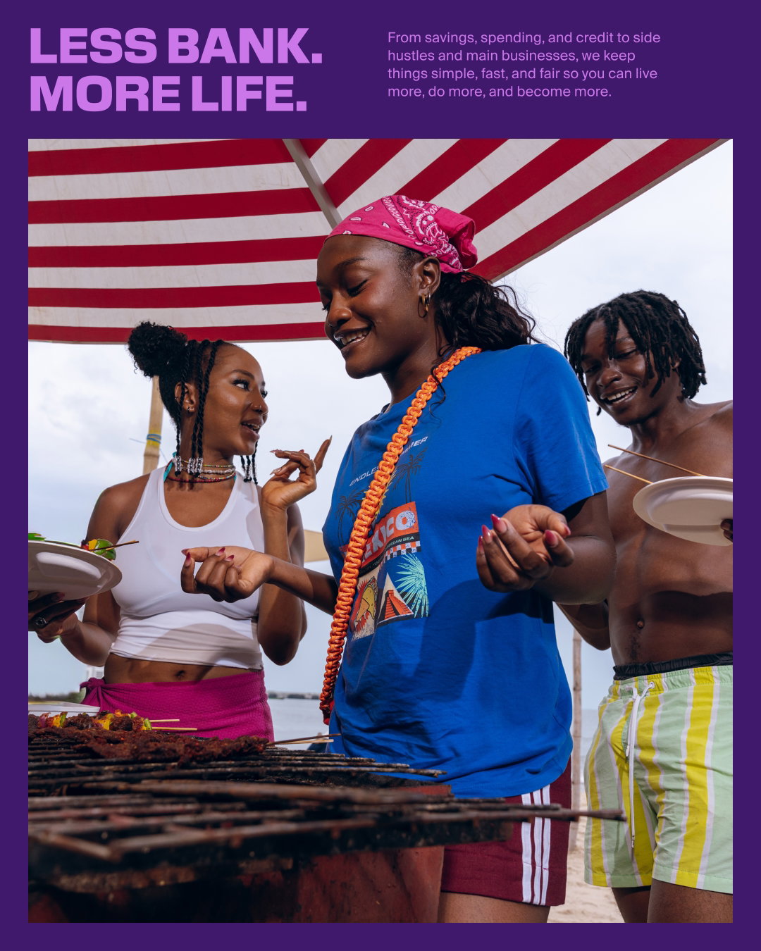
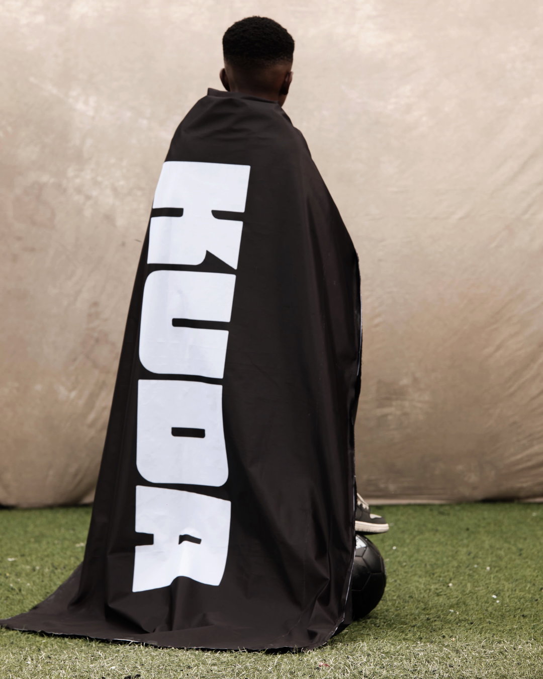
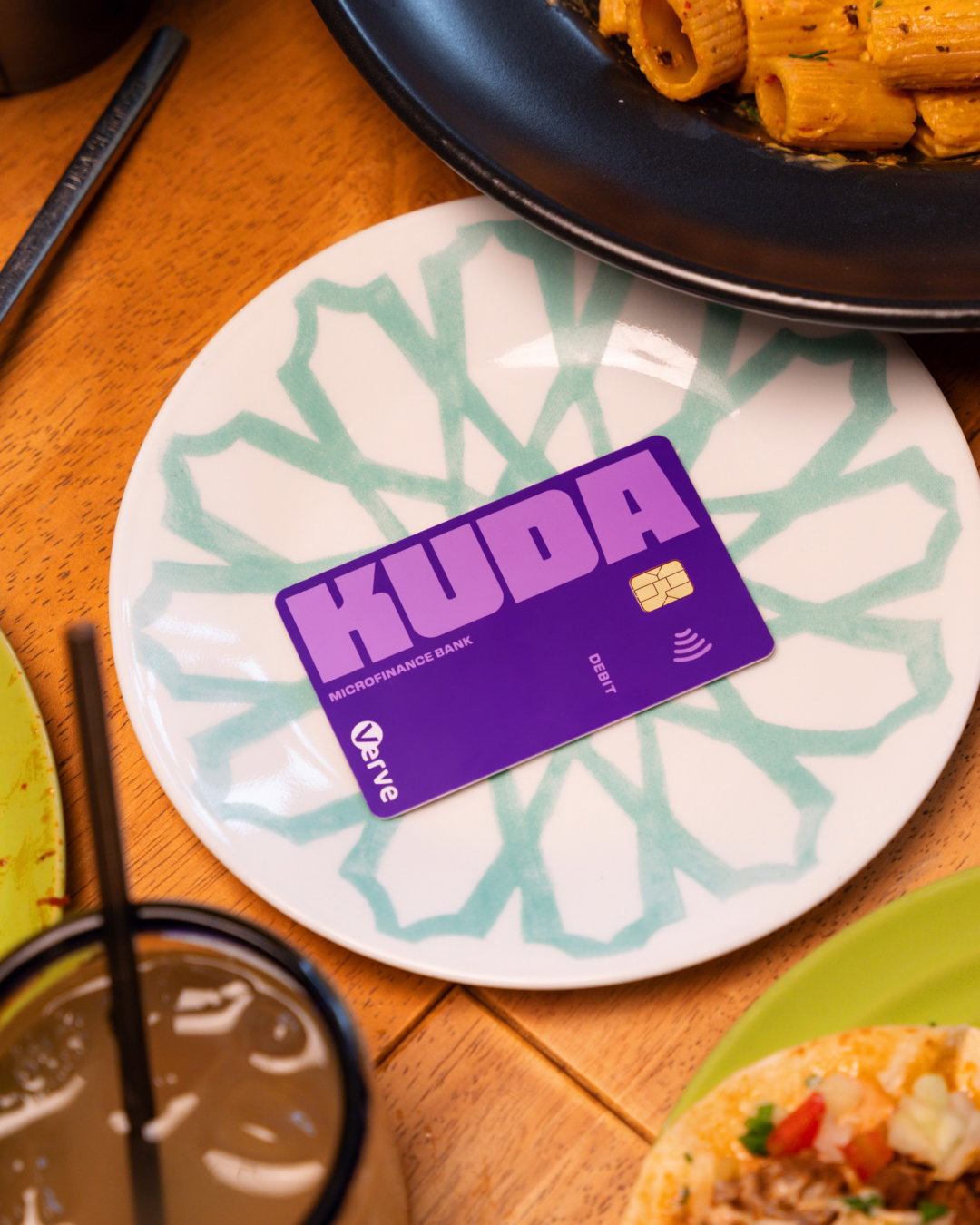
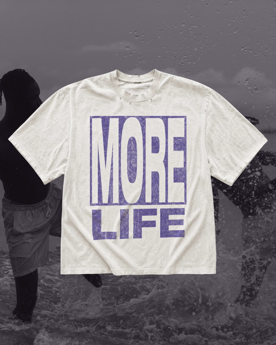
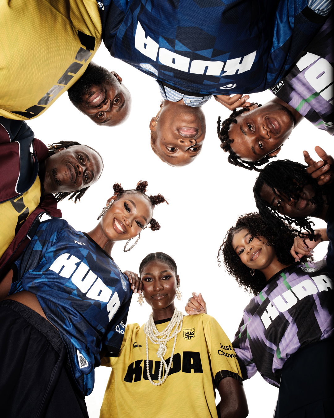
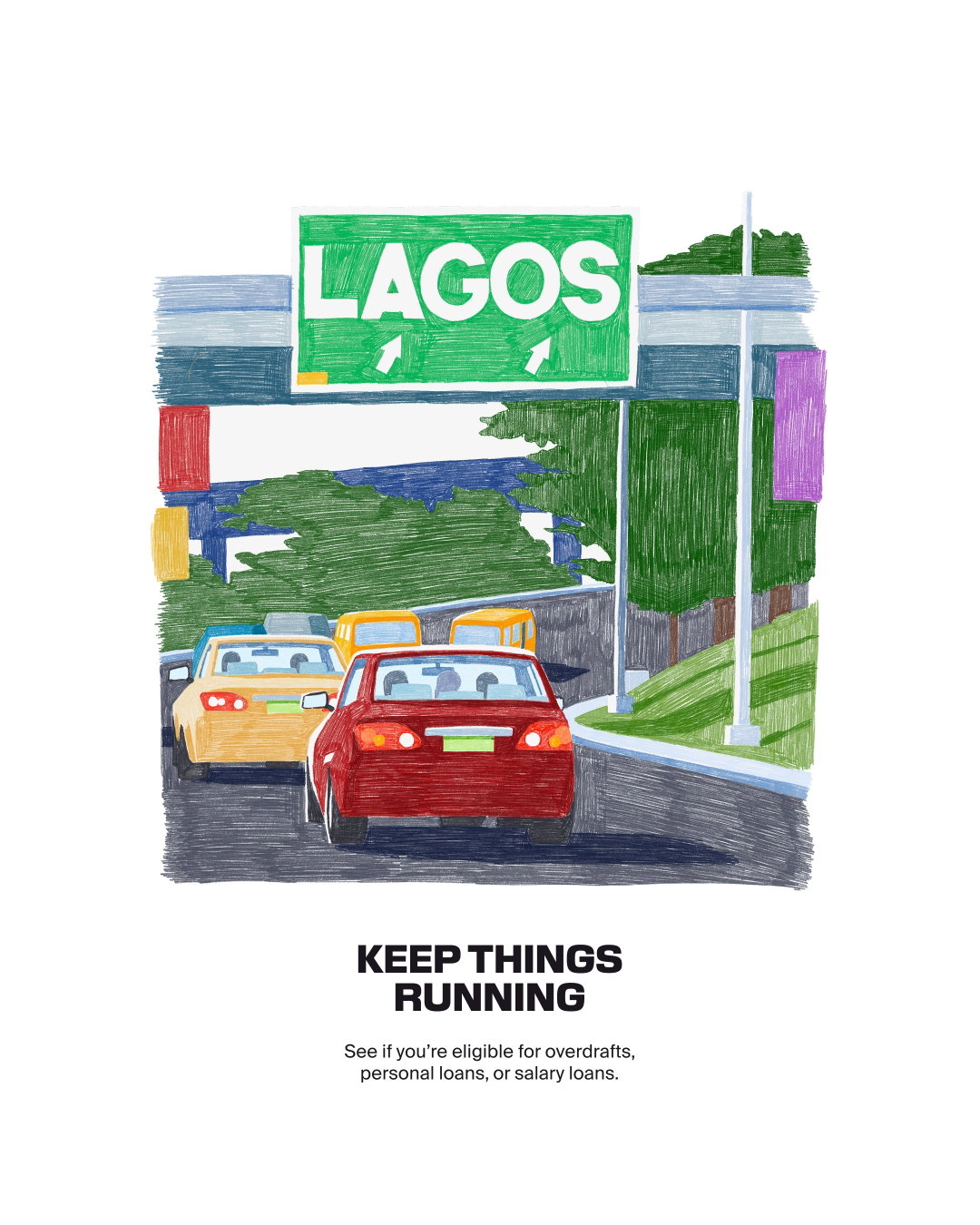
Barkas also worked with local Nigerian photographers to capture documentary-style, unfiltered moments like friends sharing plates at a barbecue, a huddle of people in football-style kits, a figure wrapped in a black Kuda flag and a monochrome beachscape where a ‘More Life’ tee looks right at home. Even the bank card gets a scene, resting on a patterned plate among a spread of food, which is a pretty good way of telling people their money is for dinner. There’s also hand-drawn illustrations which add a dose of warmth and playfulness – in one, there’s a Lagos road scene of crowded traffic and a green city sign that carries the line ‘Keep things running’, acknowledging the go-slow for an overdraft ad. And lastly, motion design has been used to represent the movement and energy of Lagos, giving the identity a city-like rhythm of its own.
“The result is a bold, distinctive brand that feels authentically Nigerian and gives Kuda a stronger platform for growth,” says Romney Taylor, VP of marketing at Kuda. “We re-positioned Kuda for a very specific audience, and it has driven the customer behaviour you dream of from a rebrand: account openings and transactions are up, dormant customers are reactivating and deposits are flowing in.”
When looking at the system in full, what’s striking is that Barkas hasn’t tried to make Kuda look more like a bank, or less like one in the usual pastel way. It’s looked outside to the music, streets, architecture and the slang its audience already knows, speaks and lives in. As Babs Ogundeyi, group CEO of Kuda, puts it: “Life in Nigeria moves fast – it’s full of hustle, ambition and creativity. But for too long, banking hasn’t kept pace. It stopped seeing the human behind the account number and the dream behind every Naira. It stopped seeing life.”
GalleryBarkas: Kuda (Copyright © Barkas, 2026)

Hero Header
Barkas: Kuda (Copyright © Barkas, 2026)
Share Article
About the Author
—
Ayla is a London-based freelance writer, editor and consultant specialising in art, photography, design and culture. After joining It’s Nice That in 2017 as editorial assistant, she was interim online editor in 2022/2023 and continues to work with us on a freelance basis. She has written for i-D, Dazed, AnOther, WePresent, Port, Elephant and more, and she is also the managing editor of design magazine Anima.