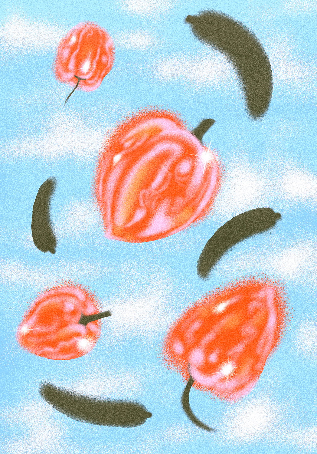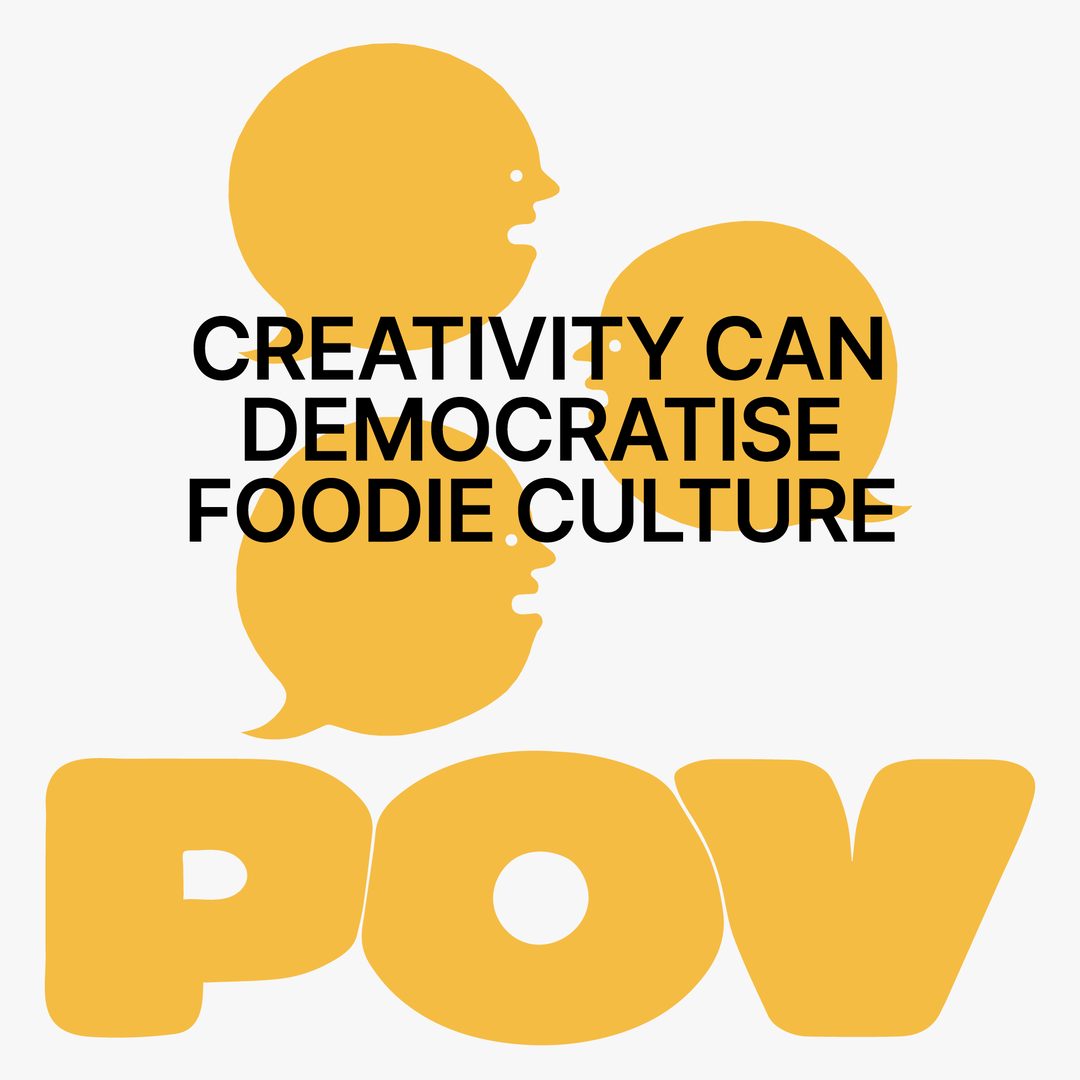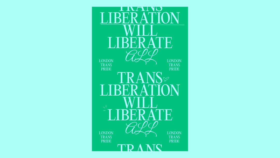
Graphic designer Ben Eli lovingly pays homage to pop and queer culture
With a stint at Depop and Wix Playground Academy straight out of graduating, there's no denying Ben's talents are one to watch.
Share
Born in Bradford and explanted to London, Ben Eli is the latest up-and-coming graphic designer to floor us with their talent. They’re a surefire product of their generation: creative origins rooted in the turn-of-the-century web builders Piczo and Freewebs, and a current aesthetic landscape which draws on the bright and pointedly-queer visuals of today’s pop zeitgeist. “It started when we would make ‘blends’ on Piczo and Freewebs, which were banners featuring celebrity photoshoots and a heavy use of Photoshop’s eraser tool and brushes with fonts from Dafont,” Ben explains to It’s Nice That. “I think it’s fitting that that’s where I got my start in graphic design, because even today I create work inspired by and featuring some of my favourite pop culture figures.” Harking back to the celebrity age of 2008 is a nostalgia that Ben carries through with them today, drawing not only on the visual qualities of said celebrities but also the resource sharing of fansites that were prevalent in tandem. “I feel like resource sharing is missing a little bit these days,” Ben says. With subsequent encouragement from their aunt and father, Ben pursued coding for websites, ultimately taking no formal training in graphic design until they enrolled at university. “I had a bit of a shock and found it a little difficult to navigate at first, as I was self-taught up until then.”
Now, Ben is a far cry from being inexperienced. They’ve landed successful stints as a junior graphic designer at Depop and recently graduated from the esteemed Wix Playground Academy. Their masterful control over typography and editorial design has catapulted them to a trajectory that we see as only going up from here. “I joined Depop right around the time we launched the new rebrand by DesignStudio, and as the only designer in-house it was my job to take that and really play with it and push it out into the world and figure out what we did and didn’t like,” Ben tells us. Ben found that designing for such an engaged and vocal community such as Depop was an endlessly rewarding experience. “They weren’t afraid to tell us what they did and didn’t like,” they say. “And I definitely think a lot of the work I did informed the basis for how I've developed my personal practice too.” Ben gushes admirably about their time at Depop and the team involved, and presumably, Depop were just as captivated by their creative capabilities as much as we are. Depop isn’t the only place that Ben recommends, however, as they talk lovingly of their time at Wix Playground Academy: “I couldn’t recommend it enough to any designer wanting to create an amazing portfolio site.”
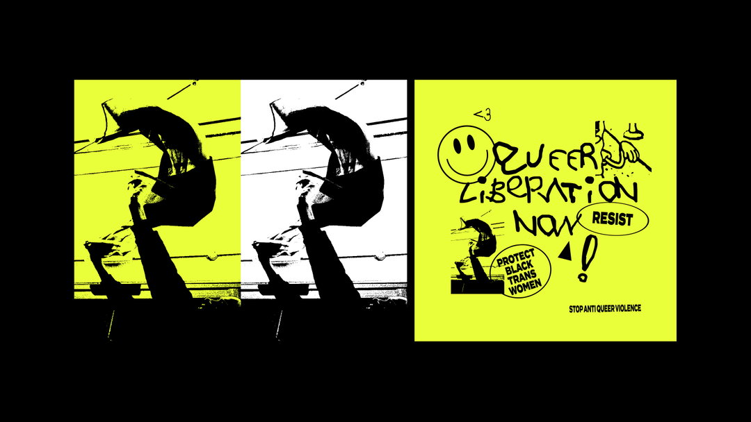
Ben Eli: Queer Liberation Now (Copyright © Ben Eli, 2019–2021)
The best part about Ben is that they’re still “learning and exploring” what their signature style may be. “That’s really important to me, rather than putting pressure on myself to develop a signature style that I'm known for,” they say. “But, I think there’s definitely a running theme of expressive and experimental typography running throughout my work, and that’s definitely something I think will always be present.” Whilst stretched out, ineligible typography is a recurrent motif in Ben’s work, their work is more about the essence and meaning than any given technique. “I want to move towards a practice that’s as much substance as it is style,” they add. Queerness in particular comes up in Ben’s work a lot, which they say is both a natural choice and a deliberate intention. “Our work is an extension of ourselves, so how could my work not feel and be inspired by queer culture?” At the same time, Ben feels there’s definite decisions made by themselves to focus on personal projects that inspire them, such as pop, music and LGBTQIA+ culture (or rather, a mix of all three). “I think at first I was a little hesitant to create work around these topics as it’s not something I really saw in these graphic design circles, but I reached a point where I felt really unashamed those were the worlds that inspired me and began to freely channel it into my work and share it more,” Ben says. “It’s like my work has had its own coming-of-age story alongside me.”
The designer’s commitment to queer stories doesn’t stop at the point of self-expression. “Design is always communicating, and you have the opportunity to make people reflect and think,” they explain. “So if I can I will use that opportunity to speak on those topics that are important to me.” Part of what makes Ben’s appeal as a designer so captivating is their ability to incorporate the message of the medium with fun pop culture references. “There’s such a rich history of visuals, performance, words and fashion in pop culture,” Ben explains. “The world-building by some of our greatest pop stars; Madonna, Gaga, Janet – I can’t get enough of it, I find a lot of excitement and inspiration in the way these pop artists do world-building and create eras out of their album cycles, and then reinvent themselves for the next one.” It’s a trait that Ben wants to encapsulate in their own work: expansive projects with multiple layers, reinventing themselves and trying new things. “So I would say I'm not only inspired by looking at traditional graphic design, it’s a lot more about channeling the excitement and energy I take away from these artists into my own work too.”
Now in the midst of developing their graphic design career, Ben is broadening their horizons. “I want to paint more, I want to sculpt, I want to photograph,” they tell us. “Basically getting more hands on, more analogous.” They’ve been finding renewed inspiration from the likes of Tracey Emin, Cecily Brown, Reginald Sylvester II and Maggi Hambling to help them incorporate the physical into the digital. “Moving into the industry I lost an element of physicality in my practice, so I definitely want to get my hands dirty again,” they explain. “Over the past year with the pandemic, I definitely fell into a burnout with the social rat race of feeling that pressure to share work constantly on Instagram so I've taken a step back from that.” They’ve honed in on their otherwise erratic artistic process, using their discipline to experiment and venture further into marrying physical creation with their graphic design. “I want to give myself the challenge of working and iterating quickly and not be too precious about things.”
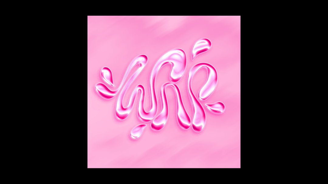
Ben Eli: WAP (Copyright © Ben Eli, 2020)
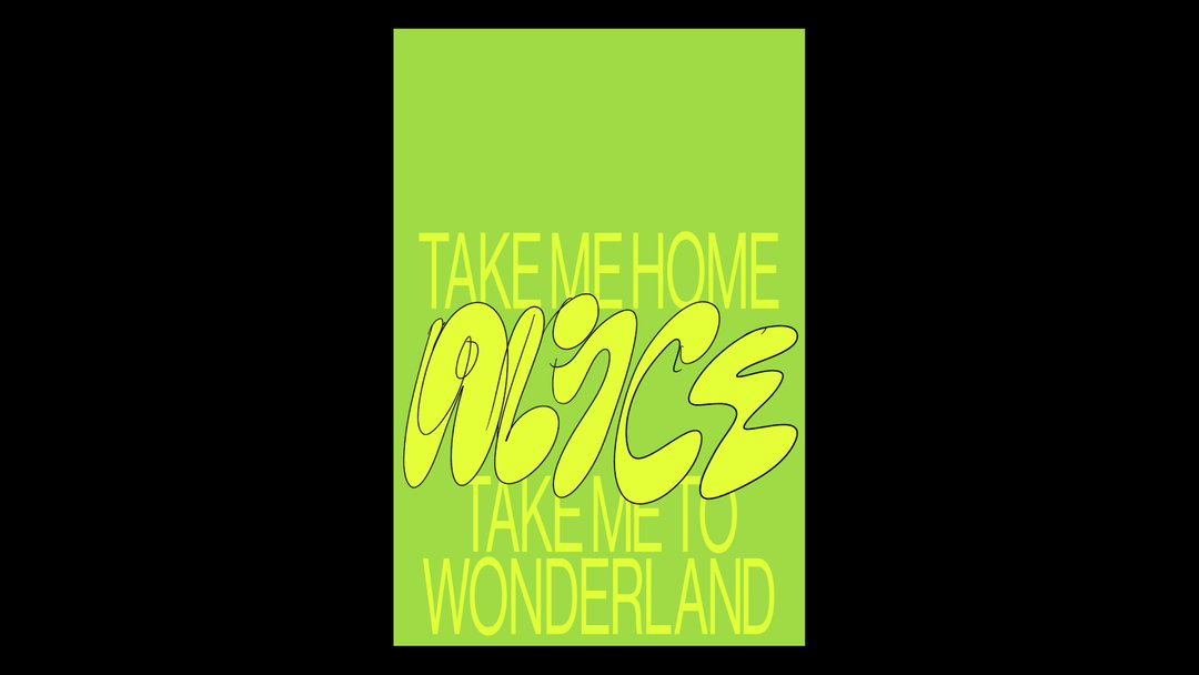
Ben Eli: Alice (Copyright © Ben Eli, 2021)
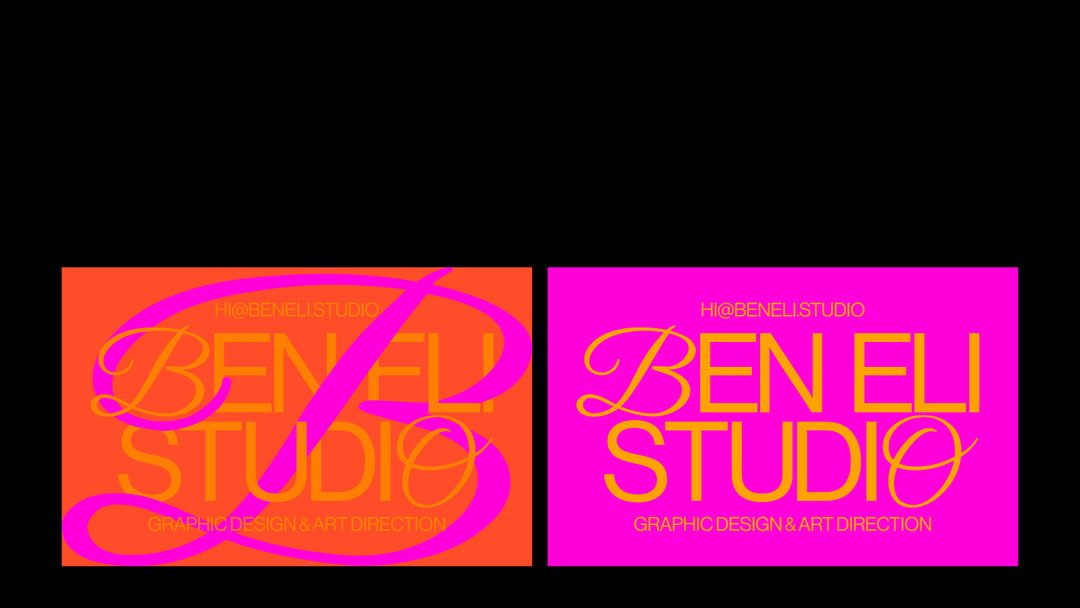
Ben Eli: Ben Eli Studio (Copyright © Ben Eli, 2021)
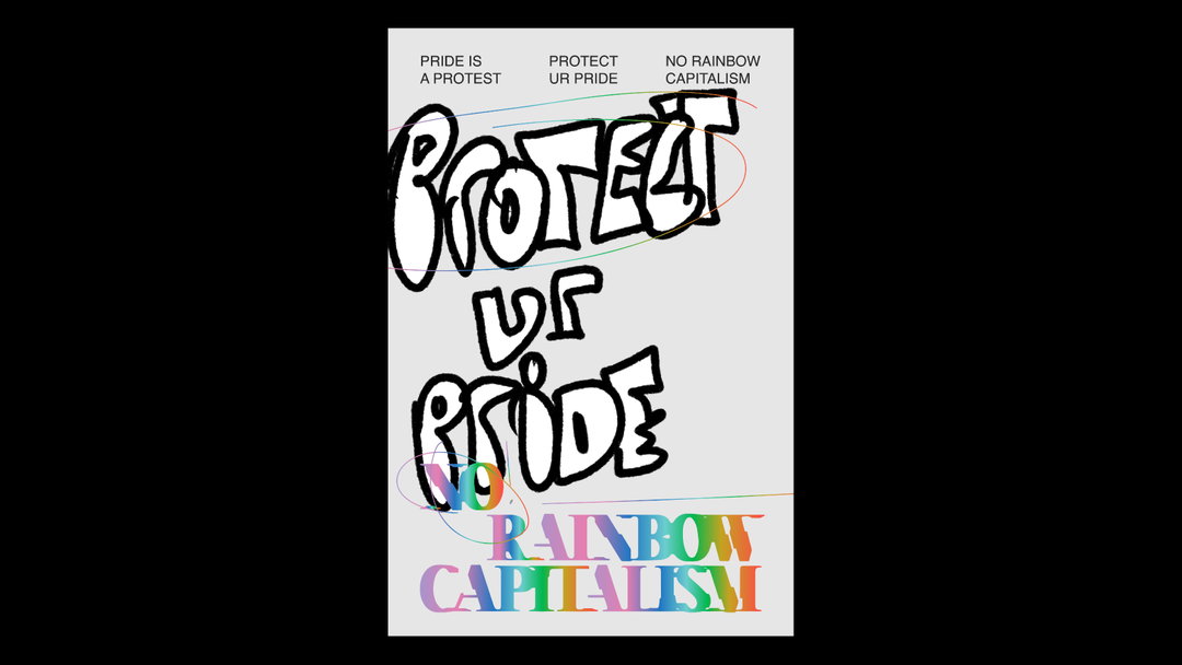
Ben Eli: Protect Ur Pride (Copyright © Ben Eli, 2021)
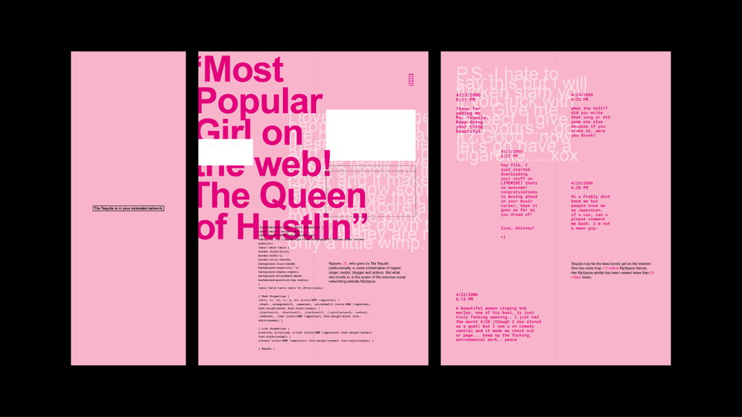
Ben Eli: This Profile Is Set To Private (Copyright © Ben Eli, 2018)
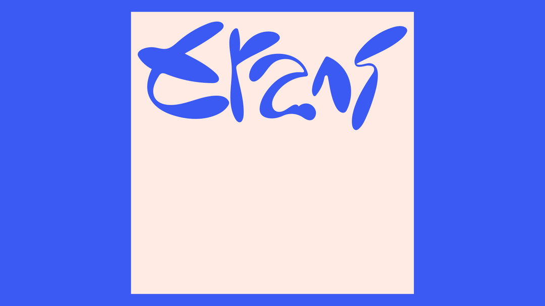
Ben Eli: Trans (Copyright © Ben Eli, 2021)
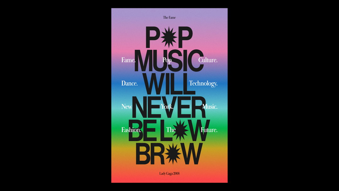
Ben Eli: Pop Music Will Never Be Low Brow (Copyright © Ben Eli, 2021)
Become an Extra Nice Supporter
Unlock an inspiring new way to explore It’s Nice That, get your hands on exclusive perks, and help bring meaningful creative projects to life.
Hero Header
Ben Eli: Trans Liberation (Copyright © Ben Eli, 2021)
Share Article
Further Info
About the Author
—
Joey is a freelance design, arts and culture writer based in London. They were part of the It’s Nice That team as editorial assistant in 2021, after graduating from King’s College, London. Previously, Joey worked as a writer for numerous fashion and art publications, such as HERO Magazine, Dazed, and Candy Transversal.