Launch Recite Me assistive technology
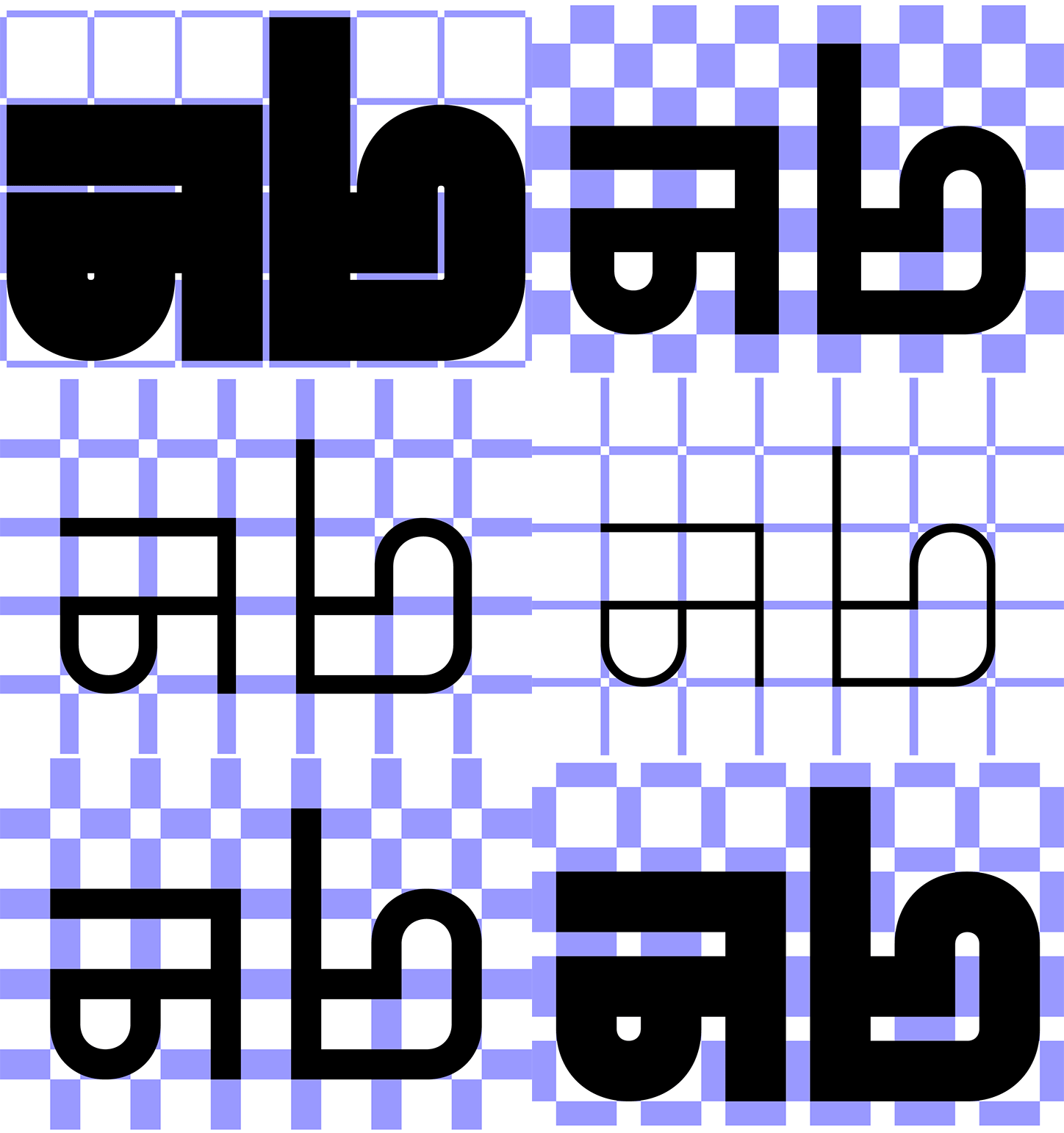
An animation in which bold black abstract shapes shift and morph against a purple and white checkered background. The forms evolve from thick, heavy blocks into thinner, linear outlines.

Typeface Pickle-Standard both obeys and rejects the grid at the same time

—
Date
9 November 2018

Benoît Bodhuin claims to be “curious about everything” which is a useful trait for a graphic designer. Specialising in type design, Benoît has designed a wide variety of type families including Marriane, Zigzag and Mineral. Continuing to impress us with a determination to push the limits of the abstract letterforms Benoît’s most recent creations are two grid inspired typefaces Standard and Pickle-Standard.

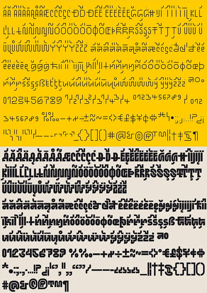
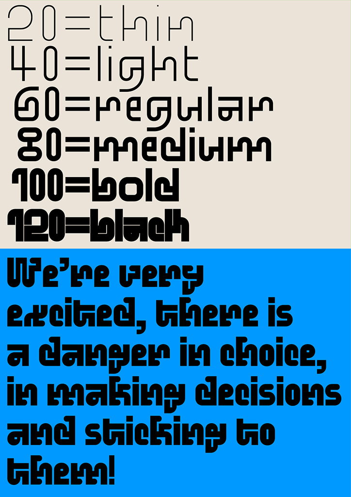
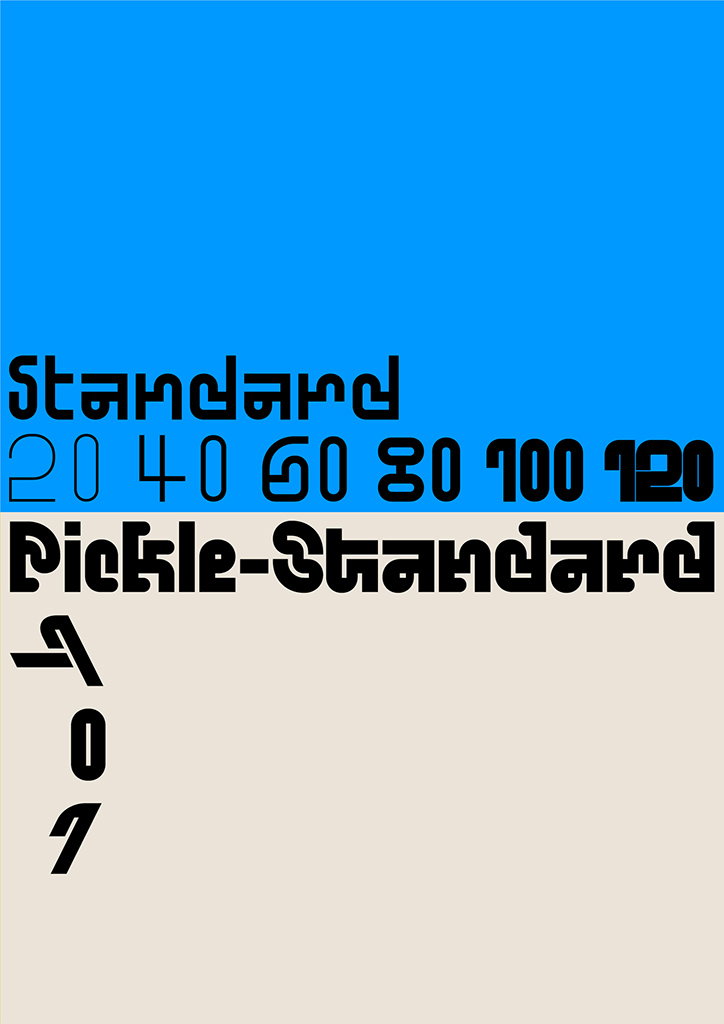
Both typefaces feature wonderfully quirky latin glyphs, maze-like in its even distribution between straight lines and curves. Standard comes in six different weights from 20 to 120. Its heaviest weight feels overpoweringly dense with slivers for counters and eyes (that’s the empty space within the ‘o’ and ‘e’). Comparatively, its lightest weight is airy and the letterforms are pointedly defined by the awkwardly shaped bowls in the form of semi-circles that jut out of the stems.

On the other hand, Pickle-Standard comes in three different styles: italic, regular and reversed italic. Pickle-Standard is a more rounded typeface and soft curves cushion the numerous bends that distinguish these highly-stylised typefaces. The slanting italic and reversed italic styles are particularly sleek, as the italicised horizontal lines run in strict parallels to one another creating smooth feelings of satisfaction. On the design of the typefaces, Benoît says “its drawing obeys and emancipates from the grid at the same time”. There is an elegant balance between the typeface’s straight lines that adhere to the grid contrast with its curves offering an irregular personality.

The typeface is informed by Benoît’s other experiments in type as well as an interest in architectural signage. He designed the first drafts of the typeface based on a grid with guidance from his architect friend Nicolas Gautron. From there, Benoît developed Standard and its six weights, followed by Pickle-Standard as a fun alternative.

The type designer likens this creative process to conducting an orchestra of letters. He tells It’s Nice That: “I try to turn noise into something harmonious”, working painstakingly “as a sculptor” who is very slowly “modifying, correcting, regulating every detail until I get what I want.” Benoît finally asserts that his design decisions are made according “to what I hear from the orchestra” and sometimes, “some decisions change according to my mood.”
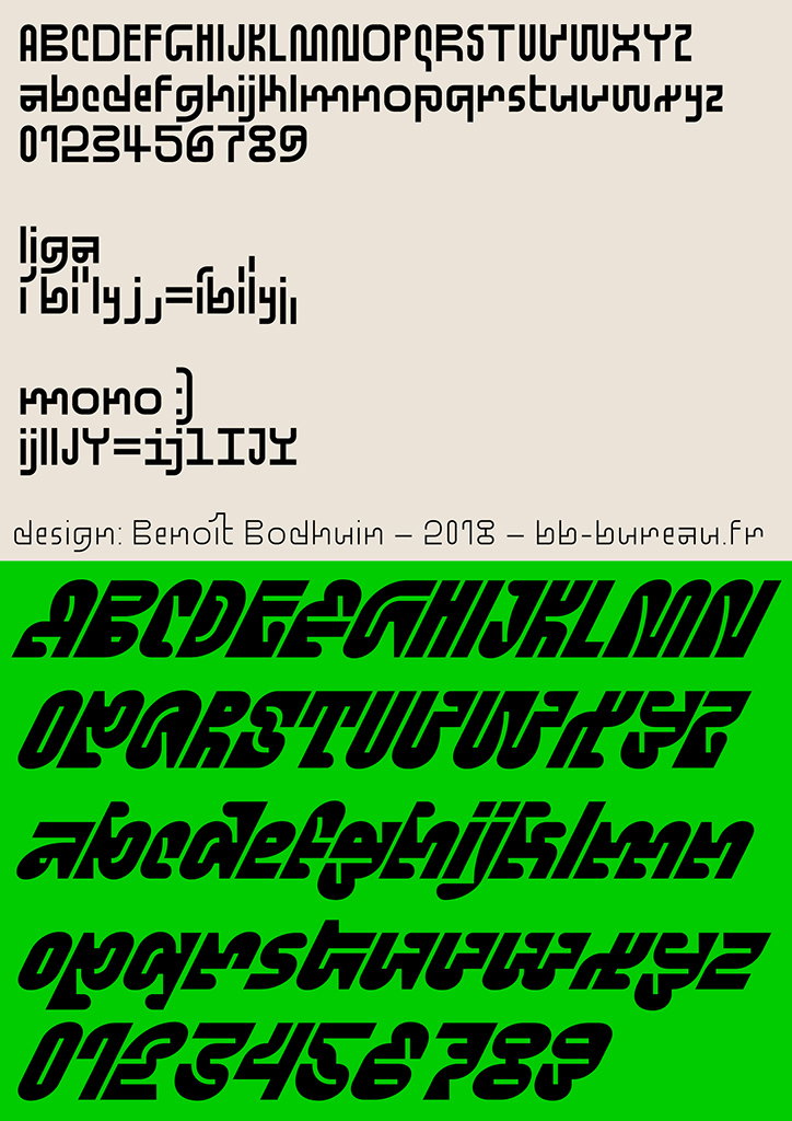
A specimen sheet for a bold, experimental typeface. The top half shows the alphabet and numbers in black on a cream background, while the bottom half repeats them in black on a bright green background. Small text in the centre reads “design: Benoît Bodhuin – 2018 – bb-bureau.fr”.
Above

Benoît Bodhuin: Standard and Pickle-Standard
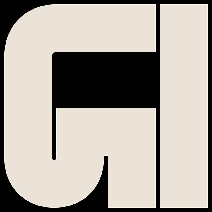
A bold, cream-coloured typographic logo on a black background. The letters “GI” are rendered in a heavy, geometric sans-serif style.
Above

Benoît Bodhuin: Standard

A typographic specimen sheet featuring a custom alphabet and number set in black on a yellow background. The characters are bold and experimental, with various accented letters and symbols arranged in neat rows.
Above

Benoît Bodhuin: Standard and Pickle-Standard
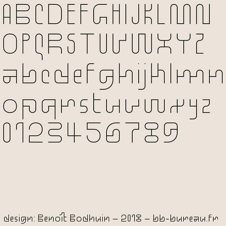
A specimen of a rounded, geometric typeface showing the uppercase alphabet, lowercase alphabet and numerals from 0 to 9. Small text at the bottom reads “design: Benoit Bodhuin – 2018 – bb-bureau.fr”.
Above

Benoît Bodhuin: Standard

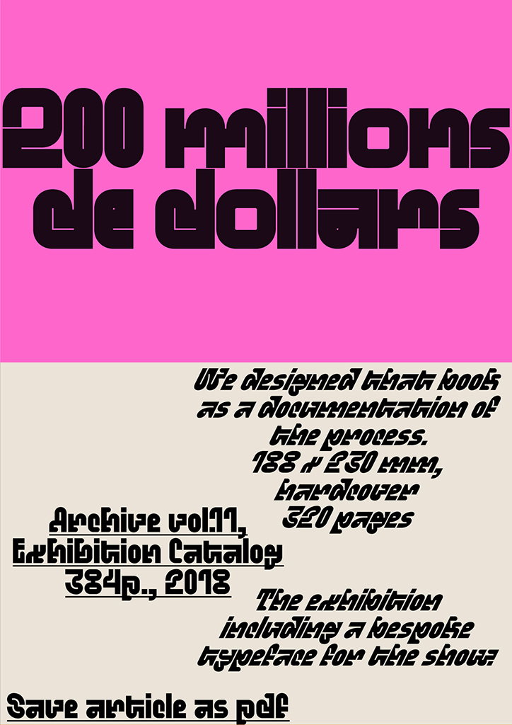
A graphic with a bright pink top half and a pale beige bottom half. Bold, dark purple text reads “200 millions de dollars”. Below, smaller stylized text describes a book design as a “documentation of the process”, listing specifications for “Archive vol.11, Exhibition Catalog”.
Above

Benoît Bodhuin: Standard and Pickle-Standard
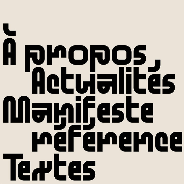
A typographic image in black and cream featuring a list of French words in a bold, rounded font. The text reads “À propos”, “Actualités”, “Manifeste”, “référence” and “Textes”.
Above

Benoît Bodhuin: Standard

A typographic study showing a font in six different weights, from “thin” to “black”, on a beige background. Below, the heaviest weight is used for a block of text on a bright blue background that reads “We’re very excited, there is a danger in choice, in making decisions and sticking to them!”.
Above

Benoît Bodhuin: Standard and Pickle-Standard

A bold, cream-coloured logo on a black background. The stylised, geometric shapes form the letters “fx”.
Above

Benoît Bodhuin: Standard

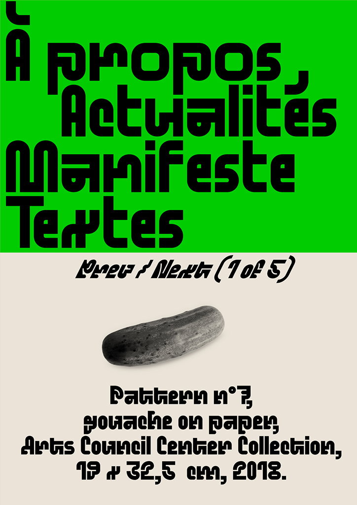
A graphic layout with a bright green top half and a cream bottom half. Bold black text on the green background reads “À propos, Actualités Manifeste Textes”. Below, a small image of a grey cucumber is paired with text that reads “Pattern n°7, gouache on paper, Arts Council Center Collection, 19 x 32,5 cm, 2018.”
Above

Benoît Bodhuin: Standard and Pickle-Standard
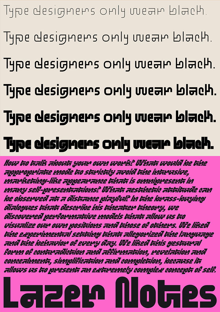
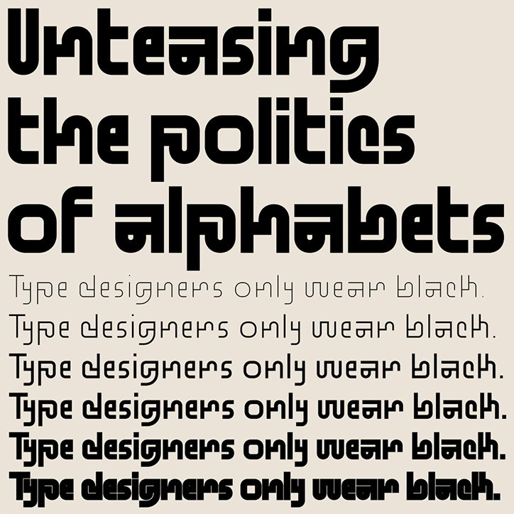
A typographic poster with a pink background. The top half repeats the phrase “Type designers only wear black.” six times in a black, stylized font. Below this, a block of dense, handwritten-style text is followed by the words “Lazer Notes” in a bold, black typeface.
Above

Benoît Bodhuin: Standard and Pickle-Standard
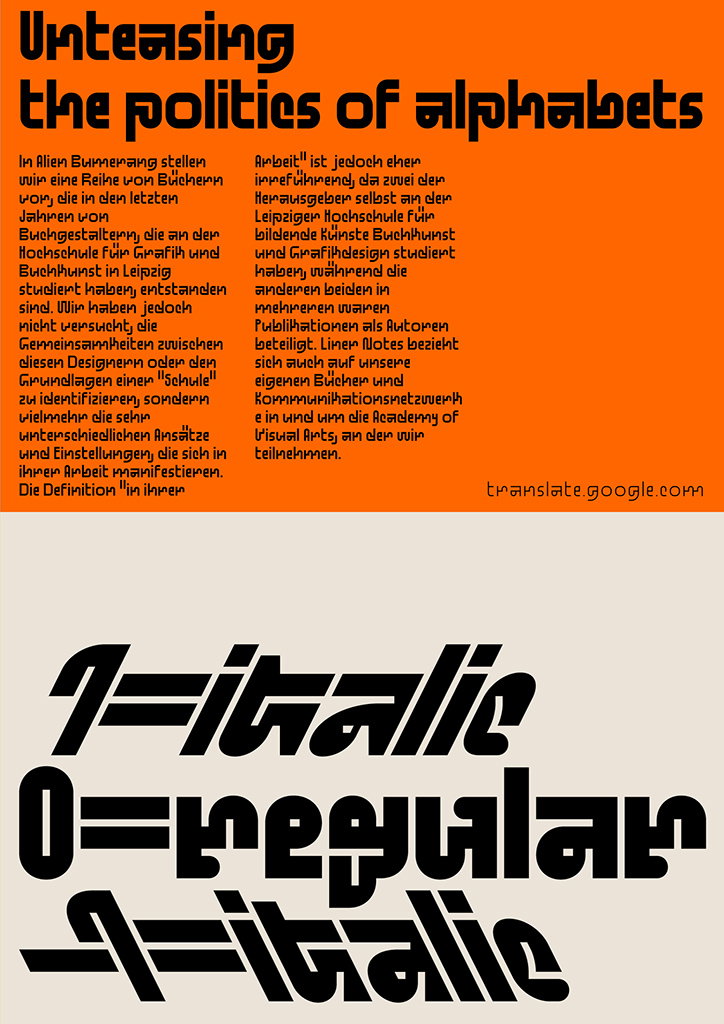
A graphic divided into two sections. The top half is orange with bold black text that reads “Unteasing the politics of alphabets” above two columns of German text and a “translate.google.com” URL. The bottom half is off-white with three lines of heavy, black typographic experiments. The lines read “1=italic”, “0=regular” and “1=italic”, using distorted and overlapping letterforms.
Above

Benoît Bodhuin: Standard and Pickle-Standard
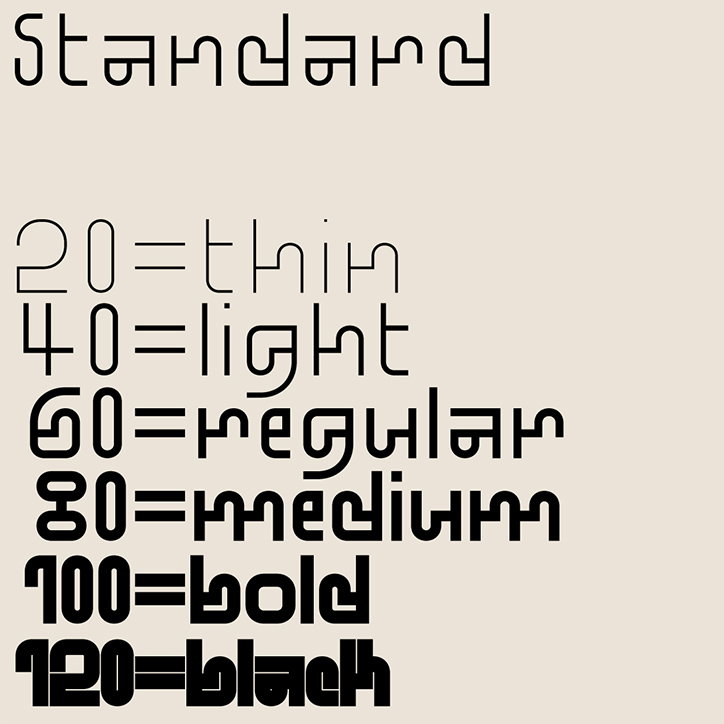
A typographic specimen showing a single font in six different weights. The weights are listed from “thin” to “black”, with corresponding numerical values from 20 to 120.
Above

Benoît Bodhuin: Standard

A typographic study showing different weights of a bold, rounded typeface. The top section is bright blue with the word “Standard” above a sequence of numbers from “20” to “120”. Below, on a cream background, the words “Pickle-Standard” appear above the numbers “101” stacked vertically.
Above

Benoît Bodhuin: Standard and Pickle-Standard
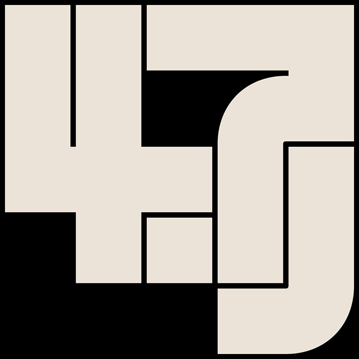
A graphic illustration of the number “47” in a bold, geometric style. The off-white characters are set against a solid black background.
Above

Benoît Bodhuin: Standard

A typographic poster with black text on a cream background. A bold headline reads “Unteasing the politics of alphabets”, followed by the repeated phrase “Type designers only wear black.”
Above

Benoît Bodhuin: Standard

A bold, cream-coloured logo on a black background. The abstract shapes form the letters “R” and “I”.
Above

Benoît Bodhuin: Standard

A minimalist logo of the letters “jr” in a pale beige tone against a black background. The letters are constructed from thick, geometric blocks with rounded corners.
Above

Benoît Bodhuin: Standard

Share Article

Further Info

About the Author

Jynann Ong

—

Jynann joined It’s Nice That as an editorial assistant in August 2018 after graduating from The Glasgow School of Art’s Communication Design degree. In March 2019 she became a staff writer and in June 2021, she was made associate editor. She went freelance in 2022.

It's Nice That Newsletters

Fancy a bit of It's Nice That in your inbox? Sign up to our newsletters and we'll keep you in the loop with everything good going on in the creative world.