Launch Recite Me assistive technology
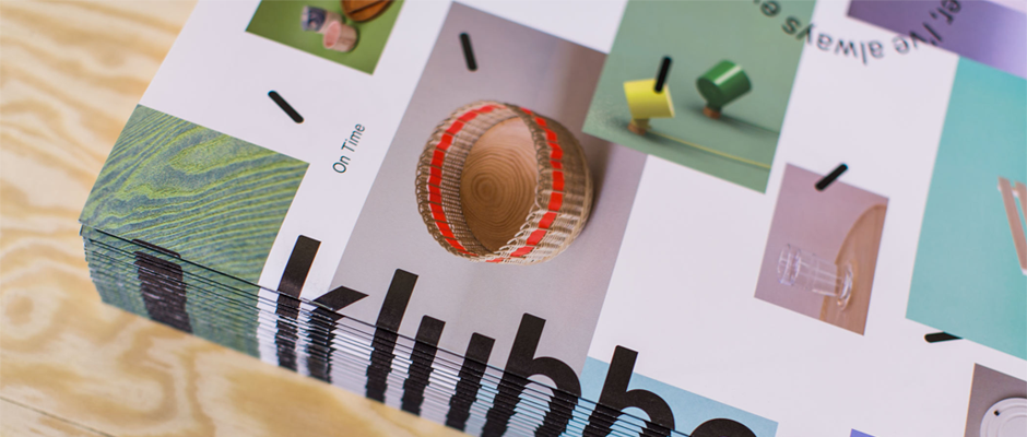
A close-up of a printed publication resting on a light wood surface. The page features a grid of images and the word “klubbo” in bold, black lowercase type.

Graphic Design: Simple, functional, Norwegian graphics from Oslo's Bielke + Yang

—
Date
25 September 2013

Oslo-based design consultancy Bielke and Yang are a pretty solid pairing when it comes to branding and graphics. The Norwegian duo are responsible for an incredibly polished body of work that includes clients in the cultural and creative sectors as well as food and lifestyle brands. They’ve recently taken on the visual identity and promotional material for Klubben – an international organisation that aims to promote Norwegian design across the world, with representatives in Oslo, Copenhagen, London, Berlin and New York – designing websites, printed matter and exhibition spaces for the project’s ventures. As a promotional tool for others they’ve done a remarkable job with the work, as a promotional tool for themselves, we think it’s working equally well.
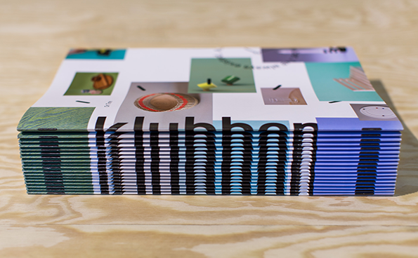
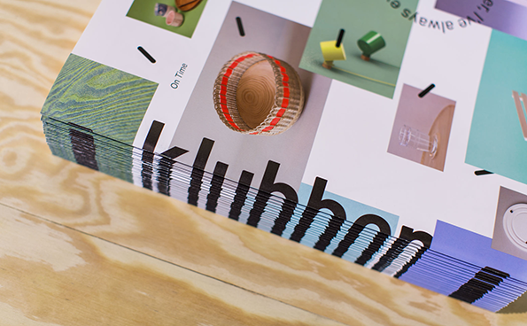
A stack of booklets rests on a light wood surface. The cover features a grid of small images and bold, black typography that reads “klubbon”.
Above

Bielke + Yang: Klubben Identity

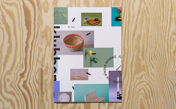
A magazine cover featuring a grid of small photographs of design objects on a white background. The images include a woven basket, a wooden tray and a candle, with the words “On Time” printed in a small sans-serif font.
Above

Bielke + Yang: Klubben Identity

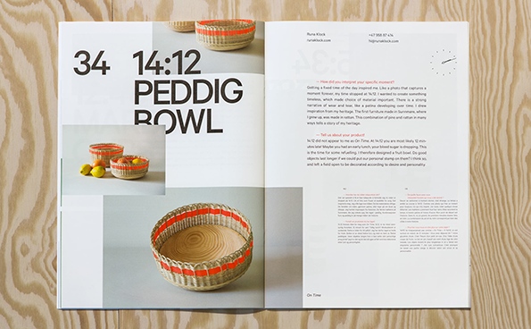
An open lookbook shows a product page for a “14:12 Peddig Bowl”. The layout features photos of a woven basket with bright orange accents, alongside descriptive text.
Above

Bielke + Yang: Klubben Identity

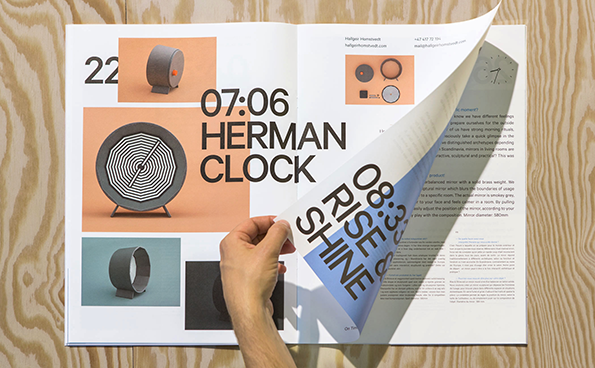
An open magazine spread features a minimalist product layout for the “Herman Clock”. A person’s hand peels back the right-hand page to reveal the text “08:30 RISE & SHINE”.
Above

Bielke + Yang: Klubben Identity

A stack of magazines rests on a light wood surface. The top cover features a grid of images and the word “klubbon” in a bold, black typeface.
Above

Bielke + Yang: Klubben Identity

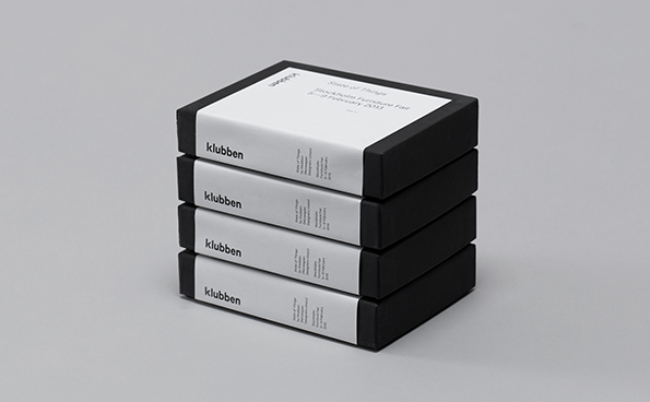
A stack of five black rectangular boxes with white labels. The top label reads “State of Things” and “Stockholm Furniture Fair 5–9 February 2013”, while the others feature the word “klubben”.
Above

Bielke + Yang: Klubben Identity

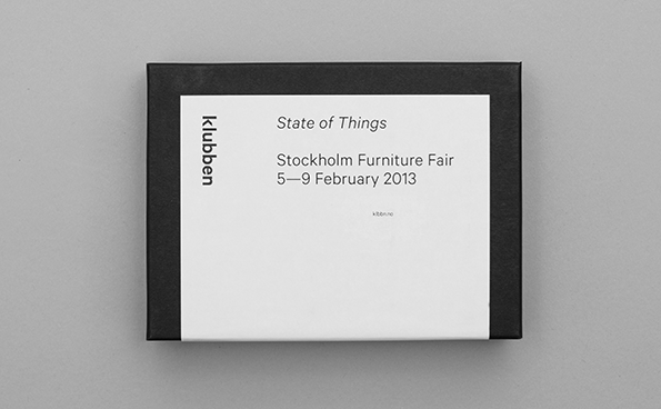
A black box with a white label on the front. The label reads “State of Things”, “Stockholm Furniture Fair” and “5–9 February 2013”, with “Klubben” written vertically along the left edge.
Above

Bielke + Yang: Klubben Identity

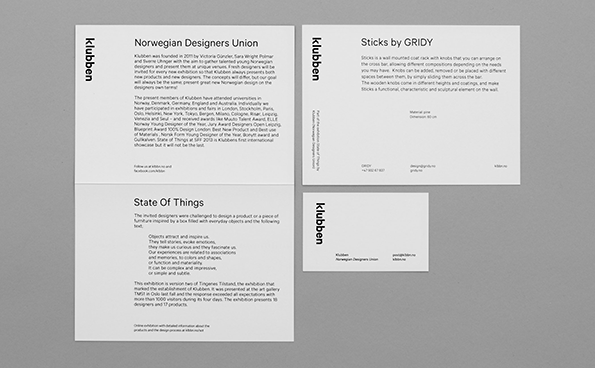
Four white square cards with black text are arranged in a grid on a grey background. Each card features the word “klubben” written vertically along the left edge.
Above

Bielke + Yang: Klubben Identity

Share Article

Further Info

About the Author

James Cartwright

—

James started out as an intern in 2011 and came back in summer of 2012 to work online and latterly as Print Editor, before leaving in May 2015.


It's Nice That Newsletters

Fancy a bit of It's Nice That in your inbox? Sign up to our newsletters and we'll keep you in the loop with everything good going on in the creative world.