Launch Recite Me assistive technology
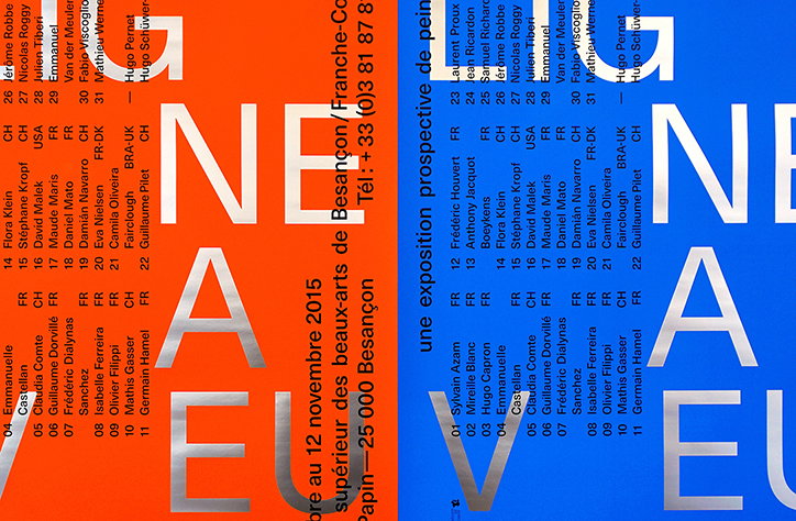
A graphic design layout split vertically between orange and blue backgrounds. Large, silver, fragmented letters spell “Nouveau” across both sides, overlaid with lists of names and locations.

Paris studio Bizzarri Rodriguez's portfolio is sharp, considered and typographically super

—
Date
13 May 2016

Showing a flair for minimalism and typographic design, Paris-based graphic design studio Bizzarri Rodriguez has a superb portfolio of considered and beautiful work. The studio is helmed by Thomas Bizzarri and Alain Rodriguez, and its clients are mostly from the cultural and publishing sectors.

One of their recent projects that caught our eye is the designs for publisher Le Feu Sacré Éditions, which use a neutral colour palette of browns and grey. These sit alongside a more colourful poster design for painting exhibition
 Ligne aveugle , curated by Hugo Schüwer-Boss and Hugo Pernet at ISBA fine art school in Besançon. Throughout their work, typography is at the fore and simple layouts strip the project back to their most essential elements to wonderful effect.
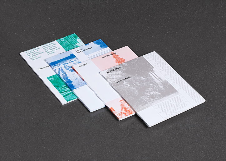
Four slim booklets are fanned out across a dark grey surface. Each cover features a different image and name, including “Khvay Sen”, “Lettres de Panduranga”, “Arin Rungjang” and “Vendy Rattana”.
Above

Bizzarri Rodriguez: Jeu de Paume

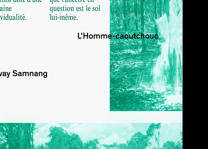
A page from a publication featuring teal-tinted images of a forest. The text “L’Homme-caoutchouc” is printed beside a vertical image of a figure blending into the trees.
Above

Bizzarri Rodriguez: Jeu de Paume

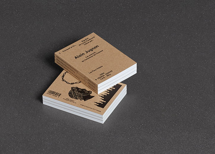
Two small books with brown cardboard covers are stacked on a dark grey surface. The top book features the name “Alain Jugnon” and the title “Les preuves de l’existence de l’homme”.
Above

Bizzarri Rodriguez: Le Feu Sacré Éditions
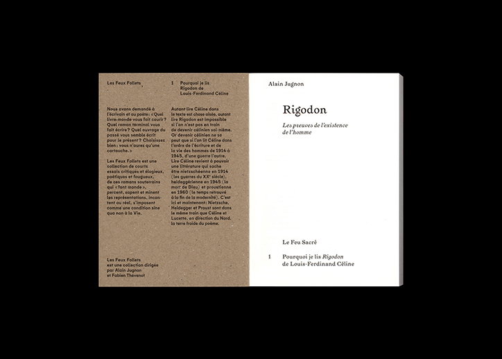
An open book with a black left page and a white right page. The right page features the title “Rigodon” and the subtitle “Les preuves de l’existence de l’homme”.
Above

Bizzarri Rodriguez: Le Feu Sacré Éditions
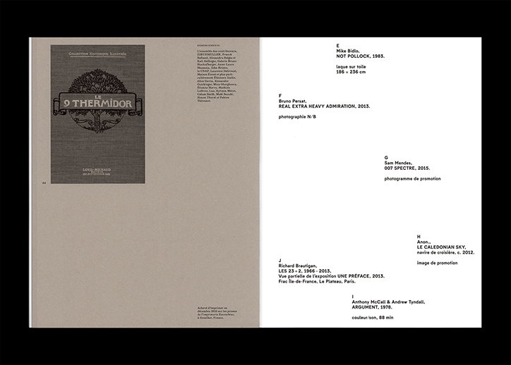
An open book shows a grey page with a detailed illustration of a tree and the text “LE THERMIDOR”. The opposite white page lists various artworks and artists, including “Mike Bidlo” and “Sam Mendes”.
Above

Bizzarri Rodriguez: Le Feu Sacré Éditions
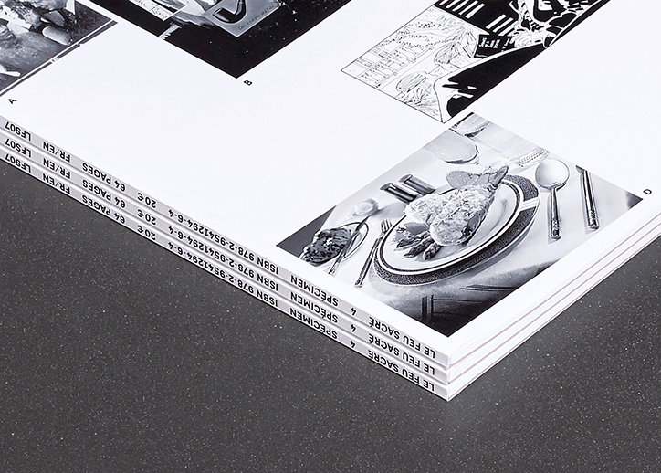
A stack of black and white printed booklets rests on a dark surface. The edge of the pages features repeated text including “LE FEU SACRÉ”, “SPÉCIMEN” and an ISBN number.
Above

Bizzarri Rodriguez: Cadrage Type Specimen
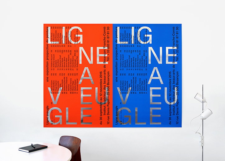
Two bold typographic posters, one red and one blue, hang side by side on a white wall. Both feature the words “LIGNE AVEUGLE” in large, silver, fragmented letters and include a list of names and event details.
Above

Bizzarri Rodriguez: Ligne Aveugle

Share Article

About the Author

Emily Gosling

—

Emily joined It’s Nice That as Online Editor in the summer of 2014 after four years at Design Week. She is particularly interested in graphic design, branding and music. After working It's Nice That as both Online Editor and Deputy Editor, Emily left the company in 2016.


It's Nice That Newsletters

Fancy a bit of It's Nice That in your inbox? Sign up to our newsletters and we'll keep you in the loop with everything good going on in the creative world.