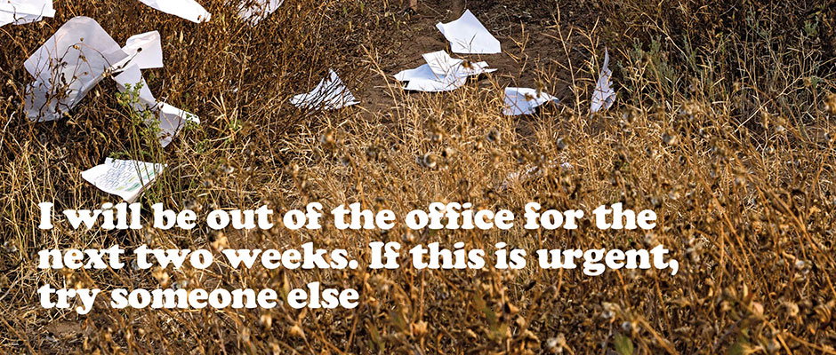
What Bloomberg Businessweek looks for when commissioning creative
As far as editorial design is concerned, Bloomberg Businessweek has practically become a byword for brilliance. It’s long been celebrated for its innovative covers and spreads, shaped by the razor-sharp mind and smart eye of former creative director Richard Turley and Rob Vargas, who now holds the role. Each part of the magazine is so carefully considered, from layout to illustration to photography, and the ETC lifestyle section is no exception.
ETC is art directed by Jaci Kessler, who landed the role after Richard spotted an op-ed photo illustration series she created for Bloomberg View. She works in a small team alongside editor Kurt Soller and photo editor Alis Atwell; who together look to “create or commission art and layouts that are fun, conceptual and a bit weird at times, because that’s what would draw us in as readers,” Jaci explains.
“ETC has its own typographic identity, which was designed before I became art director, but I want to make sure it is always evolving and being pushed to its limits. Like the rest of the magazine, we have a limited choice of typefaces, but there are so many ways to use them—you really discover how versatile they can be when you’re forced to work with the same ones week after week, and need to find ways to make them communicate completely different concepts.”
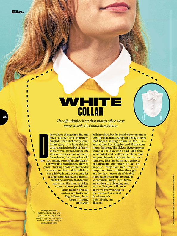
Elizabeth Renstrom: Dickie shot
As is perhaps to be expected with such varied content, the commissioning of ETC can rarely be second-guessed, with a huge range of illustration and photography styles. “The ETC art identity is created specifically by the art, although of course it’s inspired by the typography and vice versa. Part of this identity is that it’s always changing,” Jaci says. “I try to feature many different illustration styles, but they need to work well together in order for ETC to maintain a certain look and feel.
“That’s not to say they should look similar, because they shouldn’t. I think it’s more about finding the right amount of contrast. The same goes for photography – photos need to play off each other, and off accompanying illustrations, to have a good amount of tension and also feel harmonious.”
"An illustrator's concepts are equally important as their style. If they're not clever, it doesn't really matter how nice the illustration looks."
Jaci Kessler
To commission illustration, Jaci says she looks for work that “needs to look really sure of itself.” She adds: “I think confidence is a really important aspect of illustration. An illustrator’s concepts are equally important as their style. If they’re not clever, it doesn’t really matter how nice the illustration looks.
“I’ll reach out to someone if I can look through their portfolio and know right away that they can offer something more than just a visual summary of the story; good illustrations add their own opinions. Of course they also need to be communicative and reliable, and in the right time zone depending on what our schedule is like. If you want to be on an art director’s go-to list, reply to emails as quickly as you can, even to say you’re unavailable.”
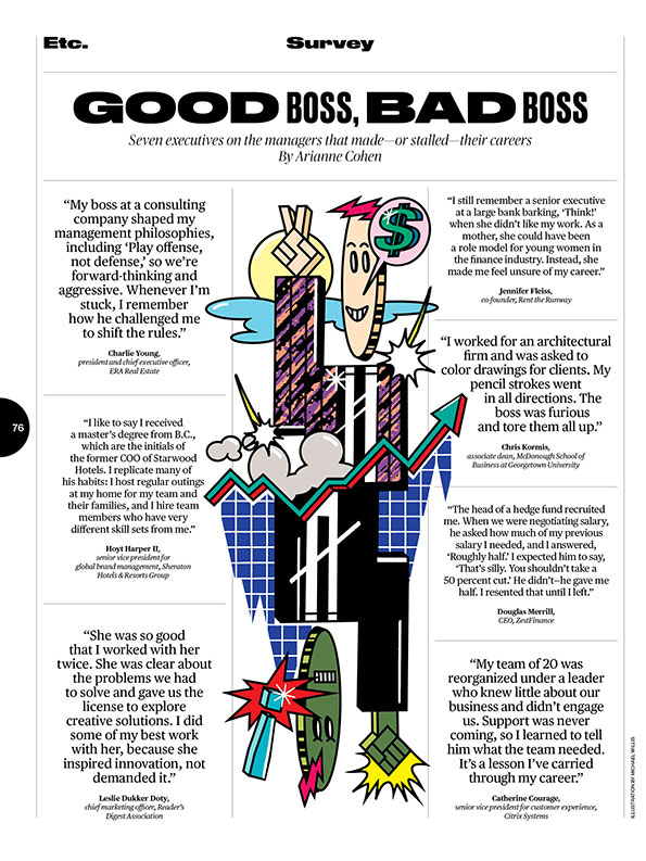
Michael Willis: Survey illustration
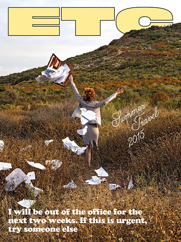
Mathew Scott: Opener for Summer Travel 2015 special issue
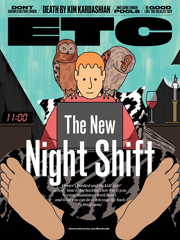
Jan Buchczik: Opener for The New Night Shift illustration
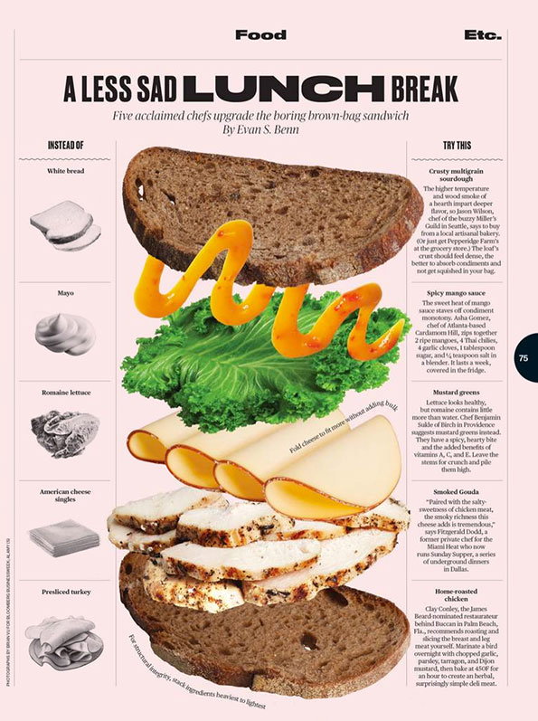
Brian Vu: Sandwich improvements
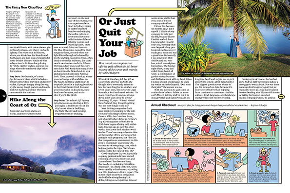
Illustrations by Tomi Um, top right photo Adam Birkan: Spread for Summer Travel 2015 special issue
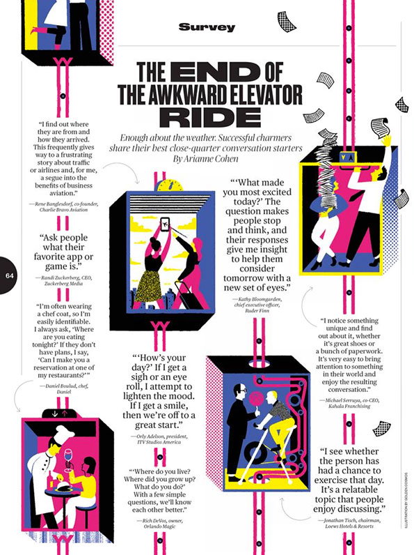
Golden Cosmos: Survey illustration
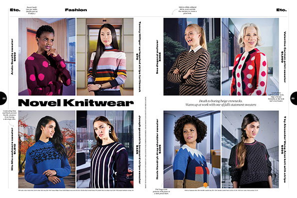
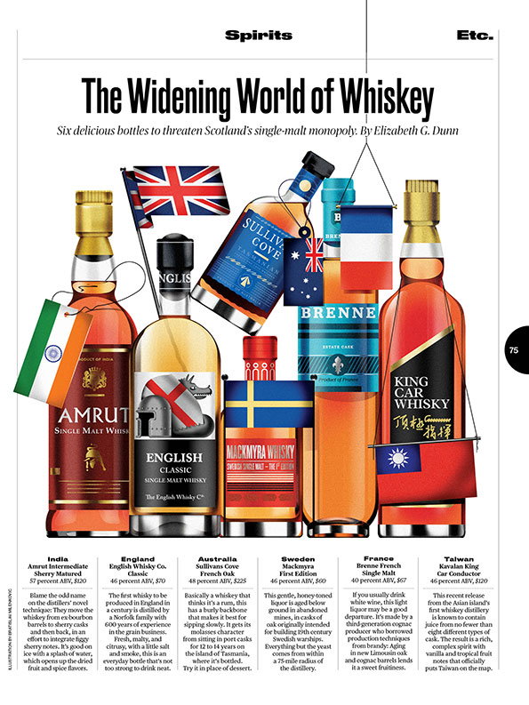
Logan Jackson: Sweaters
Share Article
About the Author
—
Emily joined It’s Nice That as Online Editor in the summer of 2014 after four years at Design Week. She is particularly interested in graphic design, branding and music. After working It's Nice That as both Online Editor and Deputy Editor, Emily left the company in 2016.