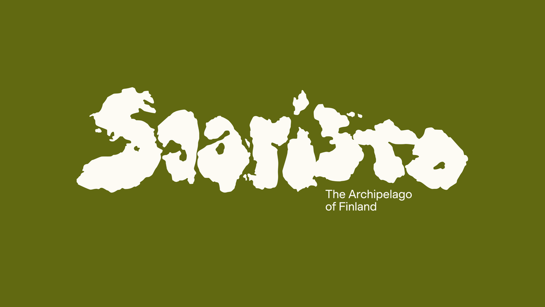
Bond’s wordmark for the world’s largest archipelago takes its shape from island formations
The Helsinki-based studio’s destination identity for Saaristo pays homage to Finland’s wild landscape.
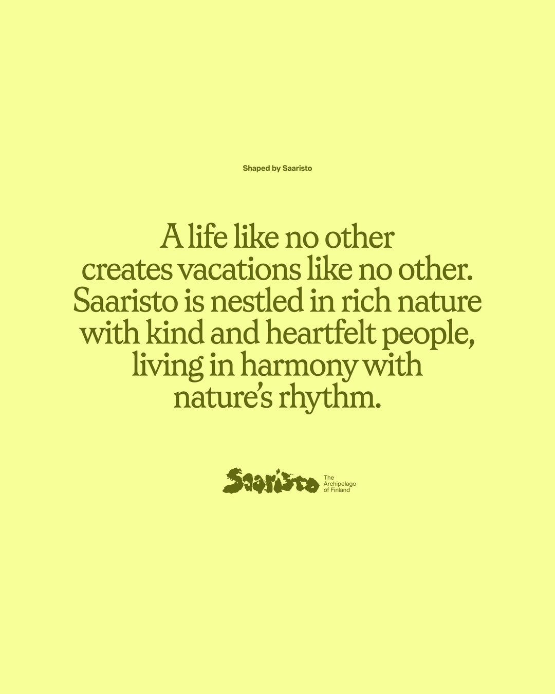
The word Saaristo – meaning archipelago in Finnish – “was our greatest inspiration,” says design director Kasperi Salovaara. He’s outlining the creative concept behind design studio Bond’s destination brand for the archipelago of Finland, the world’s largest by island count. The team wanted to create a genuine identity, one that felt true to the landscape rather than an inauthenticity imposed. “Our goal was to visually capture the feeling of being there,” he says. Tasked with shaping an identity to promote the 40,000 unique islands that make up this vast cluster of islands, Bond cemented its geographically-led approach with a simple concept: ‘shaped by Saaristo’. “This was a constant reference point that ensured every element of the identity stayed true to its origins,” Kasperi says, “this concept reinforced the way Saaristo shapes every person who visits, and is ultimately changed for the better.”
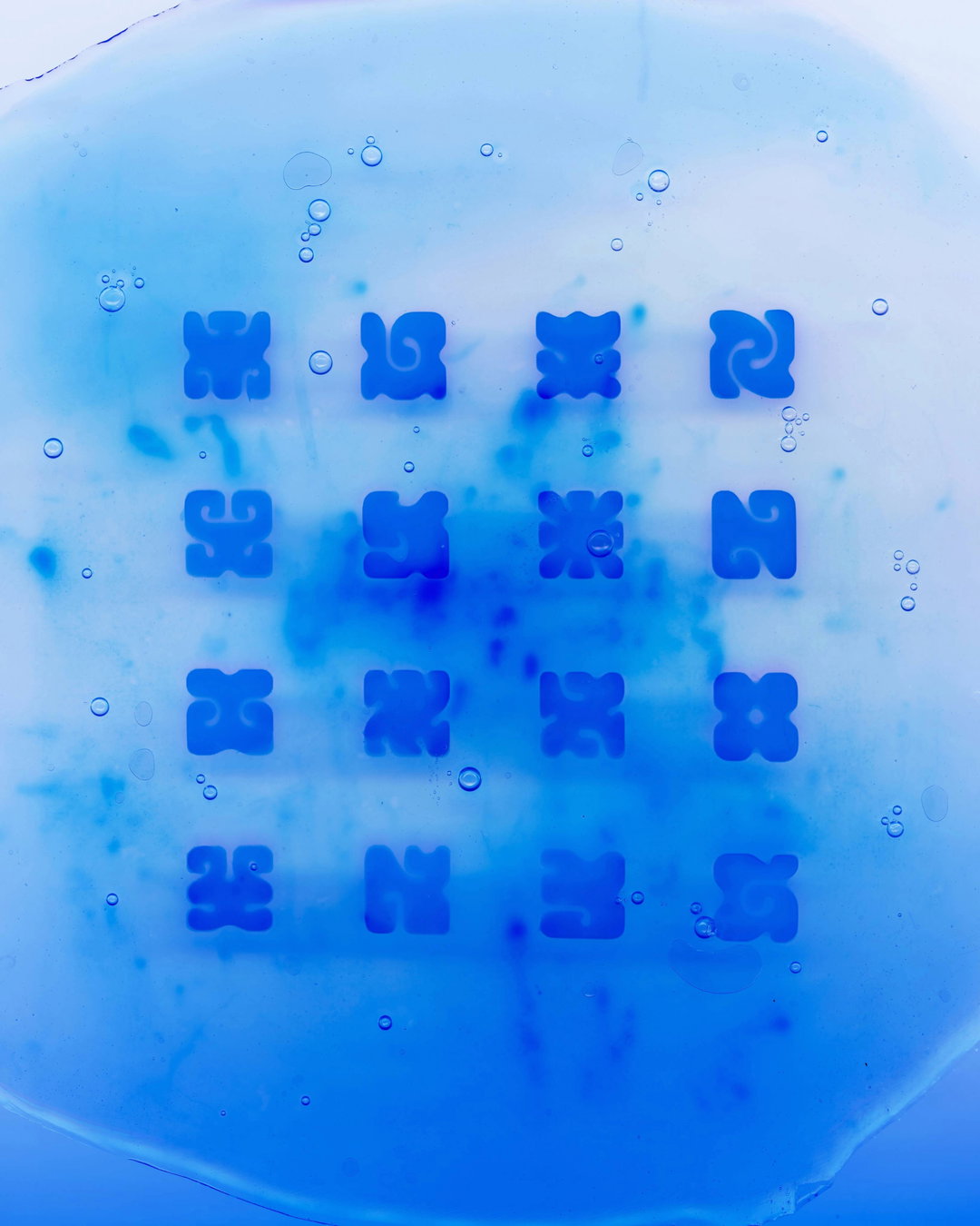
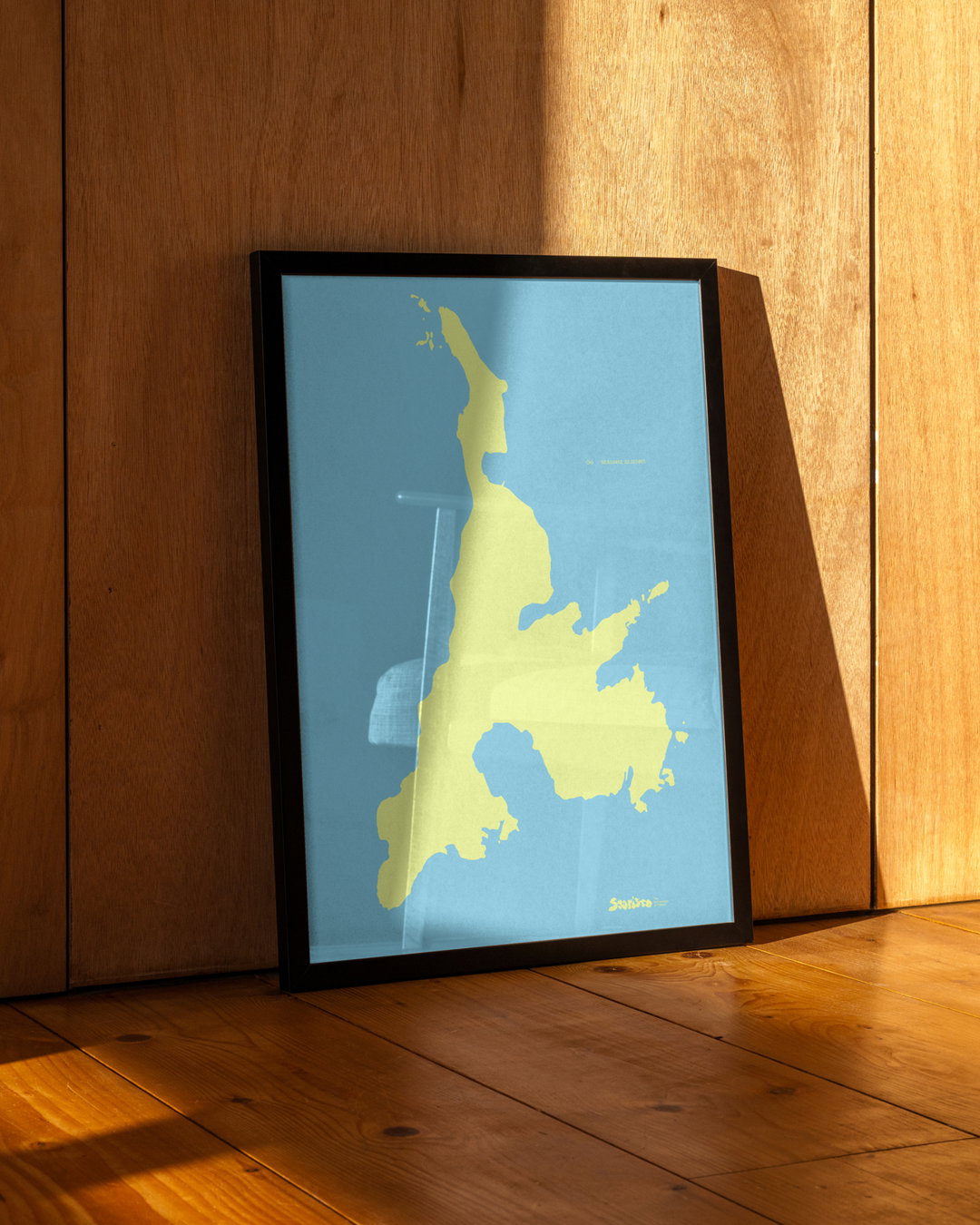
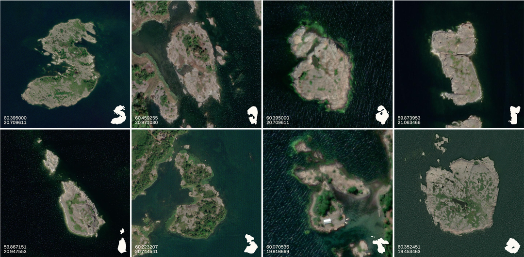
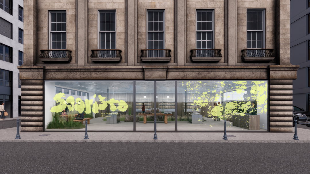
The brand’s north star is its topographical wordmark, made up of eight of the archipelago’s real islands. “Geography wasn’t our initial focus when we started the project; the idea emerged organically as we explored maps of the archipelago,” Kasperi says. “Each island is uniquely shaped, unlike any other,” he adds, “and that’s when it clicked: with 40,000 islands, surely every letter of the alphabet could be found among them.” Having then stumbled on an unmistakable ‘S’ shaped island, the realisation truly took hold. The team spent countless ours scouring Google Maps, combing through the 40,000 islands one by one to find the studio’s geographical alphabet. Their efforts have resulted in a sculpted wordmark that is an accurate, engrossing and authentic expression of the region. “A humorous twist during the process saw one island ‘go missing’, prompting a two-day search across maps until the team rediscovered it,” Kasperi says.
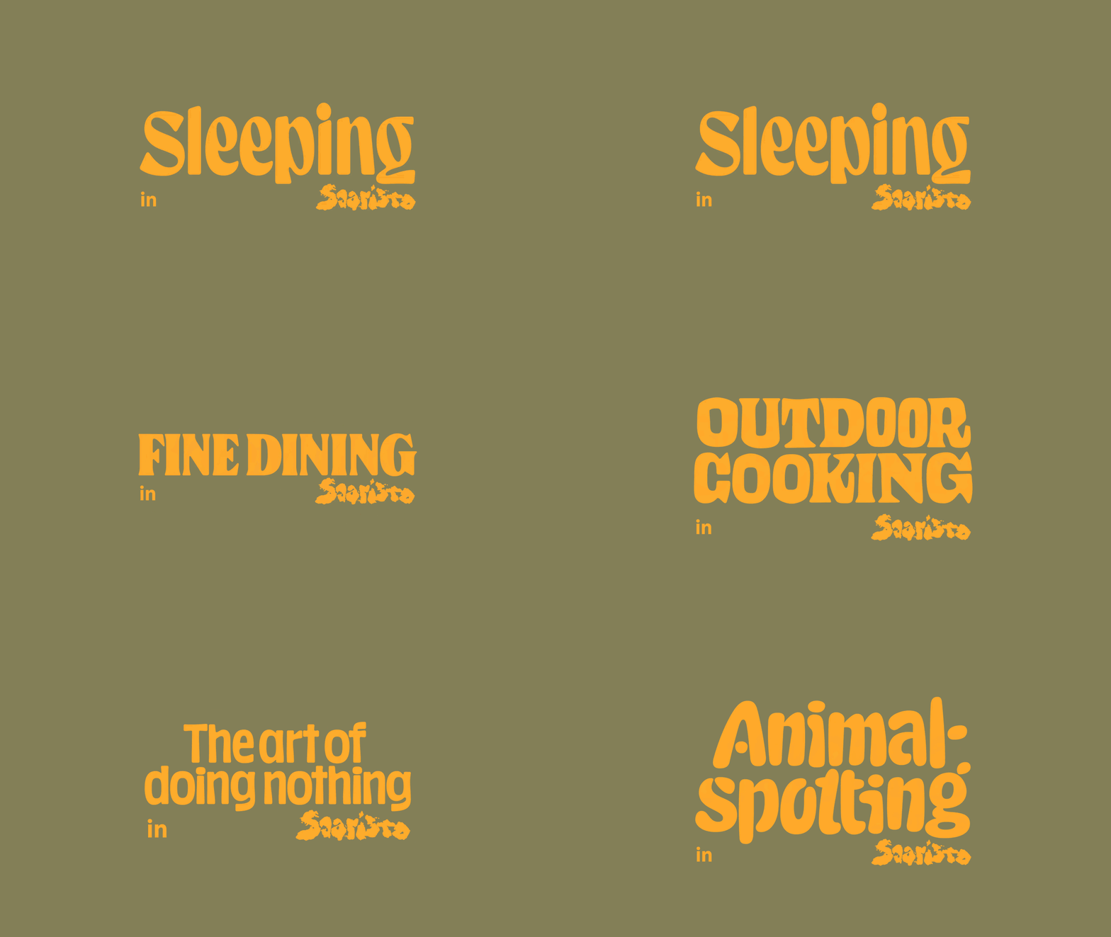
Supporting the distinctive wordmark is a maritime-inspired combination of typefaces, each with its own visual and practical function. Muoto by 205tf added a sense of precision and legibility to complement the raw feel of the wordmark, Kasperi explains, while Kolonia by ECAL Typefaces helped define the brand’s tone. Working across print and digital contexts (as well as helping appeal to different markets) Muoto and Kolonia, in combination, made for a cohesive typographic system. Together, all of these elements reference the remarkable, wild and rugged landscape it champions.
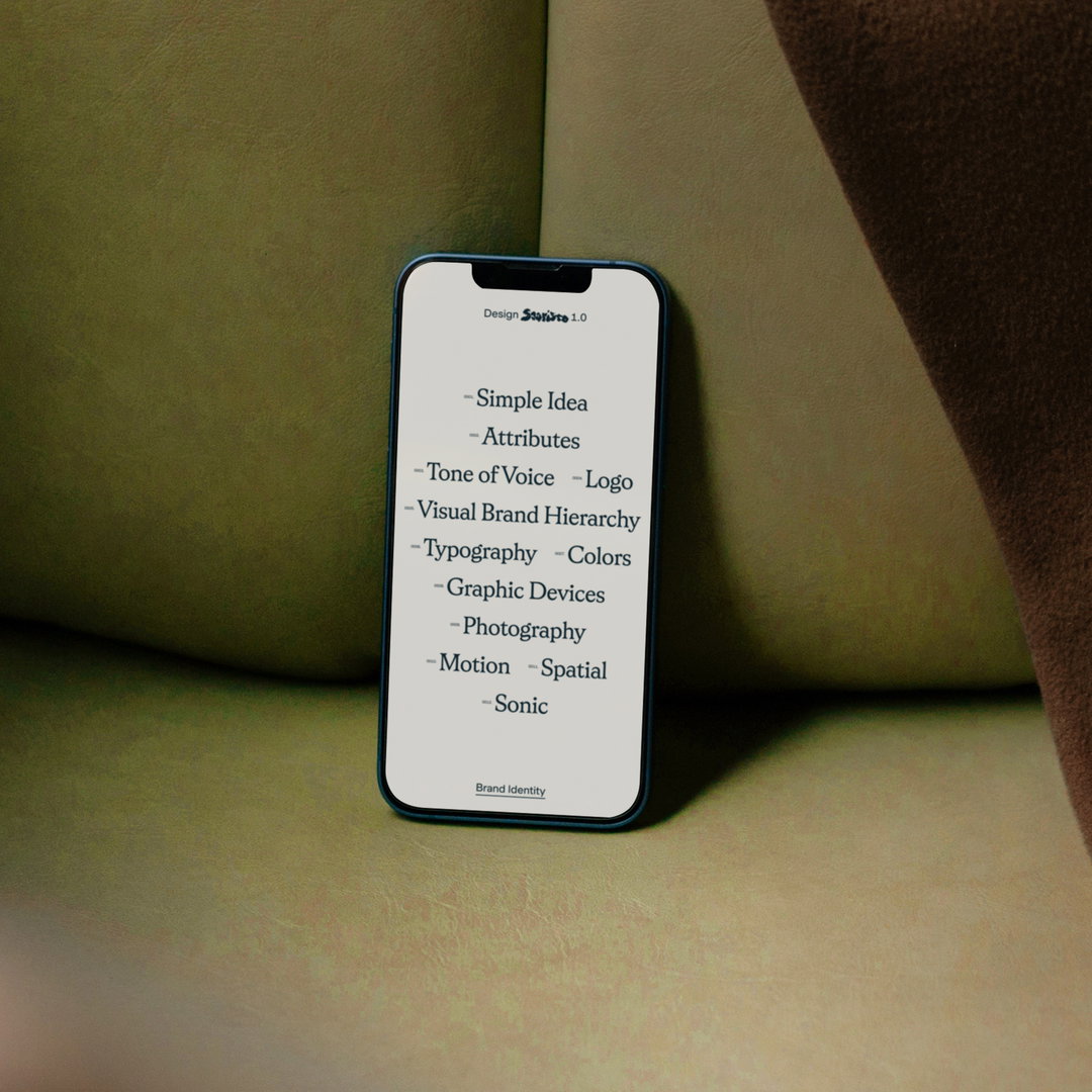
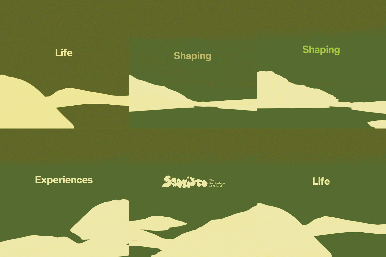
Despite its remarkable credentials, Saaristo is not widely known outside of Finland. Hoping to push a sustainable tourist angle onto the destination – and, in doing so, improving the services of those living there – Bond developed not only the visual identity but also its strategy, spatial experience and motion and sonic principles. “Saaristo will soon begin a series of collaborations and seasonal events to celebrate the launch of the brand,” Kasperi says, with the primary aim being to demonstrate the diversity of activities the archipelago offers. “So the events in particular will place a spotlight on the locations and local operators that make Saaristo such a unique travel destination.”
GalleryBond: Saaristo (Copyright © Bond, 2025)

Hero Header
Bond: Saaristo (Copyright © Bond, 2025)
Share Article
Further Info
About the Author
—
Hailing from the West Midlands, and having originally joined It’s Nice That as an editorial assistant in March 2020, Harry is a freelance writer and designer – running his own independent practice, as well as being one-half of the Studio Ground Floor.