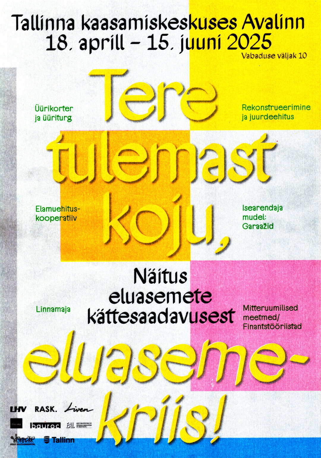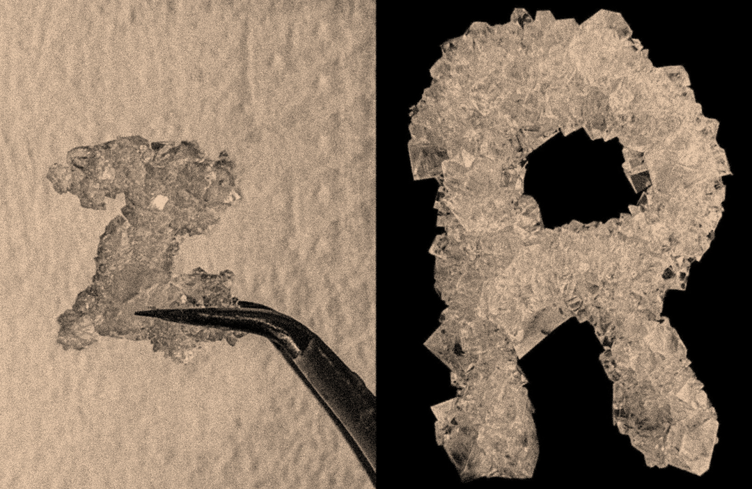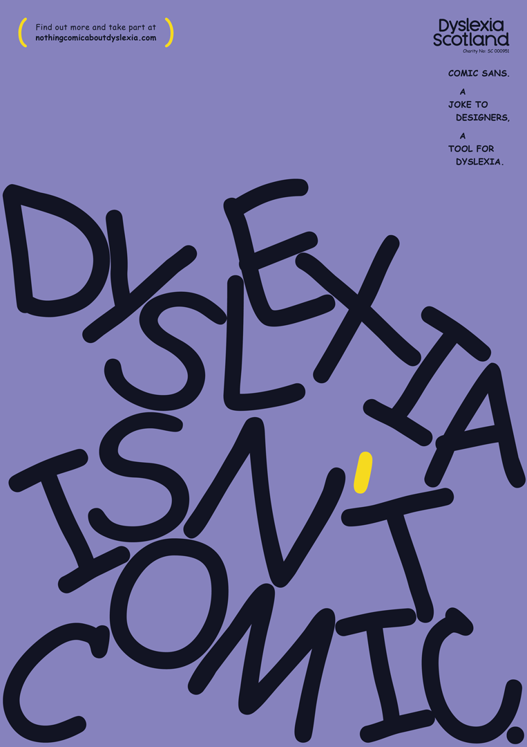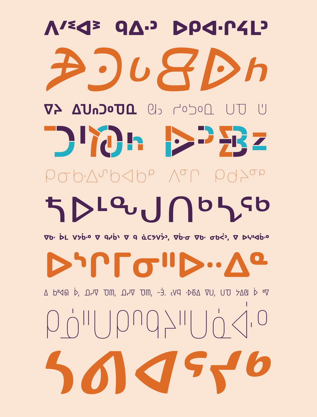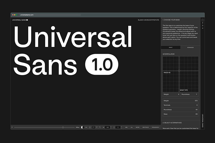
Universal Sans is a customisable variable typeface system by Family Type
With a background in graphic design and branding, typographer Briton Smith understands the challenges designers face when searching for the right typeface all too well. “Often a custom typeface would be ideal for a project but time and budget constraints rule this out,” Briton tells us. “Designers may select a typeface but wish to tweak one or two characters based on their preference or to make it more ‘ownable’ for the client.”
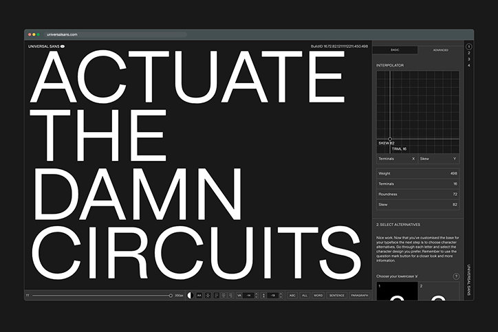
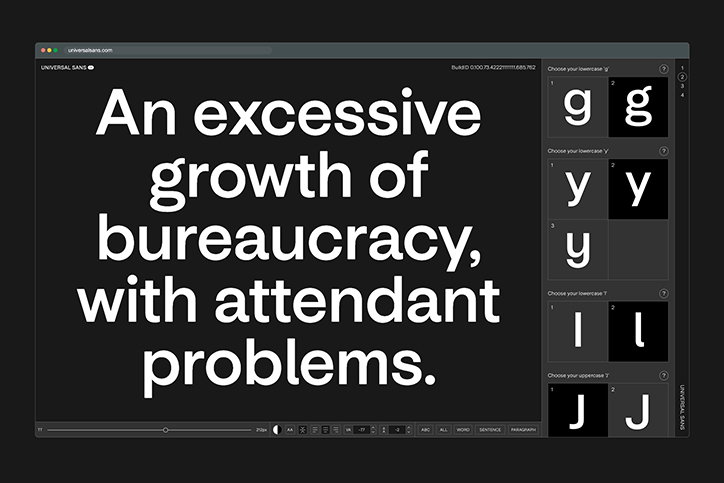
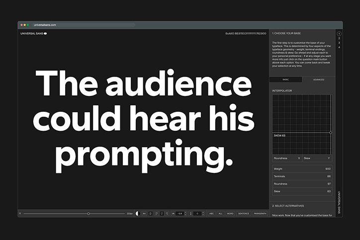
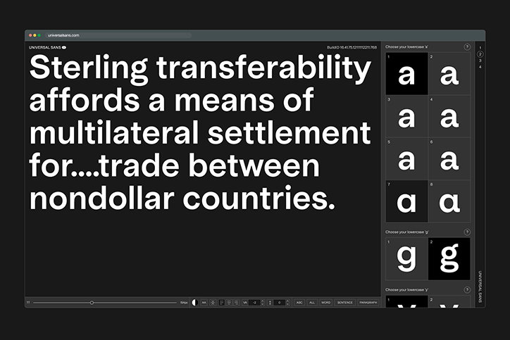
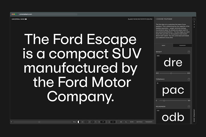
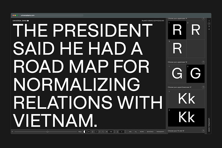
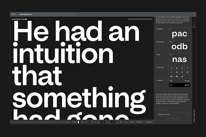
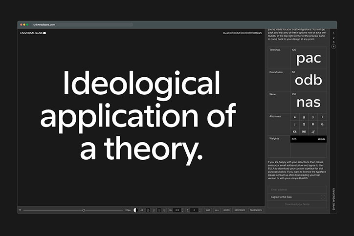
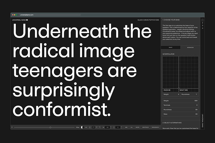
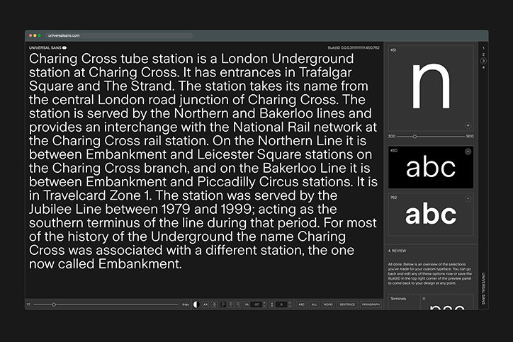
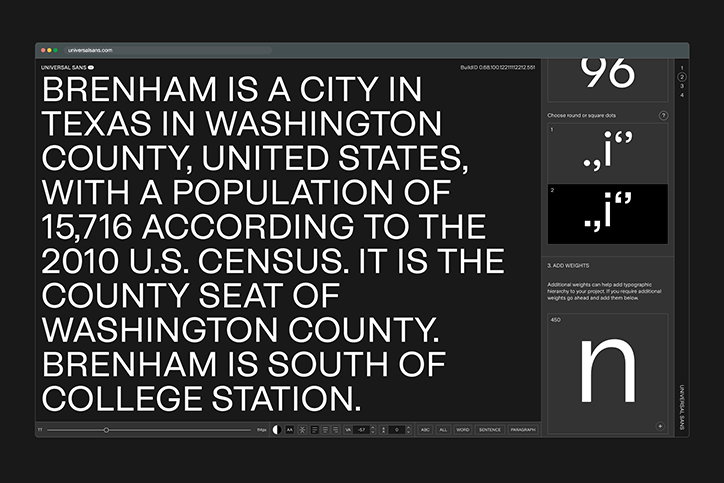
In response to this, Briton has launched Universal Sans, a variable typeface system that allows people to customise and download their own sans serif typeface. Released by Family Type, Briton’s recently launched type foundry with a focus on exploring how technology can be applied to type design and typography, Universal Sans is the first of its kind. “[It’s] the culmination of drawing many sans serif typefaces sand starting to experiment with how a single framework tweaked in certain ways could be used to create different typefaces that range from grotesques to geometric and humanist styles,” Briton adds. In turn, the personality of a typeface can be significantly changed by modifying the design of one character.
Variable fonts have been at the forefront of a lot of discussion in the design community of late, but Universal Sans feels like a step further; towards open-source type design. For Briton, however, it’s more about exploring the creative potential of variable fonts, viewing them as more than just a practical solution to type design’s problems. “I’ve been experimenting with variable fonts for a while and became really interested in the possibility of using them creatively to change the character of a typeface, rather than the conventional axes of weight, width, italic or optical size,” Briton explains. “This approach resulted in instances that were stylistically distinct and wouldn’t be used together in the same design – they weren’t part of the same family. I started to think of variable fonts as a way to create new typefaces rather than as a way to use typefaces, and also as a way to provide some control over the final stages of the type design process to the user.”
To achieve this, Briton needed to build a user interface around the typeface and a system to build the files using a combination of custom code and open source font tools. To do so, Twomuch studio’s help was enlisted, a firm fave of ours here at It’s Nice That.
Conversations around open sourcing design can be divisive, with some seeing it as a way of removing the skill required by a trained designer. But Universal Sans aims to aid the community, not undermine it. “The main benefit of this approach is that by removing the barriers of time and budget it makes customised type more widely accessible,” Briton explains. And rather than marking a the step in the direction towards automating type design altogether, Briton sees Universal Sans as a reminder that human touch will always be required. “The main drawback is that it is limited in scope – it doesn’t serve to replace traditional type design which can cover a much greater stylistic range… It was never intended to replace traditional type design which has many benefits and will remain the go-to solution in most instances.”
With the hope that Universal Sans becomes part of the vernacular and a useful tool for designers, the next step is to tackle Universal Serif, “but it’s quite a different challenge,” Briton concludes.
Family Type: Universal Sans
Family Type: Universal Sans
Family Type: Universal Sans
Family Type: Universal Sans
Family Type: Universal Sans
Family Type: Universal Sans
Family Type: Universal Sans
Family Type: Universal Sans
Family Type: Universal Sans
Family Type: Universal Sans
Family Type: Universal Sans
Share Article
Further Info
About the Author
—
Ruby is Senior Creative at It's Nice That, overseeing our visual output across platforms and projects. Before that, she was associate editor on the editorial team, after joining in September 2017 following graduation from Central Saint Martins.