Designer Brodie Kaman reflects on how his practice has developed over the past year
When we spoke to Australian graphic designer Brodie Kaman last July, he had just moved to Berlin and was conducting a journey of self-discovery in his life and work as a way of gaining control over his mental health, channelling his creativity during particularly “low times”.
Brodie’s work still intersects with the disciplines of music and performance, and over the past year, his practice has picked up pace as he’s taken on commercial projects with more and more prominent musical artists. Speaking of some of these larger projects, he tells us: “One stand out would be working with Brian Roettinger on the Mark Ronson and Miley Cyrus single. I’d been doing flyers for a party series Mark has been doing the last year called Club Heartbreak, which is where the initial broken disco ball came from. Then when it came to album time I worked with Brian to finesse it and turn it into the first single cover.”
This is all being taken in Brodie’s stride, and he’s been applying his signature DIY design approach and aesthetic within a variety of different and overlapping contexts, from music to sportswear. “I’ve been doing some bigger projects as an art director with Loud for Adidas which has been a nice change of pace, and the Toro Y Moi tour packages for Europe and Asia were really fun too.”
He’s also branched off into fashion, with a series of prints designed for Australian fashion innovator Dion Lee’s SS19 collection. As Brodie tells it: “The collection was playing with the idea of privacy; controlling what we show and don’t show. Using two variations of his code typeface and vectorised elements from one of the textiles, I interpreted it in a way that would represent the brief and sit well amongst the rest of the collection.” That Brodie’s designs integrate seamlessly among Dion Lee’s architectural silhouettes and lustrous textures is testament to the versatility of his work and its application beyond the immediate field of graphic design.
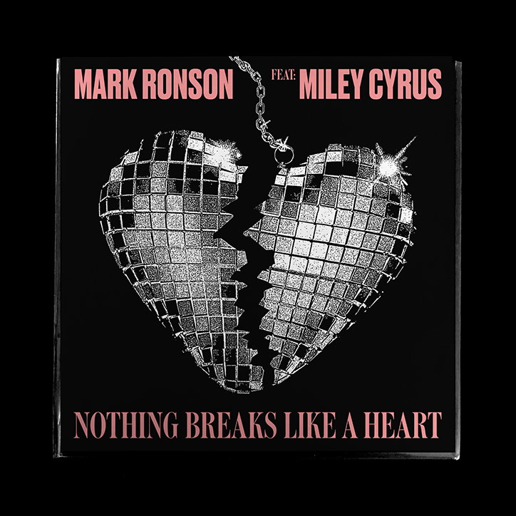
Brodie Kaman: Mark Ronson and Miley Cyrus, Nothing Breaks Like a Heart
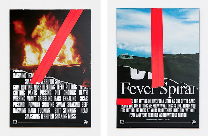
In his personal work, Brodie has continued to explore avenues for drawing on graphic design practice as a means of self-investigation and self-expression. His recent exhibition, Fever Spiral, at Weserhalle Berlin, presented a series of screen and digital prints encompassing both text and image, and contemplating the experience of mental illness and addiction. “The exhibition was a small collection of seven works touching on internal dialogue and past experience while serving as a platform for reflection and growth," he tells us. "Visually, it was loosely based on screen titles and film posters. I like to keep the screen prints minimal to emphasise the word or phrase while making the collages a little more playful.”
Summing up for us the elements of his work that he feels have undergone the greatest development over the past year, Brodie says: “Composition and negative space have become more of a focal point and something I’ve been much more conscious of. I’ve been experimenting with typography and customising typefaces for specific projects, as well as trying to not repeat myself too much.”
Brodie’s multidisciplinary design exploits in the commercial sector have us in constant admiration. What’s really exciting, though, is seeing how his practice evolves as he explores the therapeutic and meditative capacities of graphic design as a medium, a platform and a discipline.
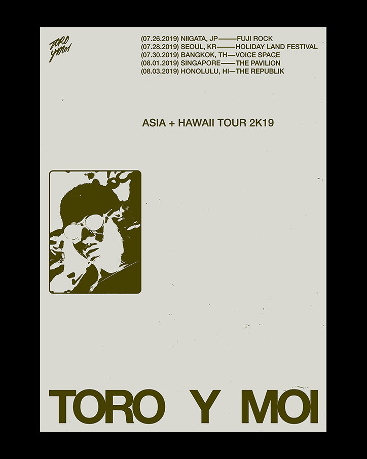
Brodie Kaman: Toro Y Moi
Brodie Kaman: Toro Y Moi
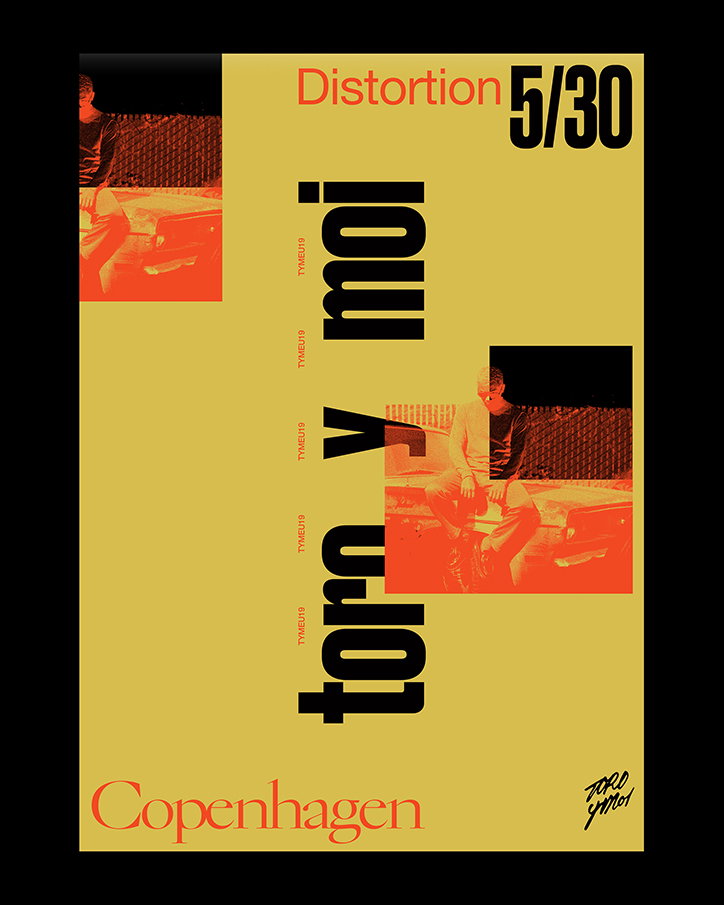
Brodie Kaman: Toro Y Moi
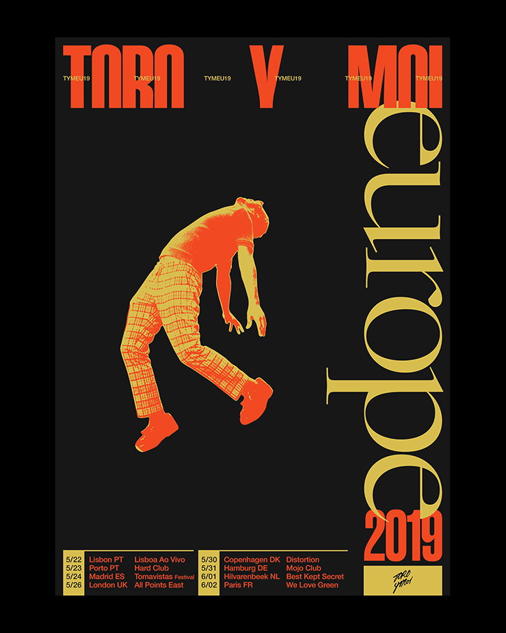
Brodie Kaman: Toro Y Moi
Brodie Kaman: Toro Y Moi
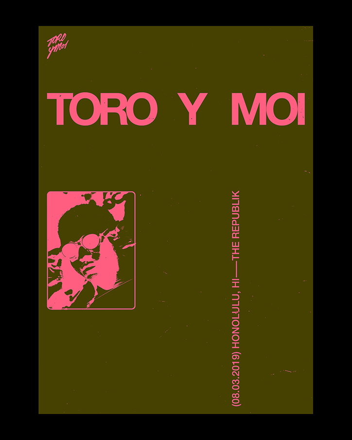
Brodie Kaman: Toro Y Moi
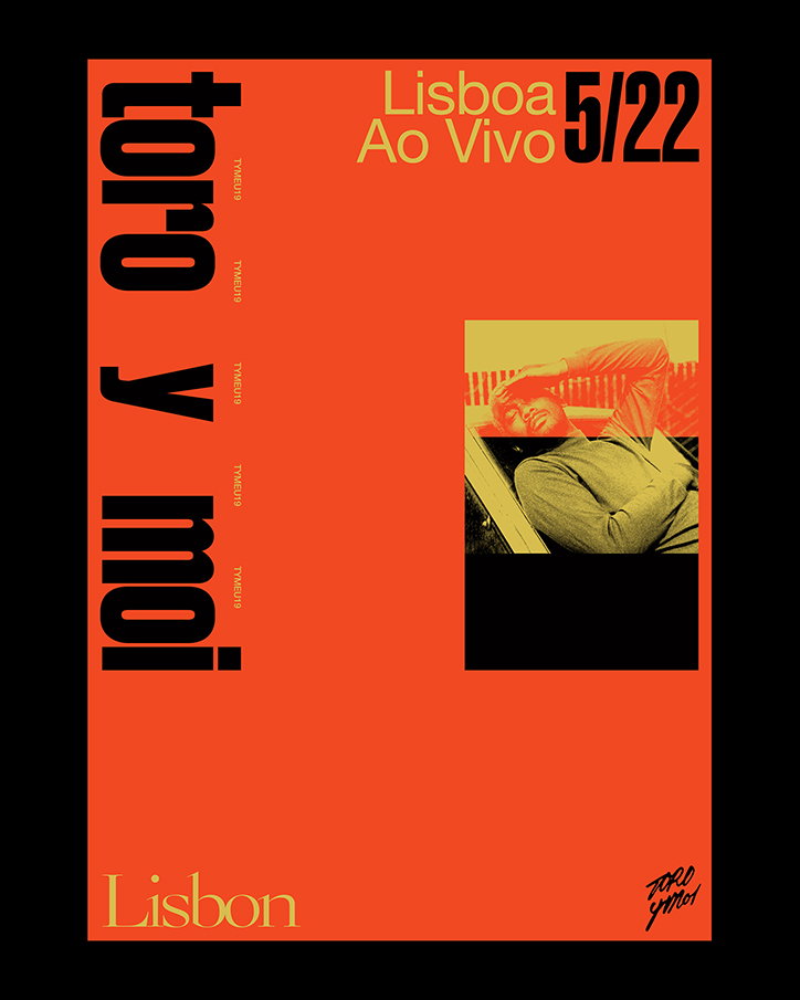
Brodie Kaman: Toro Y Moi
Brodie Kaman: Toro Y Moi
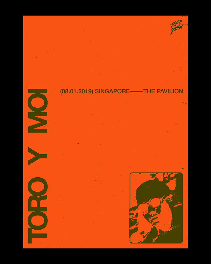
Brodie Kaman: Toro Y Moi
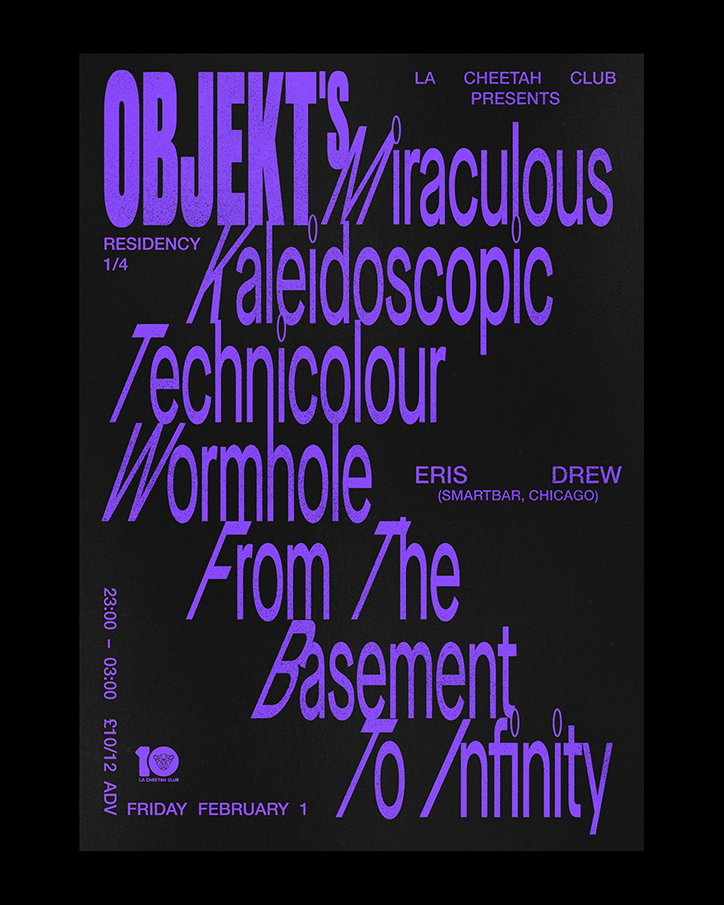
Brodie Kaman: Objekt
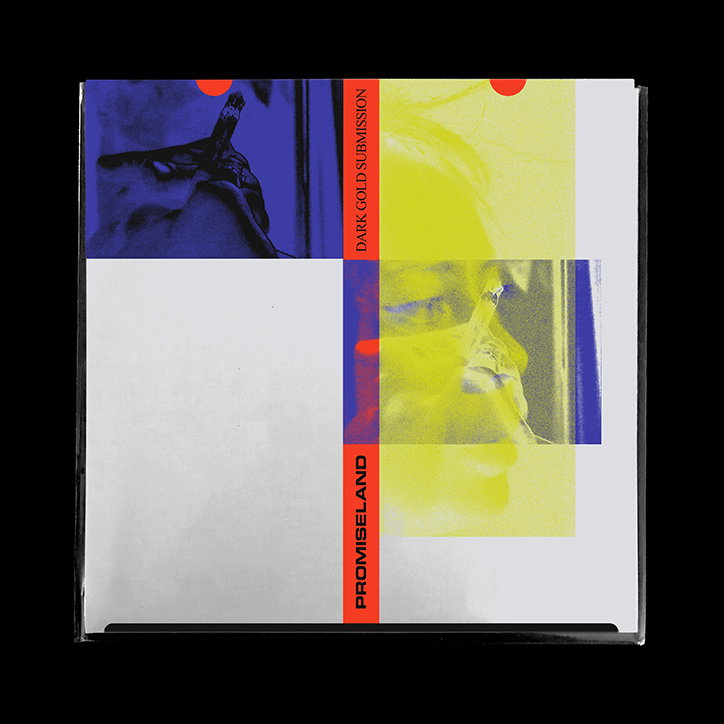
Brodie Kaman: Promiseland
Brodie Kaman: Promiseland
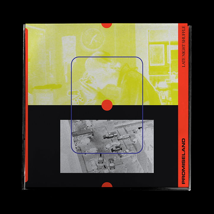
Brodie Kaman: Promiseland
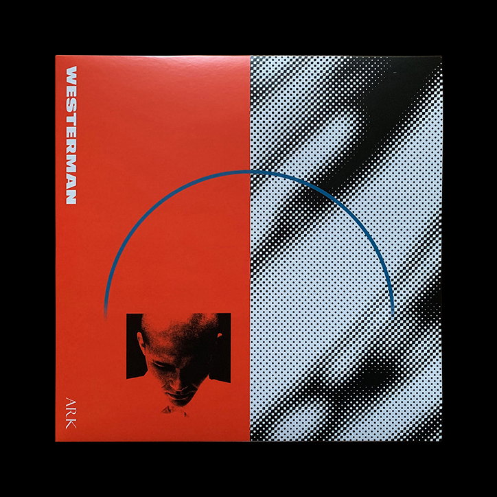
Brodie Kaman: Westerman
Brodie Kaman: Westerman
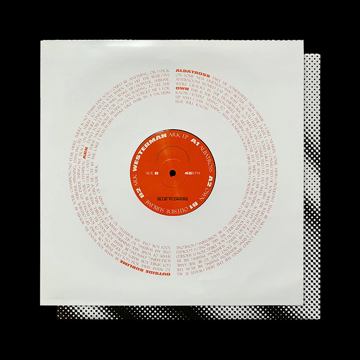
Brodie Kaman: Westerman
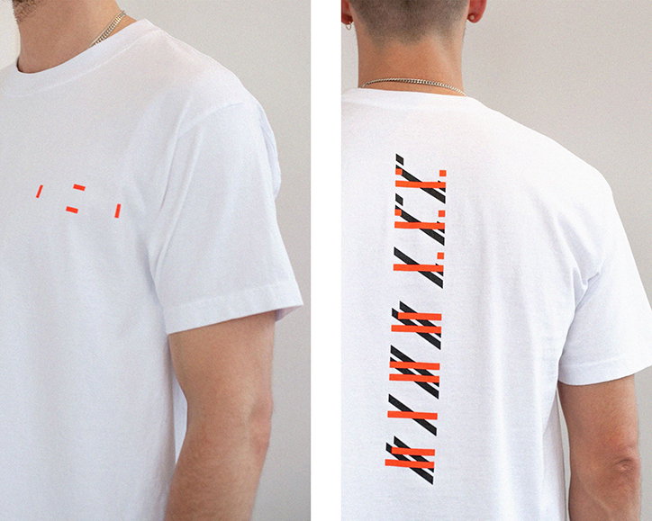
Brodie Kaman: Dion Lee
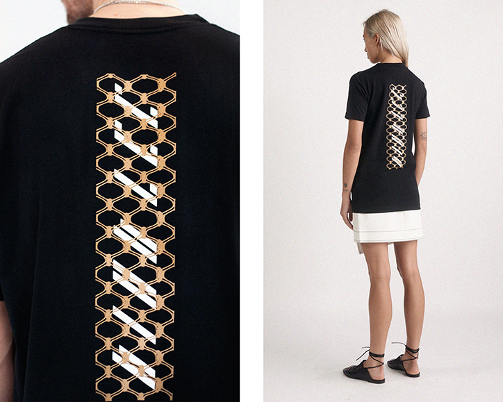
Brodie Kaman: Dion Lee
Share Article
Further Info
About the Author
—
Rowe joined It’s Nice That in the summer of 2019 as an editorial assistant. She wrote many fantastic stories for us, mainly on hugely talented artists and photographers.