Launch Recite Me assistive technology
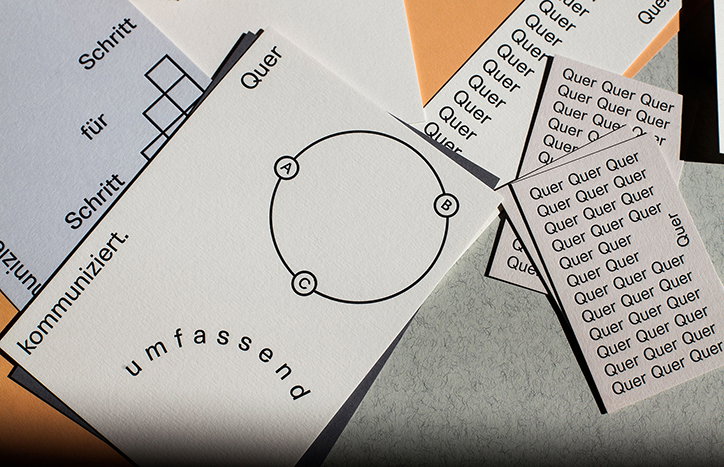
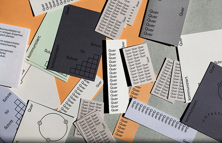
A collection of printed cards in grey, white, orange and green are scattered across a surface. Many feature the word “Quer” repeated in a grid, while others show diagrams and the words “Schritt für Schritt” and “kommuniziert”.

Bruch creates a simple and type-based identity for Quer

—
Date
27 June 2016

Graz-based design studio Bruch, founded by Kurt Glänzer & Josef Heigl, has created a simple and crisp identity for communication company Quer. The brief asked for a suite of stationery, a website and printed promotional material. “We decided to show exactly what the core of the company is about, by creating a characteristic identity where the arrangement and emphasis of text creates an image or message without the common logo approach,” say the designers.

Bruch wanted to concentrate on distilling its ideas down to make the Quer’s message as clear as possible. “Because we decided to bring the content to the front, we did not want to distract the viewer with a playful typeface. That is why we chose Unica, a neutral but beautiful font. Very simple graphics combined with type help to the viewer to get the message much faster,” says Josef. “Overall reduction and white space was very important to us. And the more reduced a design is, the more you have to take care how you use the single elements.” The identity and overall aesthetic will now be developed to create a magazine to publicise the company.
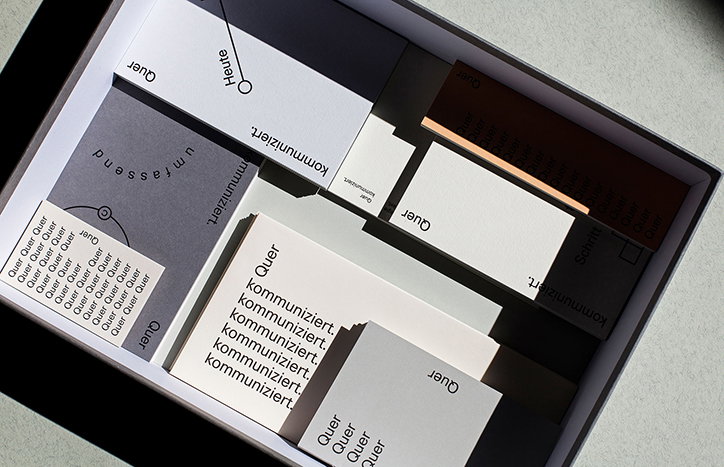
A collection of printed cards and slips of paper in a grey box. The cards feature minimalist typography in German, including the repeated words “Quer” and “kommuniziert.”
Above

Bruch: Quer

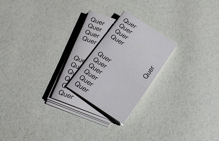
A stack of white business cards fanned out on a grey surface. Each card features the word “Quer” repeated in a clean, black sans-serif typeface.
Above

Bruch: Quer

A collection of printed cards with German text and diagrams. One card shows a circle with the letters “A”, “B” and “C” inside it, with the words “Quer” and “umfassend” printed around the edge.
Above

Bruch: Quer

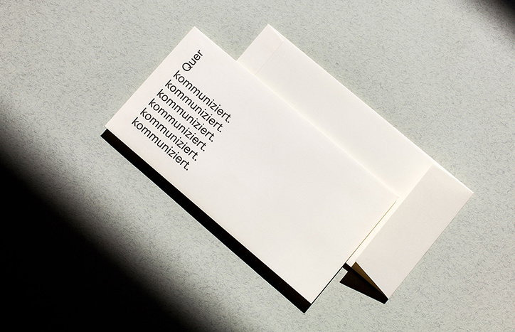
Two white cards and an envelope lie on a grey surface, partially shaded. One card features the word “Quer” followed by the word “kommuniziert.” repeated seven times in a column.
Above

Bruch: Quer

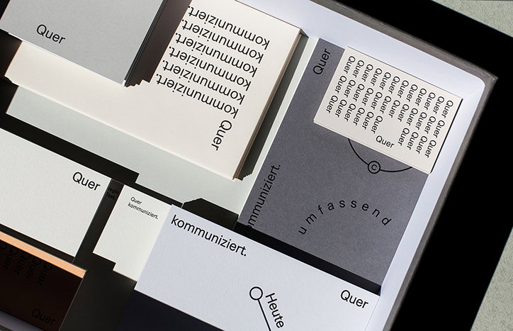
A collection of printed cards and papers in grey, white and black. The pieces feature minimalist typography with the German words “Quer”, “kommuniziert” and “umfassend”.
Above

Bruch: Quer

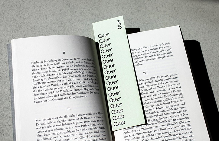
An open book with German text is marked by a long, narrow bookmark. The bookmark features the word “Quer” repeated in a vertical column.
Above

Bruch: Quer

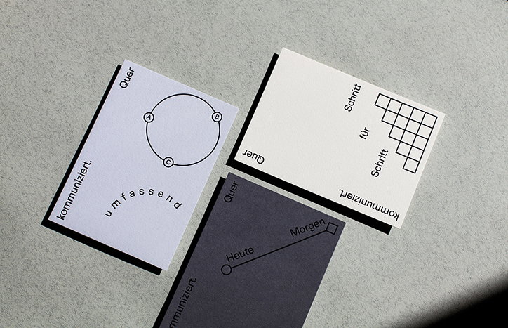
Three printed cards lie on a grey surface. Each features a simple geometric diagram and German text including the words “kommuniziert” and “Quer”.
Above

Bruch: Quer

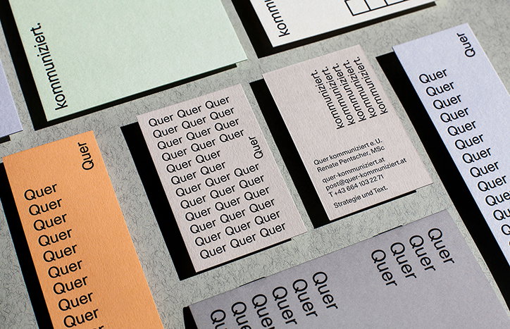
A collection of business cards and stationery in muted tones of orange, grey and green. The cards feature repetitive typography of the word “Quer” and the phrase “kommuniziert.”
Above

Bruch: Quer

Share Article

About the Author

Owen Pritchard

—

Owen joined It’s Nice That as Editor in November of 2015 leading and overseeing all editorial content across online, print and the events programme, before leaving in early 2018.

It's Nice That Newsletters

Fancy a bit of It's Nice That in your inbox? Sign up to our newsletters and we'll keep you in the loop with everything good going on in the creative world.