Cast Iron Design’s “sassy and free-spirited” branding for Byte Bars
Behind the witty, irreverent and youthful packaging is a lot of serious design, thanks to the skills of the Colorado-based studio.
Share
Nowadays our supermarket shelves (not to mention our Instagram feeds) are well stocked with beautifully designed food and drink products. Over the past decade or so, brands have realised that to catch a customer’s eye online or offline, great packaging is a prerequisite. So, it’s a rare thing indeed when a piece of food branding makes you really stop and take note. Cast Iron Design, a studio founded by Richard Roche and Jonny Black and based in Boulder, Colorado, has managed that feat with its branding for Byte Bars.
“The two Byte co-founders happened to be local, and one of their friends was in one of the design courses we taught at CU [University of Colorado Boulder],” says Jonny. The young entrepreneurs, who had created a new natural energy bar, met Jonny and Richard at the Cast Iron office and “everyone clicked well from the very beginning.”
From that point, the first step was agreeing on an approach. Through workshops and discussions, the team decided on what Jonny calls a “contrarian strategy”: to create “something that would break expectations in the natural bar category and appeal to people of a similar demographic to the founders themselves.” He describes that demographic as “young, active millennials who care about health and sustainability, who look for products that stand out (in this case, with a sassy personality and free-spirited vibes)”.
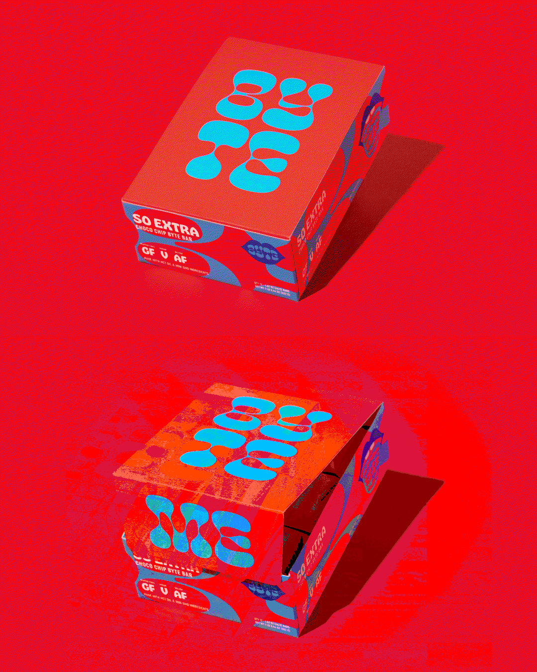
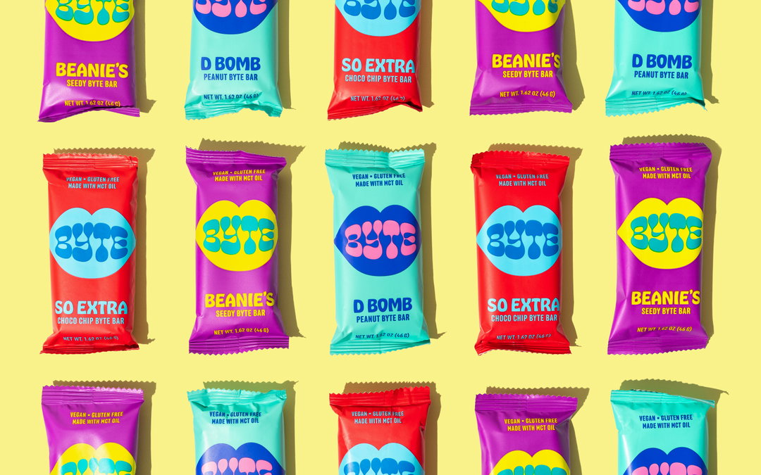
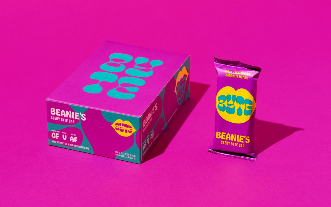
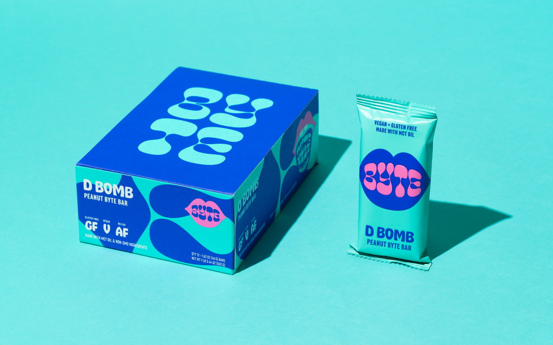
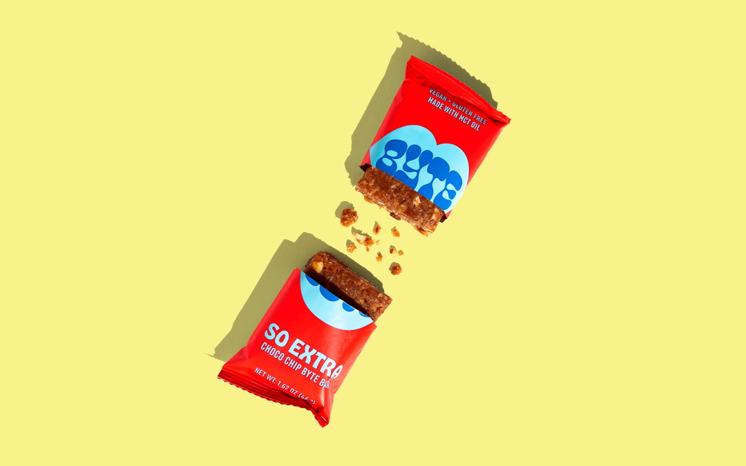
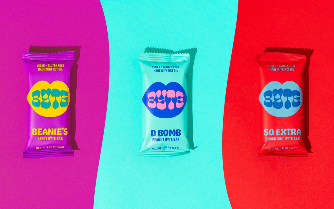
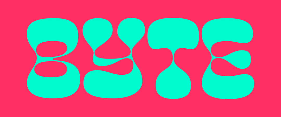
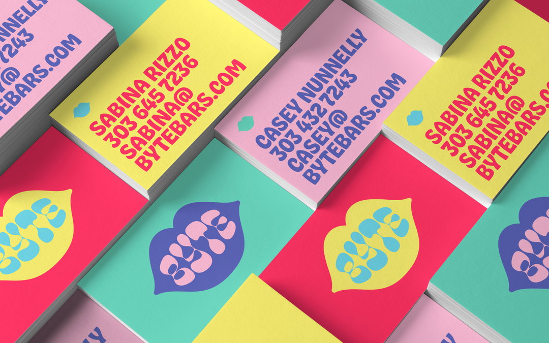
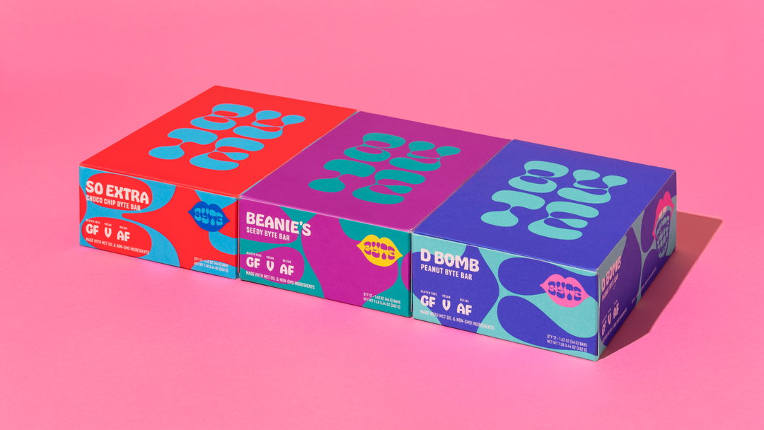
The final branding is colourful, punchy and definitely sassy, dominated by a set of lips, an irreverent tongue, and super-playful copywriting and typography. There are also some witty details throughout. The lid of the shipper says “me”, so that when you open the box, it reads as “byte me”, for instance. “Pretty much only the shelf stockists will see that message,” says co-founder Richard, “but we love injecting those little bits of personality into a brand that reward people who are paying attention to the details (even if it’s not the customer).” Labels on the retail box say: “Vegan V, Gluten Free GF, and Delicious AF”. “If anyone asks,” says Richard, “the ‘AF’ officially stands for ‘and fun’.”
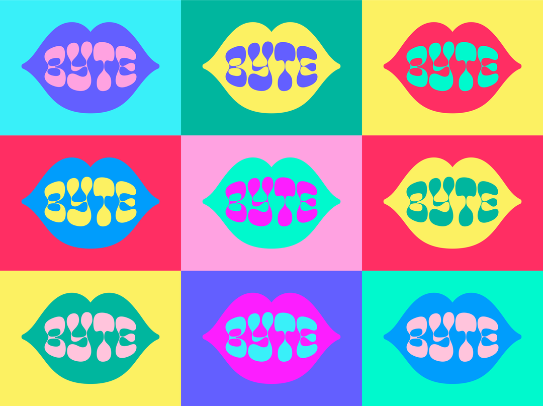
Cast Iron Design: Byte Bars branding
Unsurprisingly, however, behind all the playfulness is a lot of rigour and serious design. “No matter how playful we’re able to get with a brand, there’s always the underlying formal and technical part of us that we can’t turn off,” Richard explains. “All of the layouts are still on a grid and have careful thought put into the hierarchy.” The extensive colour palette and working out which colours were allowed to touch took over a dozen hours to get right. “Finding Pantone matches was a whole other challenge.”
Yet the main feeling you get from looking over the visual assets of this branding project is that the designers had a lot of fun creating this work. Partly, according to Richard, this is down to a particularly understanding and adventurous client. “It’s always extra enjoyable for us when we get to do something more youthful, carefree, and unexpected for the category, when we get to subvert expectations,” he says. It helped that the client was basically targeting people like themselves. “It’s freeing when we can just make something we know the client will love and not have to run it by any additional filters like senior management.” (I can almost hear your sighs of agreement, dear readers.)
GalleryCast Iron Design: Byte Bars branding
Share Article
Further Info
About the Author
—
Matt joined It’s Nice That as editor in October 2018 and was editor-in-chief in September 2020–2024. He was previously executive editor at Monocle magazine. He is now a freelance writer and editor.