Launch Recite Me assistive technology
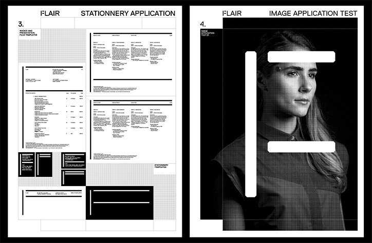
Two pages from a brand guidelines document for “Flair”. The first page shows “Stationery Application” with various layout templates for letterheads and documents. The second page, titled “Image Application Test”, features a black and white portrait of a person partially obscured by bold white geometric shapes.

Catalogue and Clément Le Tulle-Neyret's simple, flexible identity for creative agency Flair

—
Date
12 January 2016

We’ve said it before and we’ll say it again: it sure as hell can’t be easy designing for designers. Thankfully, French studio Catalogue has pulled it off with this superb design for creative studio Flair. The identity uses a very simple monochrome palette and clear, crisp typography based around a flexible “F" for Flair. The different elements of the letter are used to form an ever-changing logo-mark, and also act as a framing device. The ascender, stem and bars of the letter take on different lengths for different applications of the identity, making for a very simple yet super smart system that works across anything from online platforms to photographic posters. The identity was developed with Clément Le Tulle-Neyret, whose excellent work we covered on the site a month or so ago.
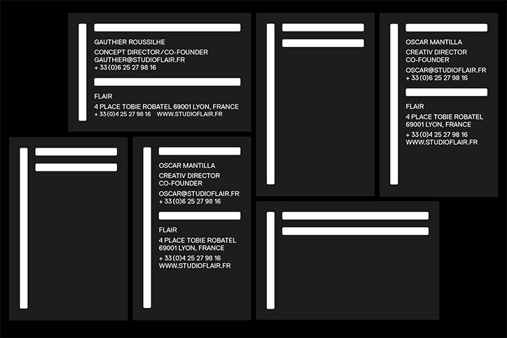
A collection of black business cards with white text and graphic bars. The cards list the names and contact details for Gauthier Roussilhe and Oscar Mantilla of the studio “Flair”.
Above

Catalogue: Flair identity

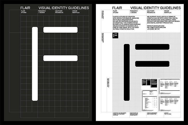
Two pages from a visual identity guidelines document for “Flair”. The left page shows a white logo on a dark grey grid, while the right page displays the same logo in black on a white background alongside blocks of descriptive text.
Above

Catalogue: Flair identity

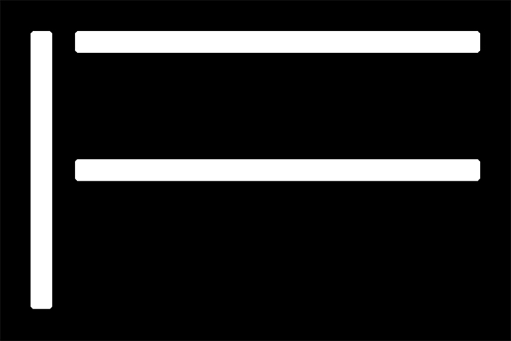
A white graphic of a capital letter “F” on a black background. The letter is composed of thick, rounded lines.
Above

Catalogue: Flair identity

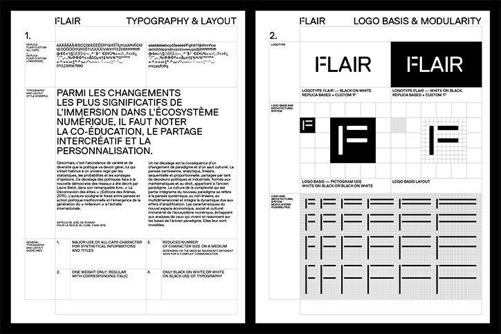
Two pages from a brand guidelines document for Flair. The first page focuses on “Typography & Layout” with a large block of French text and font samples. The second page, “Logo Basis & Modularity”, shows the Flair logo in black and white versions alongside various grid layouts and icon variations.
Above

Catalogue: Flair identity

Share Article

About the Author

Emily Gosling

—

Emily joined It’s Nice That as Online Editor in the summer of 2014 after four years at Design Week. She is particularly interested in graphic design, branding and music. After working It's Nice That as both Online Editor and Deputy Editor, Emily left the company in 2016.


It's Nice That Newsletters

Fancy a bit of It's Nice That in your inbox? Sign up to our newsletters and we'll keep you in the loop with everything good going on in the creative world.