




Meet the Swiss duo behind graphic design agency Cécile + Roger
Cécile + Roger is a graphic design agency run by Cécile Nanjoud and Roger Gaillard. The Geneva-based duo’s work moves across brand design, identity, type design, editorial design, illustration, motion and web design. We asked the Swiss designers to tell us more about themselves and their process.
Tell us how you found your way into graphic design…
Roger: I began my study at 15 years old at Applied Arts School in Geneva. I came to this school to learn how to make video games and when I was there I learned to love graphic design. During these years, I also learned web design and motion design.
Cécile: I discovered graphic design as I have a few designers in my family. I studied applied arts in Grenoble then I specialised in visual communication at the University of Arts and Design in Geneva, Head — Genève.
How did the two of you meet?
We met during our study at the University of Arts and Design in Geneva, Head — Genève. We didn’t really work together then. We only worked together when we finished school. First we had some personal projects, and then we collaborated in a professional way as Cécile + Roger.
What defines your work as Cécile + Roger? What do each of you bring to the creative partnership?
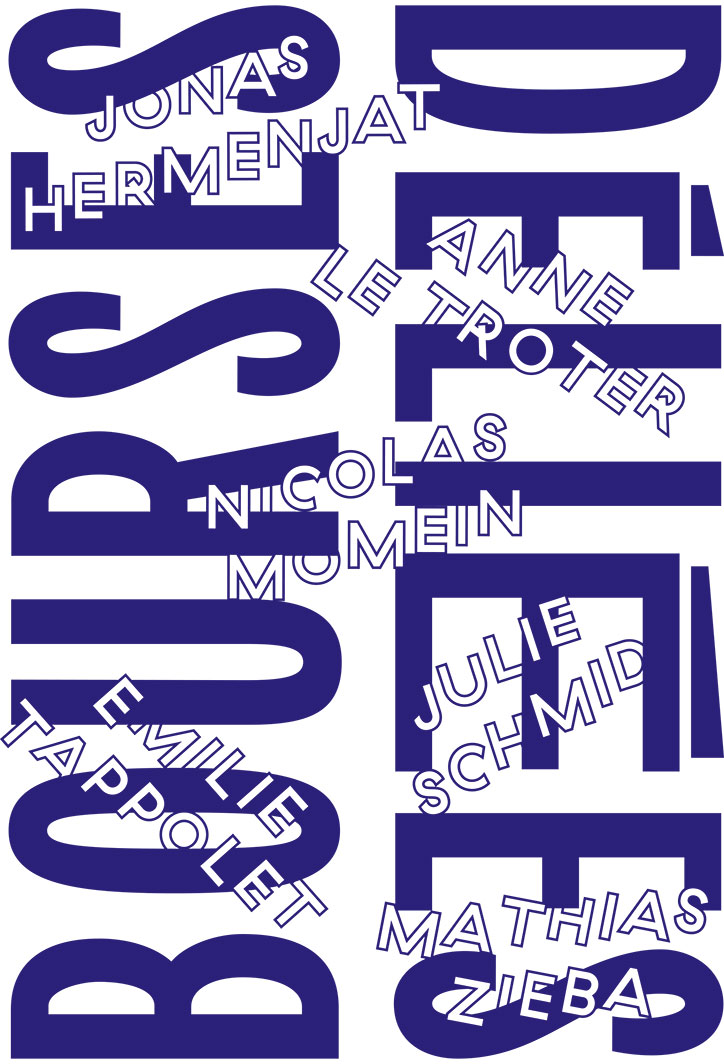
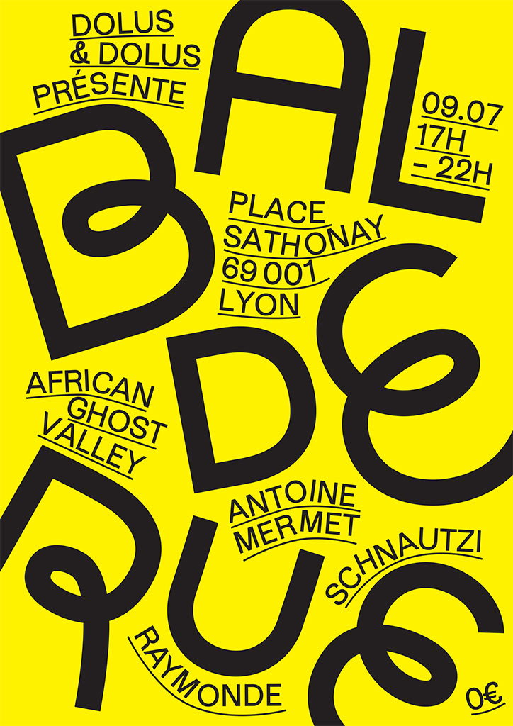
We like powerful and straight imagery. We playing with colours and typography. We enjoy working on printing medium as on digital medium. It’s very interesting for us to create much as variation as possible of one idea. Most of the time, we begin a project with a ping-pong of ideas and questioning. After that, each of us works on the best way to express these ideas. We experiment with digital and manual techniques. Finally we chose the best direction, and work together to refine the whole thing.
What’s been your favourite project during the last few months? Tell us about it.
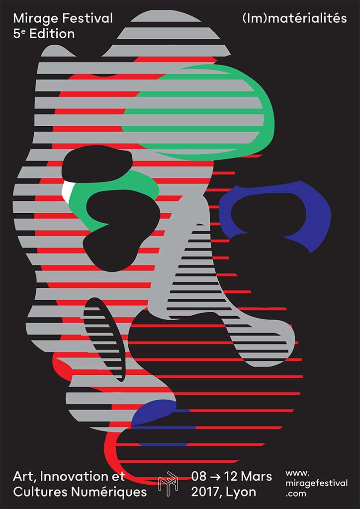
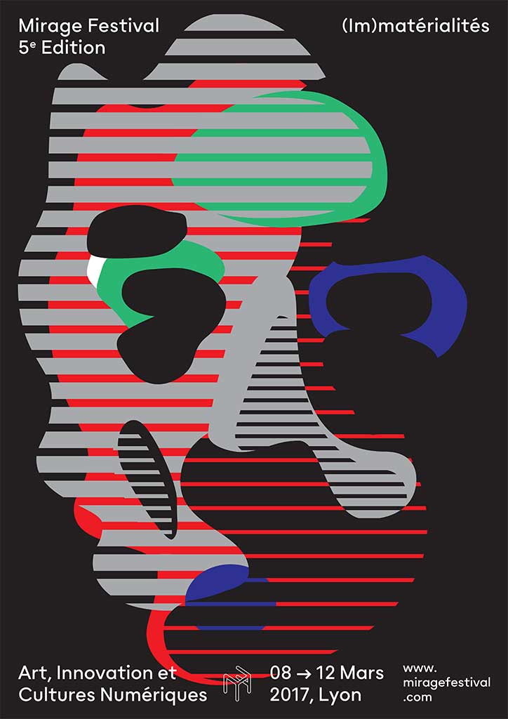
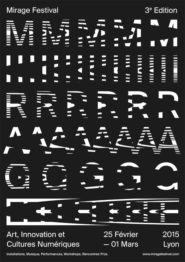
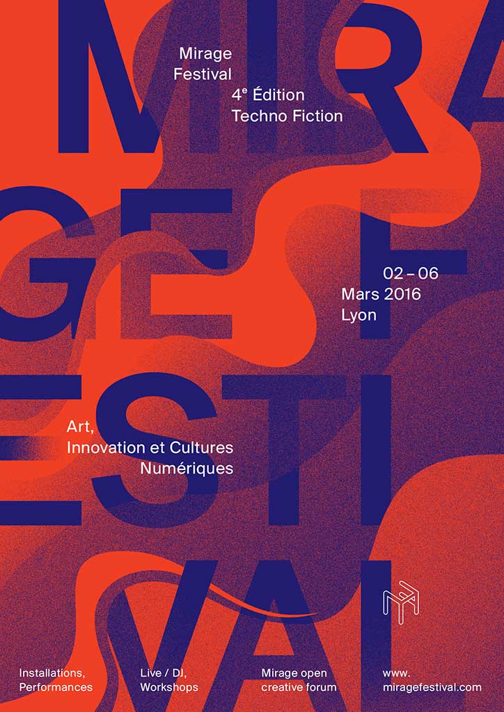
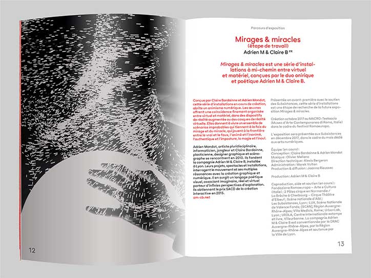
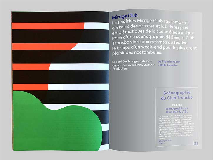
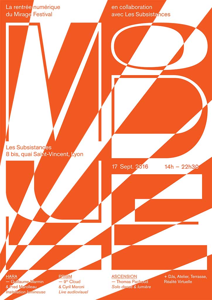
Since five years, we’ve been working with the Mirage Festival in Lyon (FR). It’s a festival about art, innovation and digital culture. The issue is to create each year a visual identity as innovative as the festival. We attend very interesting shows and exhibitions during the festival. That improves our knowledge of the digital art scene, full of experimentation and new technology. It’s inspiring and it has an impact on our work.
Cécile + Roger
Cécile + Roger
Cécile + Roger
Cécile + Roger
What continues to excite you about working in graphic design in 2017?
We’re very interested in moving and interactive graphic design. We think that we have yet a lot to learn and to explore in this field. It’s very stimulating. We have to put things into perspective and keep being aware of actuality in this field around the world. We’re working to improve our work and to go one step further. The new technology’s constant progress and its easy access make things more exciting.
Who, or what, inspires your work?
We’re inspired by artists with strong imagery like Roy Lichtenstein, Keith Haring or Matisse. We’re also inspired by Sachplakat and DADA, two movements which are very important in graphic design history. We like great Swiss graphic designers like Müller-Brockmann or Armin Hofmann because of their essential theory about graphic design. The current Swiss graphic design scene is also a great source of inspiration, especially Luzern’s scene with Studio Feixen or Erich Brechbühl. Finally, we pay attention to illustrators with clear and humorous message like Jean Jullien or Christoph Niemann.
On that note, what’s the graphic design scene in Geneva like at the moment?
We mix with a productive graphic design generation in Geneva. Its work is made of swiss historical style and freshness. We could name Neo Neo, AMI, Futur Neue, Todeschini+Mamie. Their work is very stimulating. They’re behind some projects questioning graphic design. For instance, Neo Neo creates a gallery curating exhibition and building an archive about printing matters called Print program. AMI are running an independent publishing house called Miami Books. As for us, we are setting up a poster exhibition in a public space through our association Affichage public.
Finally, which other creatives do you admire, and why?
Hard question. If we had to chose only one creative, it would be Adrian Frutiger. He has done a lot for graphic design. His creations are everywhere: French and Swiss road signs, the font Univers or some great institutional logos which are going to be used for a long time to come. Despite that, he isn’t well known by the general public. He worked, according to us, without pretension and dogmatism and left a legacy that we all have to carry on. We admire his state of mind.
Cécile + Roger
Cécile + Roger
Cécile + Roger
Cécile + Roger
Cécile + Roger
Cécile + Roger
Cécile + Roger
Cécile + Roger
Share Article
Further Info
About the Author
—
Bryony joined It's Nice That as Deputy Editor in August 2016, following roles at Mother, Secret Cinema, LAW, Rollacoaster and Wonderland. She later became Acting Editor at It's Nice That, before leaving in late 2018.



