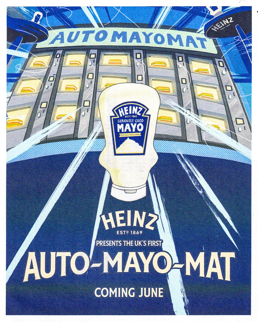
ChaChaanTeng’s saucy auto-mayo-mat identity for Heinz is a fantastically physical opponent to AI slop
Following one super successful venture into Heinz sauces, ChaChaanTeng activation for Heinz Mayo explores the romanticised sensations of food and the physicality of Japanese vending machines.
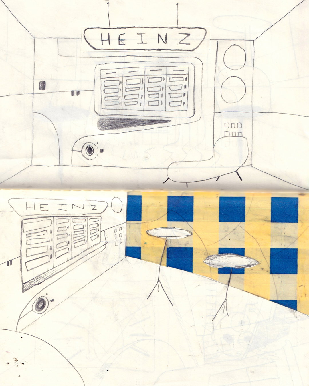
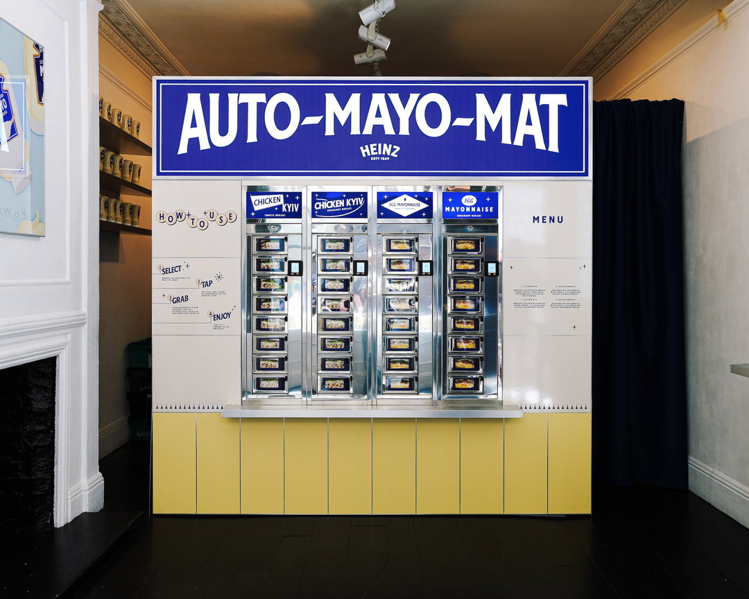
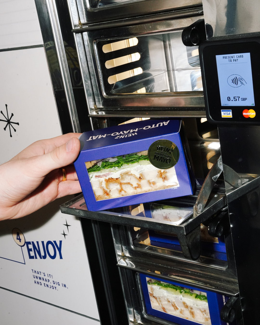
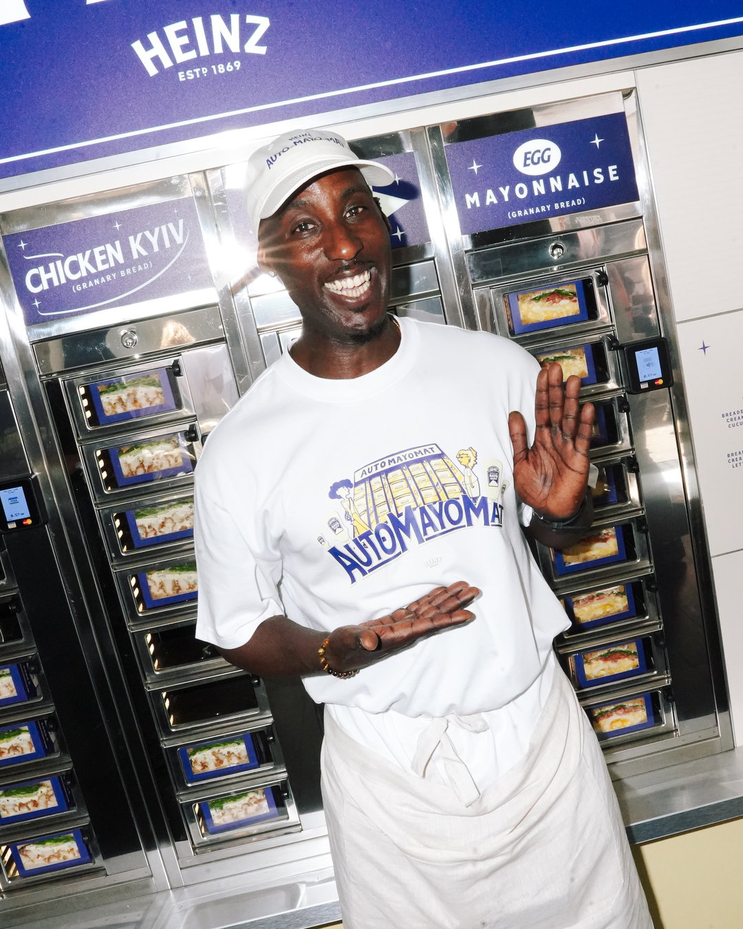
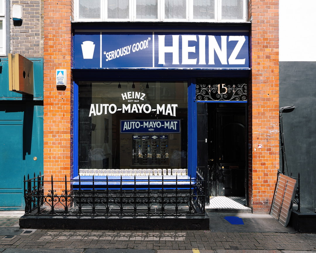
The London-based design studio ChaChaanTeng have had the rather fun task of designing and creating a physical world for Heinz Mayo – the UK’s first automated sandwich vending machine serving mayonnaise-based sandwiches. All for one of the most important dates of the year, National Picnic Week, of course. The ‘auto-mayo-mat’ concept – created by Hot Sauce, a creative studio and collaborator on the project – is not ChaChaanTeng’s first foray into the Heinz sauce universe, having previously created the identity for Heinz x Morley’s. Whilst the latter focused on creating a visual space for both brands to express themselves authentically, Wei Prior, director at ChaChaanTeng, explains how Heinz mayo-mat was about the bigger picture. “From a graphic perspective, we learned to push more expressive design languages whilst being respectful to guidelines,” says Wei, a crucial factor when shaping a whole physical world for the product that already exists IRL.
ChaChaanTeng had to contend with the existing perceptions of mayonnaise, a condiment altogether more specific, widespread and plain than Morley’s x Heinz. “We really had to focus on the experience of food in order for us to create the visual flavour,” Wei says, trying to capture the feeling of that first bite into a fresh sandwich, as well as the novelty of using automats. “All these experiences and nostalgia really fed into why it was important to us to have a vintage feel,” he adds, “and a cartoon reminiscent of when we were young.”
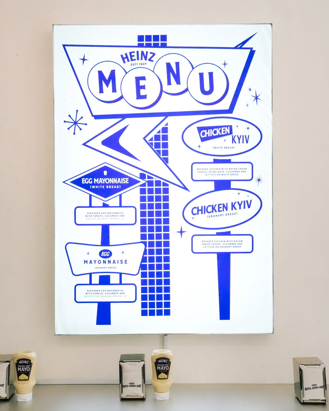
ChaChaanTeng: Heinz Mayo (Copyright © Jenny Arrowsmith, 2026)
ChaChaanTeng could afford to explore such novelty across the project because of the blank slate it was handed. “When the project first came to us, there was naturally some inspiration from Japanese vending machines, 7-Eleven culture and the Amsterdam chain, FIBO,” says Wei. “The way it’s portrayed through packaging and animation is so highly romanticised, and that essence of love for food is what we wanted to centre our world around.” Whilst looking at the visual language of Japanese vending machines, the studio was adjacently looking at mid-century American design. The identity was then rolled out across a plethora of physical applications, from merchandise, posters and packaging to the ‘auto-mayo-mat’ itself.
The physicality of the project is fundamental to both its success and the calibre of its messaging – especially given our current, digitally-saturated culture – and this hands-on approach extended to how the project existed online. “In an age of AI slop and disposable content,” Wei says, “we really wanted to create something that was as tactile as every other aspect of this project.” ChaChaanTeng, alongside animator Leah Putnam, created a nostalgic, jovial animation – reminiscent of old advertisements and children’s cartoons – that befitted Heinz’s own legacy of animation. “We felt so lucky to create a 25-second, frame-by-frame animation to add to that legacy,” Wei adds, “and we also felt extremely lucky to work with Leah,” whose animation was so fitting that it became one of the posters in the physical space.
Wei’s merry mood in detailing the design of the project is both emblematic of the project and seemingly ChaChaanTeng’s approach to its practice. There is an innate playfulness across its design alongside an embedded aptitude for what they do and an earnestness in how they do it. ChaChaanTeng’s work for Heinz Mayo really captures this, perhaps due to the client’s own appreciation of the studio. “One of the reasons I really appreciated this move from Heinz, was because we get a lot of clients asking us to ‘do something cool’,” Wei says, “but rarely follow through,” more often than not watering down an idea to an inch of what it originally was. “So it was really appreciated when Heinz had the conviction to make this happen!”
GalleryChaChaanTeng: Heinz Mayo (Copyright © ChaChaanTeng, 2026)
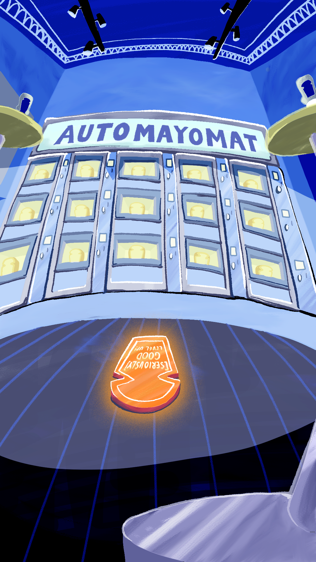
Animation: Leah Putnam
Animation: Leah Putnam
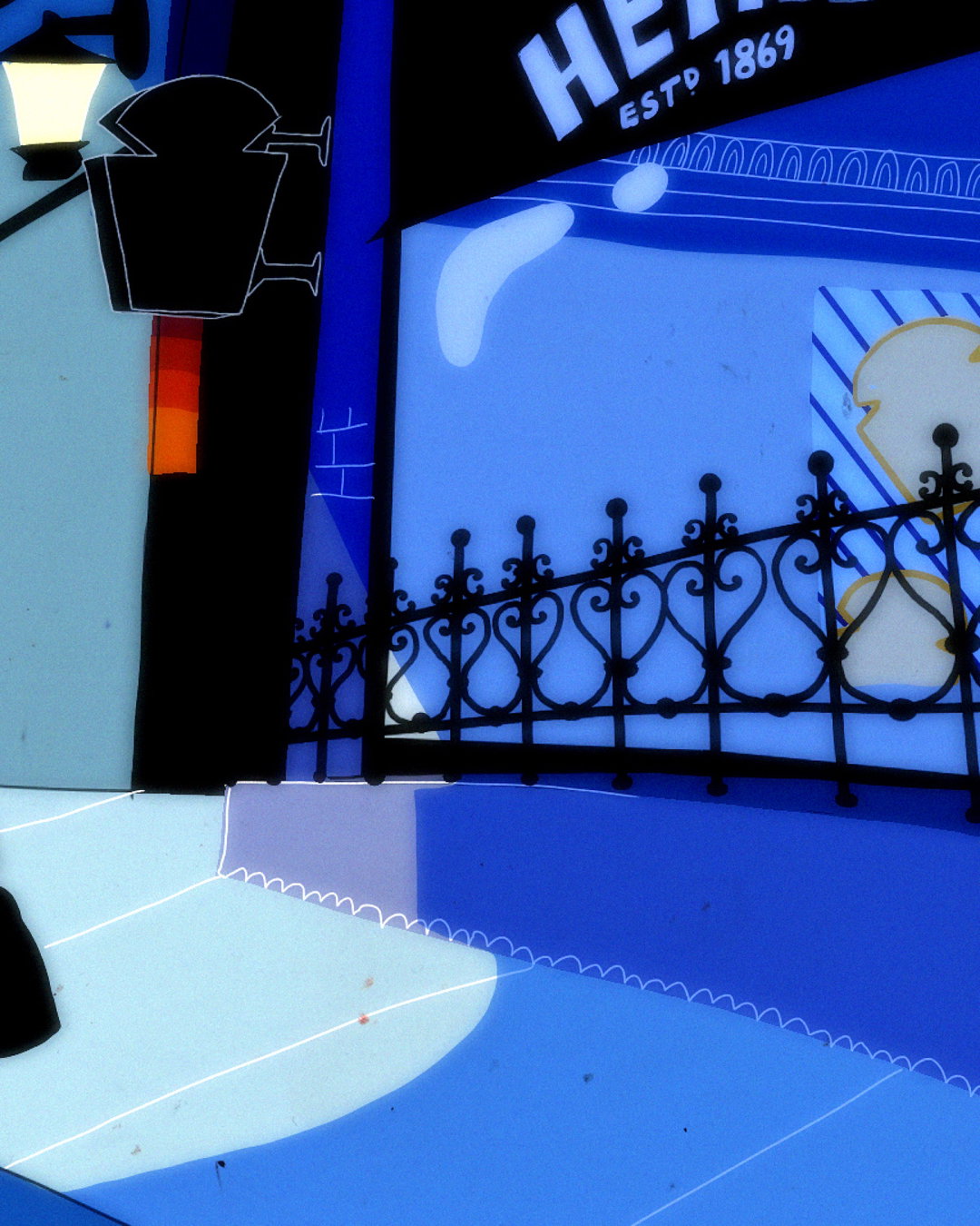
Animation: Leah Putnam
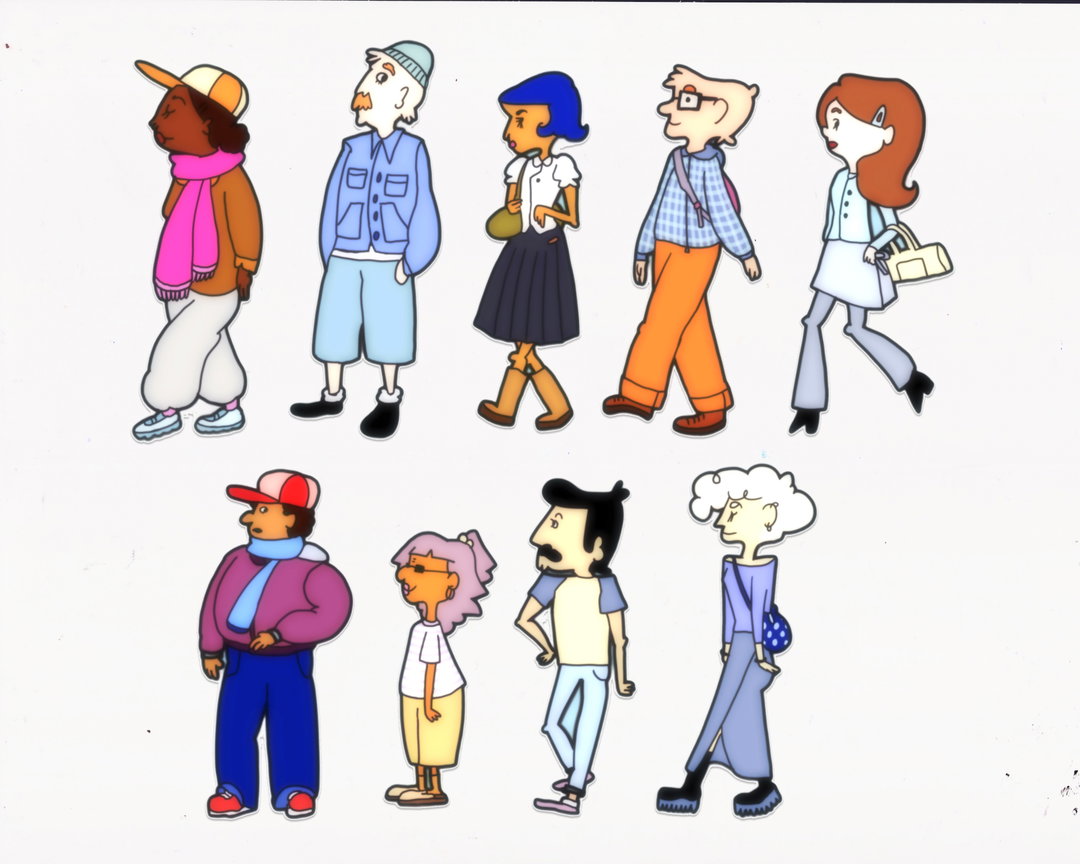
Animation: Leah Putnam
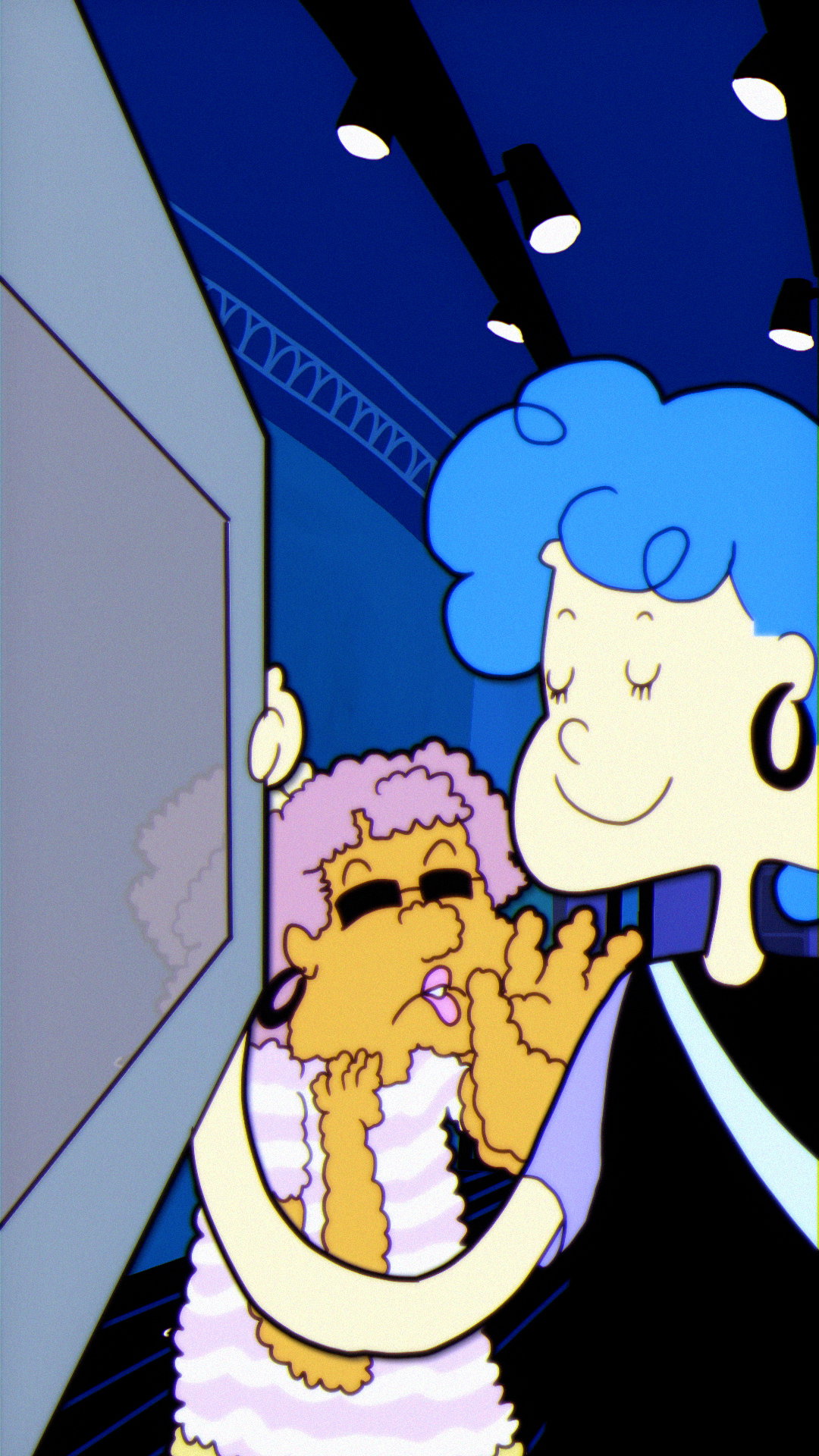
Animation: Leah Putnam
Animation: Leah Putnam
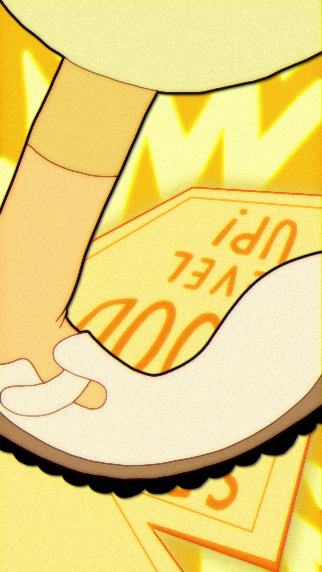
Animation: Leah Putnam
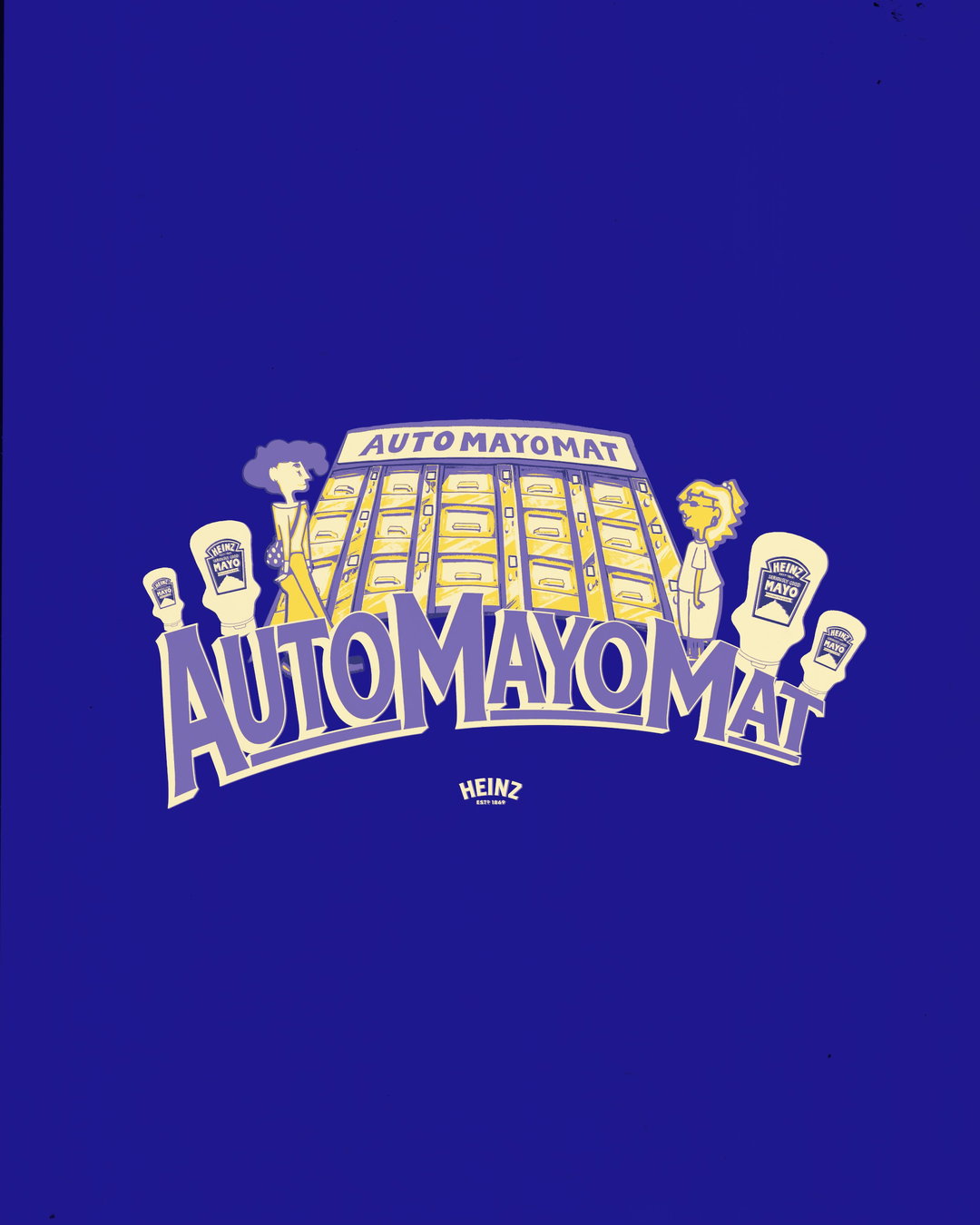
Hero Header
ChaChaanTeng: Heinz Mayo (Copyright © Jenny Arrowsmith, 2026)
Share Article
Further Info
About the Author
—
Hailing from the West Midlands, and having originally joined It’s Nice That as an editorial assistant in March 2020, Harry is a freelance writer and designer – running his own independent practice, as well as being one-half of the Studio Ground Floor.