Launch Recite Me assistive technology
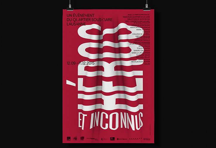
A red and white poster featuring the words “Héros et Inconnus” in bold, distorted typography. The central text appears to ripple and fold across the page, accompanied by the date “12.09 – 11.12.2015” and a list of participants.

Graphic designer Chris Gautschi finds inspiration in type, architecture and alchemy

—
Date
10 February 2017

Graphic designer Chris Gautschi’s work draws upon swiss typography from the mid 20th Century. “It is a minimalist and radical approach that tends towards using the least elements possible, thus giving it a timeless, contemporary aspect,” he says. He graduated from Ecole d’Arts Appliqués in La Chaux-de-Fonds in 2005 and has since built up a portfolio that includes identities for businesses and institutions, publications, posters and more.

His work is heavily inspired by master builders, alchemists, geometry and architecture. “I like to find parallels between the tools of the builders, and the graphic designer’s duty to build and draw what is essential for a project,” he says. “I try to apply these same methods through my designs. In those structures, one can often see the golden section at work; its function was to let the light in in order to attain visual perfection. Constructing a cathedral or a layout – for me, it boils down to the same thing.”

This year Chris will be working on architecture books, a personal project on alchemists, the identity and branding for a museum and a series of conferences in Geneva.
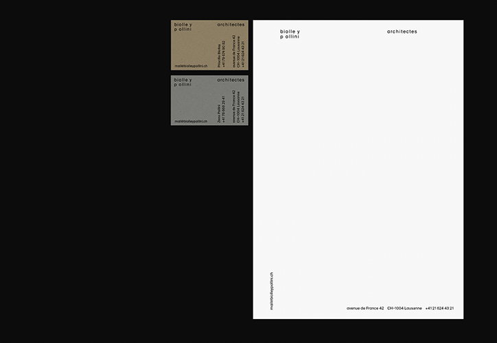
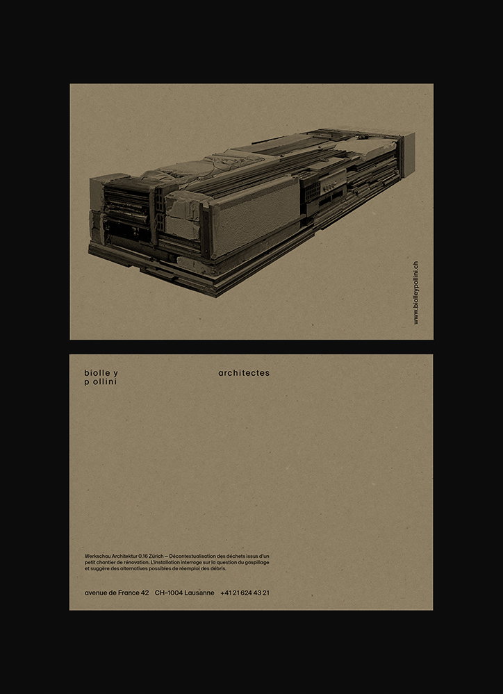
A set of minimalist business cards for “biolle y pollini architectes”. The cards feature clean typography on white and brown backgrounds with contact details and a website address.
Above

Chris Gautschi: BPA

Two business cards on a beige background. The top card shows a 3D render of a long, grey architectural structure made of layered materials. The bottom card reads “biolle y pollini architectes” and includes a short paragraph in French and contact details for Lausanne.
Above

Chris Gautschi: BPA

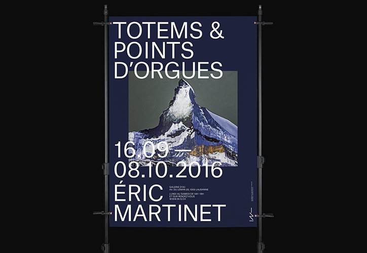
A blue poster featuring a photograph of a snow-capped mountain peak. Bold white text reads “TOTEMS & POINTS D’ORGUES”, “16.09 – 08.10.2016” and “ÉRIC MARTINET”.
Above

Chris Gautschi: Eric Martinet

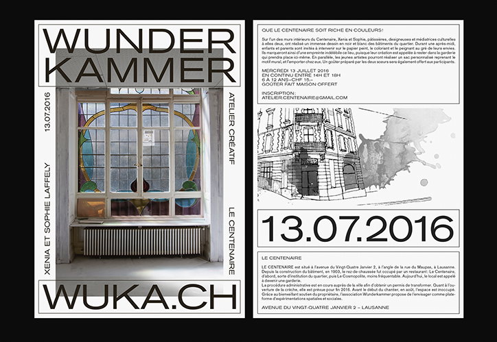
A black and white layout of a promotional flyer. The left side features a photo of a window with stained glass and the bold text “WUNDER KAMMER” and “WUKA.CH”. The right side contains a sketch of a building and the date “13.07.2016” above blocks of French text.
Above

Chris Gautschi: Wunder Kammer

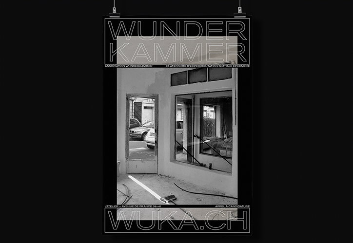
A black and white poster featuring a photograph of an empty, industrial room with an open doorway. Large outline typography at the top reads “WUNDER KAMMER” and the bottom reads “WUKA.CH”.
Above

Chris Gautschi: Wunder Kammer

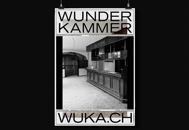
A black and white poster featuring a photograph of an empty interior with a long wooden counter. Bold text at the top reads “WUNDER KAMMER” and the bottom reads “WUKA.CH”.
Above
Left

Chris Gautschi: Wunder Kammer

Right

Chris Gautschi: Wunder Kammer

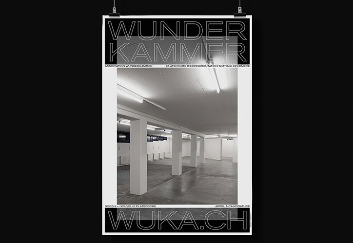
A black and white poster featuring a photograph of a stark, empty industrial space with white pillars. Large outlined text at the top reads “WUNDER KAMMER”, while the bottom reads “WUKA.CH”.
Above

Chris Gautschi: Wunder Kammer

A red and white poster featuring the words “Héros et Inconnus” in bold, distorted typography. The central text appears to ripple and fold across the page, accompanied by the date “12.09 – 11.12.2015” and a list of participants.
Above

Chris Gautschi: QSGL

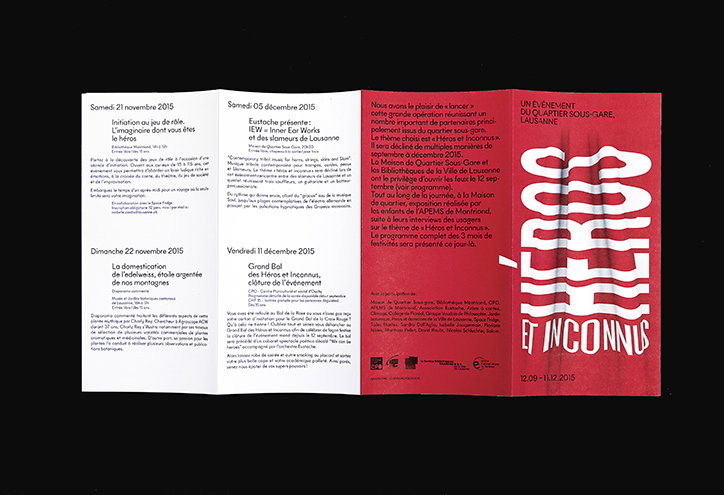
A red and black folded brochure with white text. The front cover features a large, stylised graphic that reads “Héros et Inconnus” above the dates “12.09–11.12.2015”.
Above

Chris Gautschi: QSGL

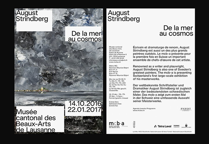
Two posters for an exhibition of August Strindberg’s work. One features a moody, abstract painting of a seascape and reads “De la mer au cosmos” and “Musée cantonal des Beaux-Arts de Lausanne”. The second is a white typographic layout with the same title and exhibition details in French, English and German.
Above

Chris Gautschi: MCBA

Share Article

About the Author

Owen Pritchard

—

Owen joined It’s Nice That as Editor in November of 2015 leading and overseeing all editorial content across online, print and the events programme, before leaving in early 2018.


It's Nice That Newsletters

Fancy a bit of It's Nice That in your inbox? Sign up to our newsletters and we'll keep you in the loop with everything good going on in the creative world.