Companion–Platform’s variable logo for Uncommon Fruits changes with the seasons
This luscious branding project for the research platform is as much about cultivation as it is communication.
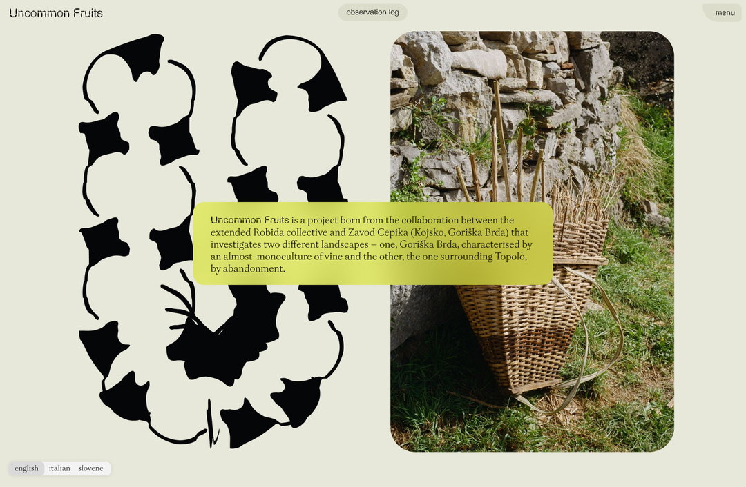
Uncommon Fruits is a collaborative, two-year initiative that investigates the existence of fruit trees, abandoned orchards and old fruit varieties, all through the lens of art and design. Devised by the Robida Collective, based in Topolò, Italy, the project is a means of forging a deeper connection between the creative world and the natural world, all the while supporting knowledge of edible ecology and the collective’s local surroundings. The studio Companion–Platform was approached by Vida Rucli – one of the founders of Uncommon Fruits – to create an identity for the platform. Being a creative outfit that its founders Lexi Visco and Clavin Rocchio describe as “ecologically oriented”, the brief was one that instantly resonated with Companion–Platform’s mission.
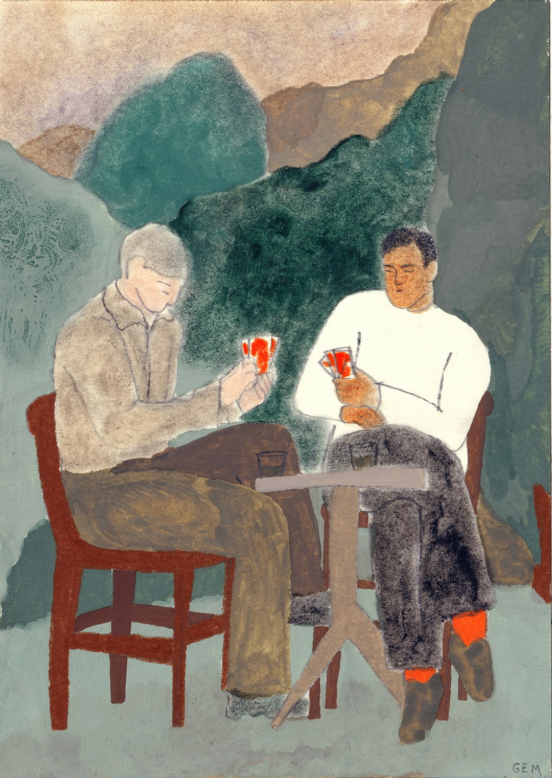
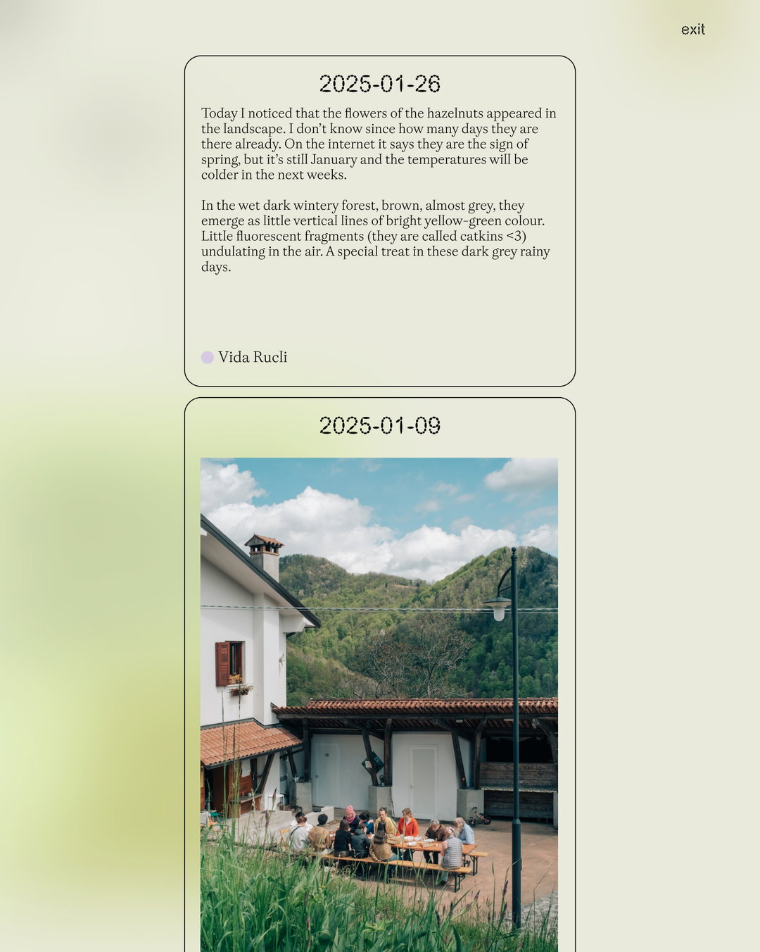
The identity was based on multiple conversations with the Uncommon Fruits collective – discussion that unearthed keywords like ‘speculative’, ‘poetic’, ‘corporal’ and ‘warm’. These conversations and keywords lead Calvin and Lexi to the general outline of a visual universe that would “capture both the systematic nature of cultivated orchards and the wild, rambunctious growth of abandoned landscapes”, says Lexi. A guiding metaphor for how the pair structured the visual identity and website was the idea of free forest walking, a practice shared by Renzo – the father of two of the collective members. It’s a process that involves breaking free from predetermined pathways when exploring the natural world, instead being led by pursuing landmarks and sensory experiences.
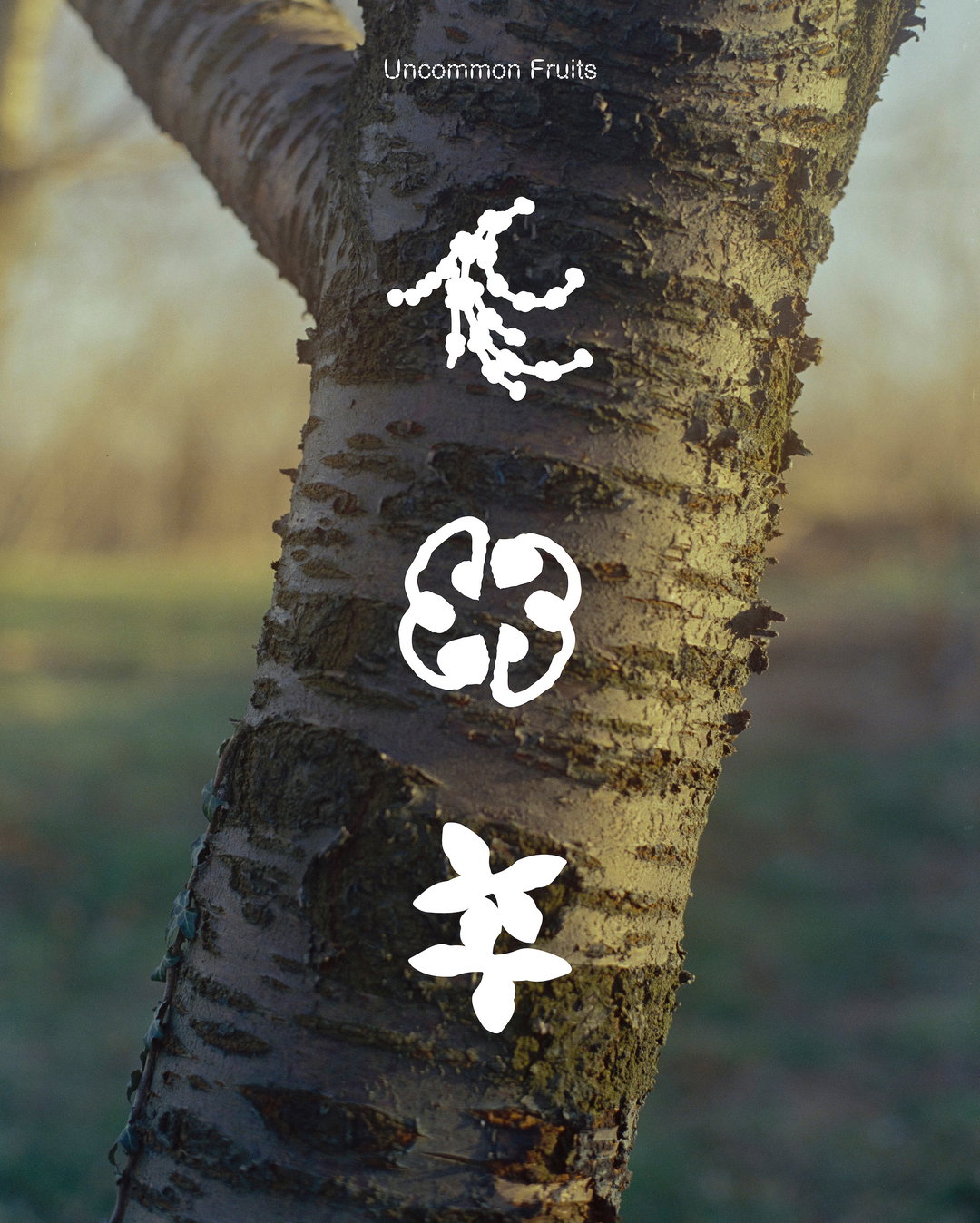
Companion–Platform: Uncommon Fruits (Copyright © Companion–Platform, 2025)
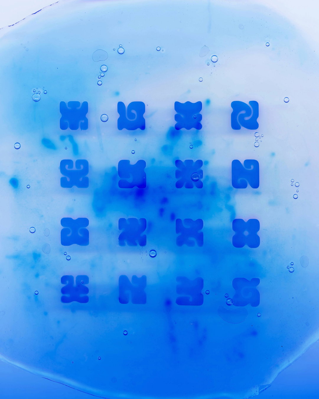
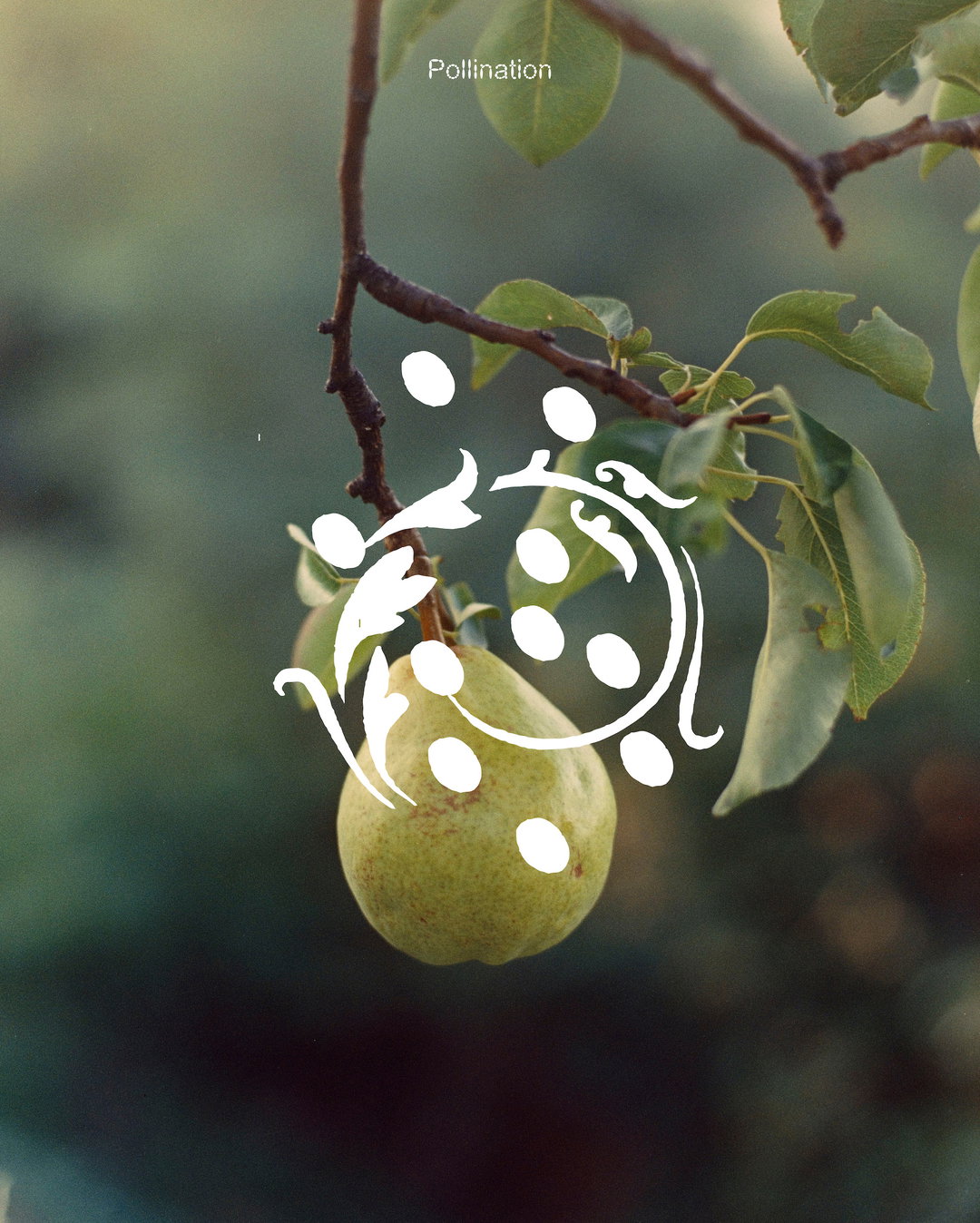
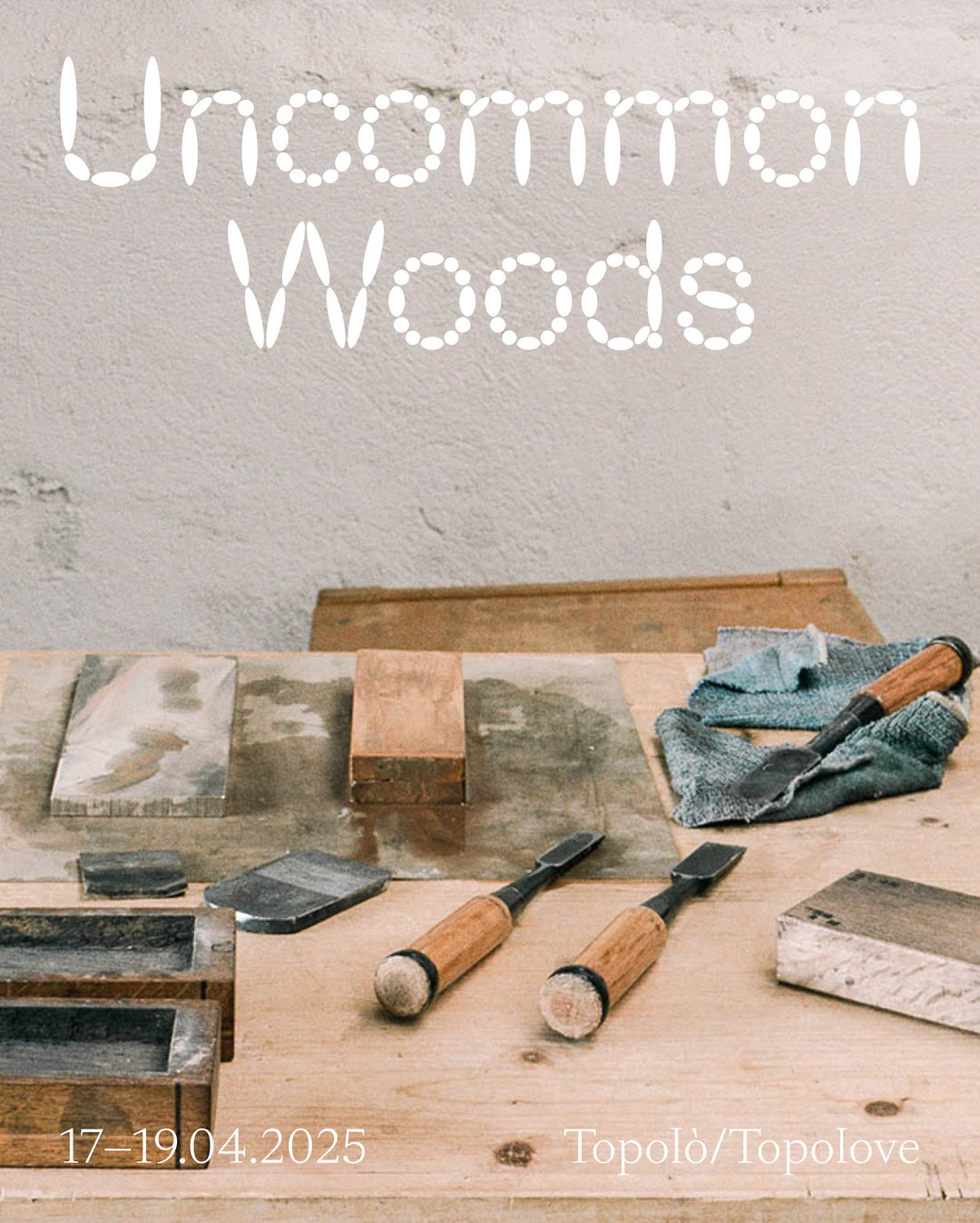
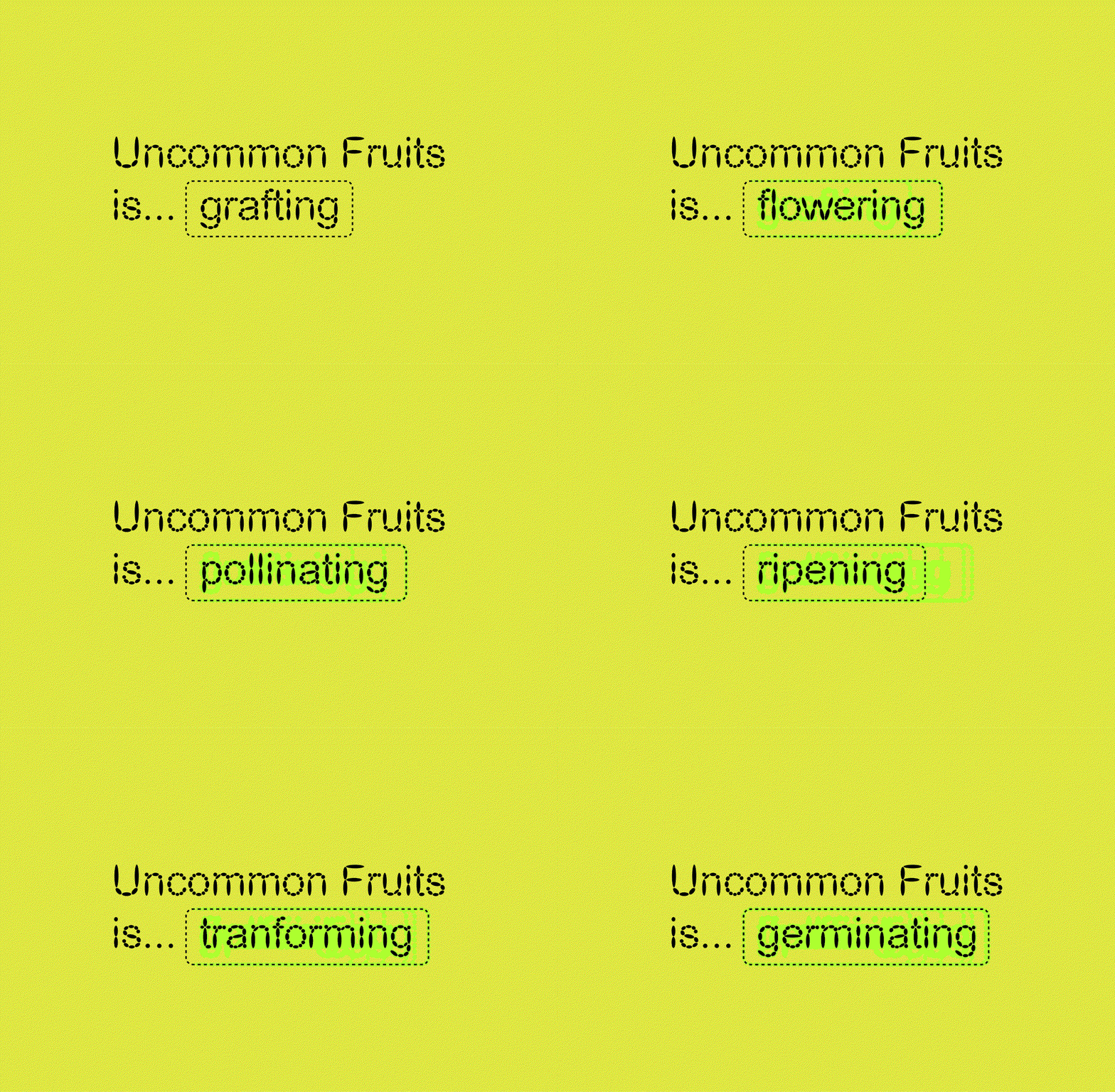
At the heart of the project is Uncommon Fruit’s new logo. Consisting of the ‘U’ and ‘F’, Lexi and Calvin used decorative dropcaps as a springboard for further exploration. They also looked at the “bold clarity” of road signs and to inform the clear, rounded shape of each letter. Then, the pair added a selection of illustrative treatments that can be added to each letter; a series of tangled leaves, rounded buds, to blooming flowers and interlocking stems. This, Lexi says “allows it to transform seasonally or contextually, creating a visual identity that feels alive and responsive rather than fixed and static”. The logo is then paired with a type treatment consisting of Theetat Thunkijjanukij’s Cerial – “it's essentially an imitation of Arial rebuilt using ellipsis forms, creating letterforms that feel simultaneously familiar and peculiar – gentle and seed-like,” says Lexi – and Gaisyr from Dinamo.
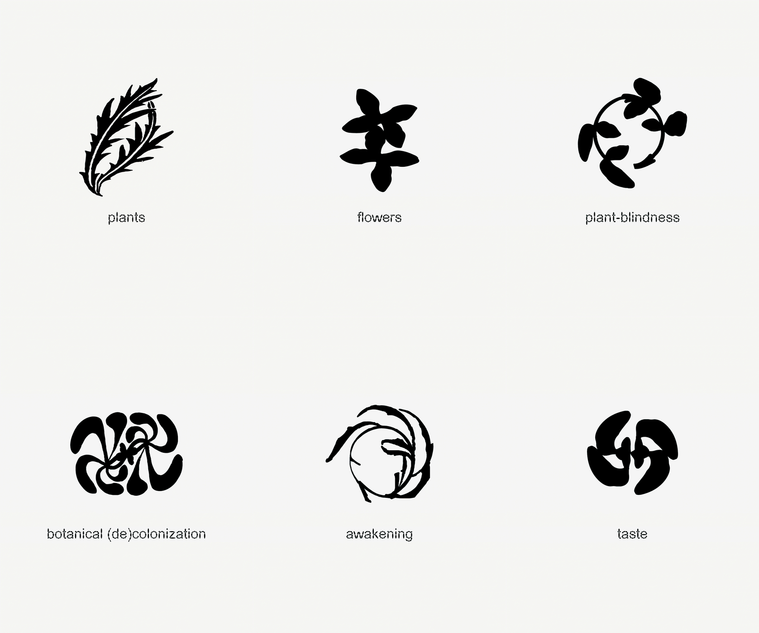
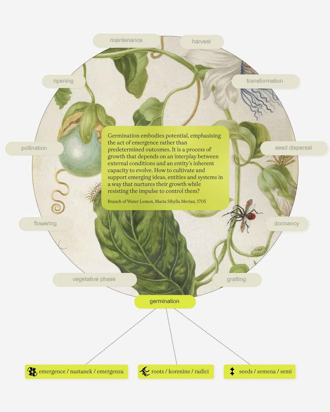
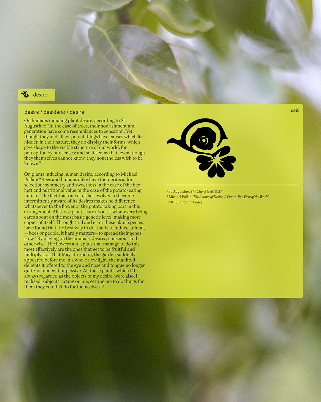
When it came to the website, Lexi and Calvin turned to a bountiful harvest for their guiding editorial principle – Uncommon Fruit’s ‘orchard of words’, a growing index of words related to the organisation’s research. “Each piece of content—whether an interview, essay, recipe, or image – has keywords attributed to it, visually emphasised within the text,” says Calvin. “This creates multiple pathways through the site based on curiosity and association rather than rigid hierarchy.” Each keyword is also given an illustrated icon, some are quite literal, whereas others take a more abstract root, implying the keyword at hand rather than directly mimicking it. This is a move that both “enriches the language and helps facilitate navigation”, says Calvin.
For Calvin, above all else, the collaboration with Uncommon Fruits reinforced one of his and Lexi’s core beliefs: “That design can function not just as communication but as cultivation – creating conditions for new ideas to take root, branch out, and bear fruit in unexpected ways.”
GalleryCompanion–Platform: Uncommon Fruits (Copyright © Companion–Platform, 2025)
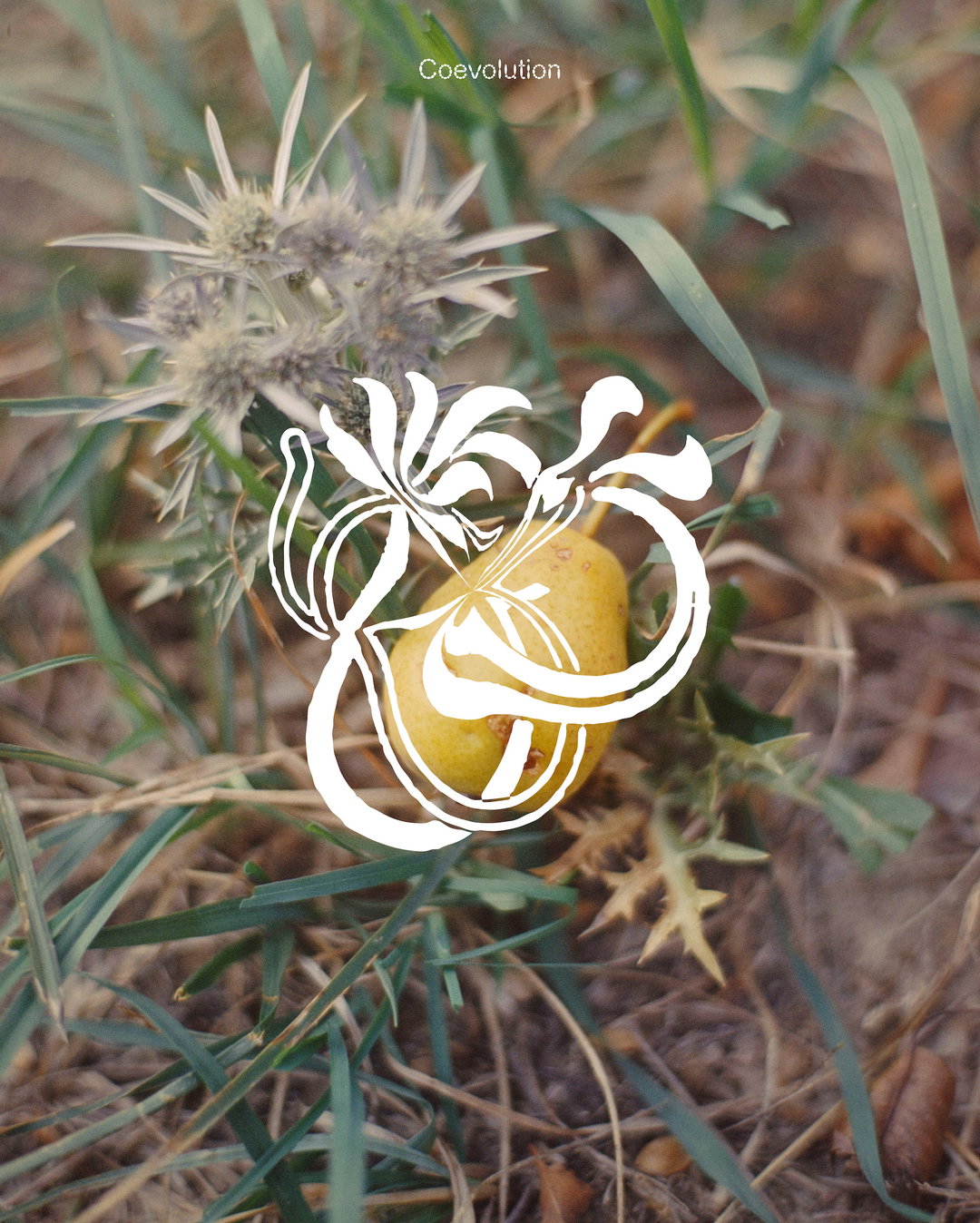
Hero Header
Companion–Platform: Uncommon Fruits (Copyright © Companion–Platform, 2025)
Share Article
Further Info
About the Author
—
Olivia (she/her) is associate editor of the website, overseeing the day-to-day editorial projects as well as Nicer Tuesdays events. She joined the It’s Nice That team in 2021. [email protected]
To submit your work to be featured on the site, see our Submissions Guide.