



Launch Recite Me assistive technology
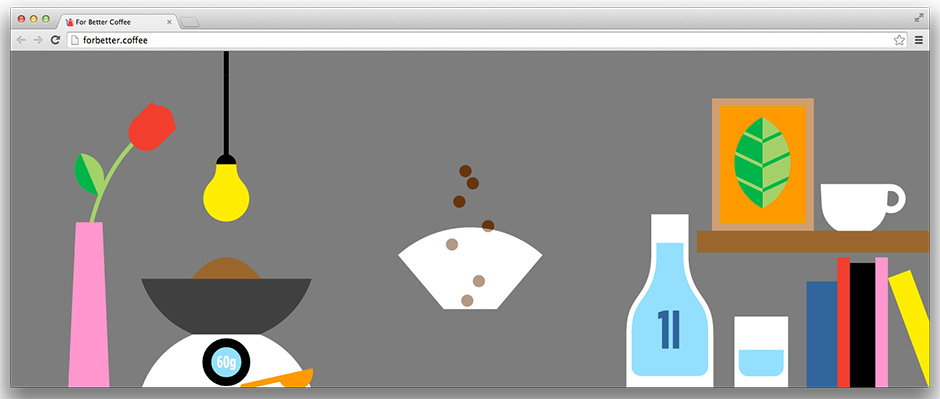
A flat illustration of a coffee brewing setup against a grey background. A scale holds a bowl of coffee grounds, while beans fall into a white filter next to a flask and a shelf of books.

Craig & Karl illustrate a slick, playful new website to help people make coffee

—
Date
20 November 2014

Websites have come a long way since the days of Space Jam and the like, and in spite of the elaborate things designers are capable of now it’s often just a slick scroll and some jazzy illustration that will have you coming back to a site again and again.

Craig & Karl are well aware of this. A Finnish coffee shop local to illustration agency Agent Pekka, which looks after the pair, has just launched a new project called For Better Coffee which aims to help people to around the world to make better coffee (a worthy cause if ever I heard one) and it got Craig & Karl on board to help illustrate a website showing five simple steps. The resulting illustrations are simple enough to keep the site uncluttered but playful enough to lend the project a youthful irreverence, elevating the project from a nice idea to an initiative you can’t help but want to get involved with. And that pour!
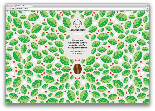
A website landing page for Freese Coffee Co featuring a pattern of green leaves and red berries. Central text reads “For better coffee” and welcomes visitors to “five essential rules for making better coffee”.
Above

Craig & Karl: For Better Coffee Website Design
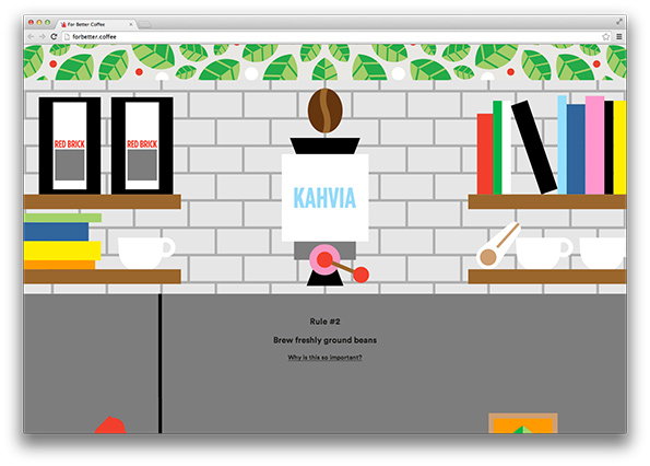
A digital illustration of a website interface featuring a coffee brewer against a white brick wall. The brewer is labelled “KAHVIA” and sits between two shelves holding books and white cups. Below the illustration, text reads “Rule #2 Brew freshly ground beans”.
Above

Craig & Karl: For Better Coffee Website Design
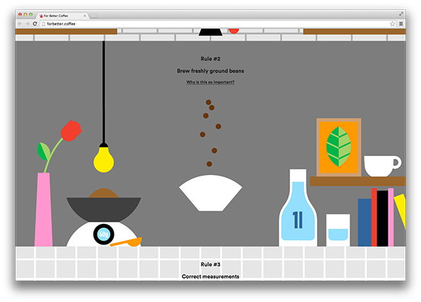
A digital illustration of a coffee brewing guide on a website. Centred text reads “Rule #2 Brew freshly ground beans”, above a white bowl with coffee beans falling into it. To the left, a bowl of coffee sits on a digital scale under a yellow pendant light.
Above

Craig & Karl: For Better Coffee Website Design
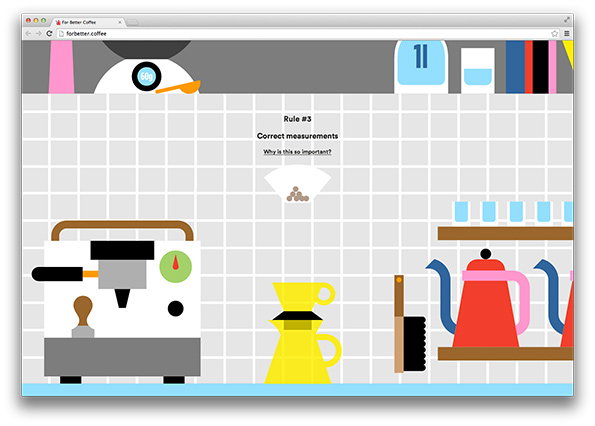
A 2D illustration of a coffee shop interior on a website. The page features a grid background and reads “Rule #3 Correct measurements” above a simplified coffee machine, a yellow dripper and red kettles.
Above

Craig & Karl: For Better Coffee Website Design
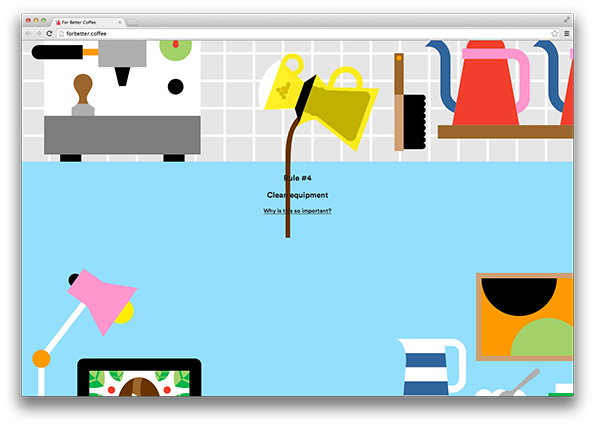
A digital illustration of a website for “forbetter.coffee”. The top half shows stylised coffee equipment, including a yellow pitcher pouring coffee. The bottom half is a light blue space with the text “Rule #4 Clean equipment” and “Why is this so important?”.
Above

Craig & Karl: For Better Coffee Website Design
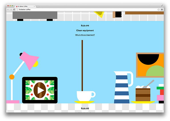
A digital illustration of a light blue room containing a lamp, a tablet, a coffee cup, and a striped jug. Text at the top reads “Rule #4 Clean equipment” followed by the question “Why is this so important?”.
Above

Craig & Karl: For Better Coffee Website Design
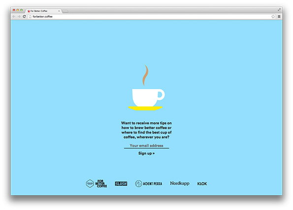
A website landing page on a light blue background featuring a simple illustration of a white coffee cup with a brown steam swirl. Text below asks if the visitor wants tips on brewing better coffee, followed by an email sign-up field and a “Sign up »” button.
Above

Craig & Karl: For Better Coffee Website Design

Share Article

About the Author

Maisie Skidmore

—

Maisie joined It’s Nice That fresh out of university in the summer of 2013 as an intern before joining full time as an Assistant Editor. Maisie left It’s Nice That in July 2015.


It's Nice That Newsletters

Fancy a bit of It's Nice That in your inbox? Sign up to our newsletters and we'll keep you in the loop with everything good going on in the creative world.
