Launch Recite Me assistive technology
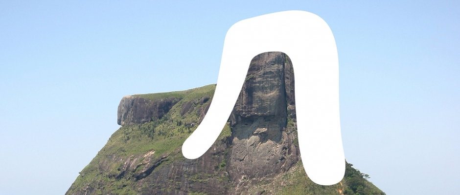
A large, rocky mountain peak under a clear blue sky. A thick, white, hand-drawn line is laid over the right side of the mountain.

Check out Dalton Maag's beautiful new typeface for the Rio Olympic Games

—
Date
17 October 2012

We’ve only just recovered from our own Olympics in London but already seem to be looking forward to the next ones in 2016. It seems like a long time away now, but they’ll be here again before we know it, with their patriotism, physical perfection and stories of triumphs of the human spirit. It’s an undeniable combination!

While the spectators’ involvement may not be required for another four years there’s a hardcore of people already working slavishly to make the Rio games even better than the ones we’ve just witnessed, many of them designers. Enter Dalton Maag to sate your design appetite for all things Olympic. The inter-continental studio’s Brazil offices have been busy over the past few months creating a bespoke typeface for the next games that’s as smooth and flowing as the London fonts were harsh and geometric.

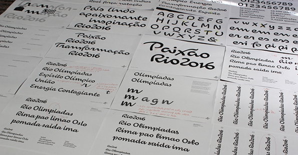
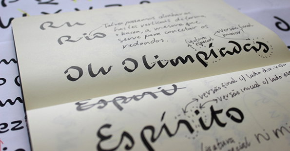
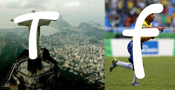
Based on the movement of athletes and Brazil’s geological and architectural hallmarks the font recalls handwritten text and maintains a fluidity of line that’s the result of early sketches in brush and ink. We’re already enormous fans of Dalton Maag’s work and this new font is no exception – but we really can’t wait to see it applied across a range of promotional material. Exciting times!
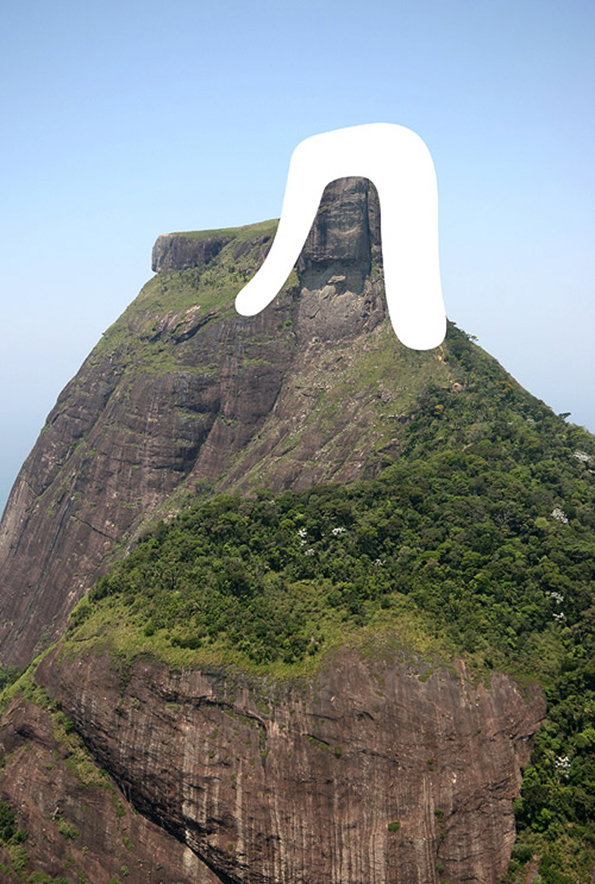
A large, white, rounded shape resembling a lowercase “n” is laid over the peak of a steep, rocky mountain. The mountain is covered in patches of green forest and grey stone under a clear blue sky.
Above

Dalton Maag: Rio Typeface

A collection of typography samples and layout sketches for the Rio 2016 Olympics. The white sheets feature various fonts and phrases in Portuguese, including “Paixão Rio 2016” and “Rio Olimpiadas”.
Above

Dalton Maag: Rio Typeface

Calligraphic sketches of the words “Olimpíadas” and “Espírito” written in black ink on cream paper. Handwritten notes and arrows in Portuguese surround the lettering, detailing technical adjustments to the script.
Above

Dalton Maag: Rio Typeface

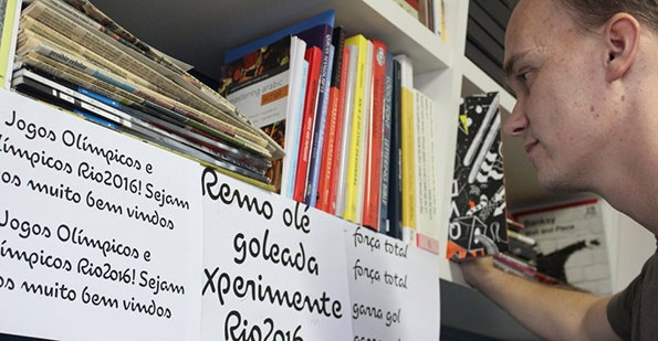
A person looks closely at a shelf of books and magazines. White labels on the shelf edge feature Portuguese text, including “Jogos Olímpicos e Rio2016!” and “Xperimente Rio2016”.
Above

Dalton Maag: Rio Typeface

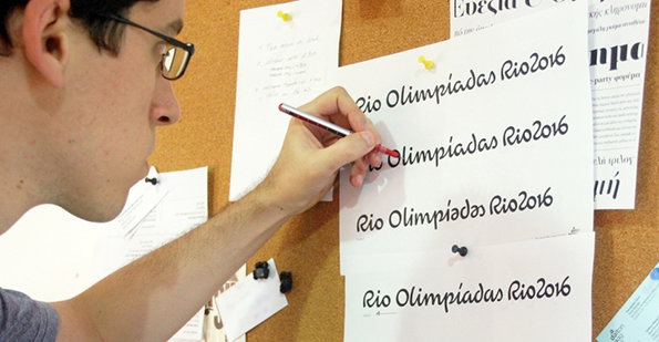
A person uses a red pen to refine a line of calligraphy on a white sheet of paper. The paper is pinned to a corkboard and shows four variations of the text “Rio Olimpíadas Rio2016”.
Above

Dalton Maag: Rio Typeface

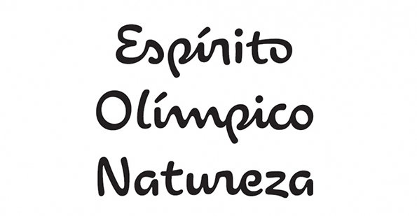
Black hand-drawn lettering on a white background reads “Espírito Olímpico Natureza”. The words are stacked vertically in a playful, rounded style.
Above

Dalton Maag: Rio Typeface

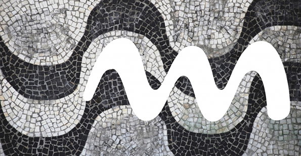
A white, wavy line is laid over a black and white mosaic. The mosaic consists of undulating bands of small, square tiles.
Above

Dalton Maag: Rio Typeface

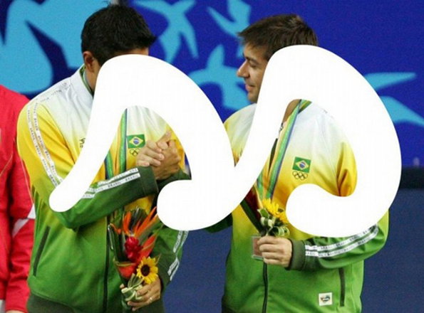
Two athletes in green and yellow Brazil team jackets stand side by side, holding bouquets of flowers. A large, white abstract shape is laid over the centre of the image, partially obscuring the figures.
Above

Dalton Maag: Rio Typeface

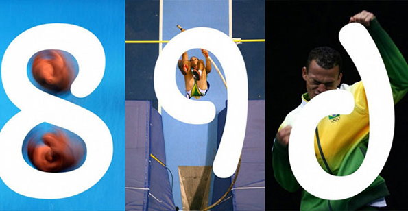
A triptych of images featuring white graphic shapes laid over sports photography. The shapes form the characters “890”, with the numbers integrated into scenes of athletes in motion.
Above

Dalton Maag: Rio Typeface

A diptych of two images. On the left, a white letter “T” is laid over the Christ the Redeemer statue overlooking Rio de Janeiro. On the right, a white letter “f” is laid over a football player in a yellow and blue kit.
Above

Dalton Maag: Rio Typeface

Share Article

Further Info

About the Author

James Cartwright

—

James started out as an intern in 2011 and came back in summer of 2012 to work online and latterly as Print Editor, before leaving in May 2015.


It's Nice That Newsletters

Fancy a bit of It's Nice That in your inbox? Sign up to our newsletters and we'll keep you in the loop with everything good going on in the creative world.