Launch Recite Me assistive technology
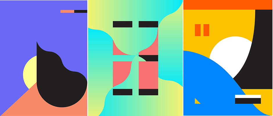
Three abstract digital compositions featuring bold geometric shapes and vibrant colours. The panels use a palette of blue, yellow, pink and green, with contrasting black and white elements.

80s brights and industrial monochromes by Dan Romanoski

—
Date
12 May 2015

Some bands thrust their fans’ hands into their pockets with things like “pussy rings,” a “tedious beer” or a box set of dildos, as James Cartwright found out.. Others are content with great graphic design across posters, record sleeves, patches and T-shirts, and that’s where Dan Romanoski fits in. Dan is a freelance designer based in Charlotte, North Carolina. His work careers through numerous styles and concerns, from some 80s-like colour combinations reminiscent of the big, baggy things my mum wore when I was small to more industrial-led monochrome works, all executed with finesse.
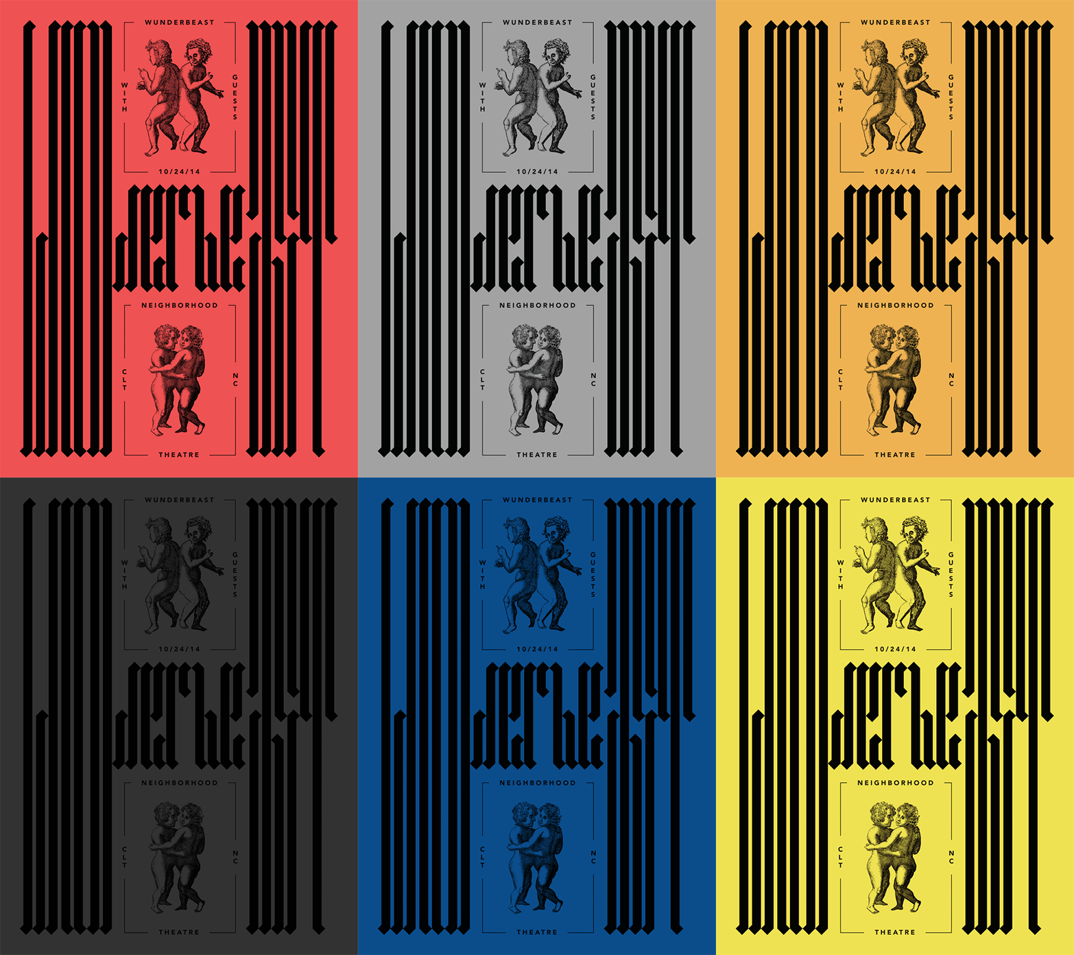
An animation of a graphic poster in which the background colour cycles through red, grey, teal, yellow, black, pink, blue and yellow. The black design features two classical illustrations of cherubs and bold, distorted typography including the words “Wunderbeast”, “Neighborhood Theatre” and the date “10/24/14”.
Above

Dan Romanoski: Gig flyer for the band Wunderbeast.
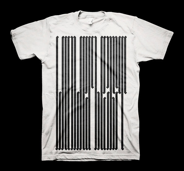
A white T-shirt featuring a graphic of black vertical lines on the front. The lines vary in length and end in sharp arrowheads, creating a jagged, rhythmic pattern.
Above

Dan Romanoski: Merchandise for the band Wunderbeast
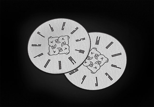
Two white circular coasters overlap against a black background. Each features a central line drawing of three intertwined figures surrounded by radiating black dashes.
Above

Dan Romanoski: Merchandise for the band Wunderbeast
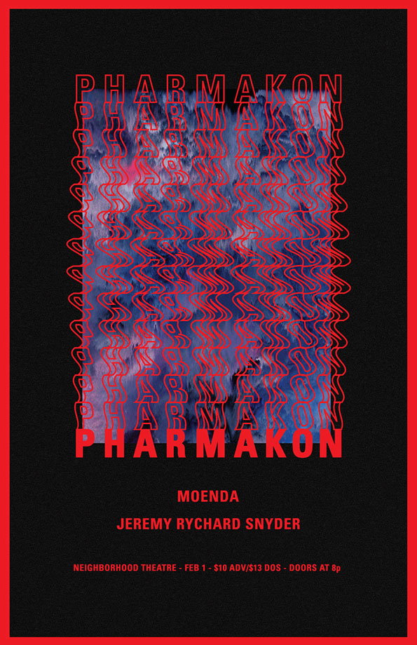
A poster for an event titled “Pharmakon” features a distorted, blue and red abstract image. The title is repeated in a wavy, red typographic pattern across the centre and appears in bold red letters at the bottom. Below the title, the names “Moenda” and “Jeremy Rychard Snyder” are listed. Small text at the base reads “Neighborhood Theatre - Feb 1 - $10 adv/$13 dos - doors at 8p”.
Above

Dan Romanoski: Pharmakon poster

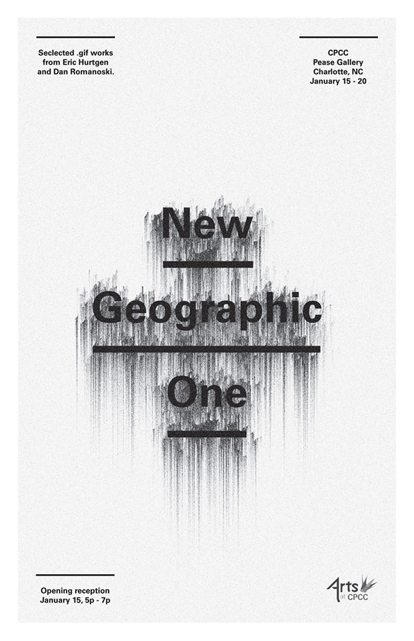
A minimalist poster for an exhibition featuring the text “New Geographic One” in a bold, black typeface. The letters appear to melt or bleed downwards into vertical grey streaks. Smaller text at the top and bottom provides details for the show at the Pease Gallery in Charlotte, NC.
Above

Dan Romanoski: New Geographic poster

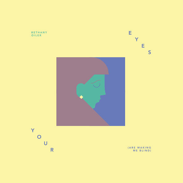
An illustration of a person’s profile in a square frame, rendered in flat blocks of purple, blue and green. The image is set against a pale yellow background with the text “Bethany Oiler”, “Eyes”, “Your” and “(Are making me blind)”.
Above

Dan Romanoski: Single art for Bethany Oiler’s Your Eyes.

Share Article

About the Author

Emily Gosling

—

Emily joined It’s Nice That as Online Editor in the summer of 2014 after four years at Design Week. She is particularly interested in graphic design, branding and music. After working It's Nice That as both Online Editor and Deputy Editor, Emily left the company in 2016.


It's Nice That Newsletters

Fancy a bit of It's Nice That in your inbox? Sign up to our newsletters and we'll keep you in the loop with everything good going on in the creative world.