Launch Recite Me assistive technology
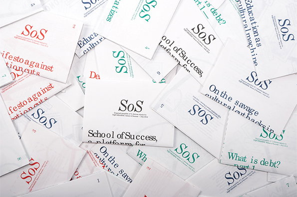
A scattered pile of white pamphlets and flyers. Several feature the “SoS” logo and phrases such as “School of Success, a platform for” and “What is debt?”.

David Ortiz makes sense of design education with these beautiful posters

—
Date
12 December 2012

Recent graphic design graduate David Ortiz produces work that focusses heavily on the communication of complex information and the visualisation of data in the simplest way possible. For his research thesis he put together this beautiful series of pamphlets that explore the effect of education budget cuts in The Netherlands.

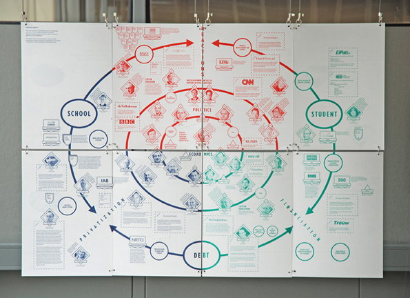
Each pamphlet contains specific information relating to one area of his research on the front – totally digestible on its own – and on the back a section of an infographic that, when all the pamphlets come together, makes an impressive whole. As a method of communication it’s undeniably impressive but, more importantly, it breaks down some fairly complex financial and legal information into more approachable, digestible chunks. If somebody had presented me with one of these before enrolling at university I might have made more sensible decisions with my limited cash.
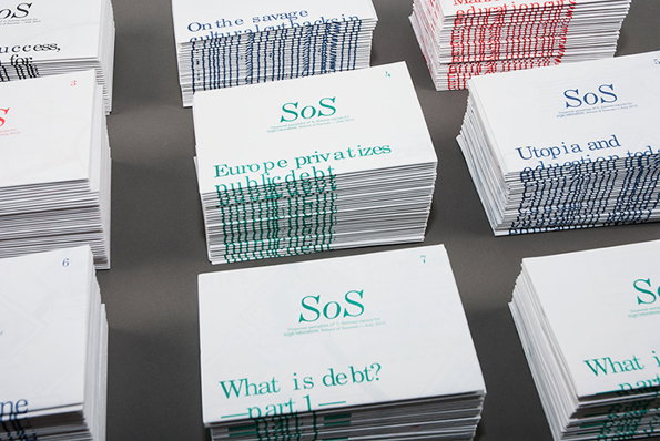
Stacks of white booklets are arranged on a grey surface. The covers feature the logo “SoS” and titles including “Europe privatizes public debt” and “What is debt? part 1”.
Above

David Ortiz: School of Success

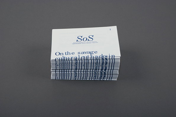
A stack of white booklets rests on a grey surface. The top cover features the logo “SoS” and the headline “On the savage cultural attacks in”.
Above

David Ortiz: School of Success

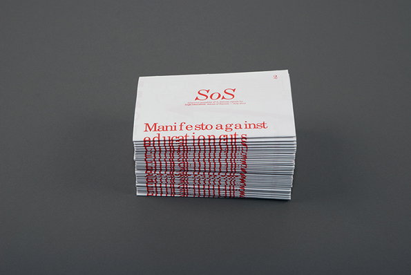
A stack of white pamphlets against a grey background. The top cover features red text that reads “SoS” and “Manifesto against education cuts”.
Above

David Ortiz: School of Success

An information-dense diagram spread across six white panels, using concentric circles and arrows to map a system. The layout connects key terms including “School”, “Student”, “Debt” and “Privatization” via a network of logos and portraits.
Above

David Ortiz: School of Success

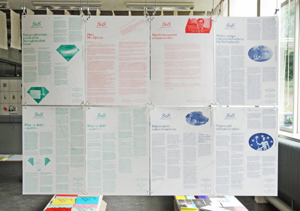
Eight large posters hang in two rows of four, each featuring dense text and a small logo that reads “SoS”. The posters use a limited palette of red, blue and green, with some including simple diagrams and small images.
Above

David Ortiz: School of Success

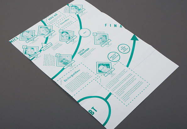
A teal and white infographic layout featuring a network of portraits and text blocks connected by curved lines and arrows. The central text reads “CUTS IN EDUCATION”, with references to “The New York Times” and “nrc.nl”.
Above

David Ortiz: School of Success

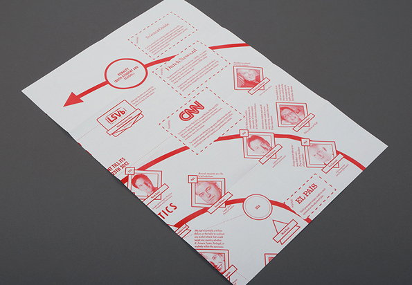
A red and white printed brochure featuring a network of connected news sources and portraits. The layout includes logos for “CNN”, “LSVb” and “El Pais” linked by dotted lines and curved paths.
Above

David Ortiz: School of Success

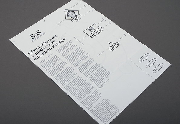
A white printed document titled “SoS” reads “School of Success, a platform for education struggle”. The page features a long column of text alongside a series of small, technical diagrams and a portrait of a person.
Above

David Ortiz: School of Success

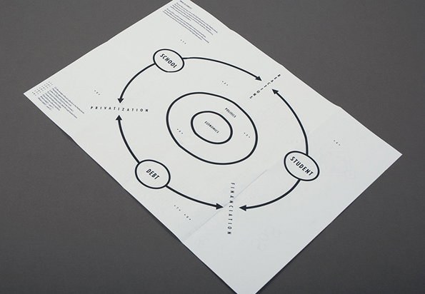
An infographic on a white page shows a circular flow chart with arrows connecting the words “School”, “Student” and “Debt”. The outer cycle is labelled with the words “Privatization”, “Financialization” and “Real Estate”.
Above

David Ortiz: School of Success

Share Article

Further Info

About the Author

James Cartwright

—

James started out as an intern in 2011 and came back in summer of 2012 to work online and latterly as Print Editor, before leaving in May 2015.

It's Nice That Newsletters

Fancy a bit of It's Nice That in your inbox? Sign up to our newsletters and we'll keep you in the loop with everything good going on in the creative world.