




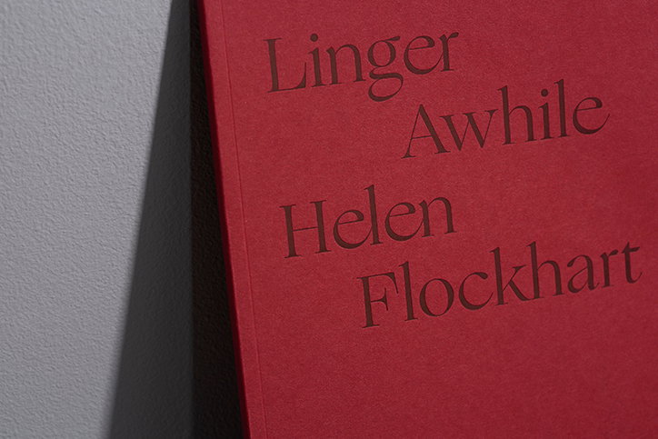
Design by Zag merges meticulous research with creative thinking
When Kat Loudon graduated from the Glasgow School of Art, she made the decision to give the whole relocating to London thing a miss. The studio she co-founded, Design by Zag, remains a Glaswegian concern, merging meticulous research with imaginative thinking to create projects that are as meaningful as they are considered.
The studio was borne as a means of questioning traditional routes into the graphic design industry. Instead of unpaid internships and expensive rent, Kat’s choice to stay in Glasgow allowed her to start her own studio within a year of graduating. Working predominantly within print and art direction, Design by Zag tends to collaborate with clients who are also within the arts. Speaking to It’s Nice That, Kat explains how “it’s a luxury to work with clients who have a creative practice of their own as they have a mutual appreciation and understanding for the design process”.
Design by Zag worked with painter Helen Flockhart to document her latest body of work Linger Awhile, an investigation into how gender influenced the history of Mary Queen of Scots. “Helen was so knowledgeable about the subject matter, sharing books and radio shows with us which in turn, informed the design of the book”. Kat’s practice is heavily dependent on extensive research of a subject matter before she begins designing. As she explains, “I start working off the screen as using my hands allows me to think tangibly through ideas before I commit to it on screen”.
During her 17 year imprisonment, Mary frequently turned to writing as a means of self-expression.In Linger Awhile, Design by Zag “use elements of her script, scattering particularly interesting typographic details throughout the book”. The graphic designer says, “the typeface was chosen to evoke classic decorative French fonts, a nod to Mary Queen of Scots’ heritage.” She then set the typeface using traditional canons of Medieval page construction and contrasted this layout with contemporary title design; setting them to stagger in “an offbeat manner” to inject an element of modernity.
For the past two years, Design by Zag has produced the visual identity for Glasgow Doors Open Days, an annual event celebrating Glasgow’s architecture and culture. Kat worked alongside the festival to create an identity which conveys “a message of pace and connectivity amongst the audience and the build environment”. Working with a new body of photographs, “we simplified the layout to create a clear and accessible layout in order to focus on images” of the architecturally impressive sites. Additionally, Kat designed the accompanying text in the guide to mirror the stopping points along the routes of the festival. The weaving placement of text allows an “organic, angular pathway”, bridging together the layout design with type.
The project is a fine example of Design by Zag’s effortless working methods which blend research, layout and intention to produce beautiful design that centres around the client’s needs.
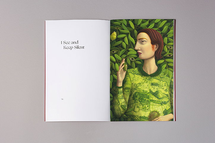
Design by Zag: Helen Flockhart, Linger Awhile
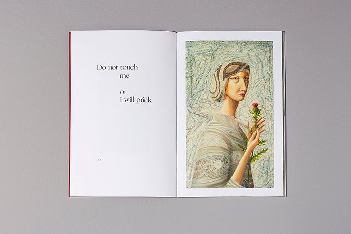
Design by Zag: Helen Flockhart, Linger Awhile
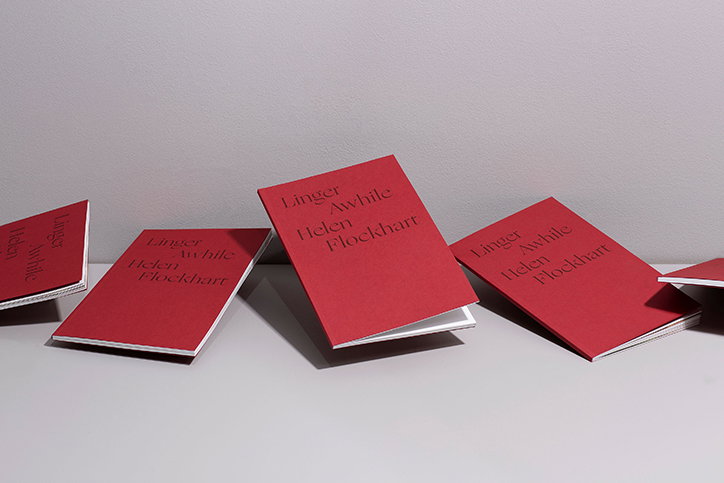
Design by Zag: Helen Flockhart
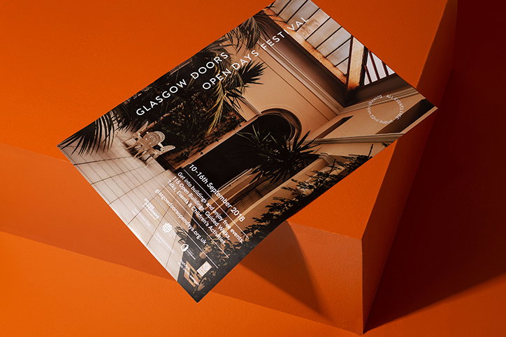
Design by Zag: Glasgow Doors Open Days
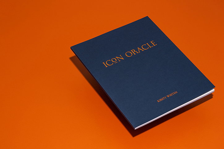
Design by Zag: Kirsty Whiten
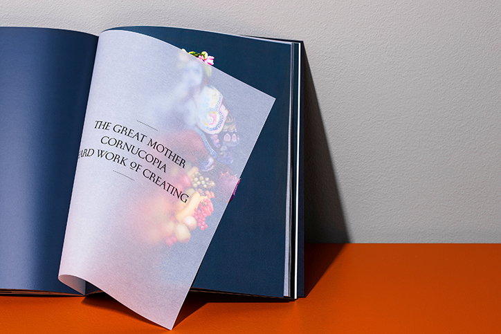
Design by Zag: Kirsty Whiten
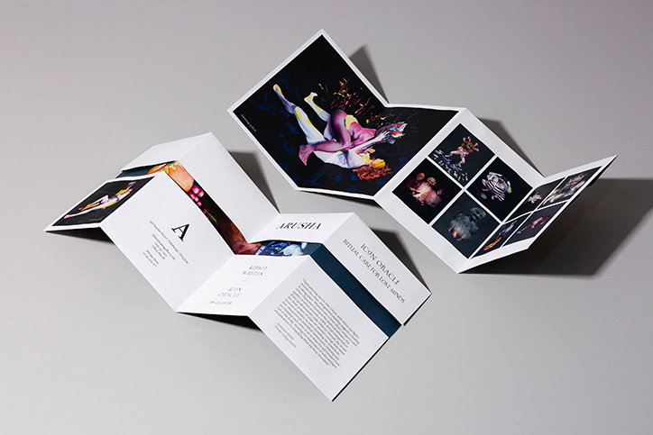
Design by Zag: Kirsty Whiten
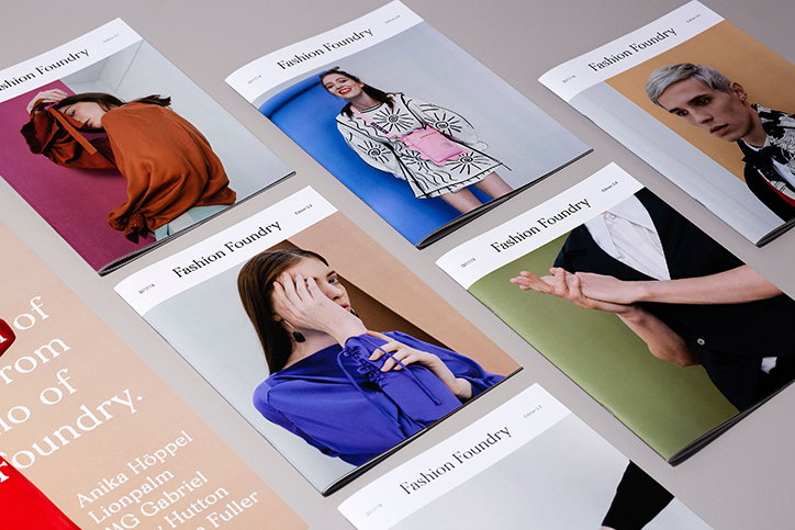
Design by Zag: Fashion Foundry
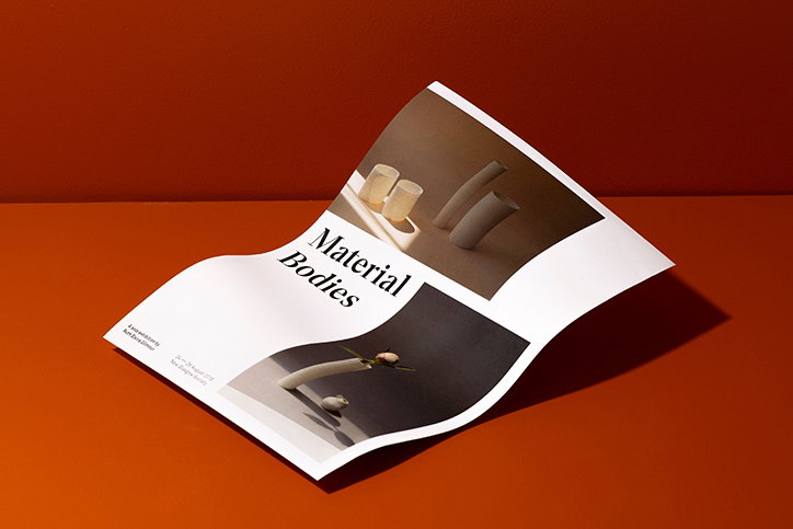
Design by Zag: Ruth Gilmore, Material Bodies
Share Article
Further Info
About the Author
—
Jynann joined It’s Nice That as an editorial assistant in August 2018 after graduating from The Glasgow School of Art’s Communication Design degree. In March 2019 she became a staff writer and in June 2021, she was made associate editor. She went freelance in 2022.