



Launch Recite Me assistive technology
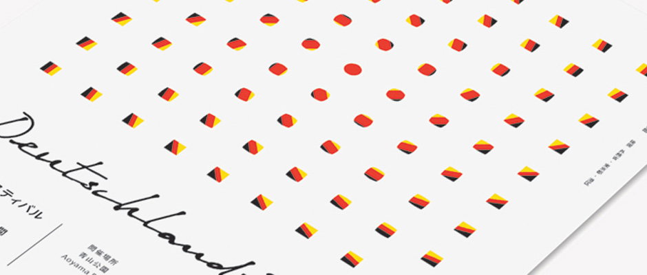
A graphic design featuring a grid of small, 3D geometric shapes in the colours of the German flag. To the left, a handwritten script reads “Deutschland”.

Studio Newwork expertly brand the bizarre-sounding Deutschlandfest

—
Date
16 January 2013

The idea of promoting German culture in Japan seems faintly ridiculous, conjuring scenes of lederhosen-wearing cultural ambassadors demonstrating the preparation of würst and schnitzel to a baffled Japanese audience, all backed by a Kraftwerk soundtrack. I’m sure that’s not how it was at Deutschlandfest 2012 in Tokyo (there’s far too many stereotypes going on there to constitute a real event), but even the bizarre name does nothing to dispel the ludicrous image.

In fact the only thing that really grounds Deutschlandfest in the realms of the plausible is Studio Newwork’s restrained identity, with its references to Bauhaus primary colour palettes and crisp kanji characters rendered in Germany’s black, red and yellow. It’s a deservedly serious and visually striking identity for an event that was (hopefully) much more worthwhile than the one I’ve just described.
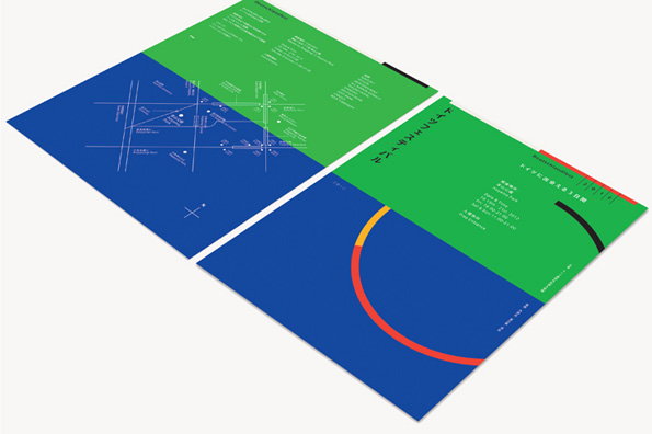
Two open brochures with a bold blue and green colour scheme. One page features a white line map, while the other displays Japanese text and a red curved graphic.
Above

Studio Newwork: Deutschlandfest 2012 identity
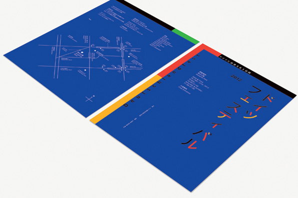
A blue folded brochure lies open on a white surface. One side features a white line map and text, while the other shows bold, stylised Japanese characters and the word “Deutschland”.
Above

Studio Newwork: Deutschlandfest 2012 identity
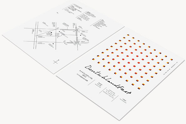
Two white flyers lie side by side. One features a minimalist map and a list of addresses, while the other shows a grid of small, colourful cubes above the cursive text “Deutschlandfest”.
Above

Studio Newwork: Deutschlandfest 2012 identity
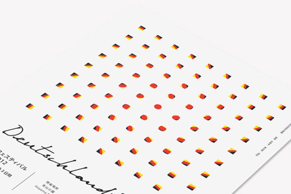
A graphic poster featuring a grid of small, abstract shapes in the black, red and gold colours of the German flag. Cursive text at the bottom reads “Deutschland”, followed by Japanese characters and the word “Aoyama”.
Above

Studio Newwork: Deutschlandfest 2012 identity
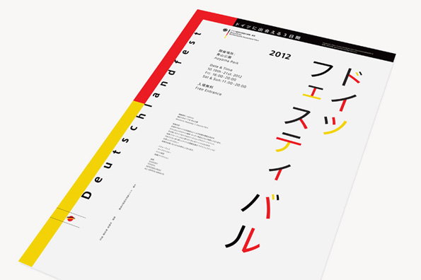
A minimalist poster for “Deutschlandfest” featuring a white background with red and yellow accents. Large red and yellow Japanese characters run vertically down the right side, with event details and the year “2012” printed in the centre.
Above

Studio Newwork: Deutschlandfest 2012 identity
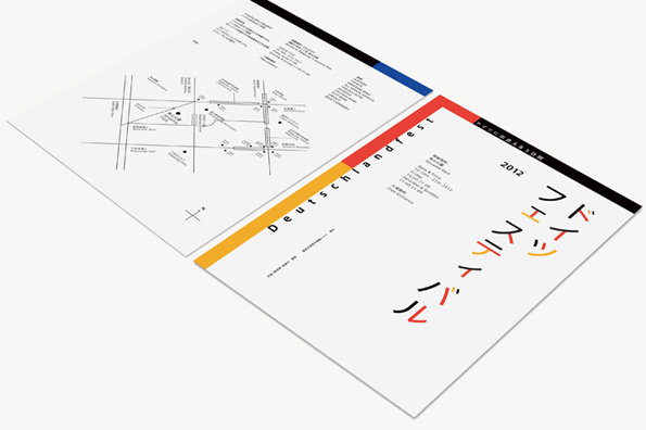
Two printed leaflets for “Deutschlandfest 2012” are laid out on a white surface. One page features a minimalist map and event details, while the other displays bold typography and Japanese characters.
Above

Studio Newwork: Deutschlandfest 2012 identity
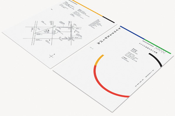
Two white printed brochures are laid side by side. One features a minimalist map and a yellow accent line, while the other shows a red and yellow semi-circle and the word “Deutschlandfest”.
Above

Studio Newwork: Deutschlandfest 2012 identity
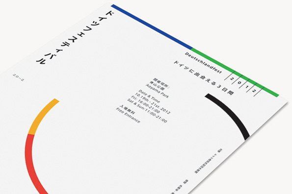
A minimalist white poster for “Deutschlandfest” featuring a blue and green line across the top. Text in English and Japanese lists the event location as “Aoyama Park” and the dates as “10.19th – 21st. 2012”. A bold red and orange curved line arcs across the bottom left corner.
Above

Studio Newwork: Deutschlandfest 2012 identity
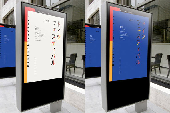
Two digital posters for the “Deutschlandfest 2012” are displayed in outdoor lightboxes. The posters feature a minimalist layout with a red vertical stripe and Japanese text reading “ドイツフェスティバル”.
Above

Studio Newwork: Deutschlandfest 2012 identity

Share Article

About the Author

James Cartwright

—

James started out as an intern in 2011 and came back in summer of 2012 to work online and latterly as Print Editor, before leaving in May 2015.


It's Nice That Newsletters

Fancy a bit of It's Nice That in your inbox? Sign up to our newsletters and we'll keep you in the loop with everything good going on in the creative world.
