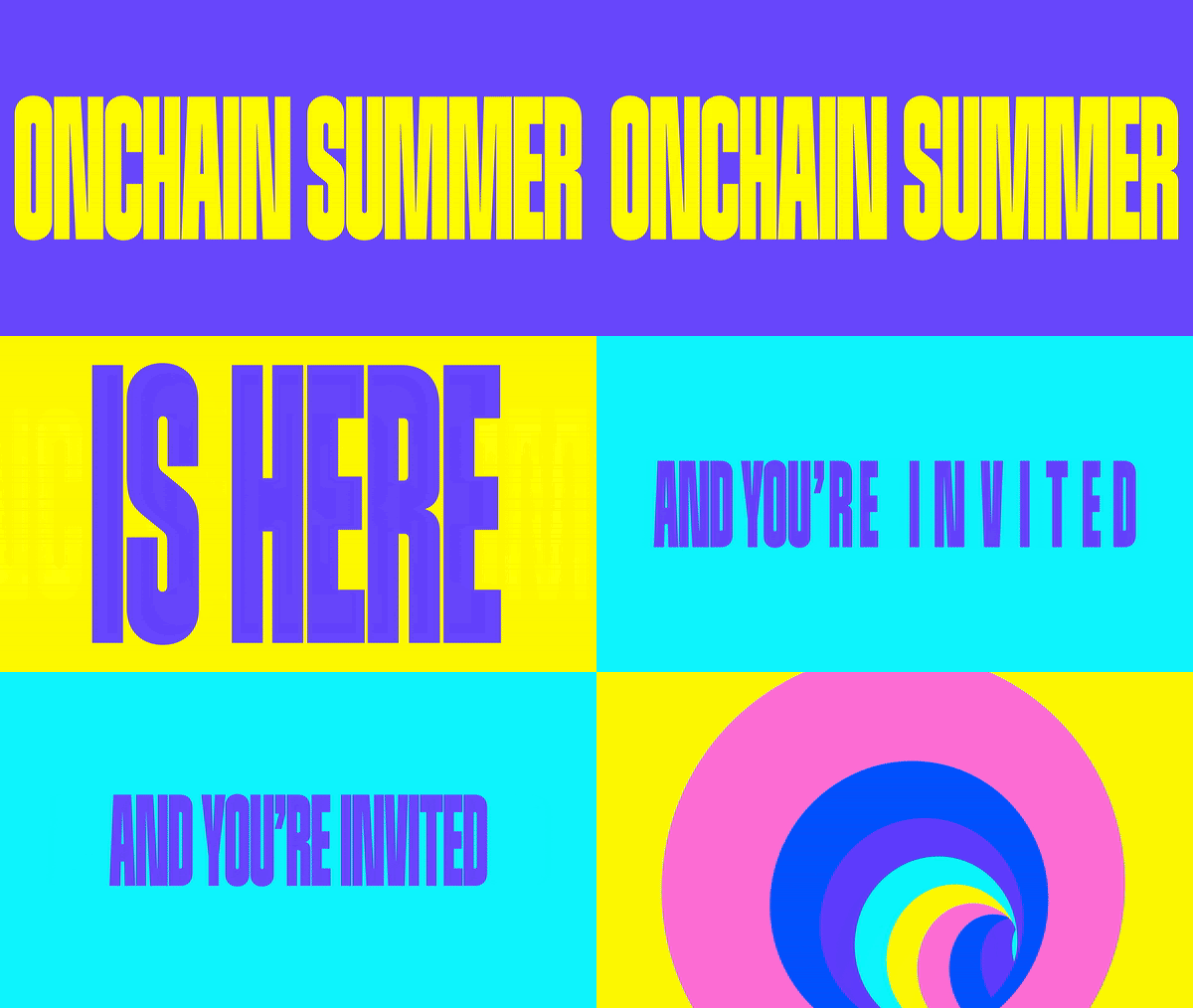
Inside the advanced and inviting visual identity DIA created for the launch of Onchain Summer
Bold colour palette? Check. Playful typographic system? Check. And an animated twist on the client’s logo? Also check. This project marries innovation with the promise of an enriching bite of arts and culture.
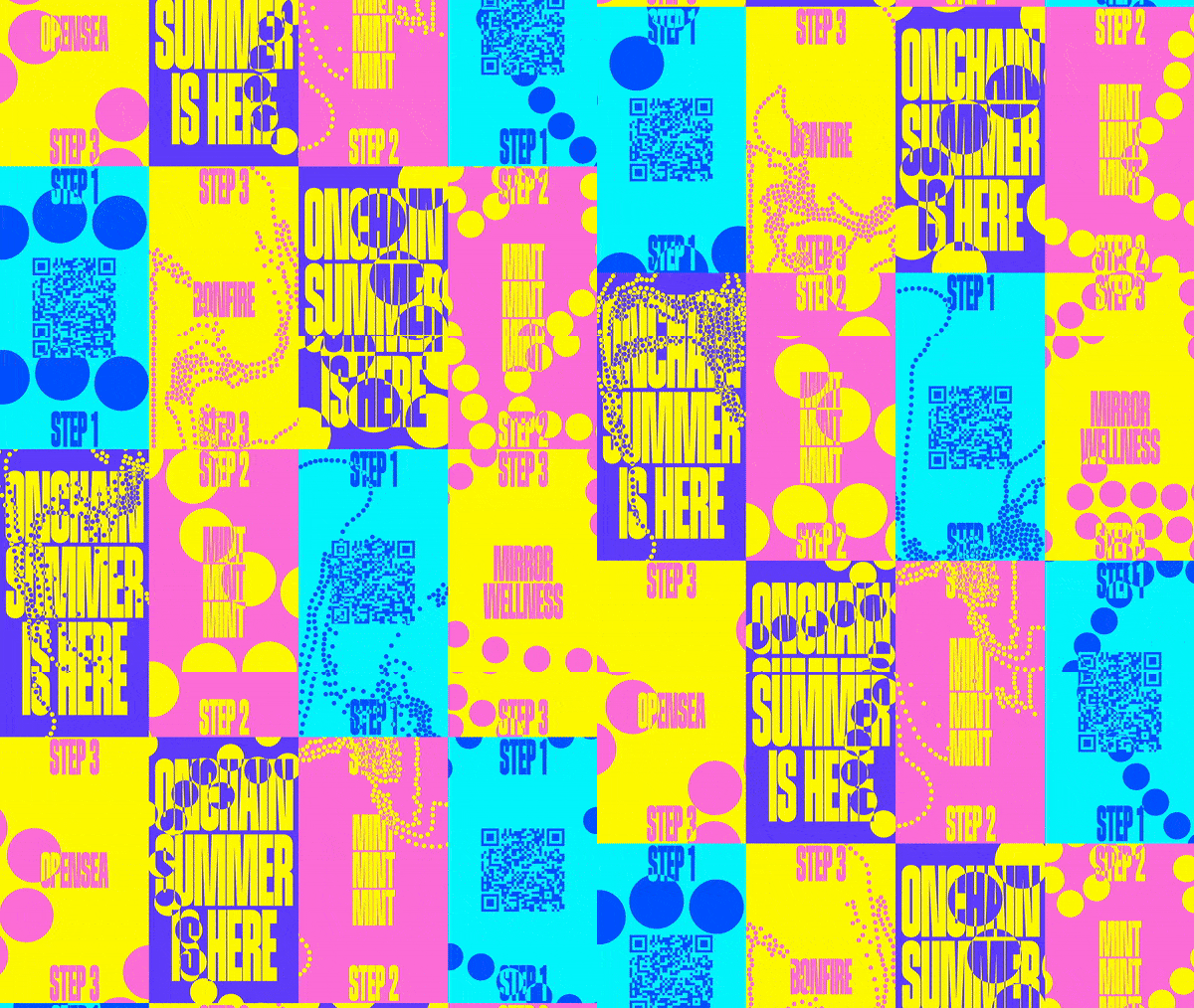
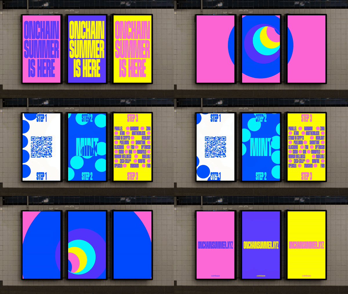
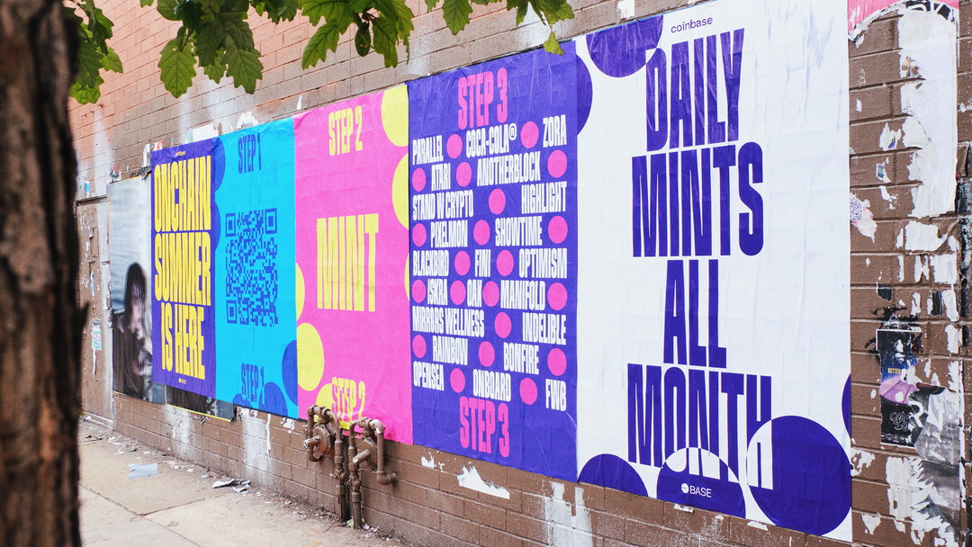
DIA has revealed the campaign identity for last year’s launch of Onchain Summer. The multi-week celebration, that took place from 9-18 August, saw people attending to see all of the art, music, gaming and community efforts stemming from the onchain sphere. Powered by Base – a leading ethereum platform for developers by Coinbase – DIA has created a cohesive and dynamic system inspired by chainlinks and the platform’s logo, with a vibrant palette that reflects its open and inviting ethos. Along with bold typography and motion toolkits that were adapted to socials, web, print and fly-posting.
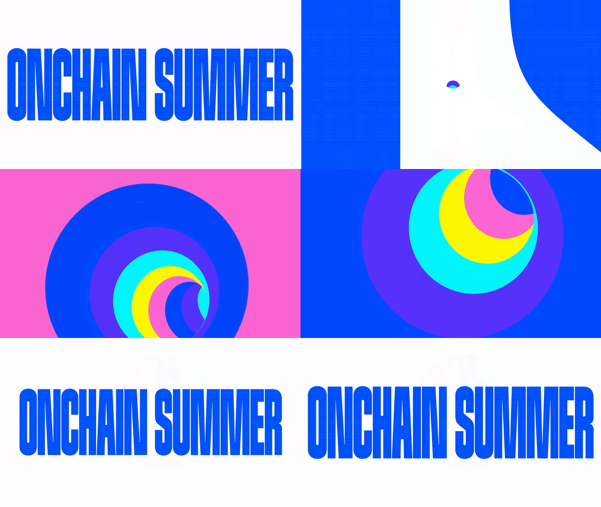
The DIA team were introduced to the Onchain Summer project by its frequent collaborators and creative direction duo at Coinbase, Esteban Cardona Jiménez and Jordan Pories. “What drew us in the most was the creative freedom and flexibility the team gave us,” Mitch Paone, creative director at DIA tells us. Being that the event is all about summer, fun, arts and culture, they quickly wanted to instil this hype and excitement in the process and visual output, while maintaining the familiar visually aspects of Coinbase. With this, the team felt it was “mandatory” to have a circle in the visual identity to reflect the Base logo, with the addition of links that “represent the flow of interaction and transaction among people on the ethereum blockchain.
Chainlink animations can also be seen throughout the project. The team used high-res screen recordings of their interactions with a generative tool they developed, which gave the Onchain Summer logotype a beaded outline. “We captured a wide range of these, from calm to frantic, small to large,” Mitch tells us, which provided a sort of library of animations for the team to work with. The team chose this approach with the intention of “providing an unexpected human touch that would otherwise feel very tech-forward, given the content”.
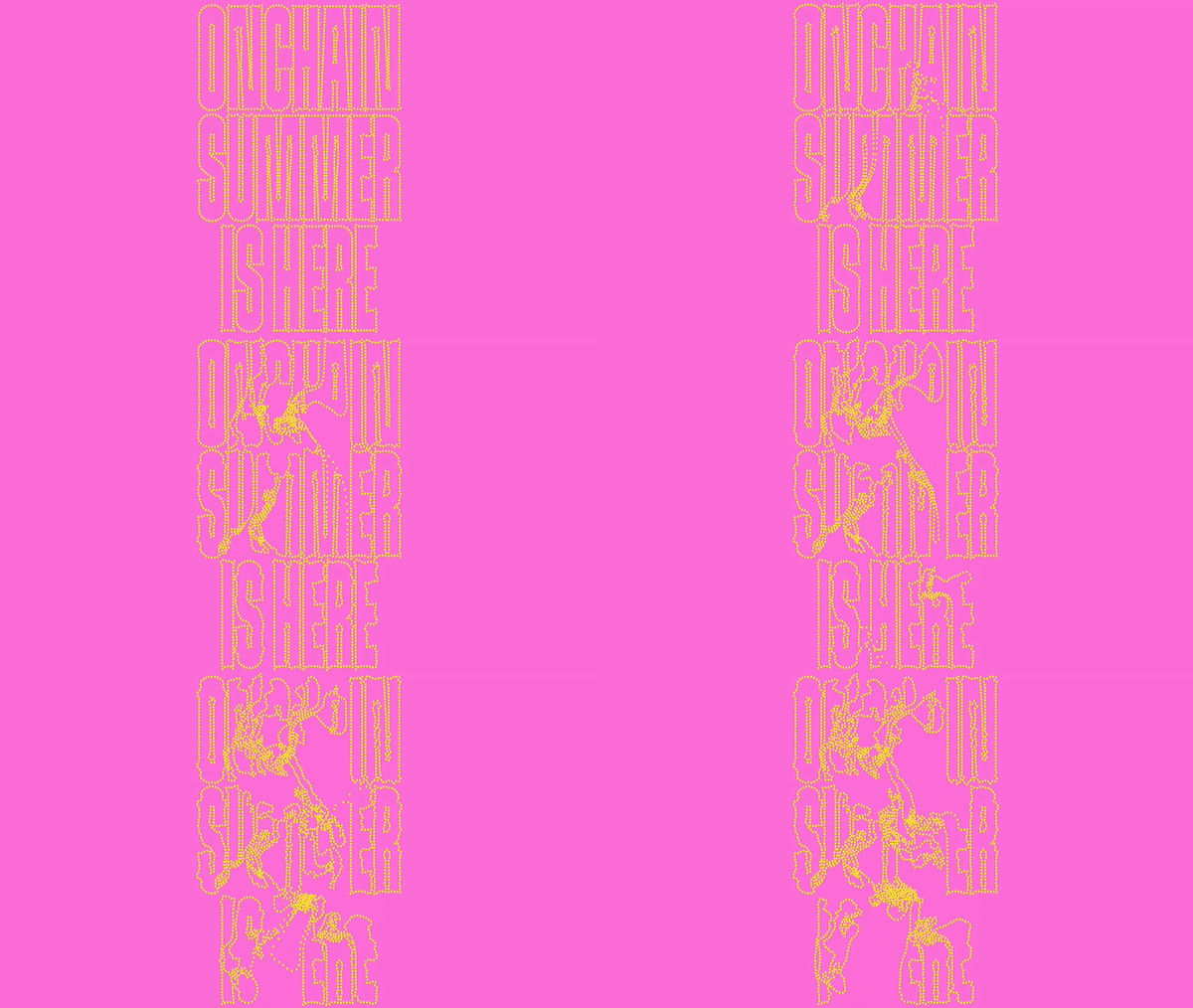
DIA: Onchain Summer (Copyright © Base, 2023)
The colour palette for the design was already established by Coinbase in the brief, however the team wanted to tweak it to find the best combinations. Throughout you can see this vibrancy, but a lot of intention, with pairings that are associated with the outdoors and energy of summer, despite it being able to be accessed from our screens. When it comes to the typography, they wanted to promote a bold, loud and clear message that they have achieved with a consistent yet advancing aesthetic. The team tested out a number of condensed sans-serif typefaces, but at first found that everything felt dry. “Luckily, AllCaps had just released Bandit, designed by Sylvan Lanz, before the project and the feel was perfect,” he adds, particularly due to its “woodcut-type poster feel that has a modern/European twist with opposite contrasting shapes that made it more playful and inviting than any of the other options”.
Although the DIA team were only able to reveal the identity to its channels this month, they have received compliments from their audience for the genius behind the visuals. Maybe it’s because of its seamless approach, that saw the identity adapted to physical and digital advertising spaces. The team achieved this through “a strict typographic system” that they worked on meticulously in order to alter to each aspect ratio, before cropping and editing the best points for each composition. As a whole, the project is a lesson in the art of two teams working together to create something that is both resonant and reflective. Showing us how design can both capture and uphold the innovation of its client brand or community, while still bringing that element of feel-good to the audience.
GalleryDIA: Onchain Summer (Copyright © Base, 2023)
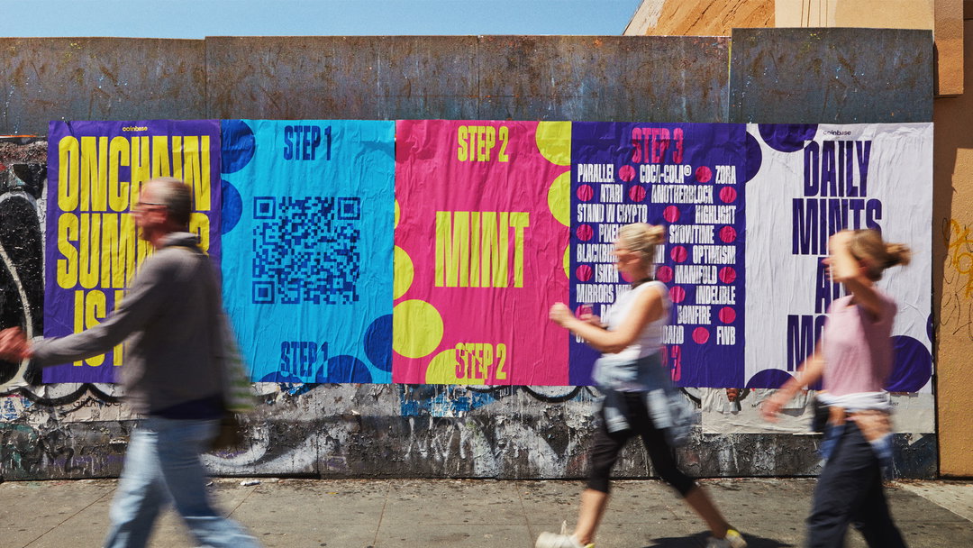

Hero Header
DIA: Onchain Summer (Copyright © Base, 2023)
Share Article
Further Info
About the Author
—
Yaya (they/them) was previously a staff writer at It’s Nice That. With a particular interest in Black visual culture, they have previously written for publications such as WePresent, alongside work as a researcher and facilitator for Barbican and Dulwich Picture Gallery.