




Diplomatie Studio’s practice is based on the relationship between static and moving images
Founded by Léo Marsal and Florian Brennemann, the studio relishes projects that allow mediums to intermingle.
For Léo Marsal and Florian Brennemann of graphic design studio Diplomatie in Paris, still and moving images can’t exist in isolation. In fact, their creative process is based on the relationship between the two, and no project considers one before the other. “This manner of approaching our projects also gives us the opportunity to see the static image as a capture of a wider universe,” the pair tells us. “Therefore, we like to work on global visual identity projects where the mediums intermingle.”
Léo and Florian met while studying in Paris and, after both went and completed master’s degrees, they had the chance to work on a visual identity project together in 2017. “This experience taught us how to work together, but also made us acknowledge the synergy between us,” they recall. This led to the establishment of Diplomatie the following year.
With the pair favouring such a holistic approach to graphic design, it’s no surprise that they also favour a collaborative process. Working on projects from their conception, they enjoy “thinking with our clients or collaborators about the way to approach their project, exposing their ideas, questioning and challenging preconceived ideas they might have.” This means the initial phase of a project is particularly stimulating for the pair, “the moment when everything is still blurry and where the concept appears in the middle of discussions and exchange.”
Working in this way naturally leads to a myriad of outcomes, mediums and visual styles. But this is also due to Léo and Florian’s staunch belief in the importance of creating paradigms in order to dispel them. “We believe in the power of the systems as much as is the freedom to exceed them,” they explain, adding that this one sentence sums up their approach to graphic design and the foundation of Diplomatie: “To give a place to creations oscillating between rigour and disturbances.”
Diplomatie Studio: Mama Told Ya (Copyright © Diplomatie Studio, 2020)
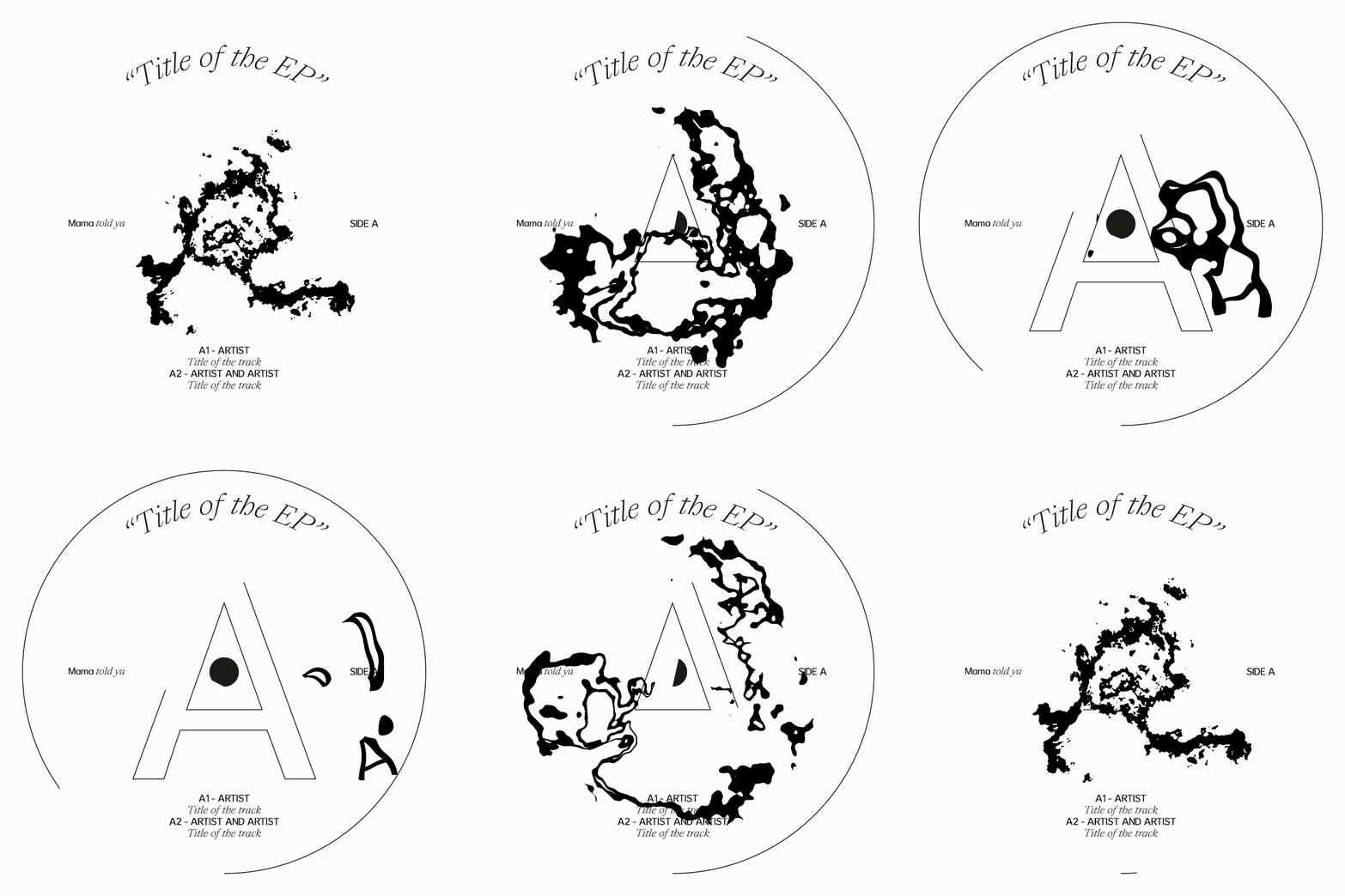
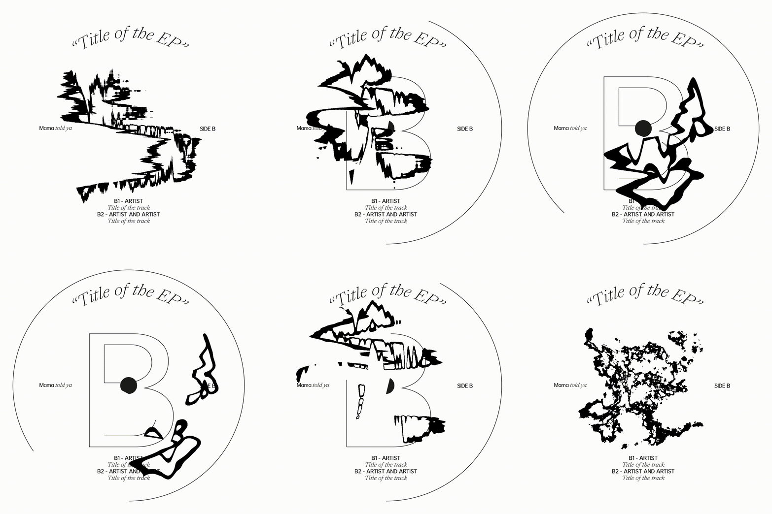
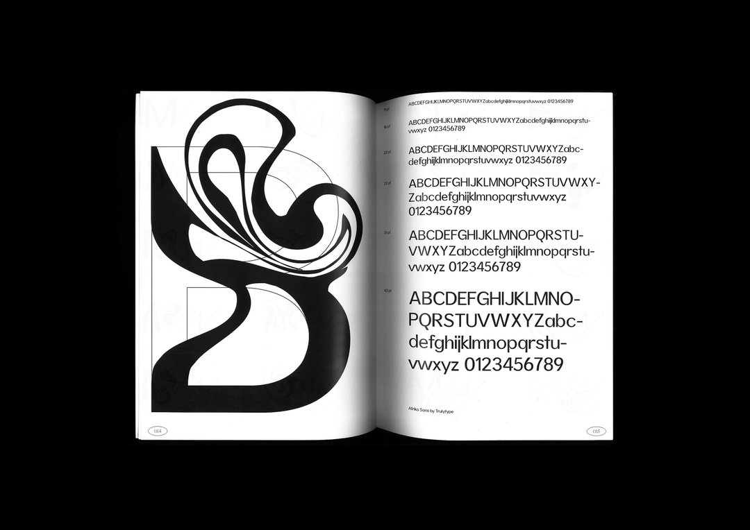
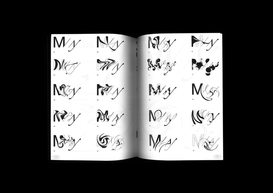
One ongoing project in which they’ve been able to flex this mantra to its fullest is with record label Mama Told Ya, founded by Anetha. Over a year in the making so far, the pair created the visual identity for the label, as well as designing three vinyl releases and their merchandising. “The idea of the label is to encourage collaboration and experimentation,” they explain. “It is in that state of mind that we chose to create an evolutive logo adapting itself to the needs and mood, distorting itself, compressing, stretching and so on.” This notion of modulating elements is often present in Diplomatie’s work and, in the case of Mama Told Ya, it creates a distinctive identity which can also be redefined with every release, “which gives birth to surprises and almost infinite possibilities,” as they put it.
Another project for Benext, an informatics development society based in Paris, demonstrates the studio’s love of rules and of breaking them. “We worked on this project in collaboration with a studio of artistic direction, with a starting point based on order and chaos. We took care of order and they managed chaos,” Léo and Florian explain. The system they created is based upon the concept at A=1, B=2, etc, in turn producing “a series of codes and unravelling only the information asked for but also giving the user the possibility to decipher the information for themselves.”
With other projects on the back burner due to Covid-19, one upcoming project they can tell us about is an exhibition due to be happening in June 2021. Léo and Florian are curating the exhibition and will, of course, be creating its visual identity, the communication, scenography and everything else in between – “a new challenge for us,” they say.
GalleryDiplomatie Studio
Mama Told Ya (Copyright © Diplomatie Studio, 2018)
Mama Told Ya (Copyright © Diplomatie Studio, 2018)
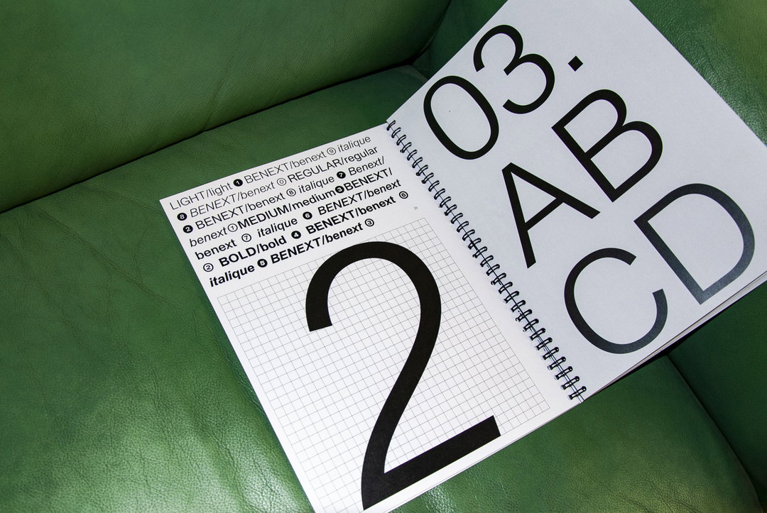
Benext company (Copyright © Diplomatie Studio and Mathilde Guiot, photography by Anaïs Lalitte, 2020)
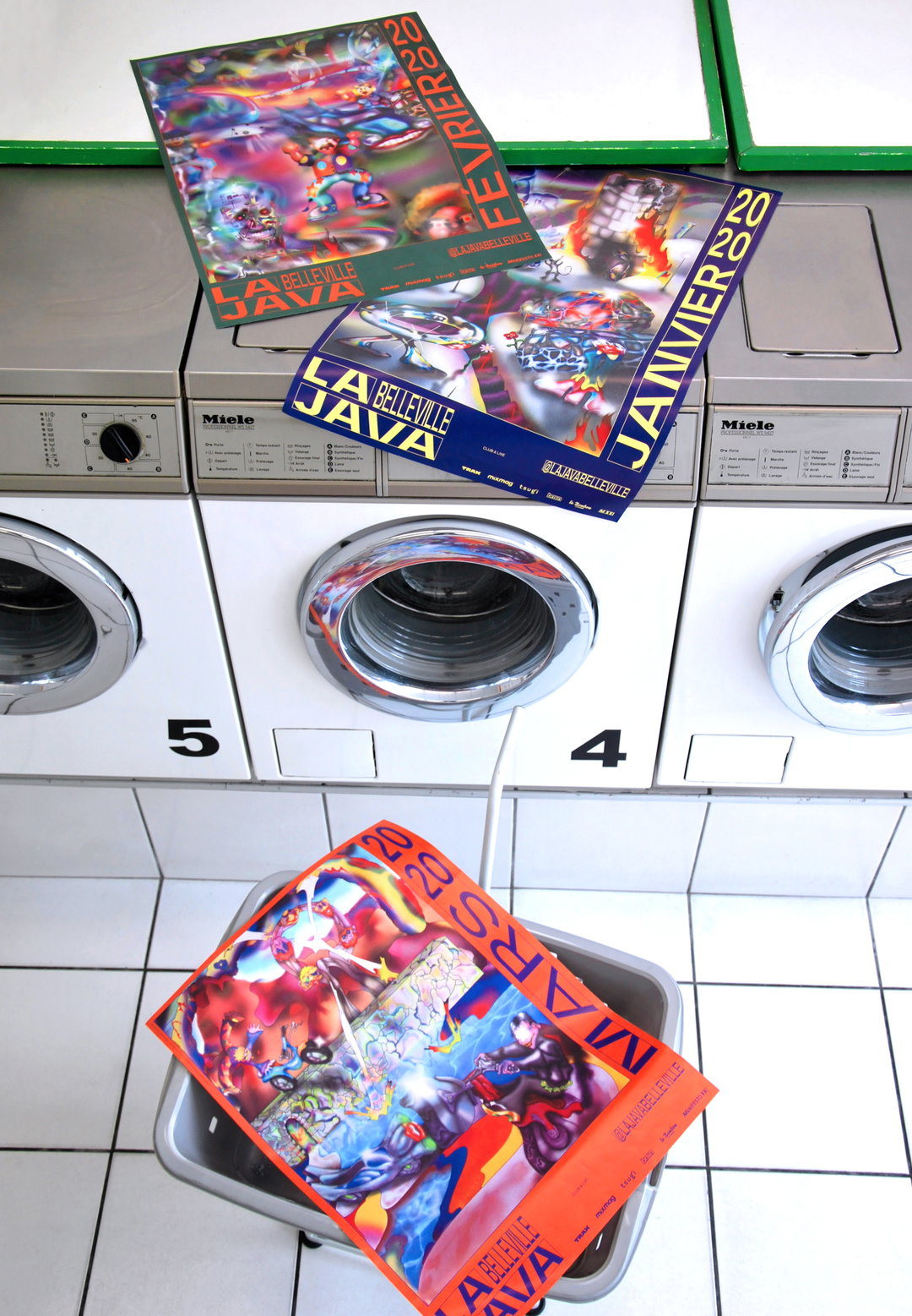
La Java Belleville (Copyright © Diplomatie Studio, photography by Anaïs Lalitte, 2020)
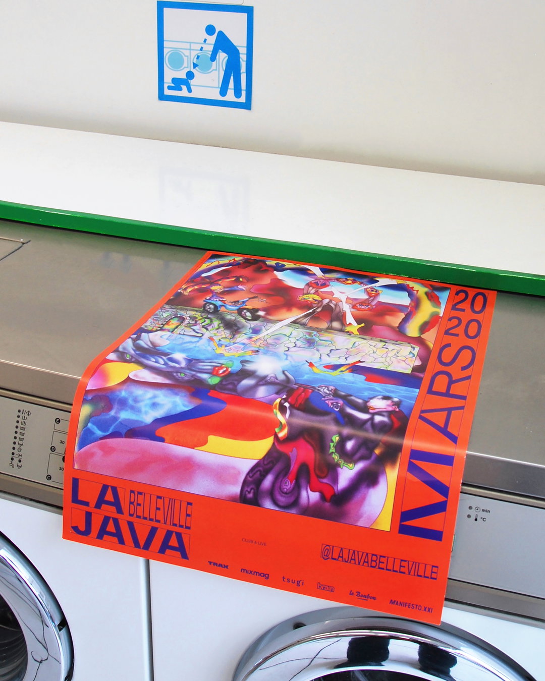
La Java Belleville (Copyright © Diplomatie Studio, photography by Anaïs Lalitte, 2020)
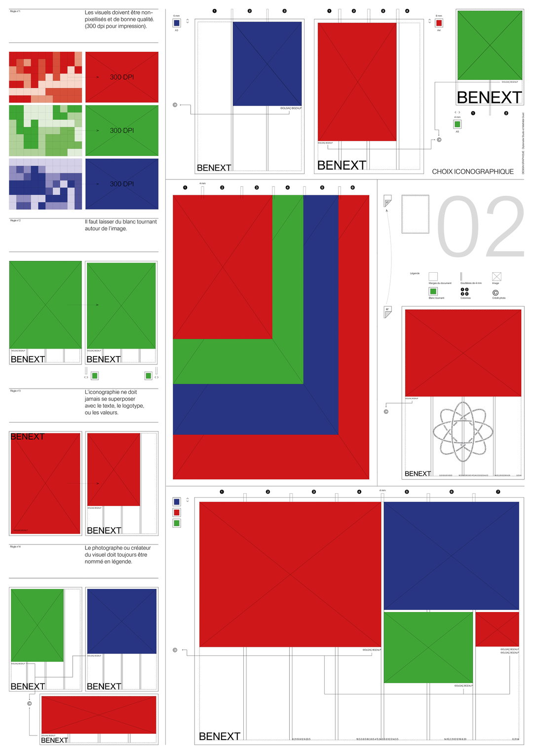
Benext company (Copyright © Diplomatie Studio and Mathilde Guiot, 2020)
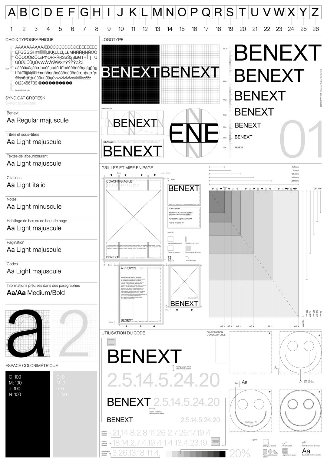
Benext company (Copyright © Diplomatie Studio and Mathilde Guiot, 2020)
Hero Header
Diplomatie Studio: Mama Told Ya (Copyright © Diplomatie Studio, 2020)
Share Article
Further Info
About the Author
—
Ruby is Senior Creative at It's Nice That, overseeing our visual output across platforms and projects. Before that, she was associate editor on the editorial team, after joining in September 2017 following graduation from Central Saint Martins.

