



Launch Recite Me assistive technology
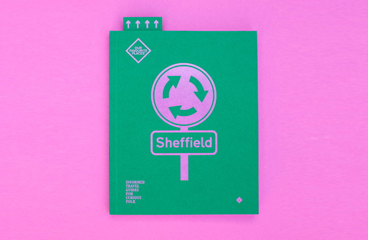
A green travel guide for “Sheffield” is set against a bright pink background. The cover features a pink circular arrow symbol and a sign reading “Sheffield”, with the phrase “Our favourite places” in a diamond badge.

Our Favourite Places is promoting the creative wealth of innovative Sheffield

—
Date
27 September 2016

Eleven is a design and visual communication studio based in Sheffield with its design inspiration and output firmly rooted in its home city. Priding itself on design that combines “high levels of craft, execution and clarity”, Eleven create accomplished products promoting the creative wealth of the Yorkshire city.

Its range of products showcasing the cultural achievements of Sheffield are available through its sister brand, Our Favourite Places. Set up by Eleven in 2010, it promotes Sheffield’s academic, artistic and industrial accomplishments. By gaining the “support of the city’s bigwigs (the universities, the council, major venues and festivals) we received ‘Cultural Destinations’ funding from the Arts Council and Visit England in 2014,” contributor Kathryn Hall explains. This funding has enabled Our Favourite Places to create an outreach to a wider audience – the readership is 55% based outside of Sheffield, 20% of that in London.

It’s products are soaked in Sheffield’s history with subtle visual references creating sophisticated souvenirs. Our Favourite Places Edition Four, is an anthology of secrets of the city, “Written by in-the-know locals, Our Favourite Places is an independent guide to the creative, unconventionally beautiful, city”. Eleven additionally sell individual maps catered for a tourist or locals personal taste, including ale. "Sheffield is much of a city of ale as it is a city of steel, typography, poetry and science,’ says the editorial. An illustrated favourite of ours is an A-Z of Sheffield, a collection of postcards each with “a mini Sheffield story or fact on the reverse – Richard Hawley’s quiff, Sheffield’s biggest hill and the birth of Bertie Bassett all feature”.

With both Sheffield Design Week and Offset Sheffield coming up in October, there has never been a more ideal time to be inspired by this hilly city of innovation.
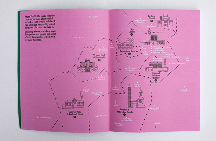
An open book featuring a pink map of Sheffield. Stylised illustrations of landmarks are scattered across the page, with labels for areas such as “Kelham Island” and “City Centre”.
Above

Our Favourite Places: Our Favourite Places Edition Four
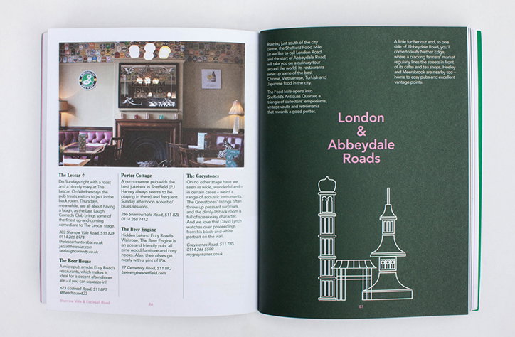
An open book showing a double-page spread. The left page features a photo of a pub interior and text describing local venues, while the right page is dark green with the heading “London & Abbeydale Roads” above a white line illustration of two buildings.
Above

Our Favourite Places: Our Favourite Places Edition Four
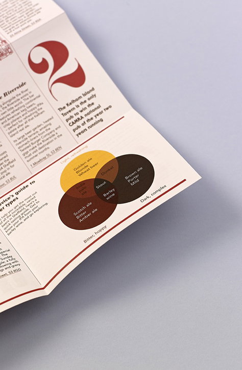
A close-up of a printed brochure featuring a Venn diagram of beer types. Overlapping circles in brown and gold are labelled with terms like “Stout”, “Golden ale” and “Brown ale”.
Above
Left

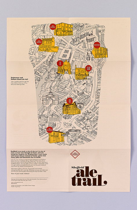
Our Favourite Places: Sheffield Ale Trail
Right

Our Favourite Places: Sheffield Ale Trail
An illustrated map of the “Shalesmoor and Kelham Island ale trail” in Sheffield. Hand-drawn buildings and streets are rendered in black line work, with selected pubs highlighted in yellow and marked with red pins. A block of text at the bottom left describes the city's heritage, while a bold title at the bottom right reads “Sheffield ale trail.”
Above

Our Favourite Places: Sheffield Ale Trail
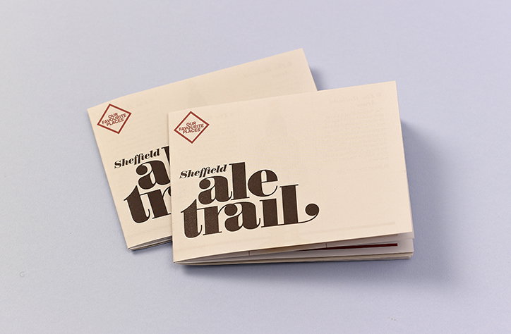
Two cream-coloured booklets lie slightly overlapped on a pale blue background. The covers feature bold, dark brown typography that reads “Sheffield ale trail” beneath a small diamond logo containing the words “Our favourite places”.
Above

Our Favourite Places: Sheffield Ale Trail

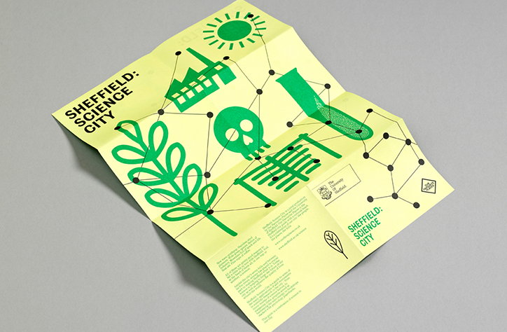
A lime green folded brochure features a network of black lines connecting various scientific icons. The illustrations include a sun, a factory, a test tube, a skull and a leaf. The text reads “Sheffield: Science City” alongside the University of Sheffield logo. Small blocks of text provide further details on the bottom panel.
Above

Our Favourite Places: Sheffield: Science City
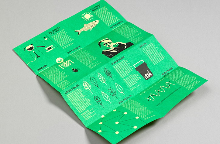
A green folded brochure featuring a grid of white illustrations and text. Sections include headings such as “The science of coffee”, “Museums” and “Green spaces”.
Above

Our Favourite Places: Sheffield: Science City
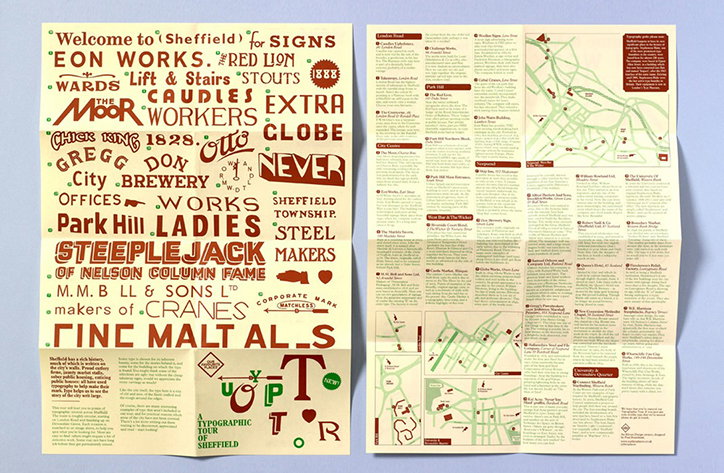
A two-page typographic guide to Sheffield. The left page features a collage of vintage-style signage and lettering, including the words “Welcome to Sheffield” and “Fine Malt Als”. The right page contains a detailed map of the city surrounded by lists of locations and descriptive text.
Above

Our Favourite Places: A Typographic Tour of Sheffield
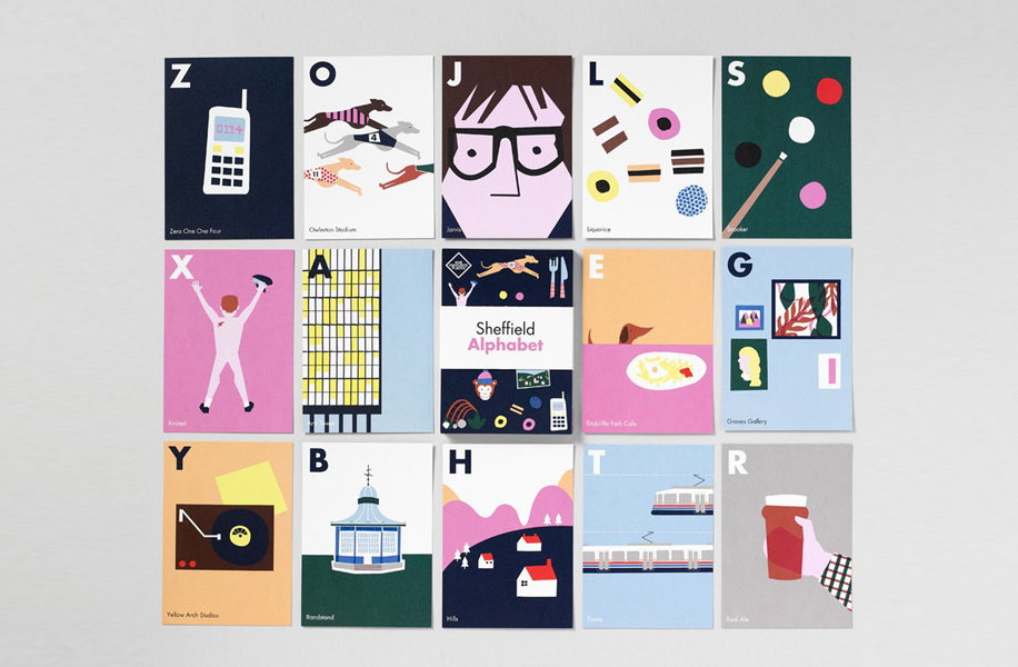
A grid of 15 colourful illustrated cards forming a “Sheffield Alphabet”. Each card features a bold capital letter and a minimalist graphic representing a local landmark, object or person.
Above

Our Favourite Places: A-Z of Sheffield
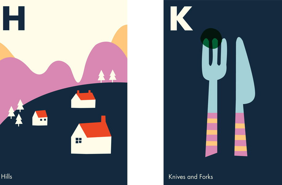
Two illustrations from an alphabet book. The first shows white houses on a dark blue hill against a purple mountain range, with the letter “H” and the word “Hills”. The second shows a blue fork and knife with striped handles against a dark blue background, with the letter “K” and the words “Knives and Forks”.
Above

Our Favourite Places: A-Z of Sheffield

Share Article

About the Author

Lucy Bourton

—

Lucy (she/her) was part of the It’s Nice That team from 2016–2025, first joining as a staff writer after graduating from Chelsea College of Art with a degree in Graphic Design Communication, eventually becoming a senior editor on our editorial team, and most recently at Insights, a research-driven department with It’s Nice That.


It's Nice That Newsletters

Fancy a bit of It's Nice That in your inbox? Sign up to our newsletters and we'll keep you in the loop with everything good going on in the creative world.

