




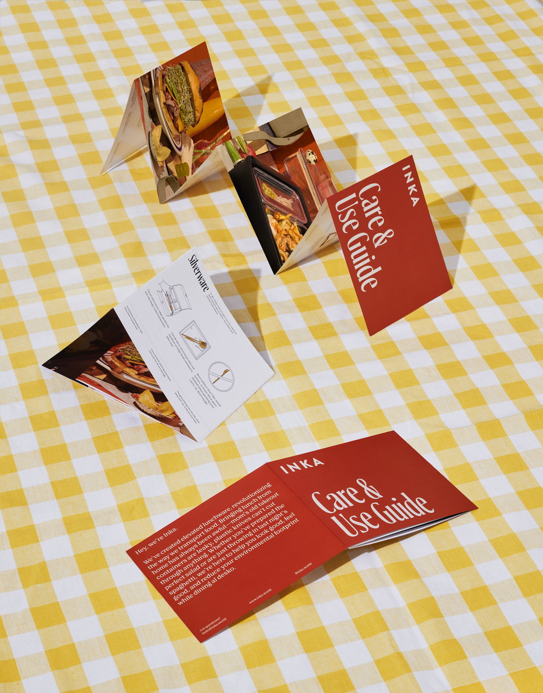
Retro type and gingham in abundance: Elizabeth Goodspeed’s branding designs will transport you to the 70s
The Providence-based designer tells us about her love of printed material and how she nearly followed a more scientific path.
Oozing with 1970s visual references, it's no overstatement to suggest that Elizabeth Goodspeed's branding designs are the epitome of vintage. Being drawn to archival design and printed ephemera, Elizabeth tells us that the best way for her to stay inspired is by looking at primary sources from the past. Often rooting her way through counter-culture magazines, old cookbooks and QSL cards, Elizabeth is never short of material. But, the designer is especially passionate about “folk” design, she explains, “and how makers throughout history have utilised the limited technologies for their era in unexpected ways to make unique work”.
With this in mind, Elizabeth enjoys working on “idea-driven and historically inspired brand identity projects”. Very much in line with her interests, Elizabeth completed a branding project for the food storage brand Inka which was “essentially a reimagining of a very 1970s approach to tupperware – a belief that reusable containers can be fun and that good things can be reused again and again”. Working across all touch points of the brand, from writing tag lines to designing packaging, Elizabeth created a cohesive brand identity that was both effective and visually striking. With warm red tones, a quaint typeface and yellow gingham in abundance, Elizabeth emulated the retro warmth of 70s design.
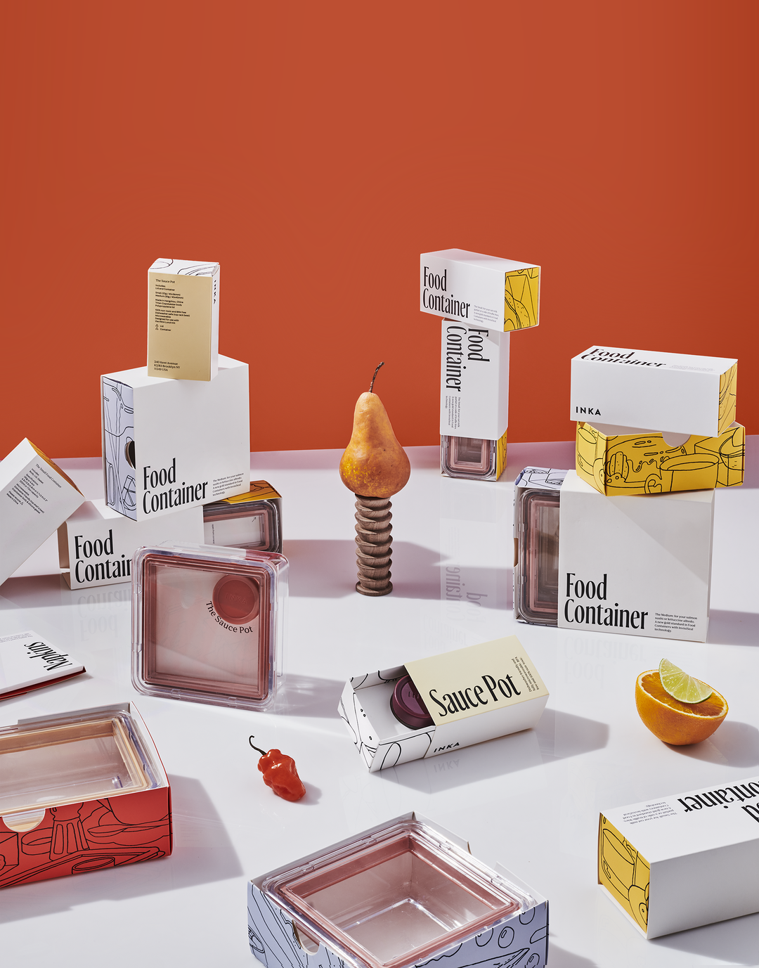
Elizabeth Goodspeed: Inka, Package Design (Copyright © Elizabeth Goodspeed, 2020)
Elsewhere, Elizabeth has also completed work for the technology company Breadwinner. Whilst Breadwinner is a brand that boasts innovative new tools for “detail-oriented” bakers, it specifically sought out an invitingly old-fashioned identity. Joining the team very early on in the development process, Elizabeth helped the founder guide the project from a single piece of “admittedly niche” technology into a fully fleshed out brand. Again applying her rigorous exploration of historical material, the project “mashes up the rich history of bread-making in Europe, especially Germany, with the DIY punk ethos of making your own bread from scratch” – its typography is fittingly inspired by gothic blacklettering.
Elizabeth clearly demonstrates a natural aptitude and eye for design, but she hasn't always been travelling directly in the creative path. Despite always being “creative” and having lawyer parents who were also interested in the arts – Elizabeth's mum is an avid theatre and museum goer and her dad is a former carpenter and hobbyist letterpress printer – the designer gravitated toward “conventionally academic” subjects in her youth, particularly the STEM fields. Going to college, Elizabeth fell certain that she wanted to be a scientist, yet unexpectedly fell in love with graphic design.
Her scientific studies, however, were not too far removed from her creative interests: “my area of focus within cognitive science was visual perception and colour processing”, she explains. “But graphic design quickly felt like a more immersive and hands-on way to examine the subject of vision. Through design, I could see how individuals respond to different colours, forms and patterns in real time, rather than in an empirical vacuum.” Having now explored her design interests personally and through various organisations (she's an alumni of the Type @ Cooper Type Design program), Elizabeth has come to the realisation that most of her work is driven by mixing typefaces and unusual display fonts; “though I realised very quickly that I didn't have the patience to be a dedicated type designer”, she adds.
Elizabeth has a lot to be excited about in the coming year. This spring she’ll be joining the team at High Tide for a few months as their next Designer Director in Residency, and she's going to be teaching her first graduate level class at Parsons on Visual Literacy. There's a particularly exciting personal project in the works too: the designer is currently producing a Riso zine focusing on the history of romance novel cover lettering. However, if Elizabeth is completely honest, she’s looking to do a little less design this year. “Going freelance and working from home during the pandemic really ate into my work-life balance”, she admits. “But now that the industry seems to be levelling out a bit, I’m eager to spend more free time with friends and to get back into some of my other interests like cooking, reading and fiber arts!”
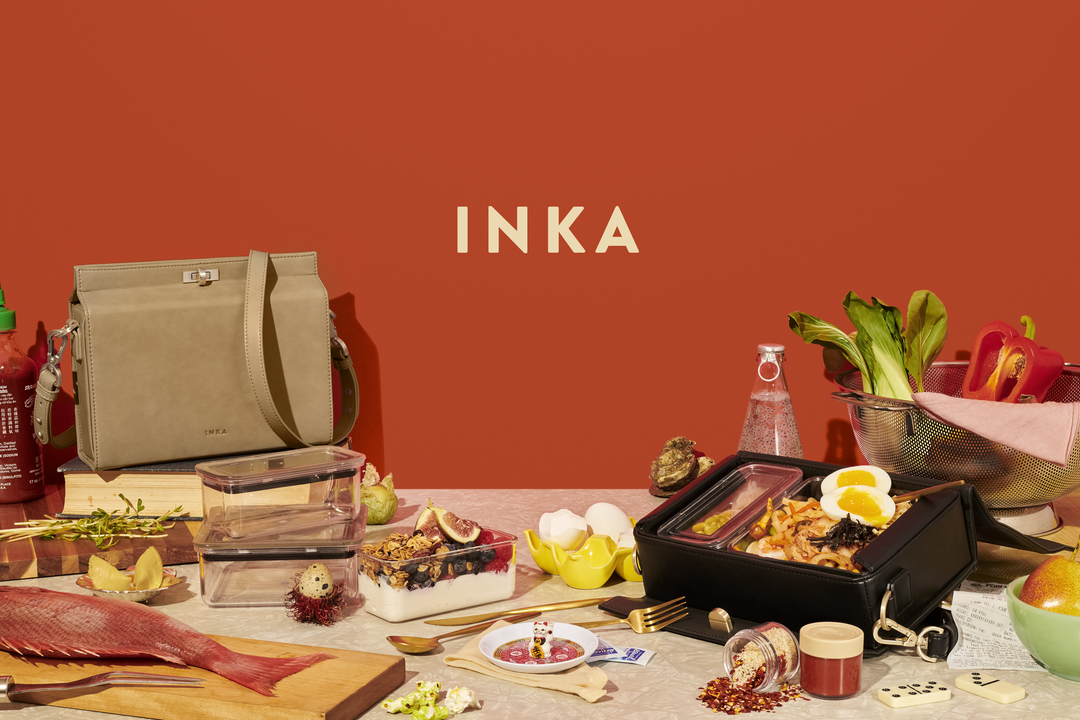
Elizabeth Goodspeed: Inka, Package Design (Copyright © Elizabeth Goodspeed & Ian Shiver, 2020)
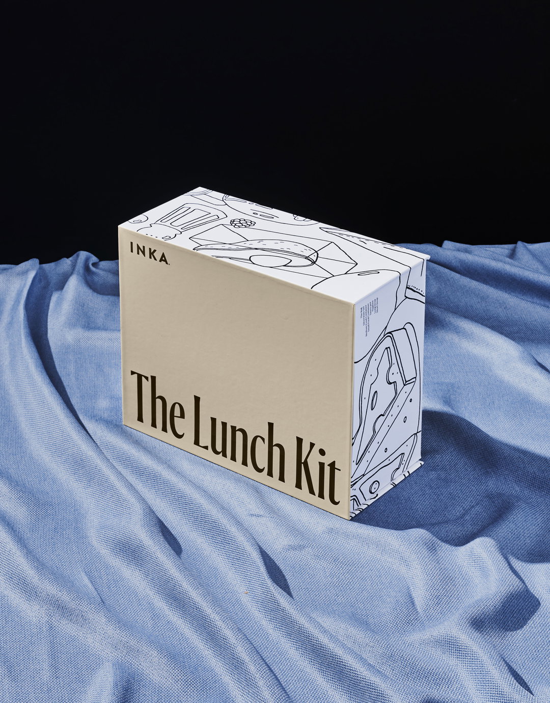
Elizabeth Goodspeed: Inka, Package Design (Copyright © Elizabeth Goodspeed, 2020)
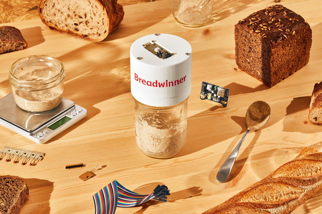
Elizabeth Goodspeed: Breadwinner Art Direction (Copyright © Elizabeth Goodspeed & Cody Guilfoyle, 2020)
Elizabeth Goodspeed: Breadwinner Art Direction (Copyright © Elizabeth Goodspeed & Cody Guilfoyle, 2020)
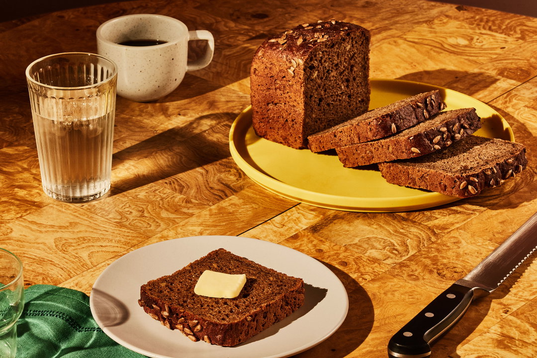
Elizabeth Goodspeed: Breadwinner Art Direction (Copyright © Elizabeth Goodspeed & Cody Guilfoyle, 2020)
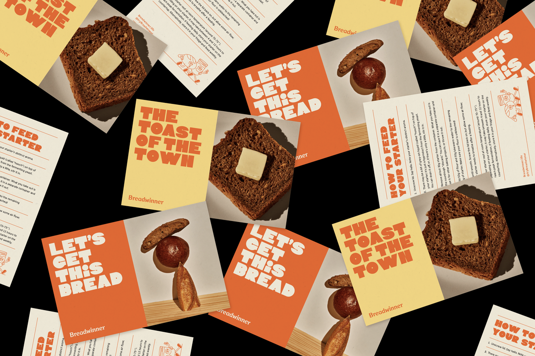
Elizabeth Goodspeed: Breadwinner Postcards (Copyright © Elizabeth Goodspeed, 2020)
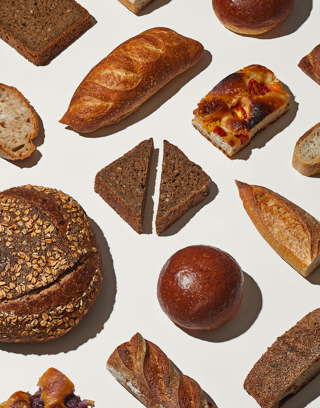
Elizabeth Goodspeed: Breadwinner Art Direction (Copyright © Elizabeth Goodspeed & Cody Guilfoyle, 2020)
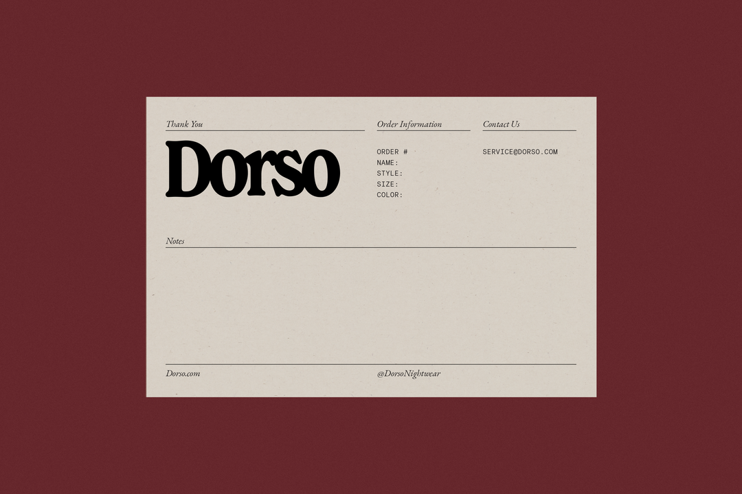
Elizabeth Goodspeed: Dorso Postcards (Copyright © Elizabeth Goodspeed, 2021)
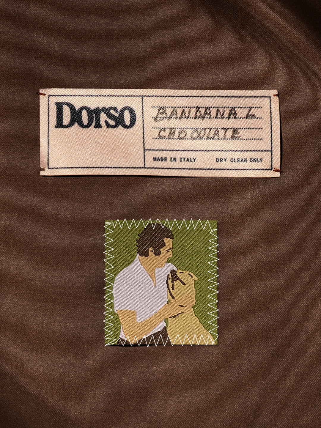
Elizabeth Goodspeed: Dorso Label (Copyright © Elizabeth Goodspeed, 2021)
Elizabeth Goodspeed: Dorso Hanger (Copyright © Elizabeth Goodspeed, 2021)
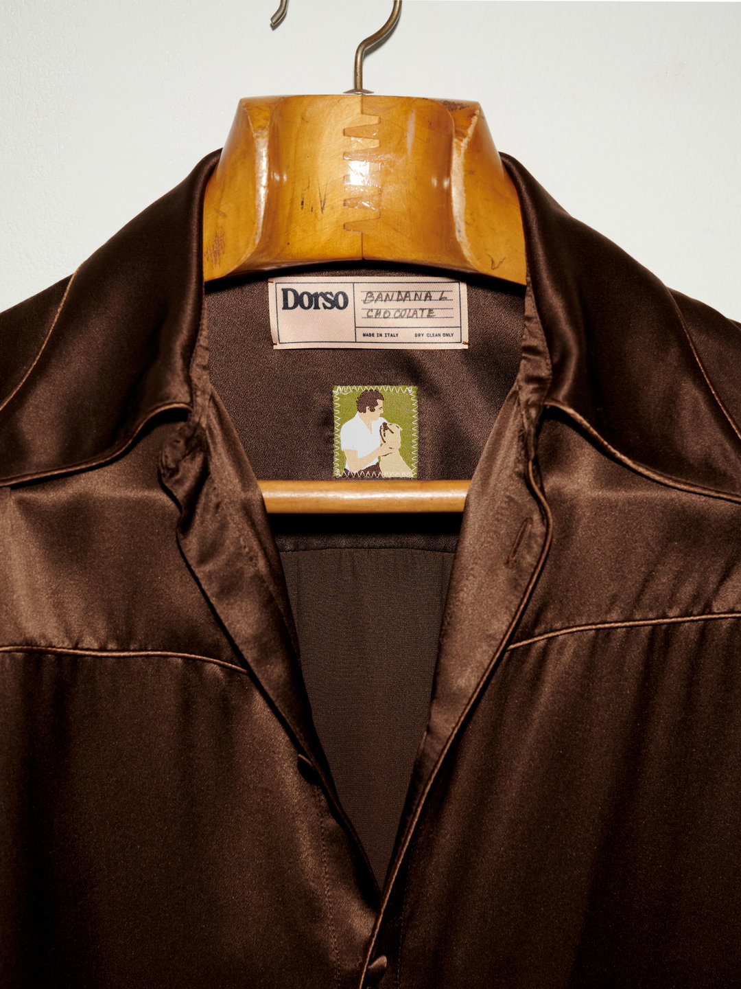
Elizabeth Goodspeed: Dorso Hanger (Copyright © Elizabeth Goodspeed, 2021)
Hero Header
Elizabeth Goodspeed: Inka Booklet (Copyright © Elizabeth Goodspeed, 2021)
Share Article
About the Author
—
Olivia (she/her) is associate editor of the website, overseeing the day-to-day editorial projects as well as Nicer Tuesdays events. She joined the It’s Nice That team in 2021. ofh@itsnicethat.com
To submit your work to be featured on the site, see our Submissions Guide.




