Pentagram's Emily Oberman talks us through her identities for the Harry Potter universe
Emily Oberman can hardly believe her luck. The designer, a partner in Pentagram’s New York office since 2012, is a self-professed Harry Potter “super fan” and for the past three years has been working to bring some of the newest projects in the wizarding universe to life. Put simply, it’s been a dream project to work on something that, as she puts it, “entertains the world”.
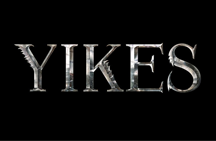
She entered the world of witchcraft and wizardry when she was approached by Sue Kroll (then an executive at Warner Bros) to create an identity for a new film franchise in the Harry Potter universe. That film was, of course, Fantastic Beasts and Where to Find Them. Emily and her team built an identity from scratch, which included a custom typeface that they (ingeniously) named Fontastic Beasts, and that was used across everything from posters to social media campaigns.
“We created two versions of the typeface: ‘clean’ and ‘hairy’,” explains Emily. “The idea was that you could mix them, because if all the letterforms were one or the other, then it would either look too ‘beastly’ or too plain.”
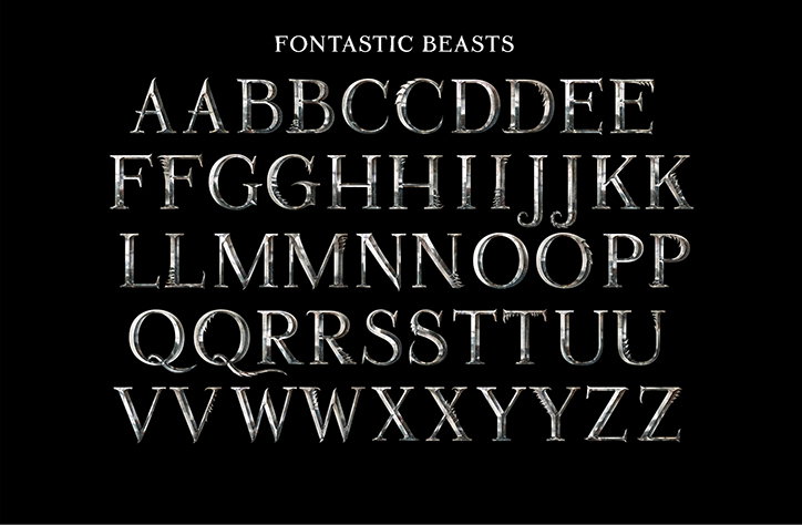
Pentagram: Fontastic Beasts
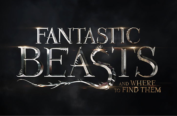
Pentagram: Fantastic Beasts and Where to Find Them logo
After the success of that first film, Emily and her team at Pentagram was brought back on board to work on the identity for the second (and most recent) film in the franchise: The Crimes of Grindelwald. This was perhaps an even more sophisticated task, as it involved “creating a hierarchy” – effectively, working on an identity system that could grow to incorporate more films as the franchise grows. “We’re trying to evolve it as the story evolves,” says Emily. “For Fantastic Beasts and Where to Find Them, the identity was a bit closer to the original Harry Potter films in the form it took. The Crimes of Grindelwald has evolved – the typography feels a bit more organic and the whole identity is a bit harder.”
Again, a custom typeface was produced, this time given the moniker Crimes New Roman. But the team went one step further with the film’s logo, burying a few subtle hints in it just for hardcore Harry Potter fans. “We realised we could hide the Deathly Hallows in the Crimes of Grindelwald logo,” says Emily. “It only took half a day before people started noticing it online. I loved doing that for the fans.”
Since then, Emily and her team have been tasked by Warner Bros and the Blair Partnership (J.K. Rowling’s agency) with two projects that are less focused on the film franchise. Firstly, she was brought on to design an identity for Wizards Unite, the augmented-reality game created by the same folks who were behind Pokémon Go (we can only imagine how successful that’s going to be when it launches next year). Again, the identity had to shift to adapt to a new set of contexts. “It had to feel more modern,” says Emily, “because a game that you play on a phone is inherently more modern. So the letterforms are more sans serif and they’re more flat rather than chiselled.” For now, only the logo has been released, with the full identity still under wraps.
On top of that, Emily was then asked to create an identity for Wizarding World, the parent company above both the Harry Potter and Fantastic Beasts franchises. “This really merges the two franchises into one,” says Emily. “The idea was to bring it all back to the origins: a book. That first Harry Potter book that J.K. Rowling wrote. That’s why the logo is a book, but all the pages are wands.”
Having completed four projects in as many years, Emily and her team are just getting started. They’ve already started talking to Warner Bros about the next film in the Fantastic Beasts franchise. All we can say is: Watch this space.
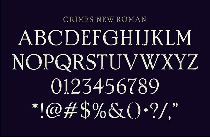
Pentagram: Crimes New Roman
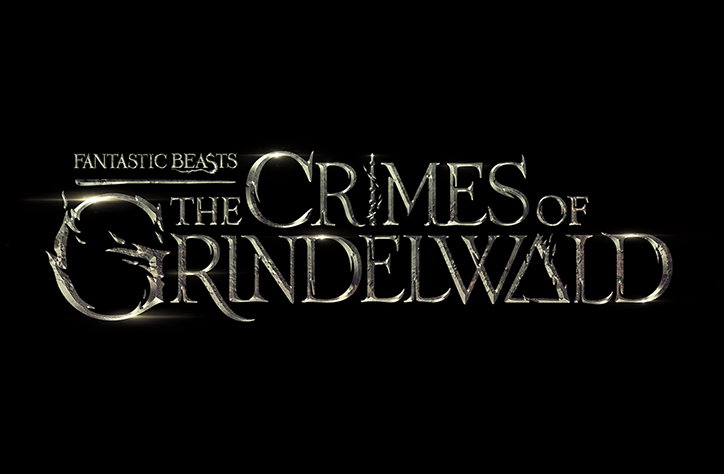
Pentagram: Crimes of Grindelwald logo
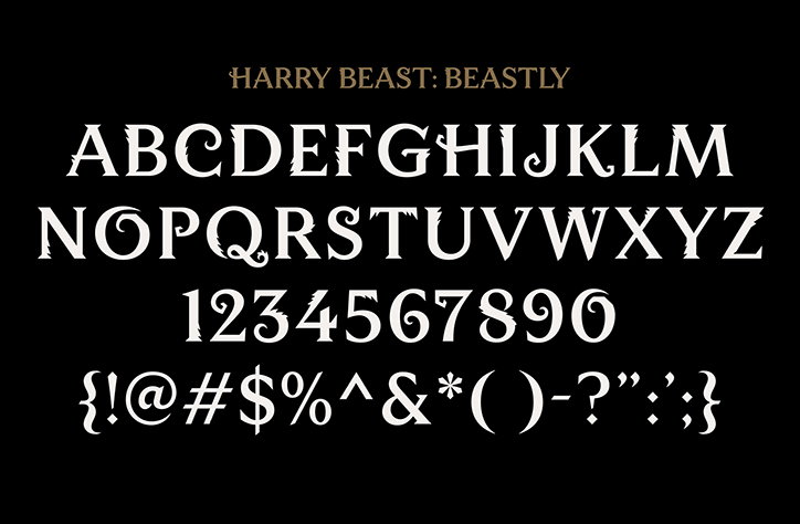
Pentagram: Harry Beast (Beastly)
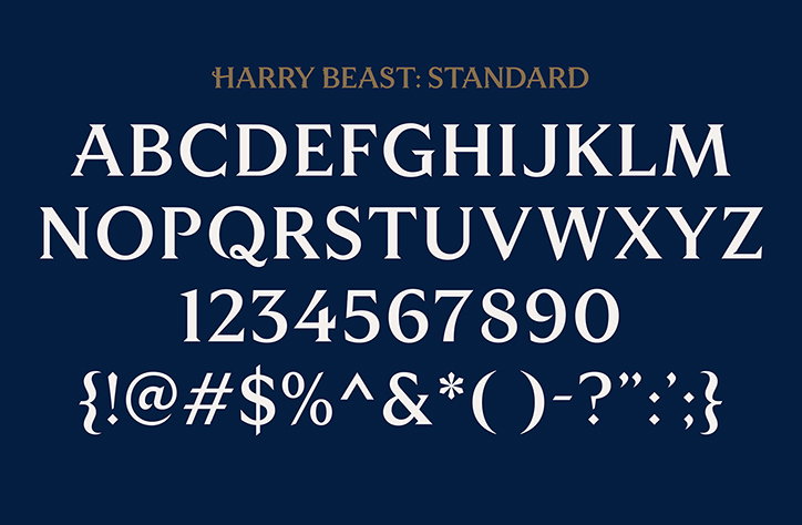
Pentagram: Harry Beast (Standard)
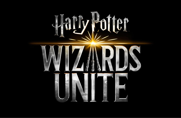
Pentagram: Harry Potter – Wizards Unite logo
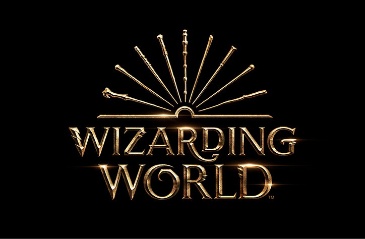
Pentagram: Wizarding World logo
Share Article
Further Info
About the Author
—
Matt joined It’s Nice That as editor in October 2018 and was editor-in-chief in September 2020–2024. He was previously executive editor at Monocle magazine. He is now a freelance writer and editor.