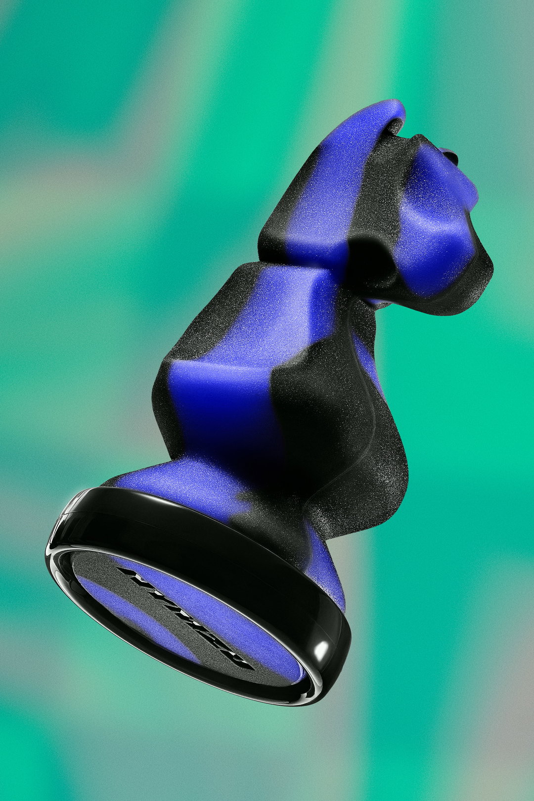
Meet graphic design studio Fakepaper, where Marie Antoinette and 70s punk rock collide
The female-led design studio talks us through their long-lasting love of all things graphic and how more tactile mediums are currently inspiring their work.
Share
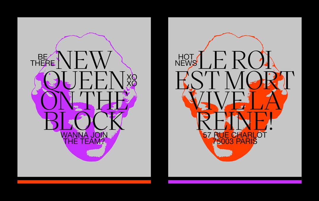
If you’re looking for a historically informed yet simultaneously playful, bold and striking identity, Fakepaper is the studio for you. Based in Paris and composed of Chloé Desvenain and Nolwenn Allarousse, the studio recently completed an identity for a restaurant cum wine cellar Le Collier de la Reine & Le Cave du Collier. Including a nod to the restaurant’s lively history (the former owner, Chloé shares with us, is linked to the theft of Marie Antoinette’s famous necklace), the studio based the identity around a portrait of the queen, but “twisting it in a more punk and offbeat universe, in homage to 70s English punk rock imagery”. And, for their adjacent wine cellar, which is currently developing a separate identity based around the “codes of a drugstore”, the studio developed a “drunk mascot” character and focused on a block-neon yellow backdrop, a deliberate antithesis to the refined world of natural wine.
From both of these brilliant identities, it’s not hard to see how Fakepaper’s practice is defined by a bold use of colour and exploratory approach to typography. With their appetite for colour being rooted in making their work accessible, they now view their bright palettes as providing the biggest springboard for each project. And, whilst it is rare for the studio to directly produce their own typeface, they view it as “important as a colour palette or logotype”. So, Chloé explains, they make sure to keep up with the output of various foundries, saving several fonts in preparation for when the appropriate project arises.
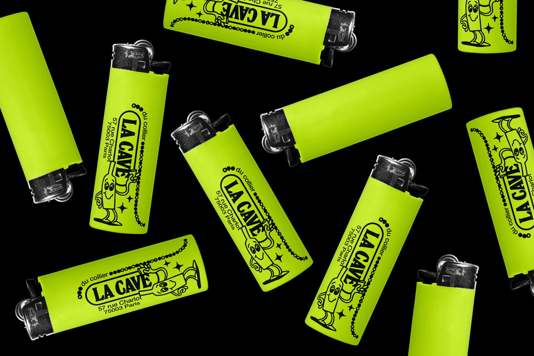
Fakepaper: La Cave Du Collier (Copyright © Fakepaper, 2022)
But, when the studio does produce typefaces, it’s sure to be in their trademark playful style. Recently, the studio created the lettering for photographer and director Charlotte Abramow’s latest exhibition. Focussing on an “organic” style, the letters have a wobbly, morphic quality, bending to each other’s form and varying in degrees of abstraction. This, Nolwenn explains, “evokes the notion of morphological variations, which is very present in Charlotte’s work”.
One thing that unifies Chloé and Nolwenn is their early attraction to graphic design and its surrounding fields. Chloé tells us that from the age of 16 she knew that she wanted to be in the field of applied arts. But, it was only after her first year of preparatory class – a scheme in France whereby students are introduced to the basics of fashion, textiles and graphics among other arts – that Chloé landed upon the design discipline. Nolwenn also attests to having an unconscious attraction to graphic design, “I remember in primary school having fun copying, recomposing and illustrating the lyrics inside my parents’ CD booklets”. And, this love of graphic letters further expanded when, in technology classes, Nolwenn came across Microsoft word software and became enamoured with its infamous array of fonts. Similarly to Chloé it was through her preparatory classes that Nolwenn gravitated toward the graphic side of things. Both doing stints at various internships and freelance positions, Fakepaper was created by Chloé in 2011, with Nolwenn joining at the beginning of 2018.
Whilst both Chloé and Nolwenn may have had their sights set on graphic design from a young age, they’re also keen to let other creative outlets feed into their work. Currently, Chloé is trying her hand at ceramics, attempting to do lettering in clay and being obsessed with the “incredible” effects of glaze. Nolwenn, on the other hand, has begun looking into stone engraving, and “who knows”, Chloé concludes, “maybe that’s something that will find its way one way or another into our work…”.
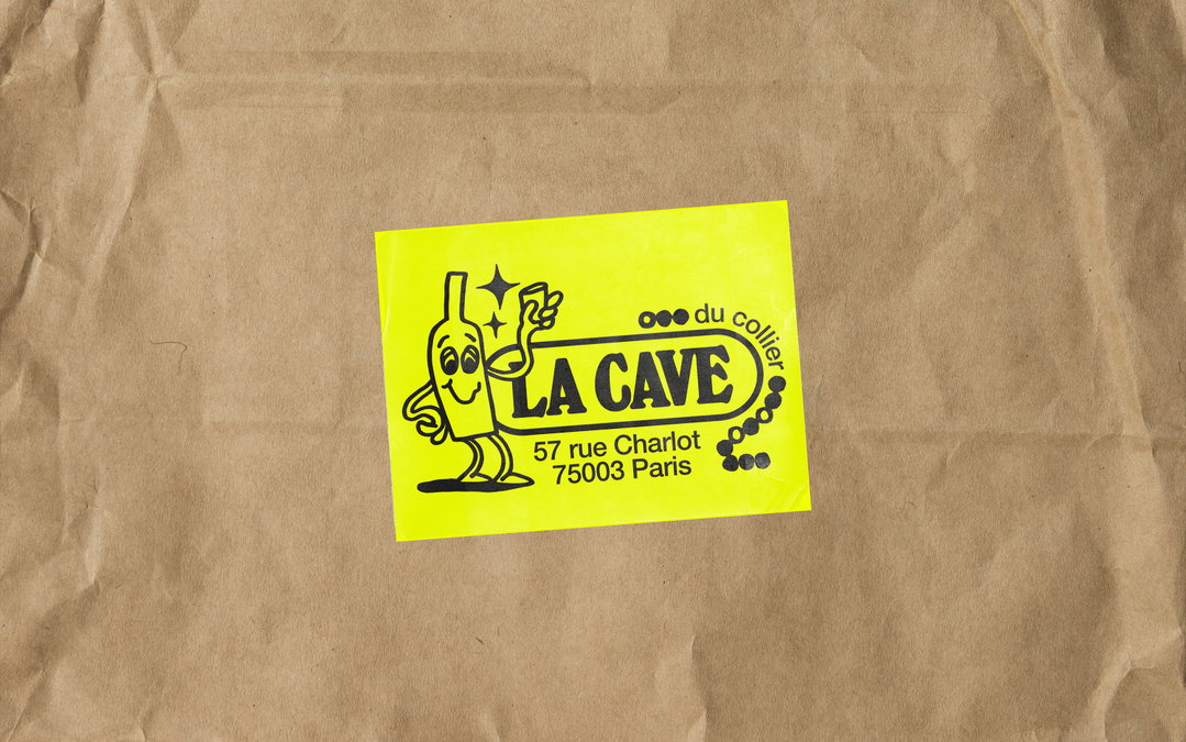
Fakepaper: La Cave Du Collier (Copyright © Fakepaper, 2022)
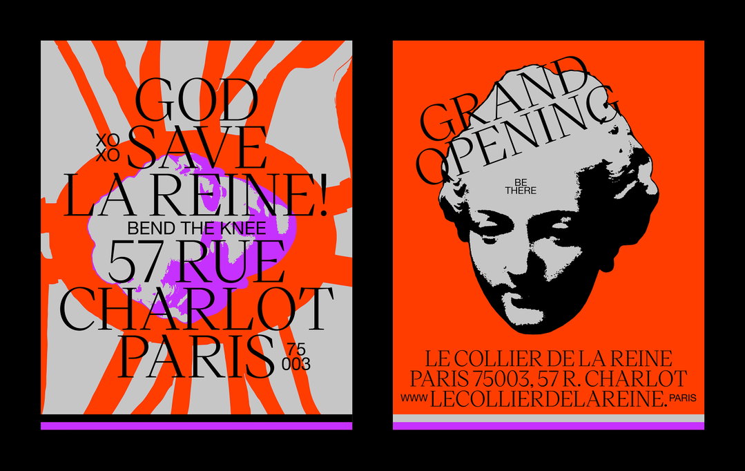
Fakepaper: Le Collier De La Reine (Copyright © Fakepaper, 2022)
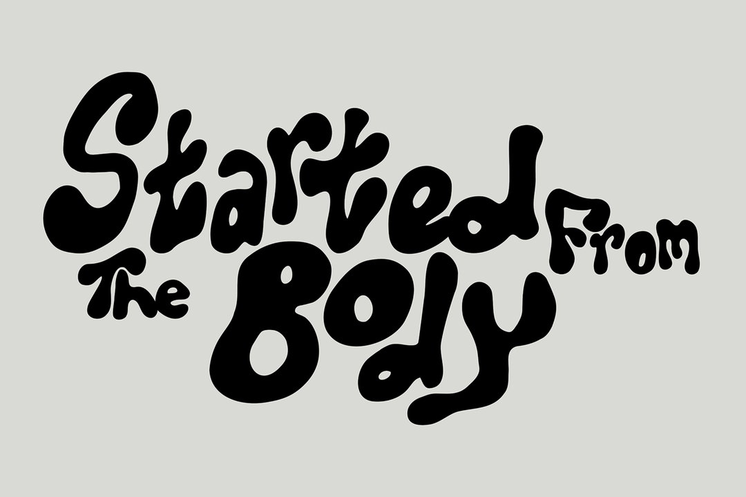
Fakepaper: Charlotte Abramow (Copyright © Fakepaper, 2021)
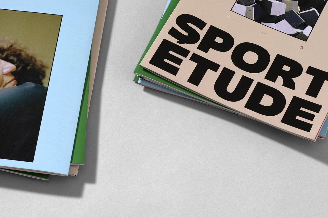
Fakepaper: Sport Étude (Copyright © Fakepaper 2018/19/20/21)
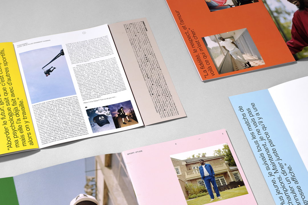
Fakepaper: Sport Étude (Copyright © Fakepaper 2018/19/20/21)
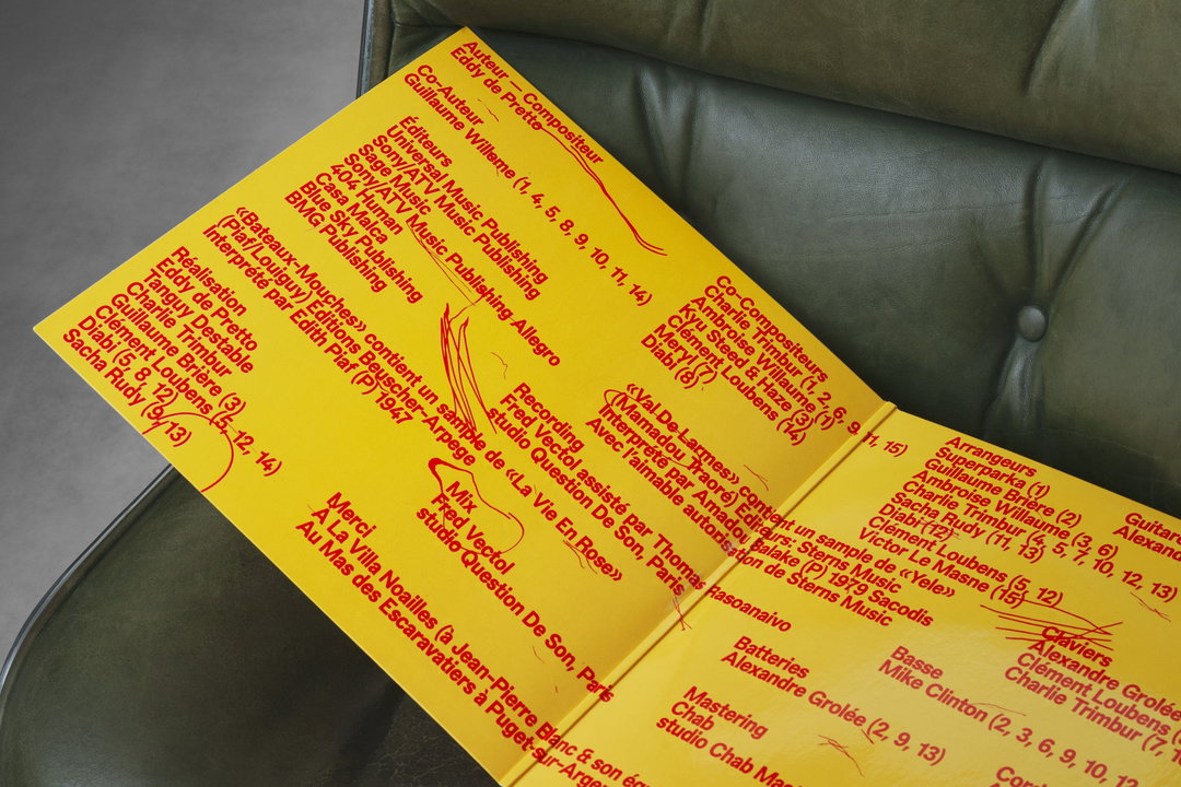
Fakepaper: Eddy De Pretto (Copyright © Fakepaper, 2021)
Fakepaper: Pantobaguette (Copyright © Fakepaper, 2020)
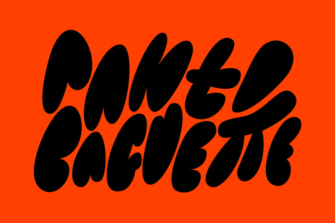
Fakepaper: Pantobaguette (Copyright © Fakepaper, 2020)
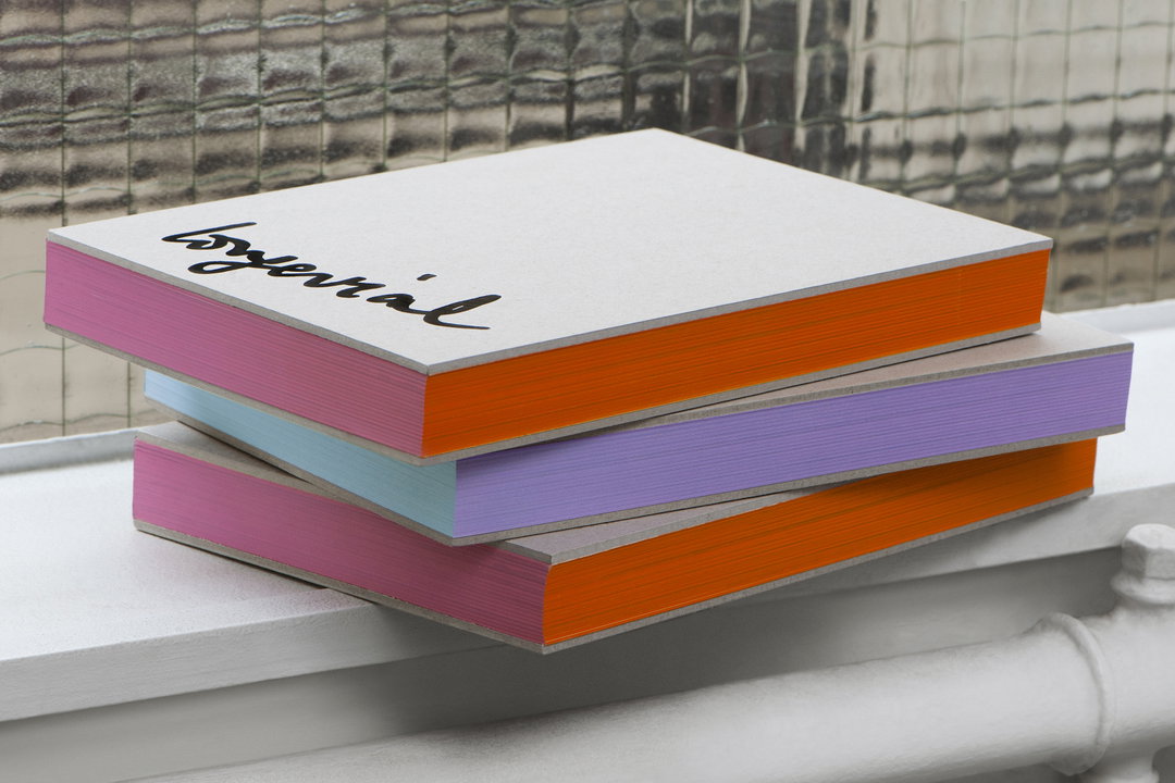
Fakepaper: Inès Longevial (Copyright © Fakepaper, 2020)
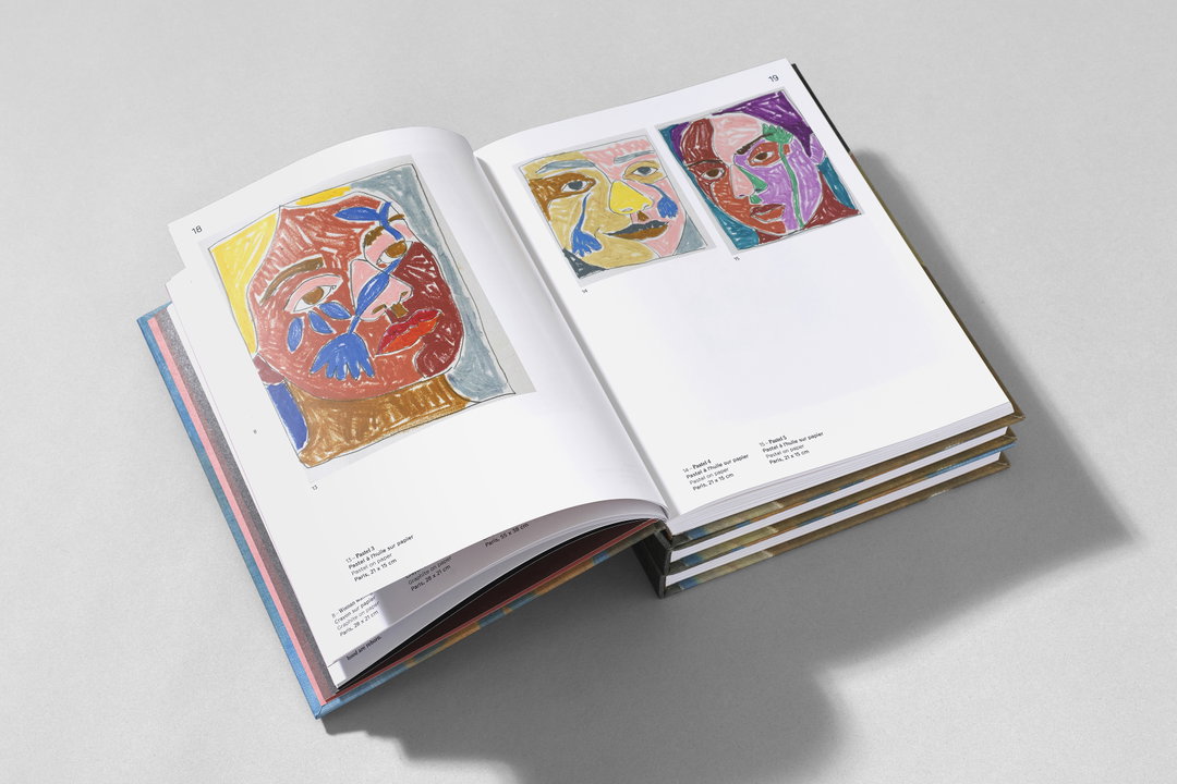
Fakepaper: Inès Longevial (Copyright © Fakepaper, 2020)
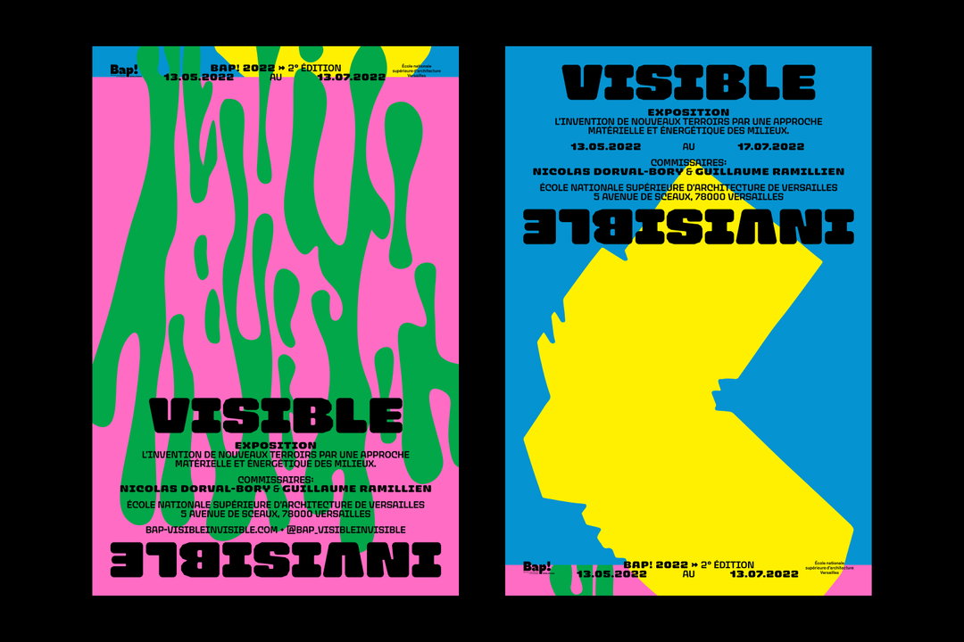
Fakepaper: BAP2 VisibleInvisible (Copyright © Fakepaper, 2022)
Hero Header
Fakepaper: Le Collier De La Reine (Copyright © Fakepaper, 2022)
Share Article
Further Info
About the Author
—
Olivia (she/her) is associate editor of the website, overseeing the day-to-day editorial projects as well as Nicer Tuesdays events. She joined the It’s Nice That team in 2021. [email protected]
To submit your work to be featured on the site, see our Submissions Guide.