




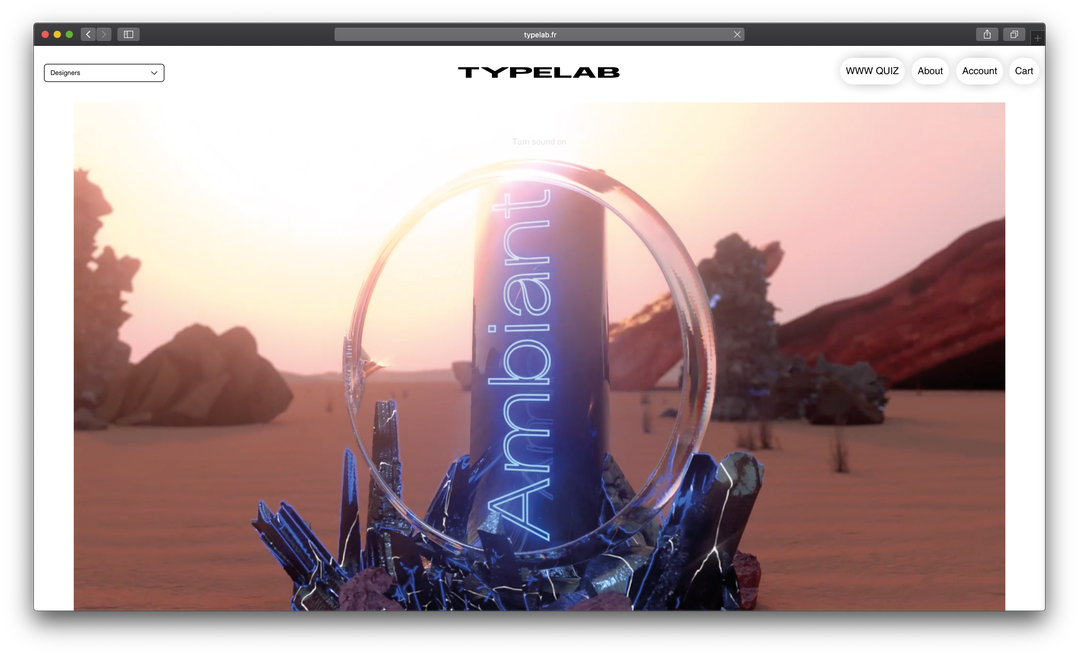
Typelab’s latest release prepares typefaces to be sent into space to represent humankind
Typelab’s founder Floriane Rousselot has been busy turning Typelab into an official foundry, as well as curating her most recent release, the Space Collection.
Share
Typelab began in 2018 as a project by Floriane Rousselot with the aim of championing the work of young designers and typographers, ultimately leading more people to buy their fonts. Through collections bringing together typefaces from different designers around a common theme or visual style, Floriane has been doing exactly that for the past two years. But now the digital platform has taken a step up, moving beyond simply a space to showcase work, to one where the work can be purchased – a fully fledged foundry.
“It was a big challenge,” Floriane tells It’s Nice That, “but it was the initial purpose [of Typelab]: giving young designers a place or a catalogue to be part of and to help them sell their fonts, supporting them in the different steps.”
Floriane tells us how the platform is more and more structured towards being a foundry but that doesn’t mean Typelab is no longer a space for experimentation. It has retained its sense of analysis (in terms of visual trends) not only through the ultra-modern typefaces it showcases, but through the experimental way in which it presents them. This is exampled in Typelab’s most recent release, the Space Collection.
The idea, Floriane explains, is to create a collection embodying several different styles, which if it were blasted into space would act a visual representation of human culture. “I wanted a very specific collection, with both serif and grotesk typefaces; very experimental ones, some typefaces playing with the illegibility, with modular aspects and contrasts,” she explains. “In the same way that Nasa sent some objects representing a part of our history into space, the Space Collection would be an immaterial capsule of typefaces also sent to Gliese 581c.”
The thinking behind this is conceptual and poetic. “As typefaces are omnipresent and essential in the way we are communicate everywhere, they are a part of our culture. I thought it would be interesting to create a collection which would be a part of messages sent to be found by extraterrestrial life the same way humans sent music and pictures, and ‘hello’ in 40 different languages.” In turn, the Space Collection is a reflection of the heritage and history each typeface embodies when it comes into fruition, how it is impossible for them to be devoid of cultural references and therefore their incredible potential for learning.
The collection therefore features the work of international designers, a somewhat asemic version of “hello” in 40 languages. It includes Arachne by Leonhard Laupichler, Icarus by Sophia Brinkgerd, Lapicide by Emilie Vizcano, Mughal by Jose Houdini and Fabio Florez, Ornamentum by Hugo Jourdan, Gang and Katana by Floriane, and Ambiant by Laura Csocsan. “I am super glad about this collection as it is really diverse,” Floriane adds. “I thought it was important to focus not only on experimental display fonts, but also typography with a long life span like Ambiant, for example.”
Not content with releasing the collection online as she has in the past, Floriane decided to run with the futuristic theme and explore what a 3D type specimen might look like. Titled Digital Exhibition, it focusses on the notion that this collection is a capsule, ready to be sent into space. It journeys through each typeface, presenting them in a setting representative of their “mood”, zooming in and out of large and macro universes. The film was produced in collaboration with Steffen Bewer to created the animation alongside Maxi Galgenmaier, Jonas Stadter, Edgar Koop, and Phillipp Bulk for the sound design.
Finally, on what the possibilities of combining 3D and typography in the future are, Floriane says that both are simply required more and more by brands, for campaigns, videos and art but that the true potentials are yet to be discovered. “This very new way of using typography and 3D enables us to explore it in detail, its textures and new contrasts we couldn’t really manage in print or 2D motion,” she concludes. “The mix of 3D and typography can be developed in so many ways so I assume there’s something to do with it. It brings our imagery further. It’s also a new process of experimentation to think about 3D typography not only as typography anymore but as a unique graphic element.”
Digital Exhibitino therefore feels like the tip of the iceberg in terms of what combining 3D and typography in this way can offer us. But it, alongside Space Collection as a whole, is an exciting step in the right direction.
GalleryTypelab: The Space Collection
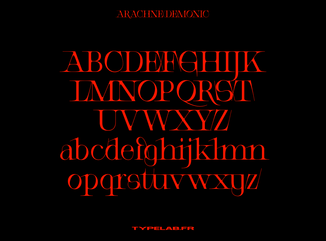
Arachne by Leonhard Laupichler
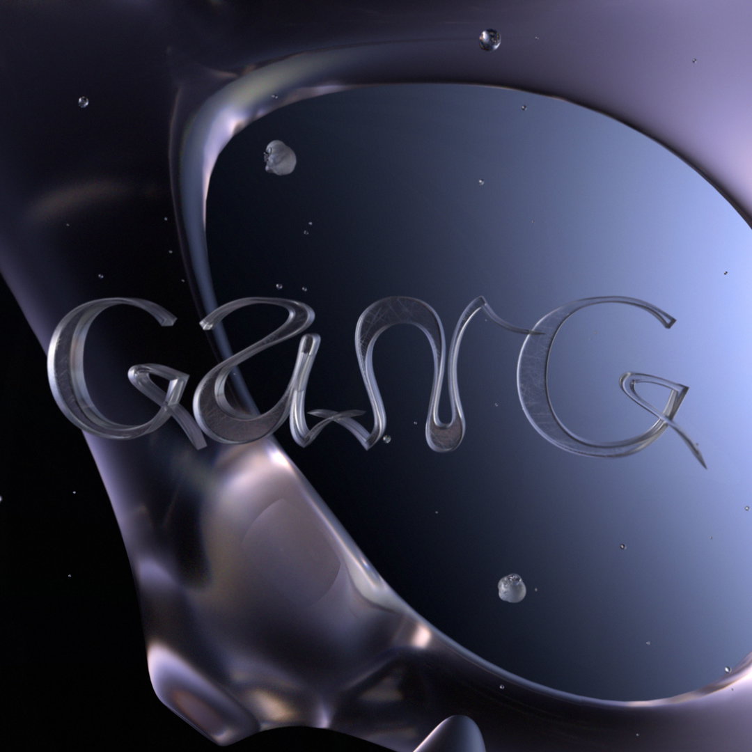
Gang by Floriane Rousselot
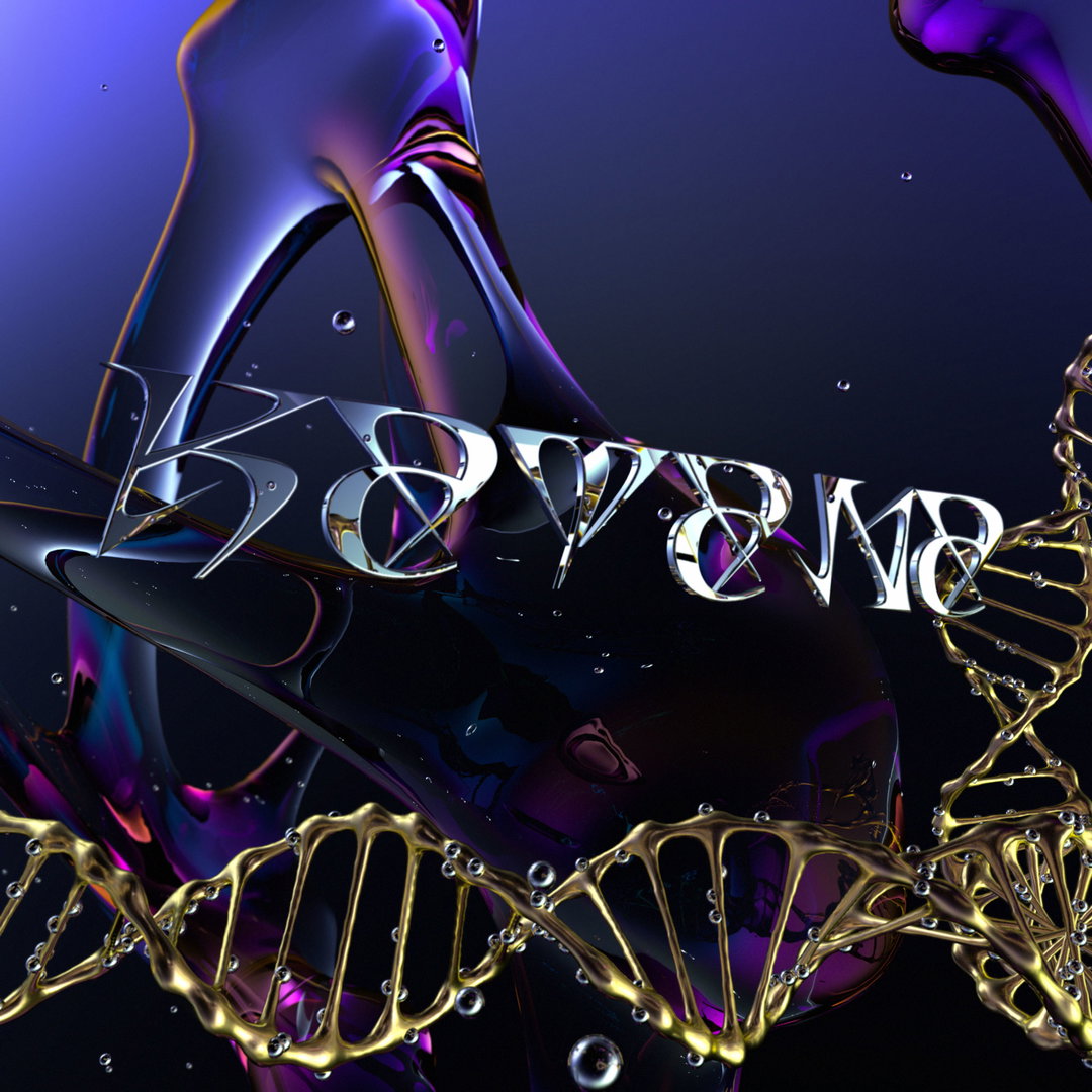
Katana by Floriane Rousselot
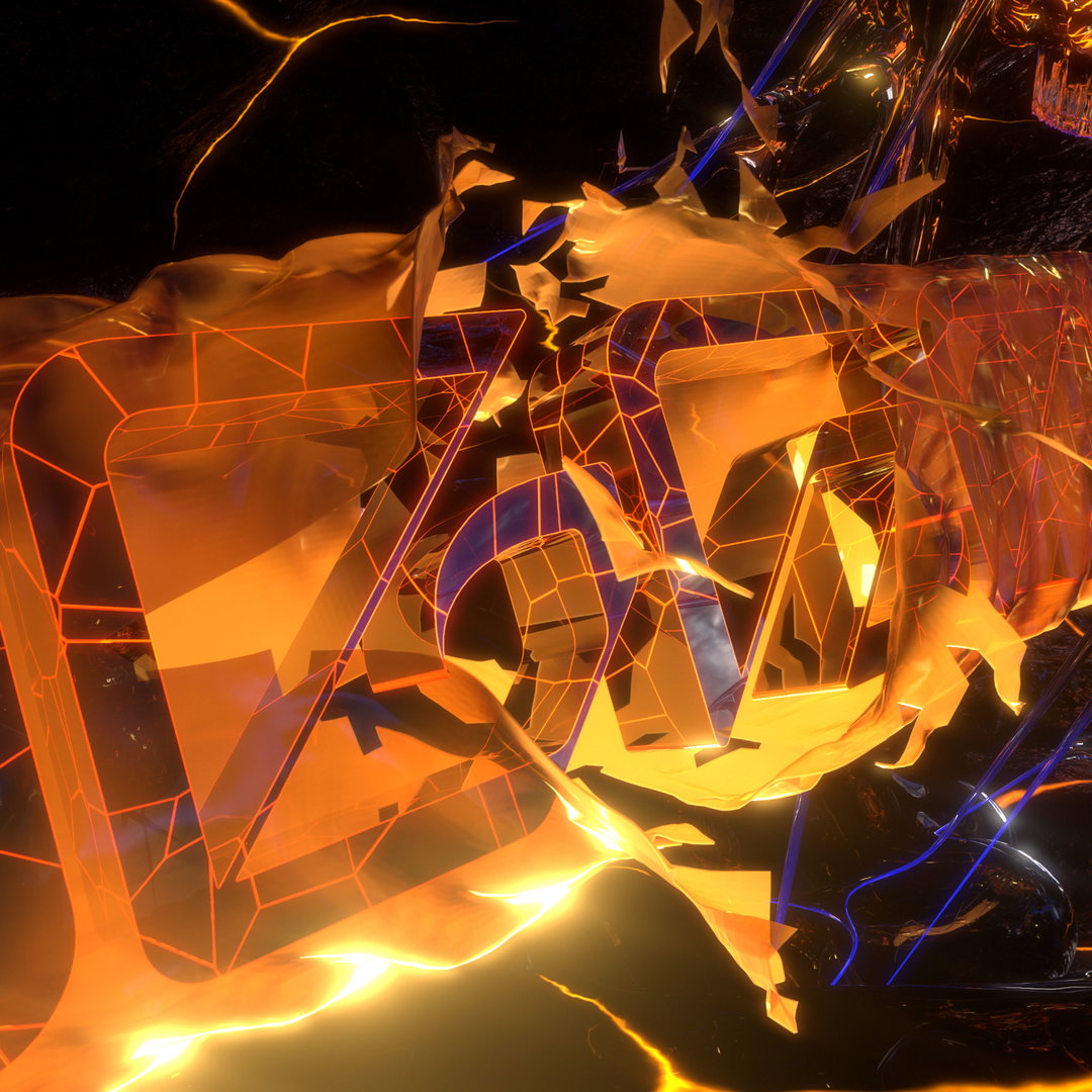
Mughal by Jose Houdini
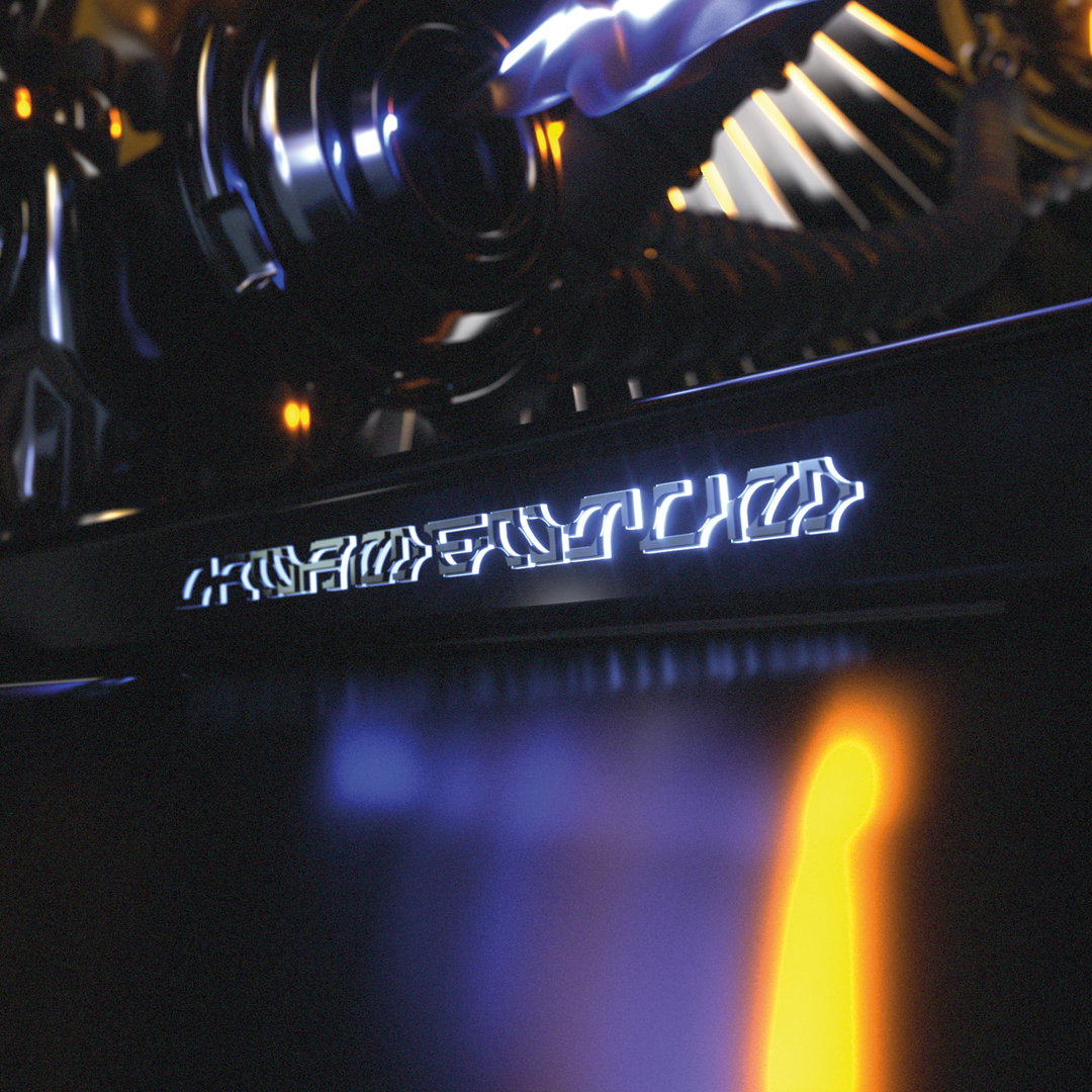
Ornamentum by Hugo Jourdan
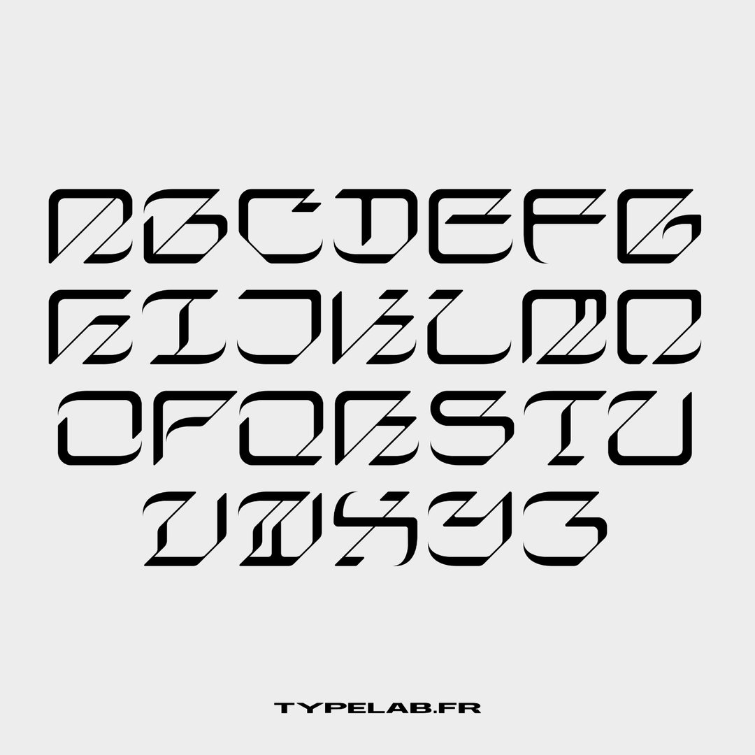
Mughal by Jose Houdini
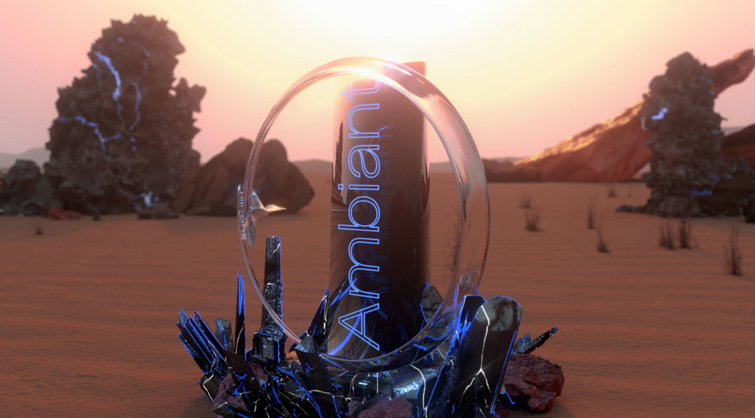
Ambiant by Laura Csocsan
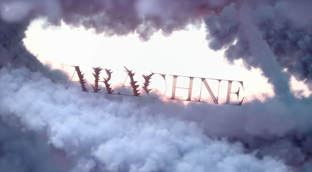
Arachne by Leonhard Laupichler
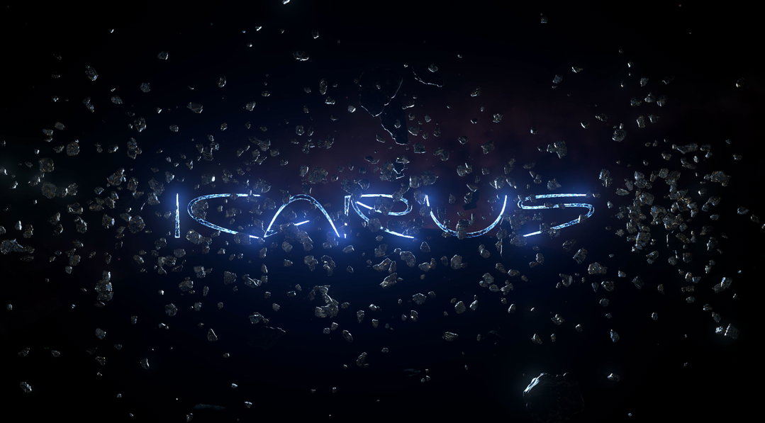
Icarus by Sophia Brinkgerd
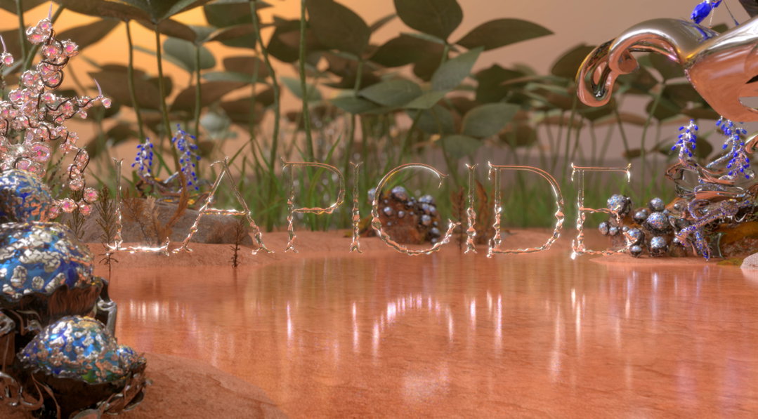
Lapicide by Emilie Vizcano
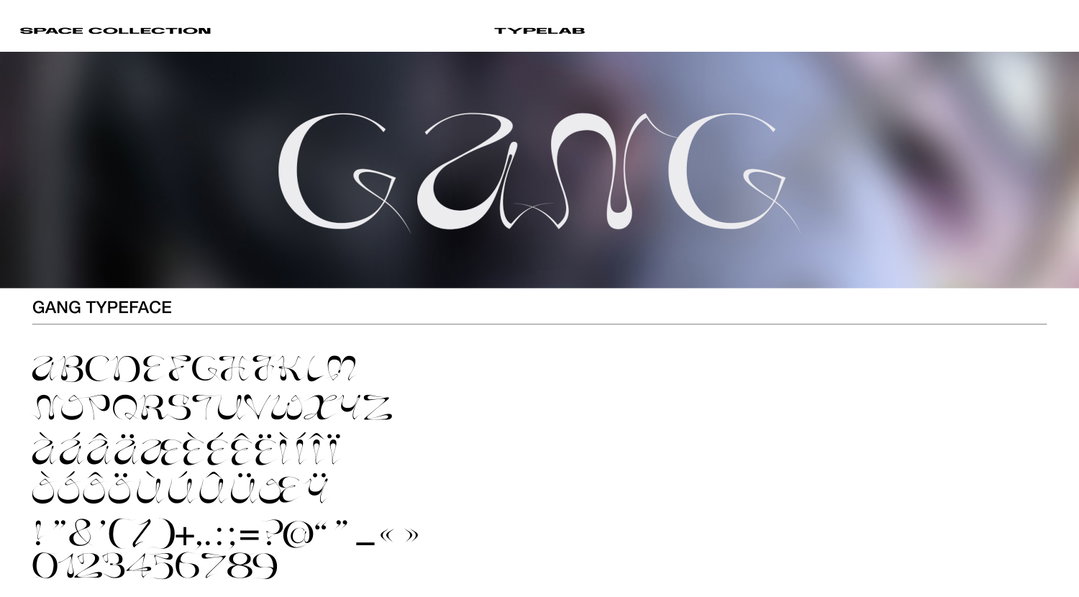
Gang specimen
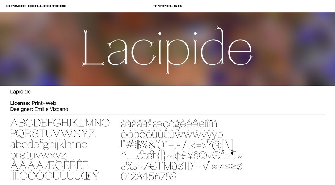
Lacipide specimen
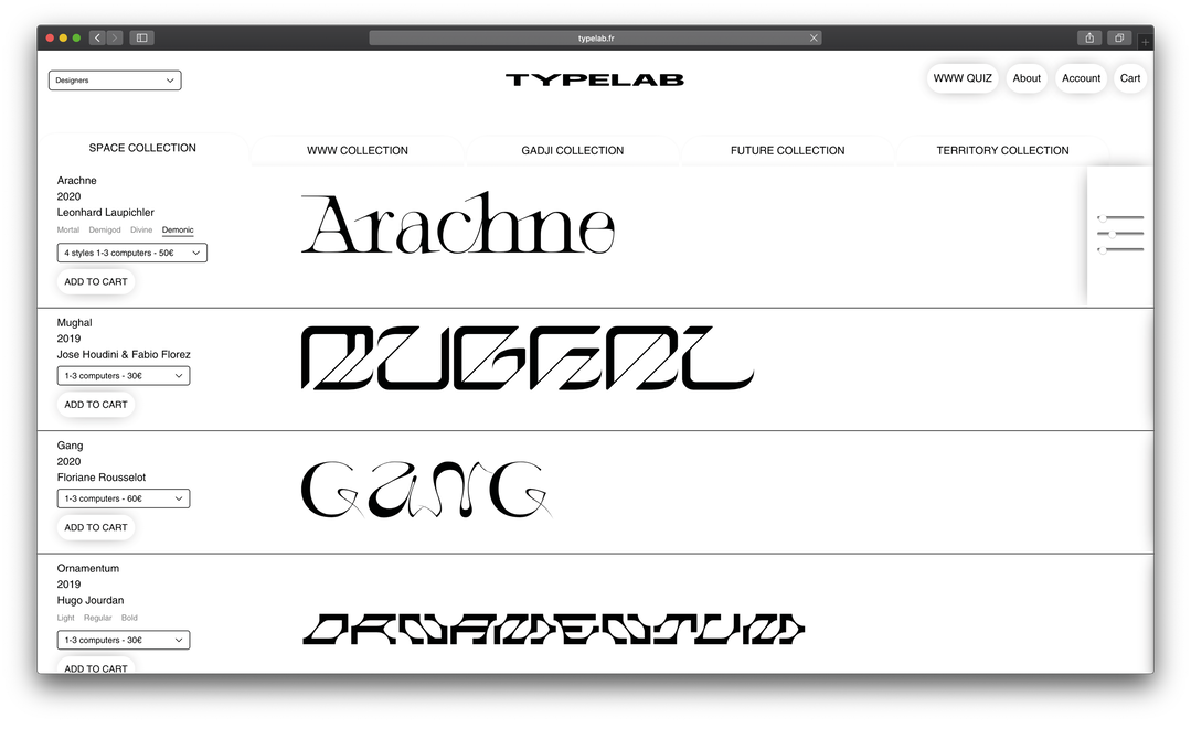
Typelab
Share Article
Further Info
About the Author
—
Ruby is Senior Creative at It's Nice That, overseeing our visual output across platforms and projects. Before that, she was associate editor on the editorial team, after joining in September 2017 following graduation from Central Saint Martins.


