



Launch Recite Me assistive technology
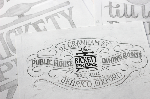
A hand-drawn logo for “The Rickety Press”, a public house and dining rooms. The ornate lettering is framed by decorative swirls and includes the address “67 Cranham St” and “Jehrico, Oxford”.

Graphic Design: Lovely hand lettering from British designer Ged Palmer

—
Date
14 October 2013

It’s not often that great design or illustration lands in your lap when you’re having a few beers at your dad’s local on a Saturday afternoon, but my dad has a great local that’s adorned with some fantastic type – although the design pretty much passes him by whether he’s had a skinful or not. The hand-rendered type that covers the interior and exterior walls of this particular pub is the handiwork of British designer Ged Palmer, hand-letterer extraordinaire and member of international type brotherhood Typeverything. Ged’s a master of all things freeform, creating logos for numerous companies, custom type treatments for books and public art projects and even the occasional public house interior. Thanks for brightening up my weekend Ged!
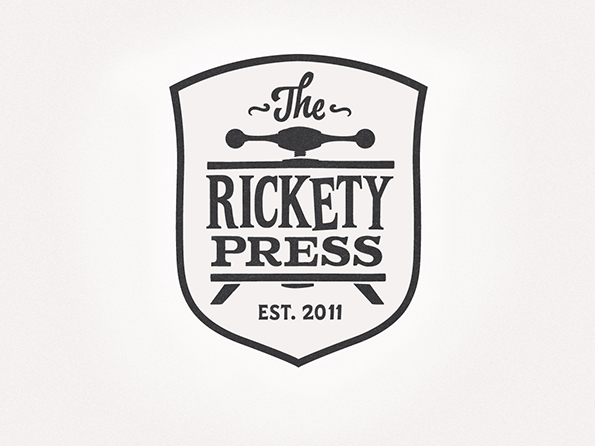
A black and white logo for “The Rickety Press” enclosed within a shield shape. The design features a stylized printing press handle above the brand name and the text “Est. 2011” below.
Above

Ged Palmer: The Rickety Press identity
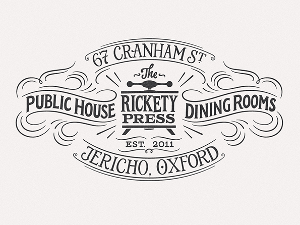
An ornate black and white logo for “The Rickety Press”, featuring a central illustration of a printing press. Decorative flourishes surround the text “Public House” and “Dining Rooms”, with the address “67 Cranham St” and “Jericho, Oxford” curving around the edges.
Above

Ged Palmer: The Rickety Press identity
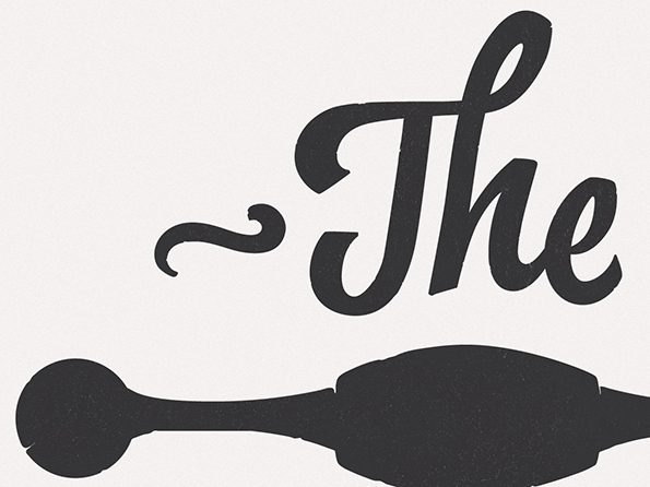
A graphic of the word “The” written in a bold, black cursive script. Below the text is a dark, horizontal silhouette of a bottle lying on its side.
Above

Ged Palmer: The Rickety Press identity
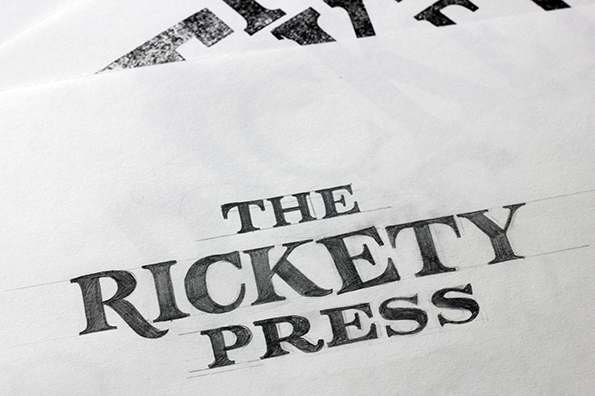
A close-up of a hand-drawn logo on white paper that reads “THE RICKETY PRESS”. The serif lettering is shaded with pencil, with faint guide lines visible beneath the text.
Above

Ged Palmer: The Rickety Press identity
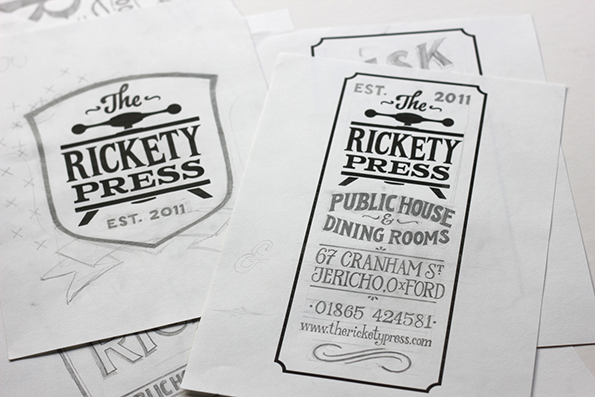
A collection of black and white logo sketches and layouts for “The Rickety Press”. One design is framed in a shield, while another is a vertical rectangle listing the business as a “Public House & Dining Rooms”.
Above

Ged Palmer: The Rickety Press identity
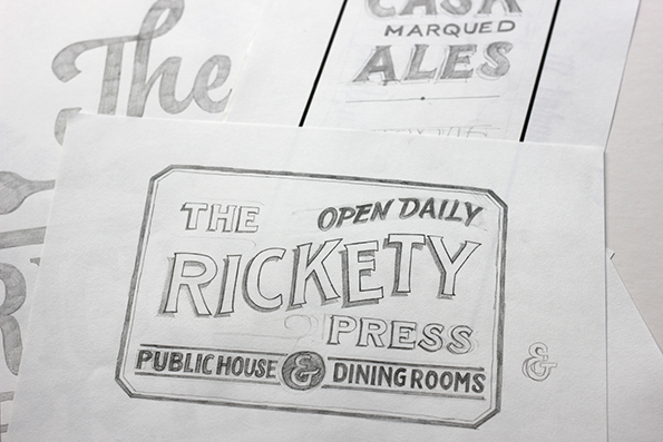
A pencil sketch of a sign for “The Rickety Press”. The design includes the phrases “Open Daily”, “Public House” and “Dining Rooms”.
Above

Ged Palmer: The Rickety Press identity
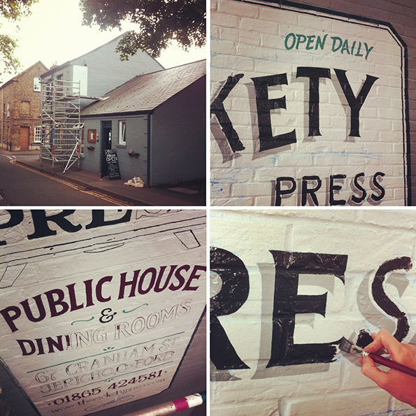
A collage of four images showing the signage for The Kety Press. One photo shows the grey exterior of the building with scaffolding, while others show a person painting the words “Kety Press” and “Public House & Dining Rooms” onto a white brick wall.
Above

Ged Palmer: The Rickety Press identity

Share Article

Further Info

About the Author

James Cartwright

—

James started out as an intern in 2011 and came back in summer of 2012 to work online and latterly as Print Editor, before leaving in May 2015.


It's Nice That Newsletters

Fancy a bit of It's Nice That in your inbox? Sign up to our newsletters and we'll keep you in the loop with everything good going on in the creative world.
