



Launch Recite Me assistive technology
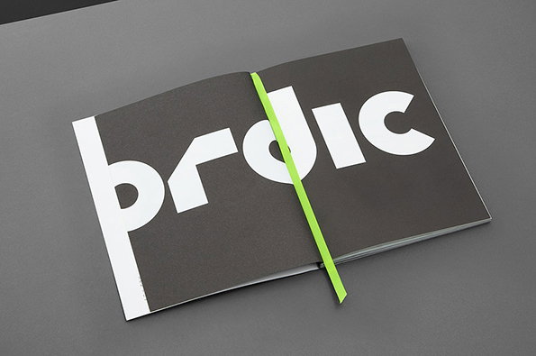
An open booklet with a dark grey cover features bold white typography that reads “prodic”. A bright green elastic band is stretched vertically across the centre of the pages.

Graphic Design: BOB Design nail identity for architecture practice Nordic

—
Date
13 August 2013

Follow the arrow and it will lead you north, skywards, to the far reaches of architectural space; it will lead you to Nordic – Office of Architecture and their beautiful new website made physical by its complementary publication – a great looking thing in its own right created by London’s BOB Design.

And it is this that has taken our fancies so much with its monochromatic black and white colours printed upon matt paper and pierced by the occasional flash of fluorescent green; it’s visual glucose. The new identity centres around the simplicity of the north arrow and the publication wears this well with its chain stitched binding holding together a presentation of the company’s thoughts and ideas about the development of urban design, folded and packaged away in a snappy goody bag, in matching colours and equipped with envelopes, business cards, headed paper and notepads. And the arrows run throughout – an architectural treasure hunt, and oh what a gem this is.
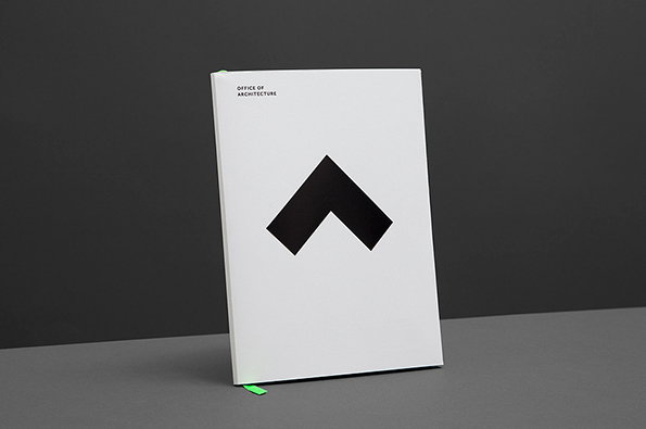
A white book stands upright against a dark grey background. The cover features a bold black chevron symbol and the words “OFFICE OF ARCHITECTURE” in the top left corner.
Above

BOB Design: Nordic – Office of Architecture
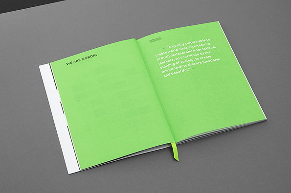
An open book with bright green pages rests on a grey surface. The left page reads “WE ARE NORDIC”, while the right page features a quote about creating “world class architecture”.
Above

BOB Design: Nordic – Office of Architecture
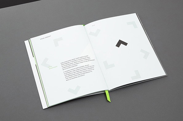
An open brand guidelines book rests on a grey surface. One page features a black chevron logo and grey graphic elements, while the opposite page contains a block of text under the heading “Visual Concept”.
Above

BOB Design: Nordic – Office of Architecture
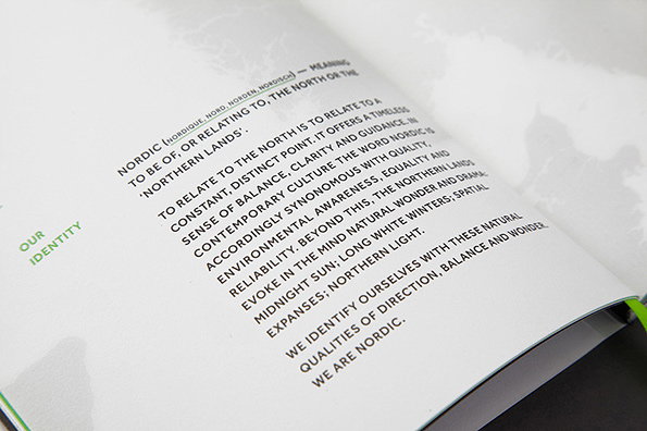
An open book shows a page of text titled “Our Identity” in green. The main text defines the word “Nordic” and describes the brand's values of balance, clarity and environmental awareness.
Above

BOB Design: Nordic – Office of Architecture
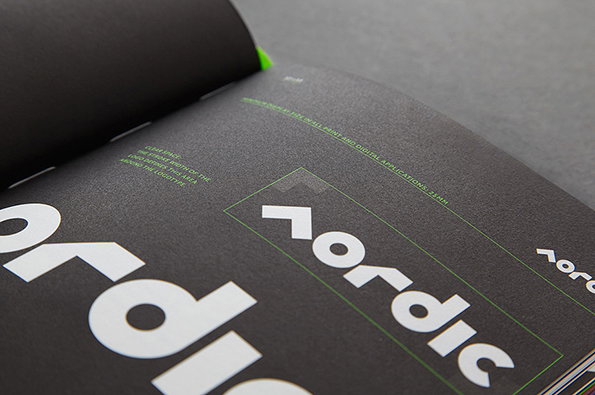
A close-up of a brand guidelines book with a dark grey page. A white logo reads “nordic” in a bold, geometric typeface, surrounded by green technical markers.
Above

BOB Design: Nordic – Office of Architecture
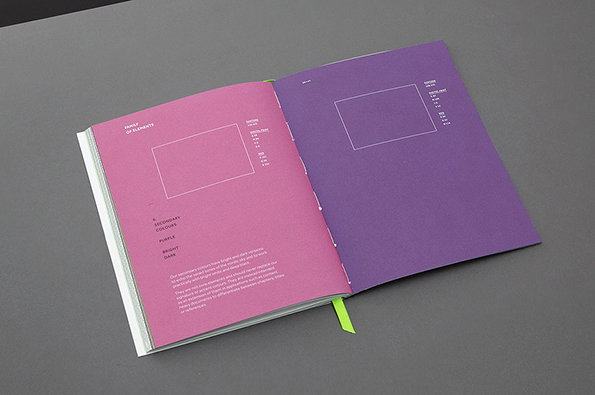
An open brand guidelines book showing two pages of colour specifications. The left page is bright pink and the right is purple, each featuring a white rectangular frame and technical colour data.
Above

BOB Design: Nordic – Office of Architecture
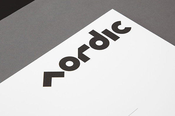
A close-up of a white card featuring a bold, black typographic logo that reads “Nordic”. The letters are stylised with geometric, angular shapes.
Above

BOB Design: Nordic – Office of Architecture
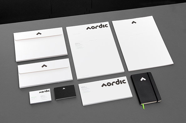
A corporate identity set for “Nordic” laid out on a grey surface. The white stationery includes envelopes, letterheads and business cards, all featuring a minimalist black logo. A black notebook with the same logo sits to the right.
Above

BOB Design: Nordic – Office of Architecture
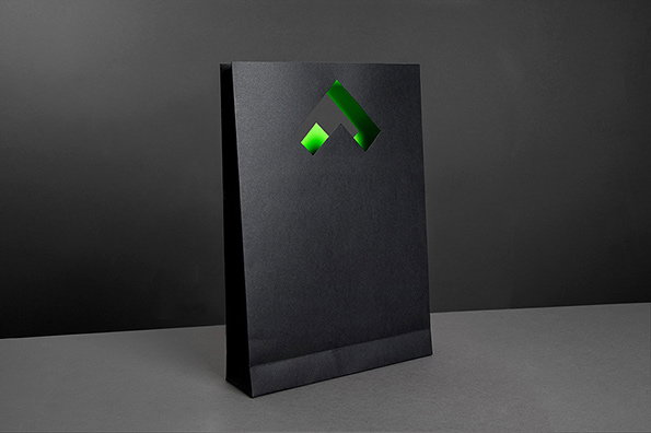
A matte black paper bag stands against a dark grey background. A geometric, arrow-shaped cutout in the centre reveals a glowing green interior.
Above
BOB Design: Nordic – Office of Architecture

Share Article

Further Info

About the Author

Emily Beber

—

It's Nice That Newsletters

Fancy a bit of It's Nice That in your inbox? Sign up to our newsletters and we'll keep you in the loop with everything good going on in the creative world.
