Graphic designer Han Gao uses text and reading as the main method for creating
The Shanghai-based creative explains why it is ideas, and not beauty, that comes first in his thoughtful practice.
For the Shanghai-based graphic designer Han Gao, the most important aspect of the design process is thinking. “Beauty doesn’t come first,” he tells us of his practice, “The concept and idea does. It’s all about why you are doing it and what you are actually doing.” Despite this, Han’s work is still strikingly aesthetic. When we first came across his impressive portfolio, we were engaged by his delicate touch, coaxing out a sensitive relationship between text and image. So we were surprised to find out that, underneath it all, Han sees himself as a researcher and experimental practitioner.
“I think I was born to work in the creative field,” he tells us of his work which has featured in the likes of Tokyo TDC and Graphic Design Festival Scotland. Back in school, he excelled in the sciences and was one of the top scoring students, but it never felt right for some reason. After trying an amalgamation of different things, he found an interest in graphic design, and almost instantly found a passion in the making process. Though he cherishes the creative freedom of expression within the discipline, still to this day, Han is “not a crazy fan of graphic design.” But because of this, he perceives a “wider view” of the discipline and is open to a myriad of possibilities.
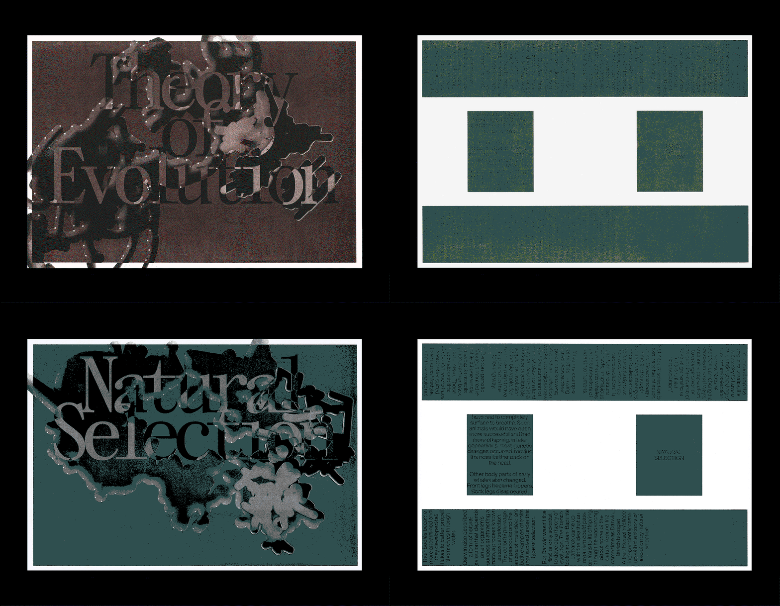
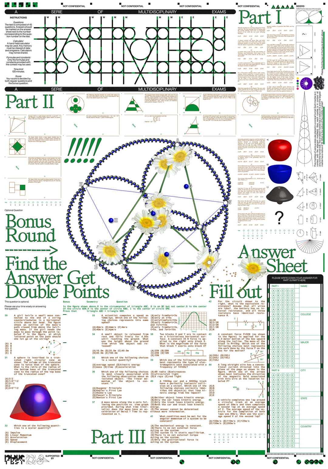
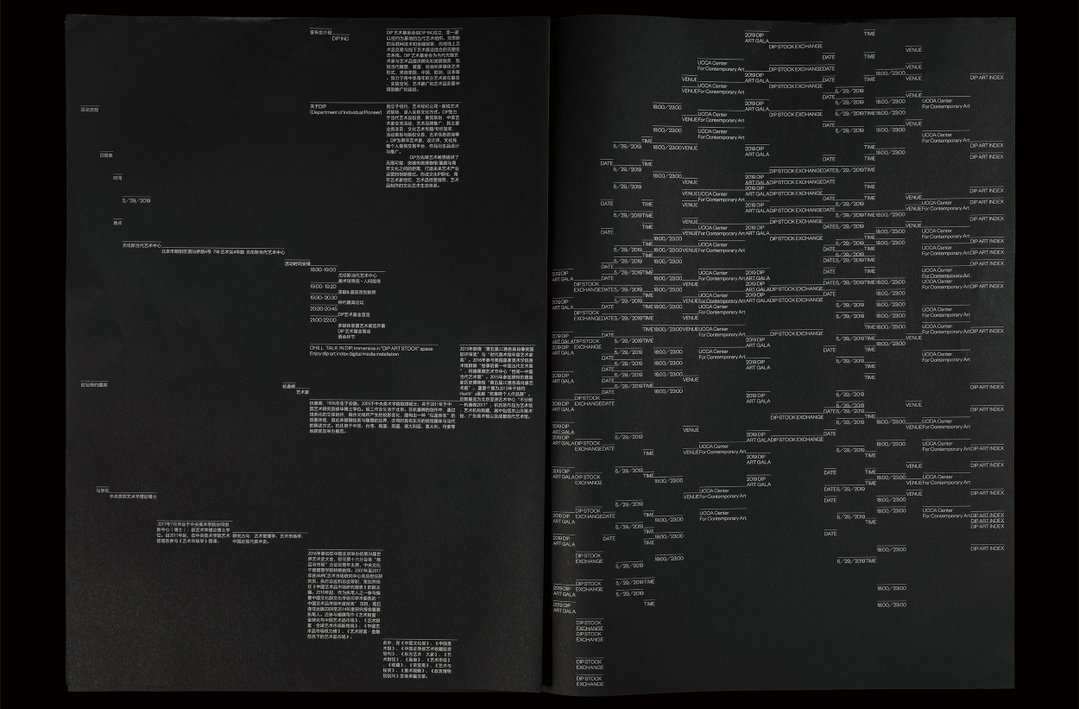
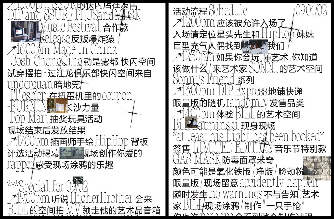
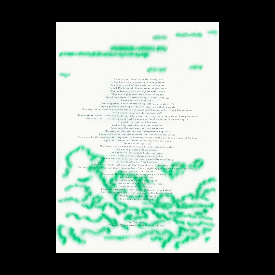
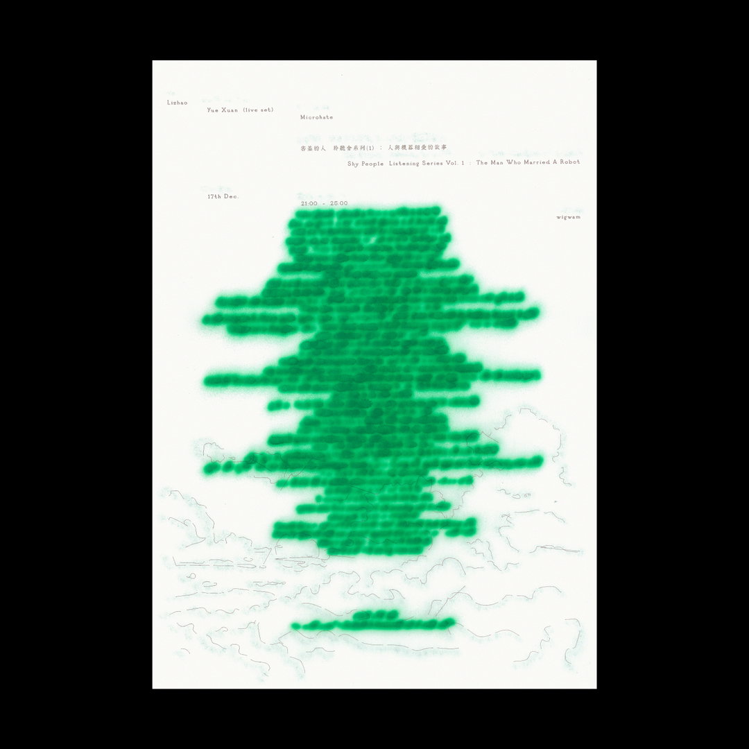
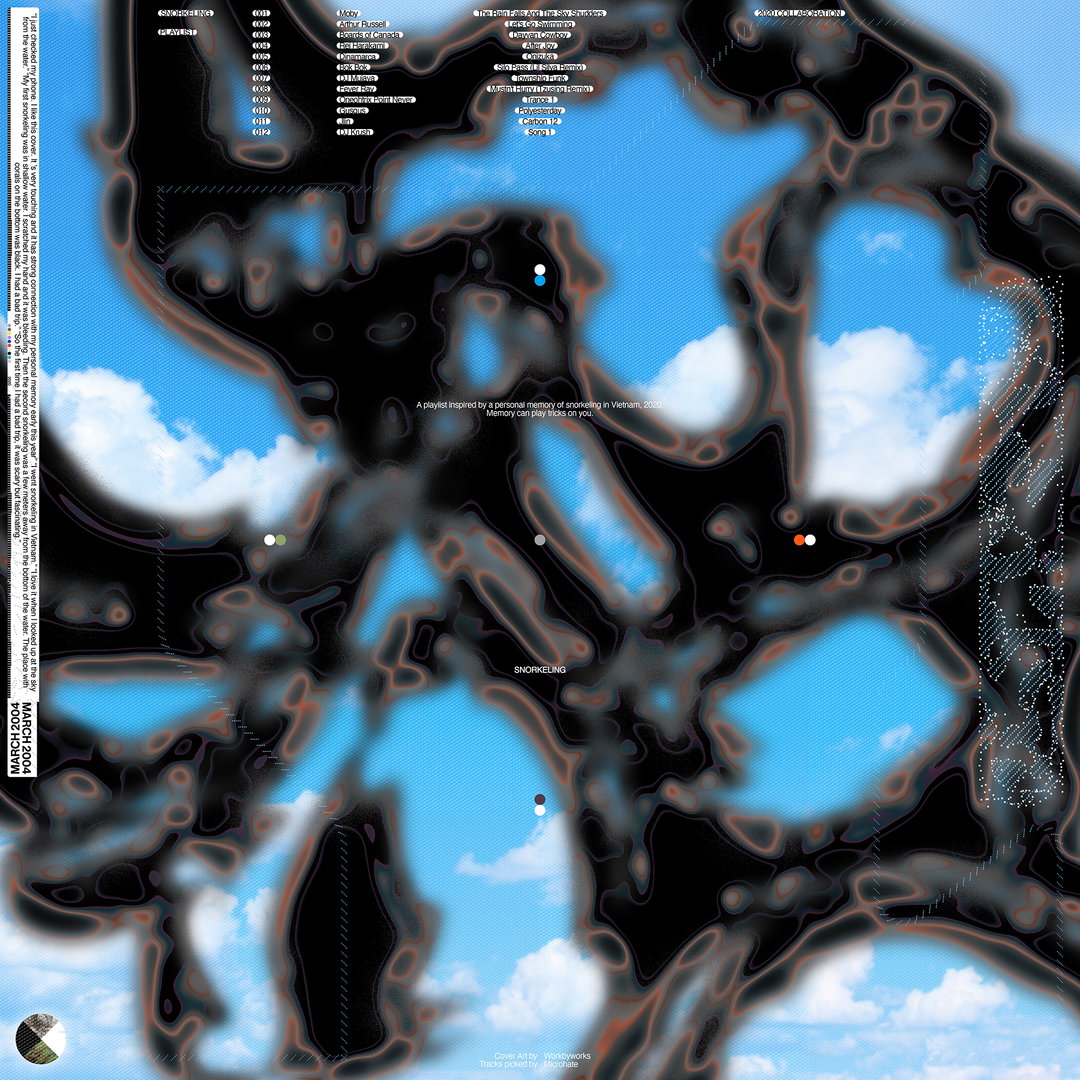
Currently, Han’s creative interest lies in the varying possibilities of reading text. “I am so obsessed with how text can influence the way audiences interact with visual works,” he explains. “Compared with shapes and images, texts have a semantic property which demands reading, processing, understanding or predicting, rather than solely looking.” In this way, he explores different ways of taking in information throughout his practice. In previous projects, like Travel for example, he’s hidden “fake stories” on the backs of pages to present the viewer with alternative storylines. He incorporates poems, lyrics, short stories and singular words throughout his work, creating an ordered yet nuanced reading experience and extending visual sensations through an array of communication design.
GalleryHan Gao
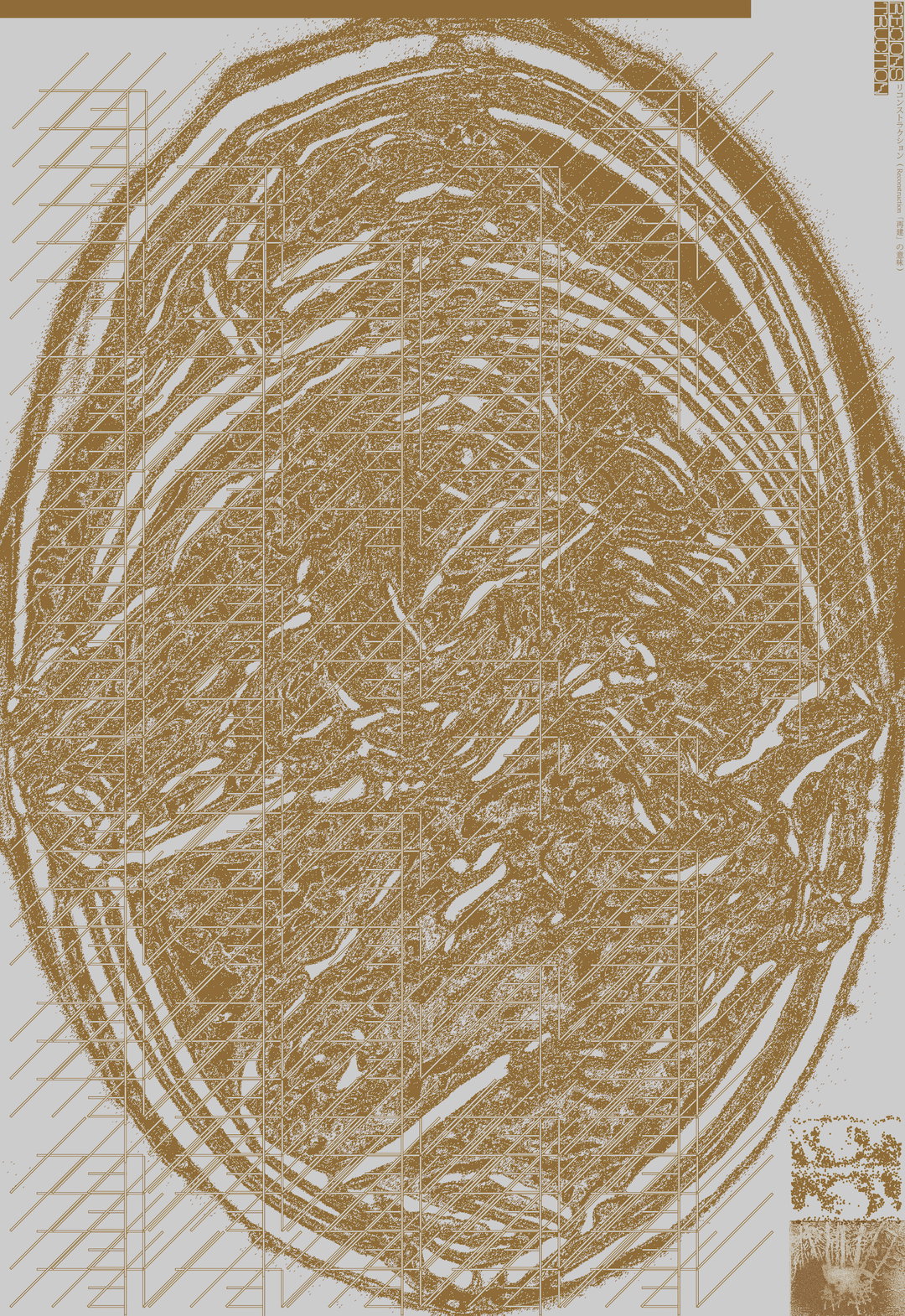
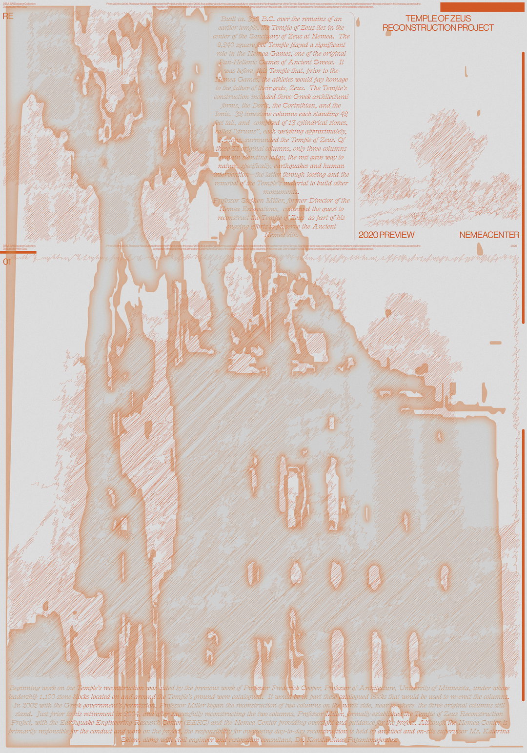
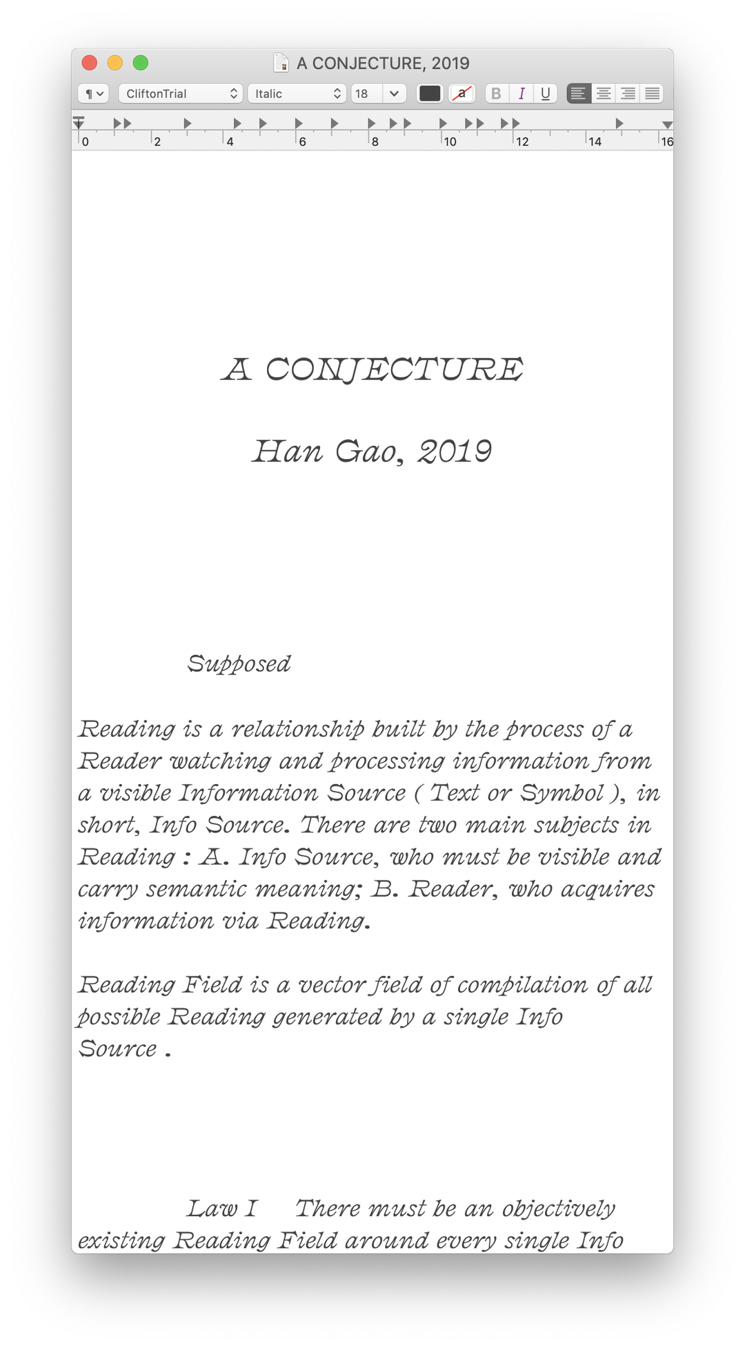
Drawing inspiration from those around him and the surrounding society that continues to shape his identity, Han is the kind of person who gets “addicted” to inspiration. “I get super excited and hyped when something pops into my brain, it’s the kind of feeling that people get drunk for,” he continues. For Han, this is the best part of his process, fully immersing himself in creative flow and unleashing a wheel of idea after idea. Using this method, Han devised an original concept that he’s called “the reading field”, exemplified through his project titled A Conjecture.
Here, he experiments with the notion of the reading field; an assessment that there is an inherent area of legibility existing around readable texts. “When people read,” Han explains, “the field is activated,” and in this project, he designs a variety of compositions to observe the reading field in different situations and experiment with its boundaries. “The project doesn’t fall into any usual category of visual language,” says Han. “It is a good example, and the start of my exploration of using text as my main method of creating.”
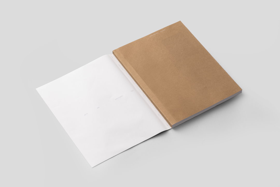
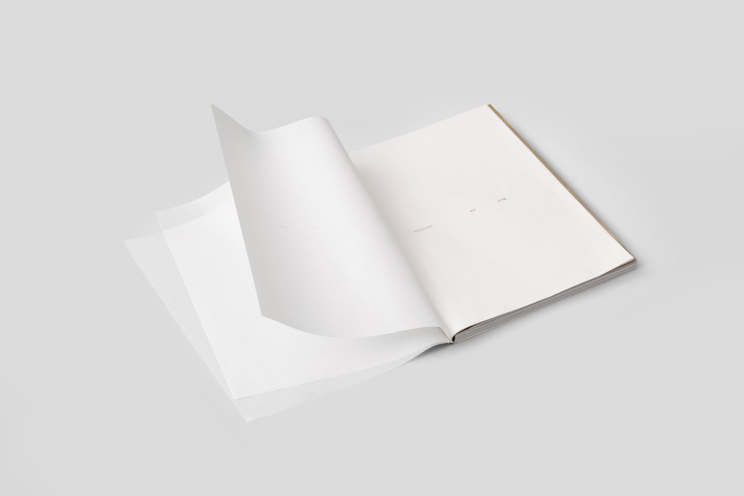
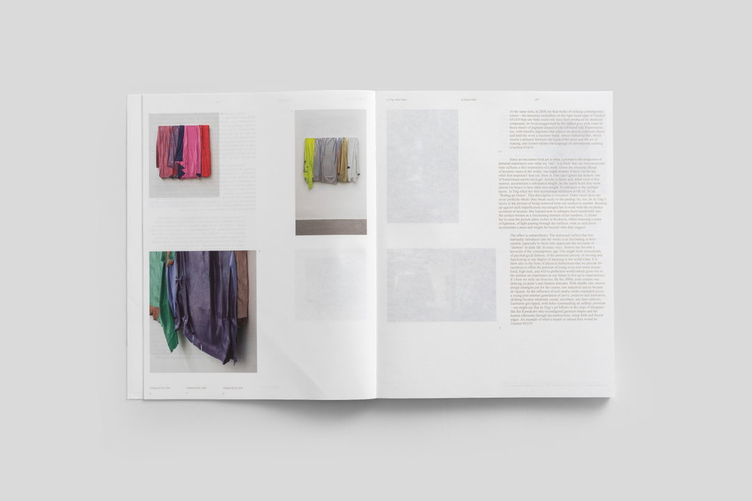
In other work, for instance the design for an artist book titled Peeling An Onion, Han demonstrates his pared back design skills in this minimalist book design. The artist didn’t want any decoration or graphic design language convoluting the work, so the concept of the work lies in applying this essentialism to every aspect of the print: the paper, binding and contents. “It looks very plain from a distance,” Han finally goes on to say, “but when you hold it in your hand and start to read, you can feel the thinking behind this book.” Looking to the future, Han is currently in the process of moving to the US to start a new life. Though he intends to maintain a focus on personal projects, he’s thinking about attending an art school, then maybe starting a business with friends. He ends, “I am open to any possibilities.”
Hero Header
Han Gao
Share Article
Further Info
About the Author
—
Jynann joined It’s Nice That as an editorial assistant in August 2018 after graduating from The Glasgow School of Art’s Communication Design degree. In March 2019 she became a staff writer and in June 2021, she was made associate editor. She went freelance in 2022.