Harriet Richardson and F37 build a typeface made from three ages of the artist’s diary confessionals
This messy and lived-in typeface nabs glyphs from pages upon pages of diary entries, making the project “part archival, part performance”, with an ‘auto-yearn’ feature to boot.
Performance artist, writer and professional “yearner” Harriet Richardson was sharing short videos of herself journaling on her burner Instagram account when someone at the type foundry F37 slid into her DMs. An act that would usually be a professional red flag, Harriet instead decided to accept the request. The message was a proposal – to collaborate with the foundry on F37 Harriet, a typeface designed by Harriet. She accepted, not only to jump at the chance of flexing her muscles in a new creative field, but also to spite corporate gloss.
The ideation stage began with ideas such as fonts inspired by protest placards or the alphabet stitched together from 100 people’s love letters and even letterforms drawn from the curves of her body. “But the age-old design cliché proved true: it’s always either your first idea or your last. All along I had this feeling in my stomach (which wasn’t just my IBS) nagging that handwriting is the most intertwined I could be with this project,” says Harriet. “Given how confessional my work has become in recent years, it felt like the most intimate and authentic route.” But, Harriet can’t promise that a F37 Butt Cheek won’t happen.
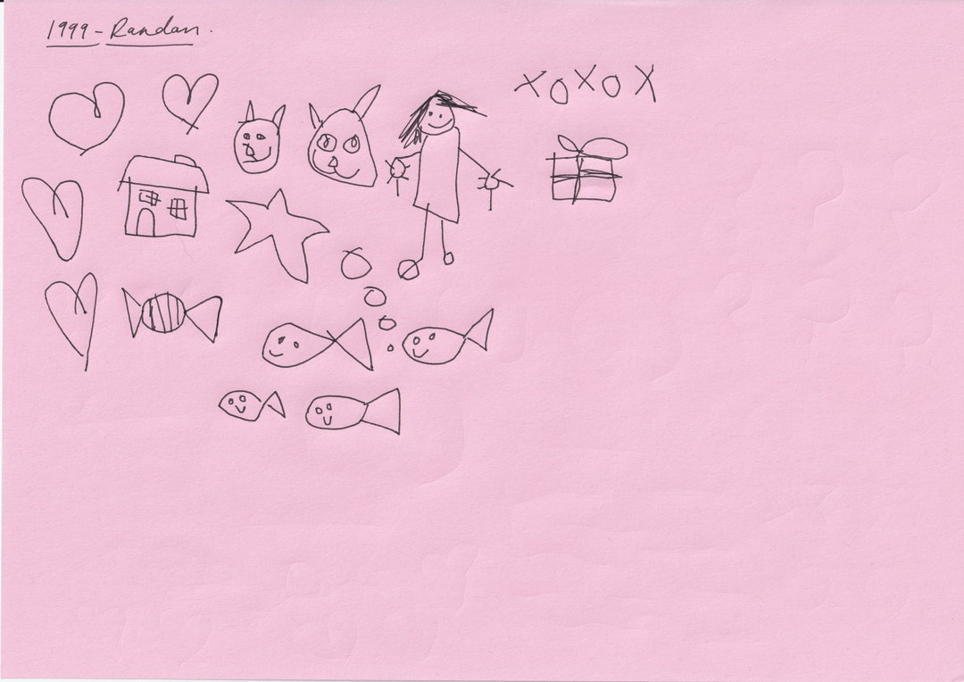
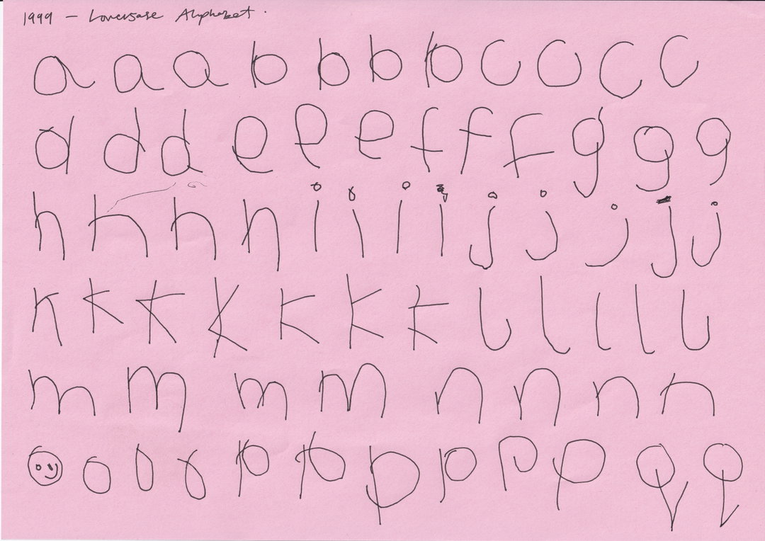
Working with F37’s Ryan Williamson on the production of the font, the typeface spans three eras of Harriet’s writing life: ages four, 13 and 30 years old. The glyphs are an amalgamation of her diary scribblings, which, when included in the typeface, become a an archival project of not only Harriet’s stylistic habits but also of the time of writing – there’s no hashtags or @’s to be found in thes early texts. In her teenage writing, there’s an angsty urgency through the heavy “pressing-too-hard” handwriting of someone desperate to prove something – and this shines through in F37’s translation of the graphite blitz that takes place in adolescent tell-alls. “This process made me acutely aware of how much we perform even in something as ordinary as handwriting,” says Harriet. “I found myself dissecting everything: past and present selves, the unconscious choices I was making, and the question of who exactly I was performing for.”
Details mean a lot to Harriet, so she veered into diva-esque demands: there must be penis and vagina glyphs (use those in your corporate projects), there had to be at least five variations of em dashes in her age 30 set and certain words that she writes most often must appear in one very particular form. For example, when you type one of Harriet’s fourteen exes’ names, they automatically switch to how she would have written it at the time. “I’m unsure if there’s a proper typographic industry term for this, but I call it ‘auto-yearn’,” says Harriet.
Instead of traditional weights, the typeface holds multiple alternates to keep it natural and flexible in order to avoid it looking like “fake childlike writing” – it’s real, messy and lived-in. When researching her handwriting, Harriet came across a crucial piece of childhood ephemera – a conversation between herself at different ages. “It reminded me that we’re never just who we are in the present. We’re layered, carrying every earlier version of ourselves,” says Harriet. “The evolution of (and even conversations between) the handwriting is such a pure way to capture that. As if to prove the point, the typeface launched on the day I turned 30 – another version of me folded into the work.”
F37 and Harriet Richardson: F37 Harriet (Copyright © F37, Harriet Richardson, 2025)
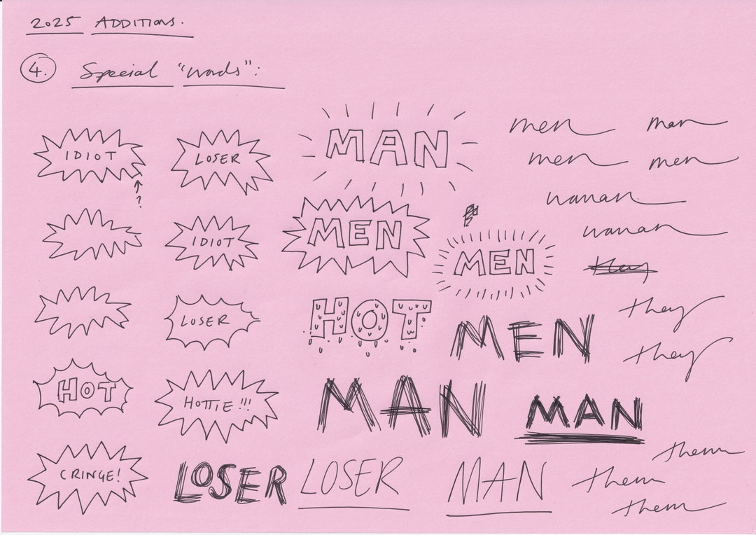
F37 and Harriet Richardson: F37 Harriet (Copyright © F37, Harriet Richardson, 2025)
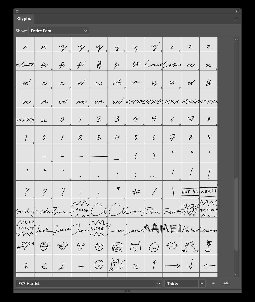
F37 and Harriet Richardson: F37 Harriet (Copyright © F37, Harriet Richardson, 2025)
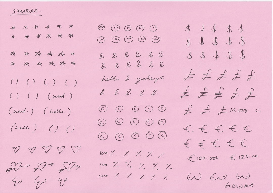
Harriet Richardson: F37 Harriet (Copyright © Harriet Richardson, 2025)
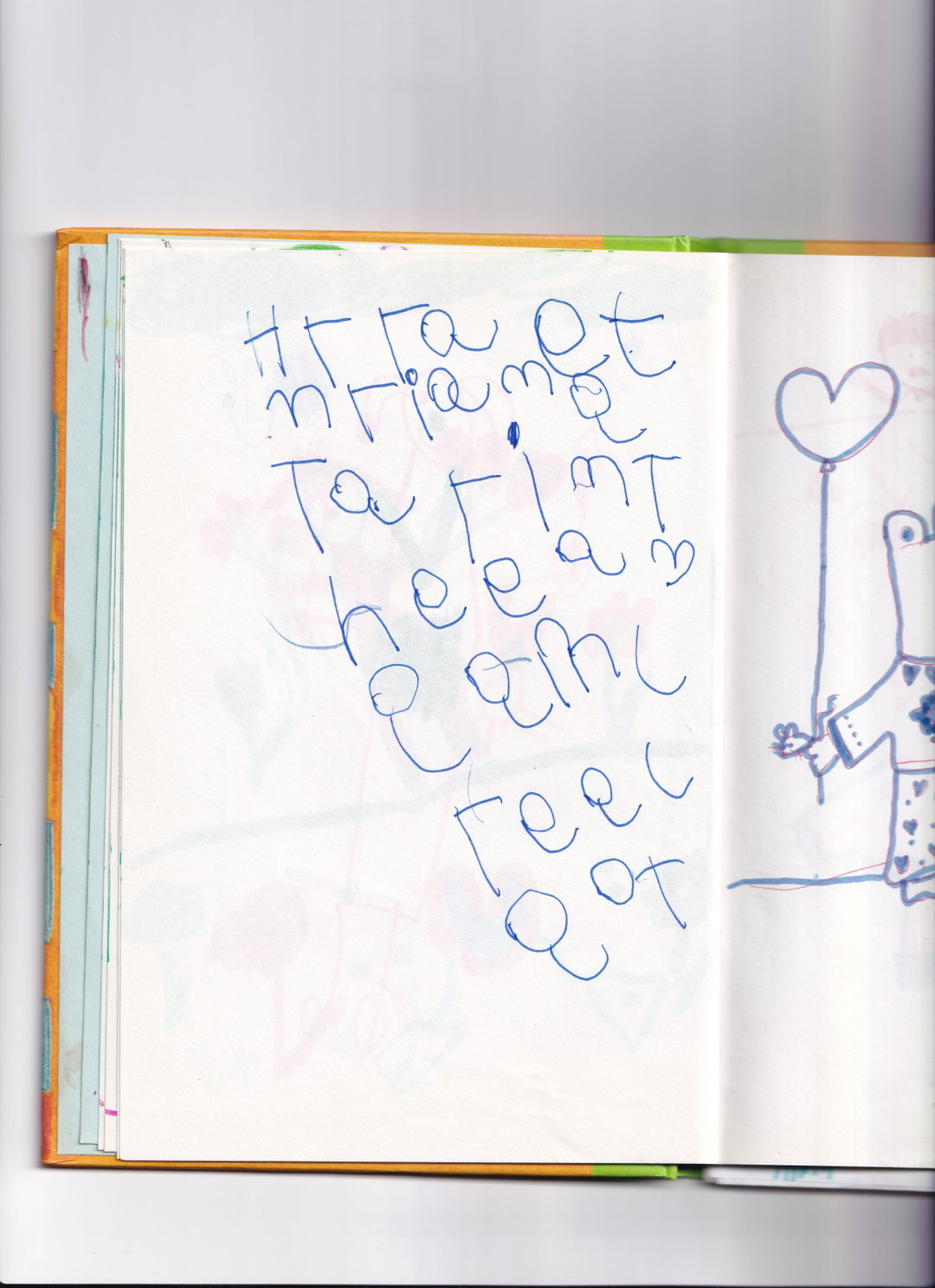
Harriet Richardson (Copyright © Harriet Richardson, 2025)
Harriet Richardson (Copyright © Harriet Richardson, 2025)
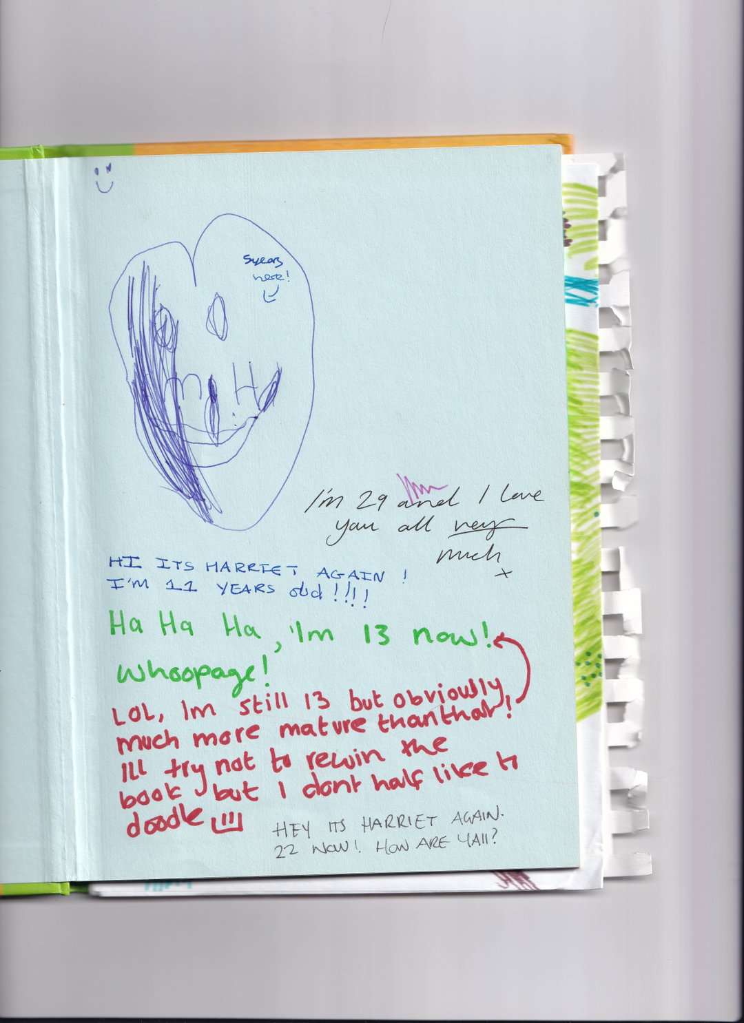
Harriet Richardson (Copyright © Harriet Richardson, 2025)
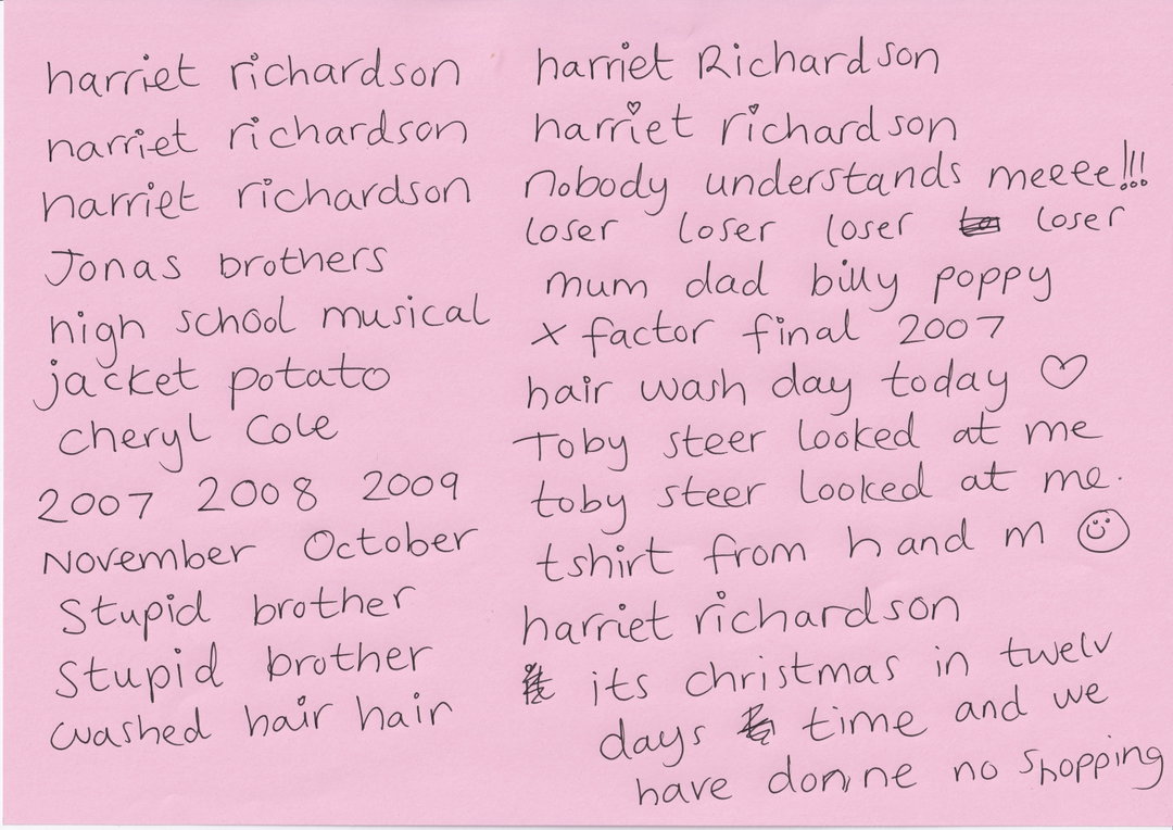
Harriet Richardson: F37 Harriet (Copyright © Harriet Richardson, 2025)
Hero Header
Harriet Richardson: F37 Harriet (Copyright © Harriet Richardson, 2025)
Share Article
About the Author
—
Paul M (He/Him) is a Junior Writer at It’s Nice That since May 2025. He has a strong interest in graphic design, digital kitsch, multimedia painting, collage, nostalgia, analogue technology and all matters of strange stuff. pcm@itsnicethat.com
To submit your work to be featured on the site, see our Submissions Guide.